When applying CSS3 inset box-shadow or border-radius directly to the image element, the browser doesn't render the CSS style perfectly. However, if the image is applied as background-image, you can add any style to it and have it rendered properly.Today I'm going to revisit the topic and show you how much more you can do with the background-image CSS trick. I will show you how to use box-shadow, border-radius and transition to create various image styles.
Take a look at the demo and note that there is border-radius and inset box-shadow applied in the first row of images. Firefox does render border-radius on image element, but doesn't render the inset box-shadow. Chrome or Safari doesn't render the border-radius and inset box-shadow at all.
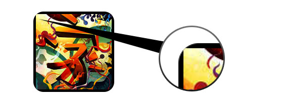
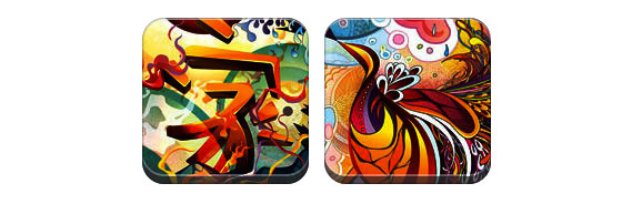
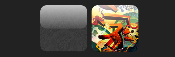
Take a look at the demo and note that there is border-radius and inset box-shadow applied in the first row of images. Firefox does render border-radius on image element, but doesn't render the inset box-shadow. Chrome or Safari doesn't render the border-radius and inset box-shadow at all.
Workaround
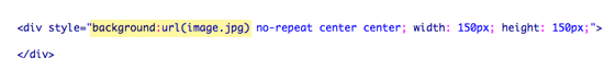
To get the border-radius and inset box-shadow working, the workaround is to apply the actual image as background-image.Dynamic Way
To make it dynamic, you can use to jQuery to wrap the background image dynamically for every image element. The jQuery code below will wrap all images with a span tag and apply the image source as the background image (jQuery code)
Output
The above code will output the following HTML code:

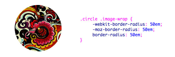
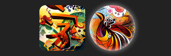
Circle Image (see demo)
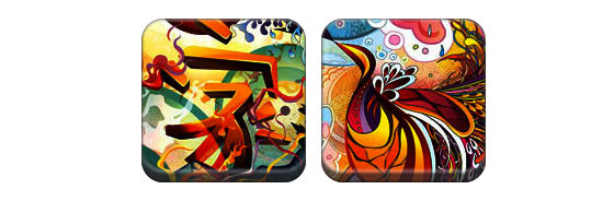
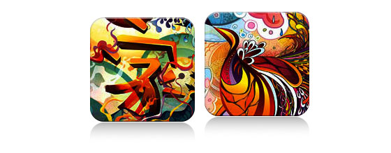
Now that the image is applied as a background image, you can pretty much add any style to it. Below is a simple circle image created with border-radius.CSS
.circle .image-wrap {
 -webkit-border-radius: 50em;
 -moz-border-radius: 50em;
 border-radius: 50em;
}
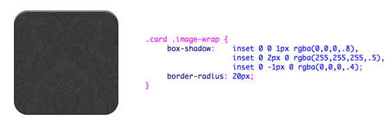
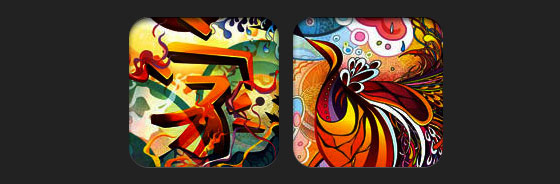
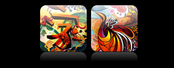
Card Style
Below is a card-like image style created with multiple inset box-shadow values.CSS
.card .image-wrap {
 -webkit-box-shadow: inset 0 0 1px rgba(0,0,0,.8), inset 0 2px 0 rgba(255,255,255,.5), inset 0 -1px 0 rgba(0,0,0,.4);
 -moz-box-shadow: inset 0 0 1px rgba(0,0,0,.8), inset 0 2px 0 rgba(255,255,255,.5), inset 0 -1px 0 rgba(0,0,0,.4);
 box-shadow: inset 0 0 1px rgba(0,0,0,.8), inset 0 2px 0 rgba(255,255,255,.5), inset 0 -1px 0 rgba(0,0,0,.4);

 -webkit-border-radius: 20px;
 -moz-border-radius: 20px;
 border-radius: 20px;
}
Embossed Style
With some alterations, I can turn the card style into embossed style.CSS
.embossed .image-wrap {
 -webkit-box-shadow: inset 0 0 2px rgba(0,0,0,.8), inset 0 2px 0 rgba(255,255,255,.5), inset 0 -7px 0 rgba(0,0,0,.6), inset 0 -9px 0 rgba(255,255,255,.3);
 -moz-box-shadow: inset 0 0 2px rgba(0,0,0,.8), inset 0 2px 0 rgba(255,255,255,.5), inset 0 -7px 0 rgba(0,0,0,.6), inset 0 -9px 0 rgba(255,255,255,.3);
 box-shadow: inset 0 0 2px rgba(0,0,0,.8), inset 0 2px 0 rgba(255,255,255,.5), inset 0 -7px 0 rgba(0,0,0,.6), inset 0 -9px 0 rgba(255,255,255,.3);

 -webkit-border-radius: 20px;
 -moz-border-radius: 20px;
 border-radius: 20px;
}
Soft Embossed Style
This is pretty much the same as the embossed style, but I just applied 1px blur to it.CSS
.soft-embossed .image-wrap {
 -webkit-box-shadow: inset 0 0 4px rgba(0,0,0,1), inset 0 2px 1px rgba(255,255,255,.5), inset 0 -9px 2px rgba(0,0,0,.6), inset 0 -12px 2px rgba(255,255,255,.3);
 -moz-box-shadow: inset 0 0 4px rgba(0,0,0,1), inset 0 2px 1px rgba(255,255,255,.5), inset 0 -9px 2px rgba(0,0,0,.6), inset 0 -12px 2px rgba(255,255,255,.3);
 box-shadow: inset 0 0 4px rgba(0,0,0,1), inset 0 2px 1px rgba(255,255,255,.5), inset 0 -9px 2px rgba(0,0,0,.6), inset 0 -12px 2px rgba(255,255,255,.3);

 -webkit-border-radius: 20px;
 -moz-border-radius: 20px;
 border-radius: 20px;
}
Cutout Style
Again with just inset box-shadow, I can make it to look like a cutout effect.CSS
.cut-out .image-wrap {
 -webkit-box-shadow: 0 1px 0 rgba(255,255,255,.2), inset 0 4px 5px rgba(0,0,0,.6), inset 0 1px 0 rgba(0,0,0,.6);
 -moz-box-shadow: 0 1px 0 rgba(255,255,255,.2), inset 0 4px 5px rgba(0,0,0,.6), inset 0 1px 0 rgba(0,0,0,.6);
 box-shadow: 0 1px 0 rgba(255,255,255,.2), inset 0 4px 5px rgba(0,0,0,.6), inset 0 1px 0 rgba(0,0,0,.6);

 -webkit-border-radius: 20px;
 -moz-border-radius: 20px;
 border-radius: 20px;
}
Morphing & Glowing
In this example, I added transition to the image wrap element. On mouse over, it will morph from rounded corners to circle and add a glowing effect. The glowing effect is done with multiple box-shadow values.CSS
.morphing-glowing .image-wrap {
 -webkit-transition: 1s;
 -moz-transition: 1s;
 transition: 1s;

 -webkit-border-radius: 20px;
 -moz-border-radius: 20px;
 border-radius: 20px;
}

.morphing-glowing .image-wrap:hover {
 -webkit-box-shadow: 0 0 20px rgba(255,255,255,.6), inset 0 0 20px rgba(255,255,255,1);
 -moz-box-shadow: 0 0 20px rgba(255,255,255,.6), inset 0 0 20px rgba(255,255,255,1);
 box-shadow: 0 0 20px rgba(255,255,255,.6), inset 0 0 20px rgba(255,255,255,1);

 -webkit-border-radius: 60em;
 -moz-border-radius: 60em;
 border-radius: 60em;
}
Glossy Overlay
The glossy gradient overlay is added with the :after pseudo element in the example below.CSS
.glossy .image-wrap {
 -webkit-box-shadow: inset 0 -1px 0 rgba(0,0,0,.5);
 -moz-box-shadow: inset 0 -1px 0 rgba(0,0,0,.5);
 box-shadow: inset 0 -1px 0 rgba(0,0,0,.5);

 -webkit-border-radius: 20px;
 -moz-border-radius: 20px;
 border-radius: 20px;
}

.glossy .image-wrap:after {
 position: absolute;
 content: ' ';
 width: 100%;
 height: 50%;
 top: 0;
 left: 0;

 -webkit-border-radius: 20px;
 -moz-border-radius: 20px;
 border-radius: 20px;

 background: -moz-linear-gradient(top, rgba(255,255,255,0.7) 0%, rgba(255,255,255,.1) 100%);
 background: -webkit-gradient(linear, left top, left bottom, color-stop(0%,rgba(255,255,255,0.7)), color-stop(100%,rgba(255,255,255,.1)));
 background: linear-gradient(top, rgba(255,255,255,0.7) 0%,rgba(255,255,255,.1) 100%);
}
Reflection
In this example, I shifted the overlay gradient to the bottom to create a reflection.CSS
.reflection .image-wrap:after {
 position: absolute;
 content: ' ';
 width: 100%;
 height: 30px;
 bottom: -31px;
 left: 0;

 -webkit-border-top-left-radius: 20px;
 -webkit-border-top-right-radius: 20px;
 -moz-border-radius-topleft: 20px;
 -moz-border-radius-topright: 20px;
 border-top-left-radius: 20px;
 border-top-right-radius: 20px;

 background: -moz-linear-gradient(top, rgba(0,0,0,.3) 0%, rgba(255,255,255,0) 100%);
 background: -webkit-gradient(linear, left top, left bottom, color-stop(0%,rgba(0,0,0,.3)), color-stop(100%,rgba(255,255,255,0)));
 background: linear-gradient(top, rgba(0,0,0,.3) 0%,rgba(255,255,255,0) 100%);
}

.reflection .image-wrap:hover {
 position: relative;
 top: -8px;
}
Glossy & Reflection
In this example, I combined the :before and :after element to create a glossy image style with reflection.CSS
.glossy-reflection .image-wrap {
 -webkit-box-shadow: inset 0 -1px 0 rgba(0,0,0,.5), inset 0 1px 0 rgba(255,255,255,.6);
 -moz-box-shadow: inset 0 -1px 0 rgba(0,0,0,.5), inset 0 1px 0 rgba(255,255,255,.6);
 box-shadow: inset 0 -1px 0 rgba(0,0,0,.5), inset 0 1px 0 rgba(255,255,255,.6);

 -webkit-transition: 1s;
 -moz-transition: 1s;
 transition: 1s;

 -webkit-border-radius: 20px;
 -moz-border-radius: 20px;
 border-radius: 20px;
}

.glossy-reflection .image-wrap:before {
 position: absolute;
 content: ' ';
 width: 100%;
 height: 50%;
 top: 0;
 left: 0;

 -webkit-border-radius: 20px;
 -moz-border-radius: 20px;
 border-radius: 20px;

 background: -moz-linear-gradient(top, rgba(255,255,255,0.7) 0%, rgba(255,255,255,.1) 100%);
 background: -webkit-gradient(linear, left top, left bottom, color-stop(0%,rgba(255,255,255,0.7)), color-stop(100%,rgba(255,255,255,.1)));
 background: linear-gradient(top, rgba(255,255,255,0.7) 0%,rgba(255,255,255,.1) 100%);
}

.glossy-reflection .image-wrap:after {
 position: absolute;
 content: ' ';
 width: 100%;
 height: 30px;
 bottom: -31px;
 left: 0;

 -webkit-border-top-left-radius: 20px;
 -webkit-border-top-right-radius: 20px;
 -moz-border-radius-topleft: 20px;
 -moz-border-radius-topright: 20px;
 border-top-left-radius: 20px;
 border-top-right-radius: 20px;

 background: -moz-linear-gradient(top, rgba(230,230,230,.3) 0%, rgba(230,230,230,0) 100%);
 background: -webkit-gradient(linear, left top, left bottom, color-stop(0%,rgba(230,230,230,.3)), color-stop(100%,rgba(230,230,230,0)));
 background: linear-gradient(top, rgba(230,230,230,.3) 0%,rgba(230,230,230,0) 100%);
}
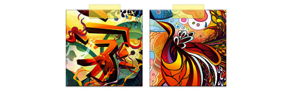
Tape Style
The :after is used here to create a tape like gradient on top of the image.CSS
.tape .image-wrap {
 -webkit-box-shadow: inset 0 0 2px rgba(0,0,0,.7), inset 0 2px 0 rgba(255,255,255,.3), inset 0 -1px 0 rgba(0,0,0,.5), 0 1px 3px rgba(0,0,0,.4);
 -moz-box-shadow: inset 0 0 2px rgba(0,0,0,.7), inset 0 2px 0 rgba(255,255,255,.3), inset 0 -1px 0 rgba(0,0,0,.5), 0 1px 3px rgba(0,0,0,.4);
 box-shadow: inset 0 0 2px rgba(0,0,0,.7), inset 0 2px 0 rgba(255,255,255,.3), inset 0 -1px 0 rgba(0,0,0,.5), 0 1px 3px rgba(0,0,0,.4);
}

.tape .image-wrap:after {
 position: absolute;
 content: ' ';
 width: 60px;
 height: 25px;
 top: -10px;
 left: 50%;
 margin-left: -30px;
 border: solid 1px rgba(137,130,48,.2);

 background: -moz-linear-gradient(top, rgba(254,243,127,.6) 0%, rgba(240,224,54,.6) 100%);
 background: -webkit-gradient(linear, left top, left bottom, color-stop(0%,rgba(254,243,127,.6)), color-stop(100%,rgba(240,224,54,.6)));
 background: linear-gradient(top, rgba(254,243,127,.6) 0%,rgba(240,224,54,.6) 100%);
 -webkit-box-shadow: inset 0 1px 0 rgba(255,255,255,.3), 0 1px 0 rgba(0,0,0,.2);
}
Morphing & Tinting
In the example below, I use the :after element to add a radial gradient on mouse over.CSS
.morphing-tinting .image-wrap {
 position: relative;

 -webkit-transition: 1s;
 -moz-transition: 1s;
 transition: 1s;

 -webkit-border-radius: 20px;
 -moz-border-radius: 20px;
 border-radius: 20px;
}

.morphing-tinting .image-wrap:hover {
 -webkit-border-radius: 30em;
 -moz-border-radius: 30em;
 border-radius: 30em;
}

.morphing-tinting .image-wrap:after {
 position: absolute;
 content: ' ';
 width: 100%;
 height: 100%;
 top: 0;
 left: 0;

 -webkit-transition: 1s;
 -moz-transition: 1s;
 transition: 1s;

 -webkit-border-radius: 30em;
 -moz-border-radius: 30em;
 border-radius: 30em;
}
.morphing-tinting .image-wrap:hover:after  {
 background: -webkit-gradient(radial, 50% 50%, 40, 50% 50%, 80, from(rgba(0,0,0,0)), to(rgba(0,0,0,1)));
 background: -moz-radial-gradient(50% 50%, circle, rgba(0,0,0,0) 40px, rgba(0,0,0,1) 80px);
}
Feather Edge Circle
The radial gradient can also be used as a mask to create a circle feather effect as seen in the example below.CSS
.feather .image-wrap {
 position: relative;

 -webkit-border-radius: 30em;
 -moz-border-radius: 30em;
 border-radius: 30em;
}

.feather .image-wrap:after  {
 position: absolute;
 content: ' ';
 width: 100%;
 height: 100%;
 top: 0;
 left: 0;

 background: -webkit-gradient(radial, 50% 50%, 50, 50% 50%, 70, from(rgba(255,255,255,0)), to(rgba(255,255,255,1)));
 background: -moz-radial-gradient(50% 50%, circle, rgba(255,255,255,0) 50px, rgba(255,255,255,1) 70px);
}
No comments:
Post a Comment