Some people see it as a trend. But it is more than just a trend. It is a new design solution — it helps to resolve the design problems associated with the different resolutions and devices (desktop, laptop, tablet, and mobile). I'm going to share a list of responsive sites that I feel are nicely done. I've categorized the list into two categories: Adaptive and Fluid & Responsive.
Adaptive Design
The following sites are examples of adaptive design. The design adapts based on the viewport width.
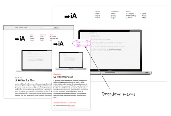
iA
Information Architects is one of my favorite minimal sites. It is simply beautiful. I admire the fact that such a beautiful design only uses two colors (black and red) with just web safe fonts, no texture images, no fancy Javascript effects or custom fonts. Transforming the navigation list menus into dropdown menus on smaller formats is very smart because it conserves a lot of space in the header.
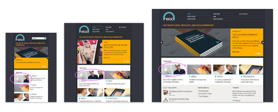
Head London
Although the Head London site is not fluid, but it did a pretty good job on the responsive layouts. The layout is consistently put together on each viewport layout. Most responsive sites use max-width to create fluid images (refer to my Responsive Design tutorial), but the images on Head is masked at full size.
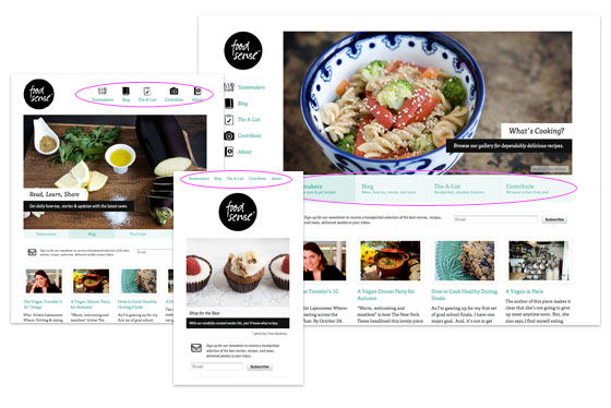
Food Sense
Pay attention to see how the Food Sense site responds. It flows from detailed 2-column layout with sidebar to 1-column layout. As the design gets smaller, it gets more minimal. The slider has 2 line of navigation text at the bottom on the large format, it then changes from two lines of text to one line, the text then disappears on the small format. The navigation menu has icons on the large formats. The menu icons disppear on the smaller formats.
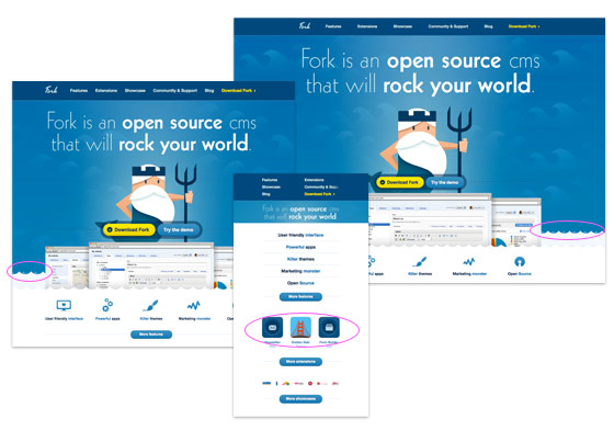
Fork CMS
Go to the Fork CMS site, resize your browser window. Notice the parallax scrolling effect on the water waves? That is fun. However, I don't agree on hiding the feature icons as it goes smaller because readers with small viewport will lose some of those information.
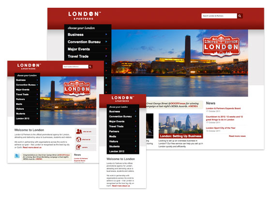
London and Partners
Design wise, I'm not a big fan of this site, London and Partners. But the responsive layouts are very well planned - from a large format 4-column layout to a small 1-column layout. Most responsive sites hide certain content as it goes smaller, but this site keeps it all. It shows that even content-rich site can be responsive.
Fluid & Responsive
Now let's take a look at the fluid and responsive sites. The following sites not only respond base on the viewport width, but the layouts and its content are fluid/elastic.
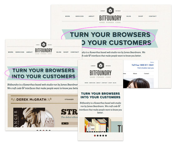
Bitfoundry
What caught my attention with Bitfoundry is the intro text. First I thought the resizable ribbon was a background image using background-size property, but it turned out that is an tag with z-index applied. This is a nice trick to make resizable background image because CCS3 background-size is not cross browser yet.
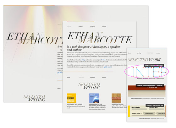
Ethan Marcotte
Ethan Marcotte, being the founder of responsive design and author of Responsive Web Design book, his site of course is responsive. Instead of using max-width to make the images responsive, Ethan uses some CSS tricks to clip the images at original size.
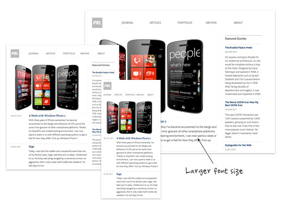
Paul Robert Lloyd
On Paul Robert Lloyd's site, not only the layout is responsive, but the font size is also responsive. On larger viewport, the font size is slightly bigger which provides more comfortable reading on large monitors. This is a good usability touch.
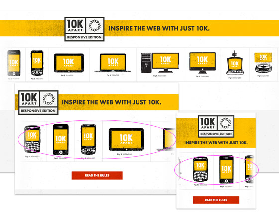
10K Apart
If you have a large display, maximize your browser's window and check out 10K Apart. Then resize your browser's window and watch the header images scrolls in opposite direction.
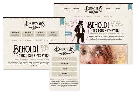
Forefathers Group
The Forefathers Group has great attention to details and it flows nicely across all viewport sizes. The overall design is very graphical. However, on the small version, it seems a lot of graphic elements were removed. It would be nice to preserve some of the graphic elements using background-size property.
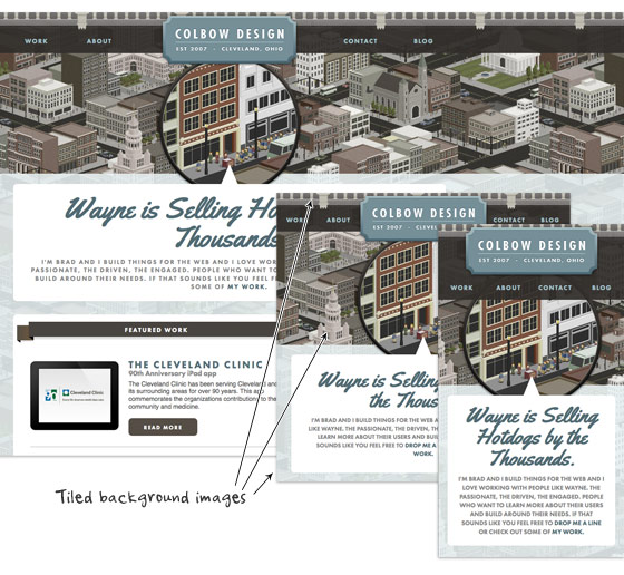
Colbow Design
Unlike the Forefathers Group site shown above, Colbow Design preserves all the graphic details on all viewport layouts. Colbow Design creatively uses tiled background images (header image, city illustration and footer image) to deliver a consistent appearance throughout all resolutions.
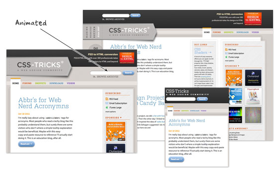
CSS Tricks
Beside of responsive design, CSS Tricks adds some transition effects to make the flow more interesting. Resize your browser window and watch the elements transit from one point to another.
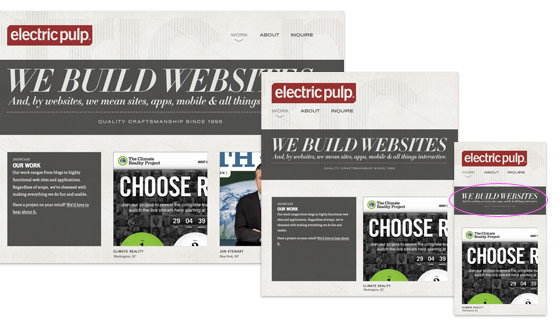
Electric Pulp
I like how Electric Pulp responds from a 3-column layout to 2-column and then a single column. However, the resizable header image doesn't work that well on smaller versions. The text becomes illegible.
Further Reading
Mediaqueri.es, a gallery dedicated on responsive sites
No comments:
Post a Comment