Many organizations prioritize internal structures and services over customer-centricity, hindering effective decision-making. Through a case study, Talke Hoppmann-Walton advocates for a shift towards an outside-in perspective and proposes the use of a user segmentation matrix to foster alignment across departments and prioritize customer needs. If you are an experienced product or UX professional or a team leader dealing with stakeholder management to drive the organization as a whole forward, this article provides you with a canvas for better decision-making and focus.
Do you recognize this situation? The marketing and business teams talk about their customers, and each team thinks they have the same understanding of the problem and what needs to be done. Then, they’re including the Product and UX team in the conversation around how to best serve a particular customer group and where to invest in development and marketing efforts. They’ve done their initial ideation and are trying to prioritize, but this turns into a long discussion with the different teams favoring different areas to focus on. Suddenly, an executive highlights that instead of this customer segment, there should be a much higher focus on an entirely different segment — and the whole discussion starts again.
This situation often arises when there is no joint-up understanding of the different customer segments a company is serving historically and strategically. And there is no shared understanding beyond using the same high-level terms. To reach this understanding, you need to dig deeper into segment definitions, goals, pain points, and jobs-to-be-done (JTBD) so as to enable the organization to make evidence-based decisions instead of having to rely on top-down prioritization.
The hardest part about doing the right thing for your user or customers (please note I’m aware these terms aren’t technically the same, but I’m using them interchangeably in this article so as to be useful to a wider audience) often starts inside your own company and getting different teams with diverging goals and priorities to agree on where to focus and why.
But how do you get there — thinking user-first AND ensuring teams are aligned and have a shared mental model of primary and secondary customer segments?
Personas vs Segments
To explore that further, let’s take a brief look at the most commonly applied techniques to better understand customers and communicate this knowledge within organizations.
Two frequently employed tools are user personas and user segmentation.
Product/UX (or non-demographic) personas aim to represent the characteristics and needs of a certain type of customer, as well as their motivations and experience. The aim is to illustrate an ideal customer and allow teams to empathize and solve different use cases. Marketing (or demographic) personas, on the other hand, traditionally focus on age, socio-demographics, education, and geography but usually don’t include needs, motivations, or other contexts. So they’re good for targeting but not great for identifying new potential solutions or helping teams prioritize.
In contrast to personas, user segments illustrate groups of customers with shared needs, characteristics, and actions. They are relatively high-level classifications, deliberately looking at a whole group of needs without telling a detailed story. The aim is to gain a broader overview of the wider market’s wants and needs.
Tony Ulwick, creator of the “jobs-to-be-done” framework, for example, creates outcome-based segmentations, which are quite similar to what this article is proposing. Other types of segmentations include geographic, psychographic, demographic, or needs-based segmentations. What all segmentations, including the user segmentation matrix, have in common is that the segments are different from each other but don‘t need to be mutually exclusive.
As Simon Penny points out, personas and segments are tools for different purposes. While customer segments help us understand a marketplace or customer base, personas help us to understand more about the lived experience of a particular group of customers within that marketplace.
Both personas and segmentations have their applications, but this article argues that using a matrix will help you prioritize between the different segments. In addition, the key aspect here is the co-creation process that fosters understanding across departments and allows for more transparent decision-making. Instead of focusing only on the outcome, the process of getting there is what matters for alignment and collaboration across teams. Let’s dig deeper into how to achieve that.User Segmentation Matrix: 101
At its core, the idea of the user segmentation matrix is meant to create a shared mental model across teams and departments of an organization to enable better decision-making and collaboration.
And it does that by visualizing the relevance and differences between a company’s customer segments. Crucially, input into the matrix comes from across teams as the process of co-creation plays an essential part in getting to a shared understanding of the different segments and their relevance to the overall business challenge.
Additionally, this kind of matrix follows the principle of “just enough, not too much” to create meaning without going too deep into details or leading to confusion. It is about pulling together key elements from existing tools and methods, such as User Journeys or Jobs-to-be-done, and visualizing them in one place.
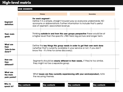
For a high-level first overview, see the matrix scaffolding below.
Case Study: Getting To A Shared Mental Model Across Teams
Let’s look at the problem through a case study and see how building a user segmentation matrix helped a global data products organization gain a much clearer view of its customers and priorities.
Here is some context. The organization was partly driven by NGO principles like societal impact and partly by economic concerns like revenue and efficiencies. Its primary source of revenue was raw data and data products, and it was operating in a B2B setting. Despite operating for several decades already, its maturity level in terms of user experience and product knowledge was low, while the amount of different data outputs and services was high, with a whole bouquet of bespoke solutions for individual clients. The level of bespoke solutions that had to be maintained and had grown organically over time had surpassed the “featuritis” stage and turned utterly unsustainable.
And you probably guessed it: The business focus had traditionally been “What can we offer and sell?” instead of “What are our customers trying to solve?”
That means there were essentially two problems to figure out:
- Help executives and department leaders from Marketing through Sales, Business, and Data Science see the value of customer-first product thinking.
- Establish a shared mental model of the key customer segments to start prioritizing with focus and reduce the completely overgrown service offering.
For full disclosure, here’s a bit about my role in this context: I was there in a fractional product leader role at first, after running a discovery workshop, which then developed into product strategy work and eventually a full evaluation of the product portfolio according to user & business value.
Approach
So how did we get to that outcome? Basically, we spent an afternoon filling out a table with different customer segments, presented it to a couple of stakeholders, and everyone was happy — THE END. You can stop reading…
Or not, because from just a few initial conversations and trying to find out if there were any existing personas, user insights, or other customer data, it became clear that there was no shared mental model of the organization’s customer segments.
At the same time, the Business and Account management teams, especially, had a lot of contact with new and existing customers and knew the market and competition well. And the Marketing department had started on personas. However, they were not widely used and weren’t able to act as that shared mental model across different departments.
But How To Proceed Quickly While Taking People Along On The Journey?
Here’s the approach we took:
1. Gather All Existing Research
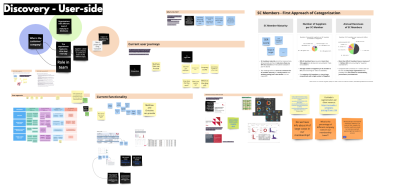
First, we gathered all user insights, customer feedback, and data from different parts of the organization and mapped them out on a big board (see below). Initially, we really tried to map out all existing documentation, including links to in-house documents and all previous attempts at separating different user groups, analytics data, revenue figures, and so on.
The key here was to speak to people in different departments to understand how they were currently thinking about their customers and to include the terms and documentation they thought most relevant without giving them a predefined framework. We used the dimensions of the matrix as a conversation guide, e.g., asking about their definitions for key user groups and what makes them distinctly different from others.
2. Start The Draft Scaffolding #
Secondly, we created the draft matrix with assumed segments and some core elements that have proven useful in different UX techniques.
In this step, we started to make sense of all the information we had collected and gave the segments “draft labels” and “draft definitions” based on input from the teams, but creating this first draft version within the small working group. The aim was to reduce complexity, settle on simple labels, and introduce primary vs secondary groups based on the input we received.
We then made sure to run this summarized draft version past the stakeholders for feedback and amends, always calling out the DRAFT status to ensure we had buy-in across teams before removing that label. In addition to interviews, we also provided direct access to the workboard for stakeholders to contribute asynchronously and in their own time and to give them the option to discuss with their own teams.
3. Refine
In the next step, we went through several rounds of “joint sense-making” with stakeholders from across different departments. At this stage, we started coloring in the scaffolding version of the matrix with more and more detail. We also asked stakeholders to review the matrix as a whole and comment on it to make sure the different business areas were on board and to see the different priorities between, e.g., primary and secondary user groups due to segment size, pain points, or revenue numbers.
4. Prompt
We then promoted specifically for insights around segment definitions, pain points, goals, jobs to be done, and defining differences to other segments. Once the different labels and the sorting into primary versus secondary groups were clear, we tried to make sure that we had similar types of information per segment so that it would be easy to compare different aspects across the matrix.
5. Communicate
Finally, we made sure the core structure reached different levels of leadership. While we made sure to include senior stakeholders in the process throughout, this step was essential prior to circulating the matrix widely across the organization.
However, due to the previous steps, we had gone through, at this point, we were able to assure senior leadership that their teams had contributed and reviewed several times, so getting that final alignment was easy.
We did this in a team of two external consultants and three in-house colleagues, who conducted the interviews and information gathering exercises in tandem with us. Due to the size and global nature of the organization and various different time zones to manage, it took around 3 weeks of effort, but 3 months in time due to summer holidays and alignment activities. So we did this next to other work, which allowed us to be deeply plugged into the organization and avoid blind spots due to having both internal and external perspectives.
Building on in-house advocates with deep organizational knowledge and subject-matter expertise was a key factor and helped bring the organization along much better than purely external consultants could have done.
User Segmentation Matrix: Key Ingredients
So, what are the dimensions we included in this mapping out of primary and secondary user segments?
The dimensions we used were the following:
- Segment definition
Who is this group?
Define it in a simple, straightforward way so everyone understands — NO acronyms or abbreviations. Further information to include that’s useful if you have it: the size of the segment and associated revenue. - Their main goals
What are their main goals?
Thinking outside-in and from this user groups perspective these would be at a higher level than the specific JTBD field, big picture and longer term. - What are their “Jobs-to-be-done”?
Define the key things this group needs in order to get their own work done (whether that’s currently available in your service or not; if you don’t know this, it’s time for some discovery). Please note this is not a full JTBD mapping, but instead seeks to call out exemplary practical tasks. - How are they different from other segments?
Segments should be clearly different in their needs. If they’re too similar, they might not be a separate group. - Main pain points
What are the pain points for each segment? What issues are they currently experiencing with your service/product? Note the recurring themes. - Key contacts in the organization
Who are the best people holding knowledge about this user segment?
Usually, these would be the interview partners who contributed to the matrix, and it helps to not worry too much about ownership or levels here; it could be from any department, and often, the Business or Product org are good starting points.
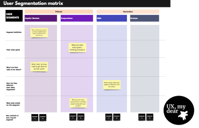
This is an example of a user segmentation matrix:
Outcomes & Learning #
What we found in this work is that seeing all user segments mapped out next to each other helped focus the conversation and create a shared mental model that switched the organization’s perspective to outside-in and customer-first.
Establishing the different user segment names and defining primary versus secondary segments created transparency, focus, and a shared understanding of priorities.
Building this matrix based on stakeholder interviews and existing user insights while keeping the labeling in DRAFT mode, we encouraged feedback and amends and helped everyone feel part of the process. So, rather than being a one-time set visualization, the key to creating value with this matrix is to encourage conversation and feedback loops between teams and departments.
In our case, we made sure that every stakeholder (at different levels within the organization, including several people from the executive team) had seen this matrix at least twice and had the chance to input. Once we then got to the final version, we were sure that we had an agreement on the terminology, issues, and priorities.
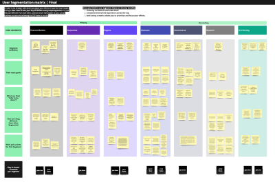
Below is the real case study example (with anonymized inputs):
Takeaways And What To Watch Out For
So what did this approach help us achieve?
- It created transparency and helped the Sales and Business teams understand how their asks would roughly be prioritized — seeing the other customer segments in comparison (especially knowing the difference between primary vs secondary segments).
- It shifted the thinking to customer-first by providing an overview for the executive team (and everyone else) to start thinking about customers rather than business units and see new opportunities more clearly.
- It highlighted the need to gather more customer insights and better performance data, such as revenue per segment, more detailed user tracking, and so on.
In terms of the challenges we faced when conducting and planning this work, there are a few things to watch out for:
We found that due to the size and global nature of the organization, it took several rounds of feedback to align with all stakeholders on the draft versions. So, the larger the size of your organization, the more buffer time to include (or the ability to change interview partners at short notice).
If you’re planning to do this in a startup or mid-sized organization, especially if they’ve got the relevant information available, you might need far less time, although it will still make sense to carefully select the contributors.
Having in-house advocates who actively contributed to the work and conducted interviews was a real benefit for alignment and getting buy-in across the organization, especially when things started getting political.
Gathering information from Marketing, Product, Business, Sales and Leadership and sticking with their terms and definitions initially was crucial, so everyone felt their inputs were heard and saw it reflected, even if amended, in the overall matrix.
And finally, a challenge that’s not to be underestimated is the selection of those asked to input — where it’s a tightrope walk between speed and inclusion.
We found that a “snowball system” worked well, where we initially worked with the C-level sponsor to define the crucial counterparts at the leadership level and have them name 3-4 leads in their organization, looking after different parts of the organization. These leaders were asked for their input and their team’s input in interviews and through asynchronous access to the joint workboard.
What’s In It For You?
To summarize, the key benefits of creating a user segmentation matrix in your organization are the following:
- Thinking outside-in and user-first.
Instead of thinking this is what you offer, your organization starts to think about solving real customer problems — the matrix is your GPS view of your market (but like any GPS system, don’t forget to update it occasionally). - Clarity and a shared mental model.
Everyone is starting to use the same language, and there’s more clarity about what you offer per customer segment. So, from Sales through to Business and Product, you’re speaking to users and their needs instead of talking about products and services (or even worse, your in-house org structure). Shared clarity drastically reduces meeting and decision time and allows you to do more impactful work. - Focus, and more show than tell.
Having a matrix helps differentiate between primary, secondary, and other customer segments and visualizes these differences for everyone.
When Not To Use It
If you already have a clearly defined set of customer segments that your organization is in agreement on and working towards — good for you; you won’t need this and can rely on your existing data.
Another case where you will likely not need this full overview is when you’re dealing with a very specific customer segment, and there is good alignment between the teams serving this group in terms of focus, priorities, and goals.
Organizations that will see the highest value in this exercise are those who are not yet thinking outside-in and customer-first and who still have a traditional approach, starting from their own services and dealing with conflicting priorities between departments.
Next Steps
And now? You’ve got your beautiful and fully aligned customer segmentation matrix ready and done. What’s next? In all honesty, this work is never done, and this is just the beginning.
If you have been struggling with creating an outside-in perspective in your organization, the key is to make sure that it gets communicated far and wide.
For example, make sure to get your executive sponsors to talk about it in their rounds, do a road show, or hold open office hours where you can present it to anyone interested and give them a chance to ask questions. Or even better, present it at the next company all-hands, with the suggestion to start building up an insights library per customer segment.
If this was really just the starting point to becoming more product-led, then the next logical step is to assess and evaluate the current product portfolio. The aim is to get clarity around which services or products are relevant for which customers. Especially in product portfolios plagued by “featuritis,” it makes sense to do a full audit, evaluate both user and business value, and clean out your product closet.
If you’ve seen gaps and blind spots in your matrix, another next step would be to do some deep dives, customer interviews, and discovery work to fill those. And as you continue on that journey towards more customer-centricity, other tools from the UX and product tool kit, like mapping out user journeys and establishing a good tracking system and KPIs, will be helpful so you can start measuring customer satisfaction and continue to test and learn.
Like a good map, it helps you navigate and create a shared understanding across departments. And this is its primary purpose: getting clarity and focus across teams to enable better decision-making. The process of co-creating a living document that visualizes customer segments is at least as important here as the final outcome.
