⭐ If you would like to buy me a coffee, well thank you very much that is mega kind! : https://www.buymeacoffee.com/honeyvig Hire a web Developer and Designer to upgrade and boost your online presence with cutting edge Technologies

Monday, April 6, 2026

Testing Font Scaling For Accessibility With Figma Variables


Accessibility works best when it blends into everyday design workflows. The goal isn’t a big transformation, but simple work processes that fit naturally into a team’s routine. With Figma variables, testing font size increases becomes part of the design flow itself, making accessibility feel almost inevitable rather than optional.

Building a true culture of digital accessibility in a company is a mission of resilience and perseverance. It’s not difficult for the discourse on accessibility to fall into the usual clichés. Accessibility is very important for people. The accessibility of digital products and services promotes inclusion. Or even, all professionals on the teams should be involved in accessibility work. Of course. No one in their right mind will dispute any of these statements (I hope).

However, the second part of this conversation, which very few companies reach, is “how?” How do we make this happen in the midst of the day-to-day work of digital transformation teams, which, as we all know, are immersed in demanding scripts, often with a very limited number of people available? Most of the time, the choice ends up being between “we do this” and “that.” And it shouldn’t, because, in these cases, I never saw accessibility winning in this equation.

It shouldn’t be this way. You don’t need to be this way. First of all, because choosing between accessibility and anything else isn’t the right choice. Accessibility is no longer just another feature to be added to the others. It’s an added value for the business and, currently, a legal obligation that can have serious consequences for companies. On the other hand, there are intelligent, optimized, and impactful ways to incorporate accessibility principles into the natural dynamics of teams. It’s possible to work on accessibility without turning team operations upside down. In essence, that’s what AccessibilityOps does. Empowering people and providing teams with simple processes so they can integrate accessibility work into their daily routines without disproportionate effort.

Accessibility And Design

Working on digital accessibility in design can involve several actions. It’s clear that we need to pay particular attention to color and how it’s used to convey meaning. Of course, the interaction sizes of elements must be comfortable. But, most importantly, we must think about design from a versatile perspective. An interface isn’t a poster. We can control many aspects of that design, but how users interact with the interface is subject to an endless number of variables. The type of device, context, purpose, network quality, etc. All of this greatly affects each person’s experience and interaction. Along with all this, when digital accessibility concerns are brought into the design process, it adds even more variables.

Assistive technologies
(Large preview)

People often use what are called assistive technologies and strategies. Basically, these are technological tools or, at the very least, “tricks” that people resort to in order to find more comfortable usage models. The famous screen readers, commonly associated with the use of blind people (but which are not only useful to them), for example, are an assistive technology. Changing colors or color contrasts between different elements is also an assistive technology. Increasing the font size (which we discussed in this text) is another example. There are countless assistive technologies and strategies. Almost as many as the different contexts of use for each person.\

We Don’t Control Everything 

In other words (and this is the “bad news” for us designers), “our design” is subject, from the users’ perspective, to transformations that we don’t control. It will be “transformed” by the user, ensuring that they can interact with the application and everything it offers in the most comfortable way possible. And that’s a good thing. If this happens and everything goes well, we will have surely done our accessibility work very well, and we all deserve congratulations. If the user applies any of these support technologies and strategies and still cannot use the digital application, it’s a sign that something is not working as it should.

Oh, and speaking of which. Don’t even think about blocking the use of these technologies or support strategies. They may be “destroying” your beautiful design, but they are allowing more and more people to actually use the app. In the end, wasn’t that exactly what we promised we wanted to do? Design for (all) people. Without exception?

Increase Font Size #

How many times have we heard someone — friends, family, or even colleagues — complaining that this or that text is too small? Text plays a very important role in the digital experience. Much information is conveyed through text: instructions for use, button captions, or interactive elements. All of this uses text as a communication tool. If reading all these elements is difficult, naturally, the experience is severely impaired.

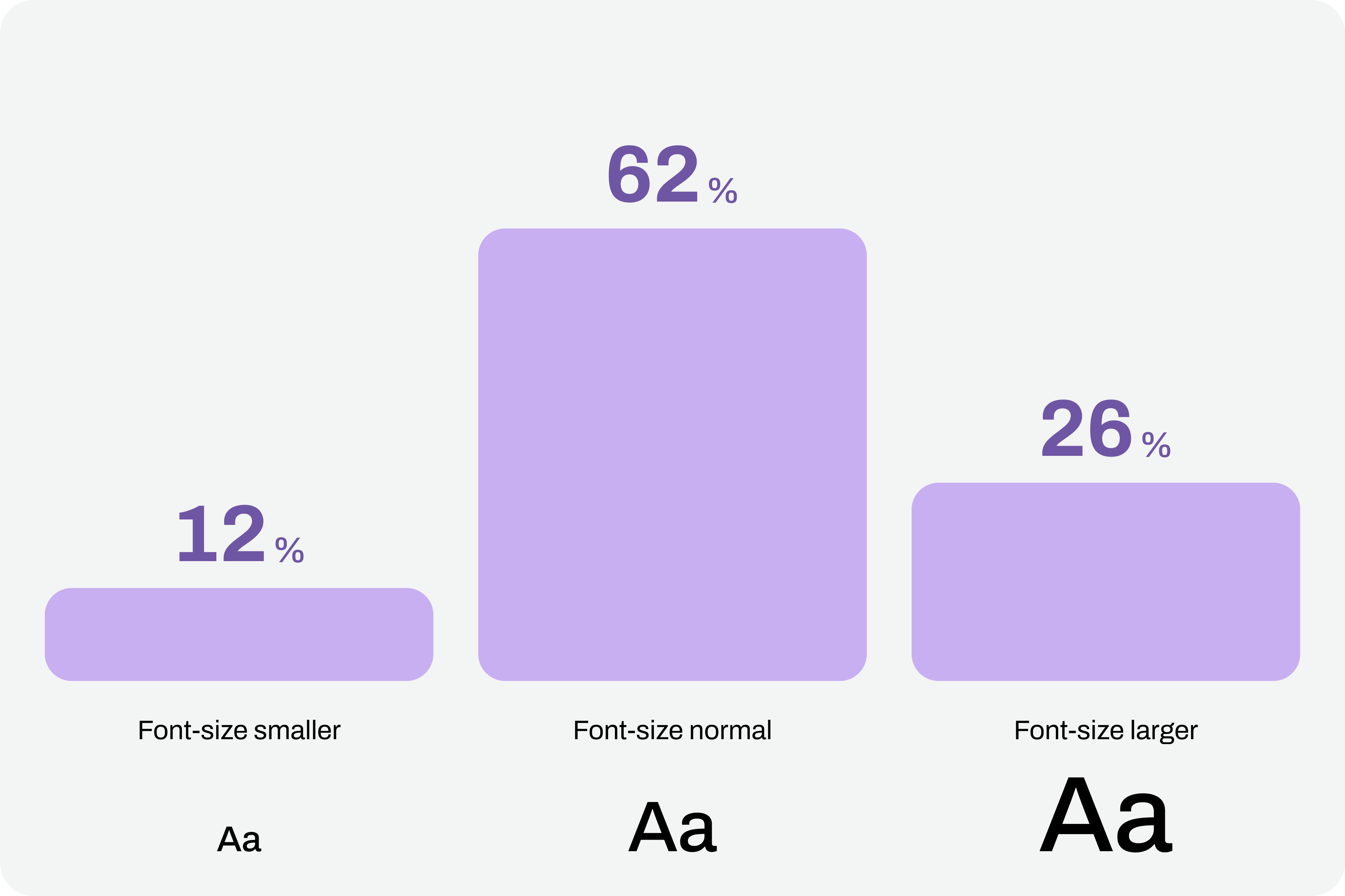
Comfortable text reading, regardless of its function, is a non-negotiable principle. This reading can be facilitated by using comfortable sizes in the design. However, supporting technologies and strategies, through the functionality of increasing font size, can also help improve readability. According to APPT data, 26% of Android and iOS mobile device users increase the default font size (data from February 2026). One in four users increases the font size on their smartphone. This is a very significant sample of people, making this functionality unavoidable in design processes.

Chart with font sizes where 26% of users use large font-size.
(Large preview)

Compliance With Guidelines

Increasing font size in interfaces can represent a huge design challenge. It’s important to understand that, suddenly, some text elements, due to user actions, can double in size from their initial size.

“With the exception of captions and text images, text can be resized without assistive technology up to 200% without loss of content or functionality.”

Success criterion 1.4.4, “Resizing Text” of the Web Content Accessibility Guidelines (WCAG), version 2.2

This success criterion is at the AA compliance level, meaning this is an absolutely mandatory feature according to any legal framework.

It’s easy to understand the 200% in this success criterion. If we assume we design the interfaces at a 100% scale, meaning the element size is the initial size, then increasing the text by up to 200% will correspond to doubling the initial size. Other enlargement scales can also be used, such as 120%, 140%, and so on. In other words, we have to ensure that users can increase the text to double its initial size through supporting technologies or strategies (and this is not a minor detail).

To comply with this standard, we don’t need to provide text size increase tools in the interfaces. In practice, these features are nothing more than redundancy. Devices already allow this to be done in a standardized way. Users who really need this setting know it (because, without it, their lives would be much more difficult). Well, they already have this setting applied across their device. And that means we can eliminate these additional interface elements, simplifying the experience.

Text size increase tool in the interface
(Large preview)

Standardized Access

An important concept to remember about assistive technologies, particularly in this case regarding increasing font size, is that most devices already have many of these tools installed by default. In other words, in many cases, users don’t need to purchase their own software or buy a specific type of device just to have this functionality.

Whether on mobile devices or even in web browsers, in the vast majority of cases, it’s easy to find installed features that allow you to increase the default font size we’re using throughout the interface. This principle of increasing font size can be applied to digital products, such as apps, or even to any type of website running on the standard web browsers used today.
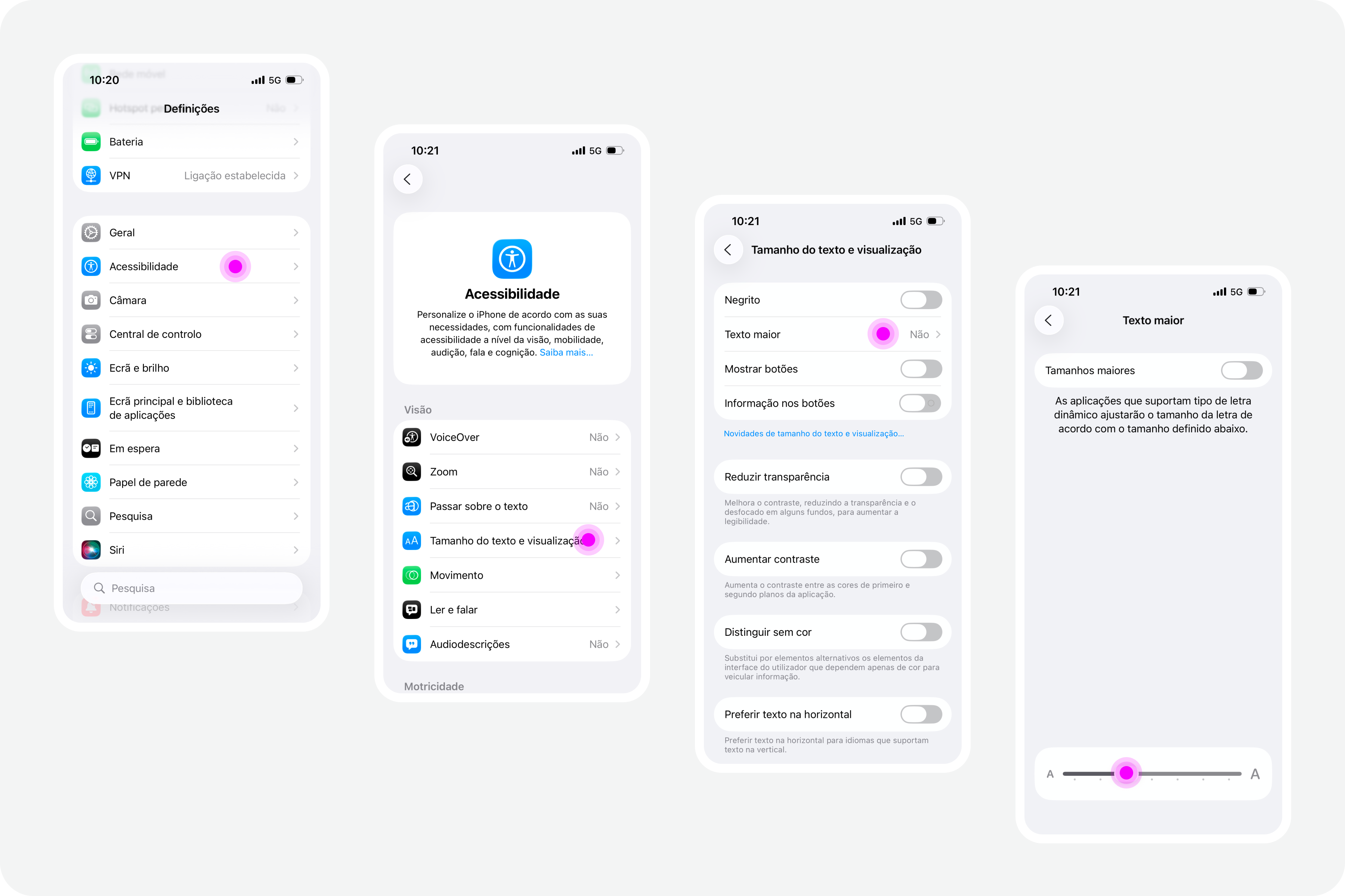
iPhones #

On iPhone devices, the font size increase feature is integrated by default. To use this feature, simply access the “Settings” panel, select “Accessibility,” and within the “Vision” options group, access the “Text Size and Display” feature and configure the desired font size increase on that screen.
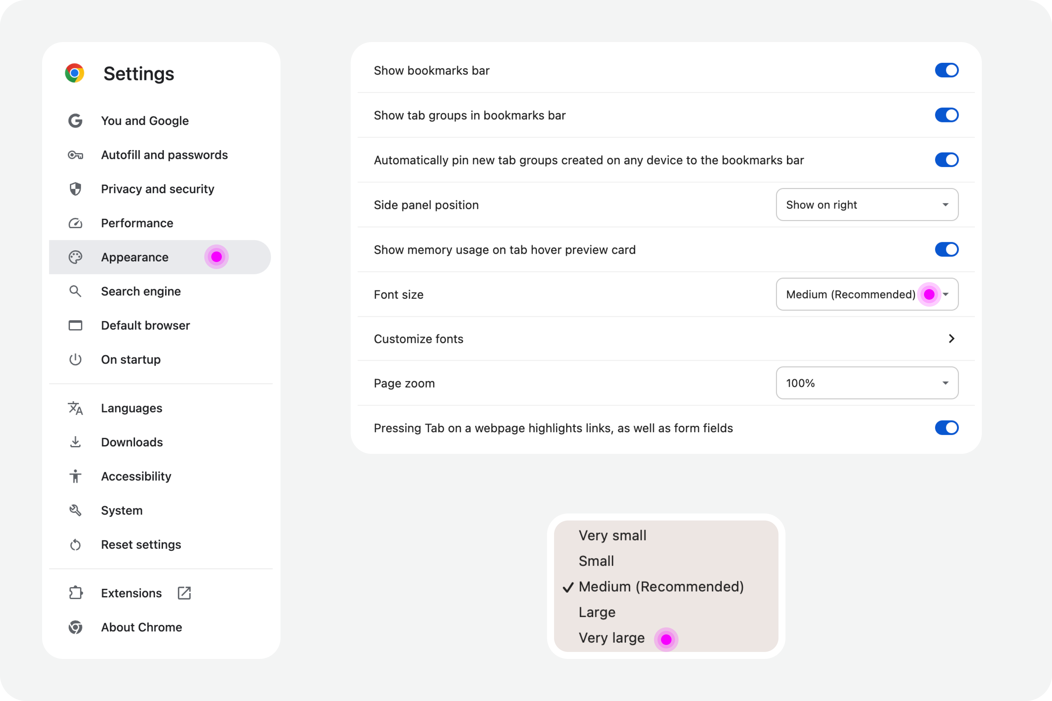
iPhone screens with settings on accessibility
(Large preview)

Google Chrome

Web browsers also offer, by default, the functionality to increase font size. For example, in Google Chrome, this feature is available in the “Options” panel, specifically in the “Appearance” area. In the list of options that appear in this group, simply select the “Font size” option. Normally, the “Medium — Recommended” option will be selected. You can change this setting to any other available font size. Try, for example, the “Very large” option.
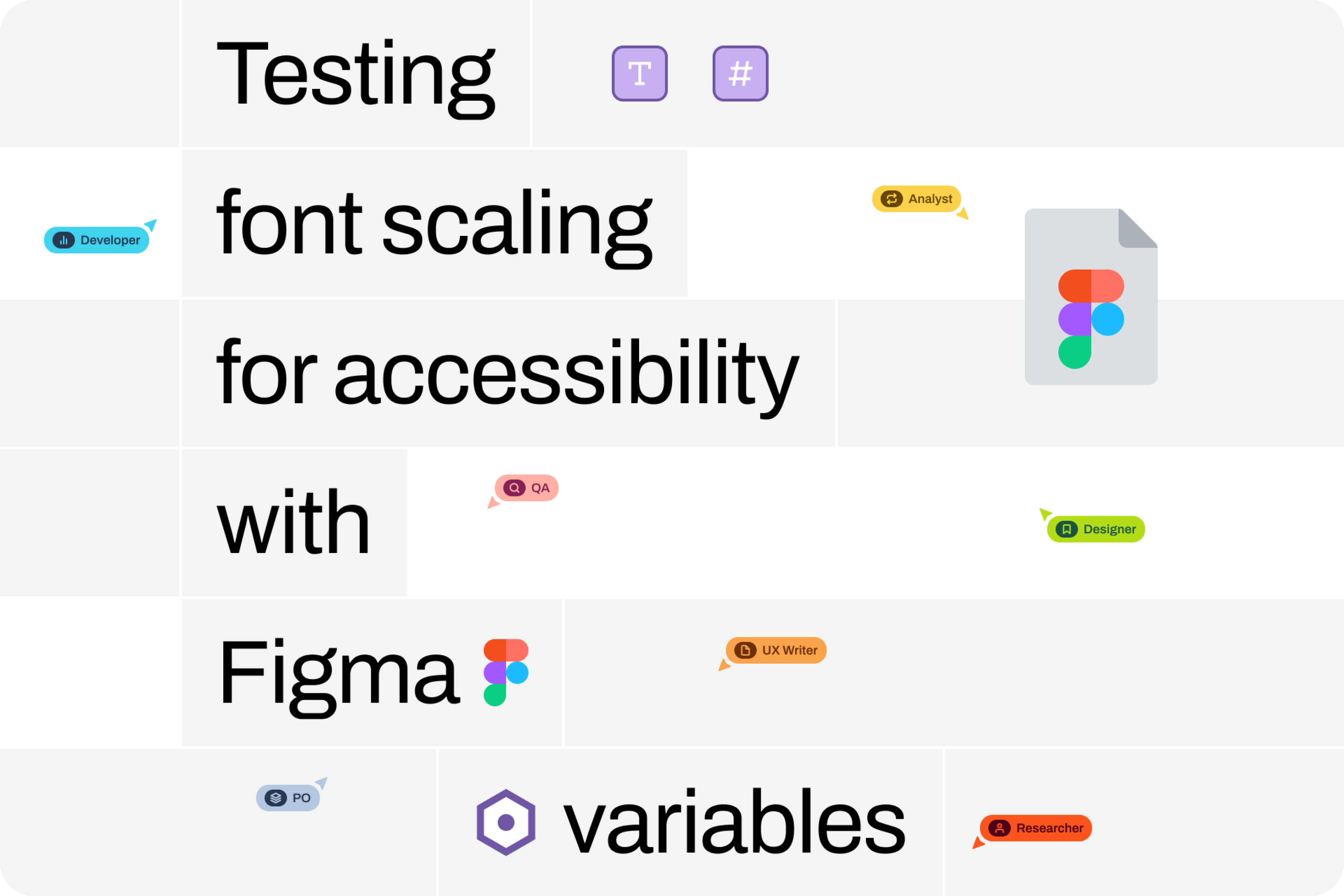
Google Chrome settings on accessibility
(Large preview)

Test In Figma #

To ensure that digital accessibility work becomes effective in the daily lives of teams, it is essential to find simple work processes. Actions or initiatives that can be integrated into the team’s routine, that address accessibility in an integrated way, and do not require a dramatic transformation of the current reality. If that were necessary, he believes, it wouldn’t happen most of the time. Therefore, designing simple work processes is half the battle for accessibility to truly happen, in this case, also within a design team.

Regarding testing font size increases in design, we have extraordinary tools at our disposal today. Those who remember the days of designing complex interfaces in Adobe Photoshop will recognize the differences in the tools we have today (and thankfully so). It’s now possible, through tools like Figma, to create such dynamism in design that testing font size increases for accessibility becomes almost unavoidable for the team.

Visualization on font sizes
(Large preview)

Note: To take this test, you need to have a strong grasp of Figma’s text styles, auto layouts, and variables. These three are fundamental tools for success without much extra effort. If you haven’t yet mastered these features, it’s highly recommended that you start there. Don’t skip steps. Learning is a gradual process that must be followed in a structured, step-by-step manner.

Where Do We Want To Go?

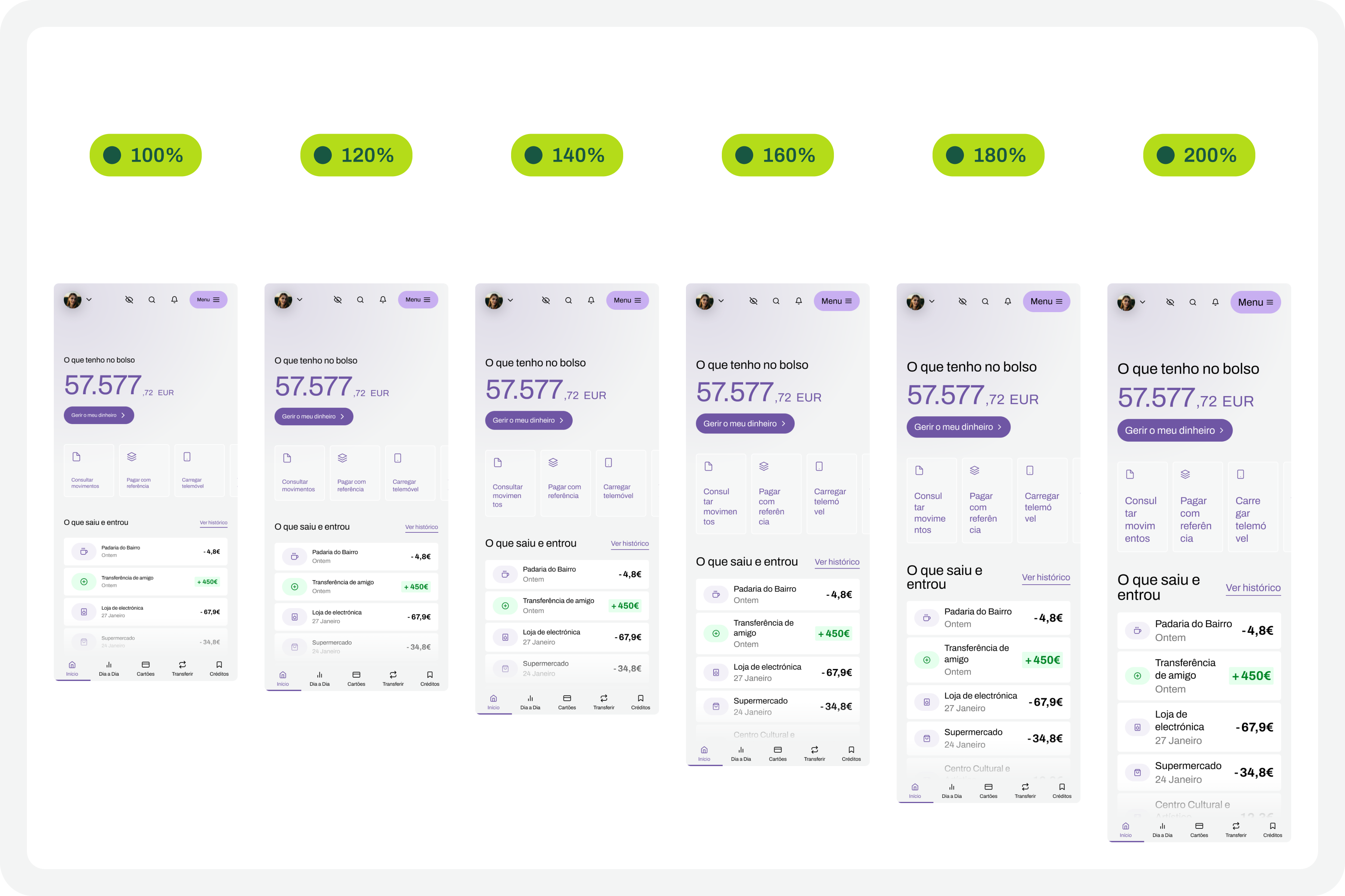
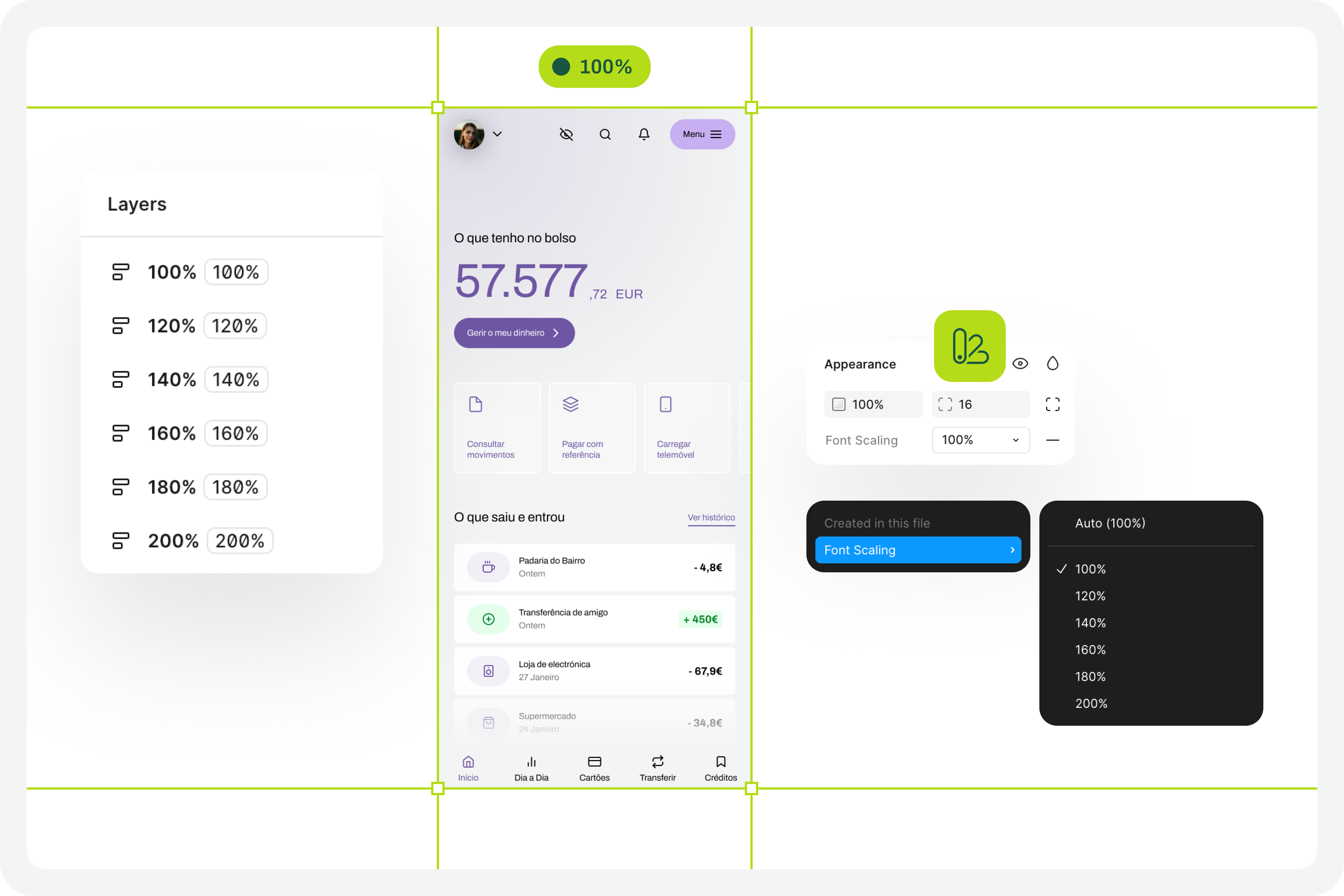
The font size increase test in Figma that we want to perform is simple. We want to have a set of variables available for all the text styles we use in the interface, allowing us to choose whether we want to see the interface with the text at a scale of 100%, 120%, 140%, 160%, 180%, or 200%. As we apply this set of variables (much like applying variables for light and dark mode), we observe the transformations of the text in the interface and understand to what extent adaptations are needed in each version of the interface with different typographic scales.

Font scaling
(Large preview)

How Do We Make This Happen? #

For this test to go so smoothly, you need to do some groundwork. Design systems can greatly help optimize much of this initial work. But I won’t lie to you. For the test to work well, your design needs to have a very serious level of organization and systematization.

This isn’t really a guide, because each team will have its own work model, and these recommendations can be applied in different ways (and that’s okay). However, for this test to work, it’s important to ensure certain assumptions in the design. To help you phase the implementation of this test model, here are some steps to follow. Step-by-step instructions to guide you in organizing your files and ensuring you can fully execute this test in the simplest and most practical way possible.

1. Designing The Interfaces #

It all starts with the design. Before any testing, the focus should, as it should, be on the design of each interface that we will want to test later. At this stage, there is still no specific concern with the font size increase test that we will perform later. Naturally, all interface design should, from the outset, follow the most basic accessibility recommendations applied to design.

Design screens
(Large preview)

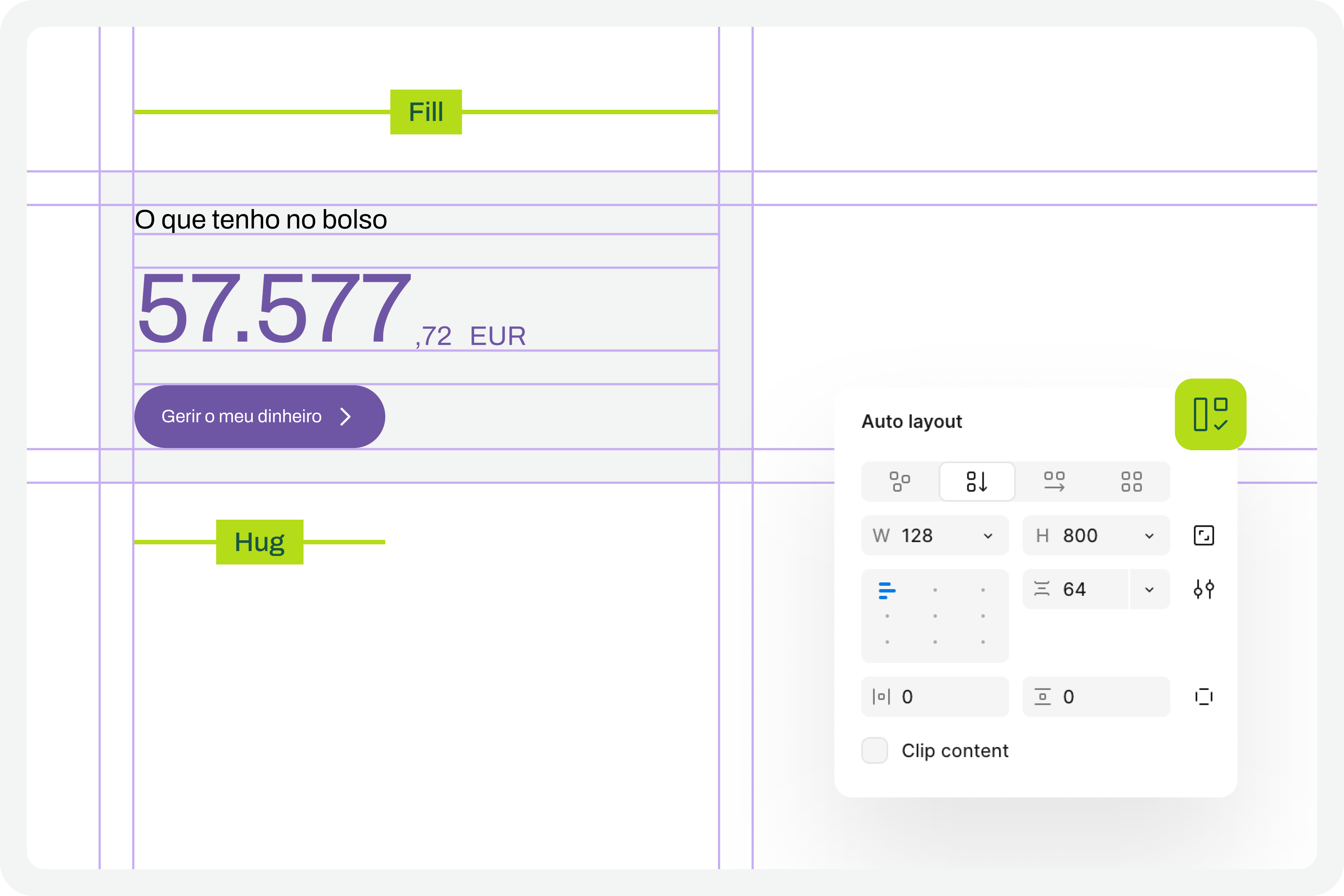
2. Apply Auto Layouts To All Elements 

In every screen design you create, you’ll need to ensure you apply auto layouts perfectly. This is a very important step. It’s this consistent application of auto layouts to the entire structure and design elements that will later guarantee the scalability of the interface when we start testing font size increases. You really can’t underestimate this step. If you don’t pay it the attention it deserves, you’ll see when we test typographic scaling in the interfaces, everything breaking down like an elephant in a china shop.

Auto layout
(Large preview)

3. Structuring And Applying Text Styles

To perform our font size increase test, we’ll also need you to have applied text styles to each interface design. You probably even started creating them as you were drawing. Great. If you haven’t done so, it’s important that you do it now. For the test to work perfectly, we really need this. Don’t leave any text element in the design without a text style applied.

Text styles
(Large preview)

4. Define The Set Of Variables 100% #

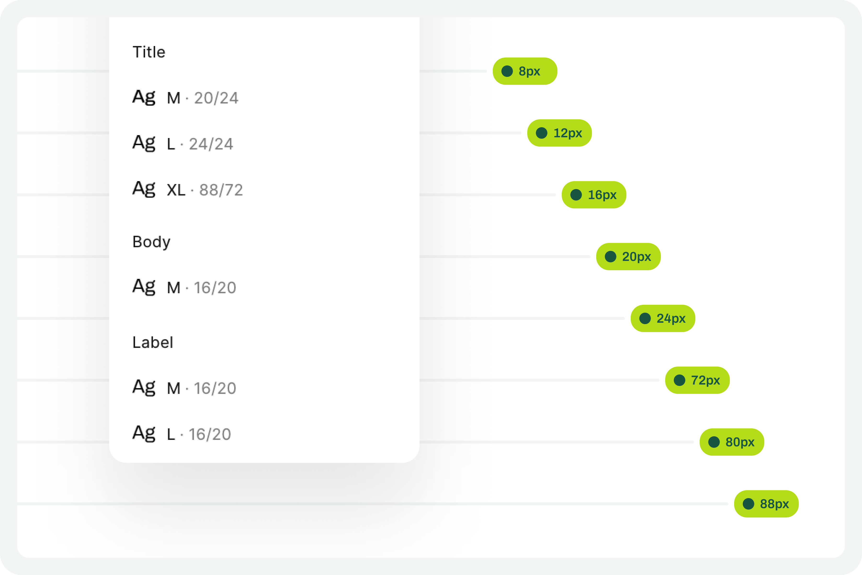
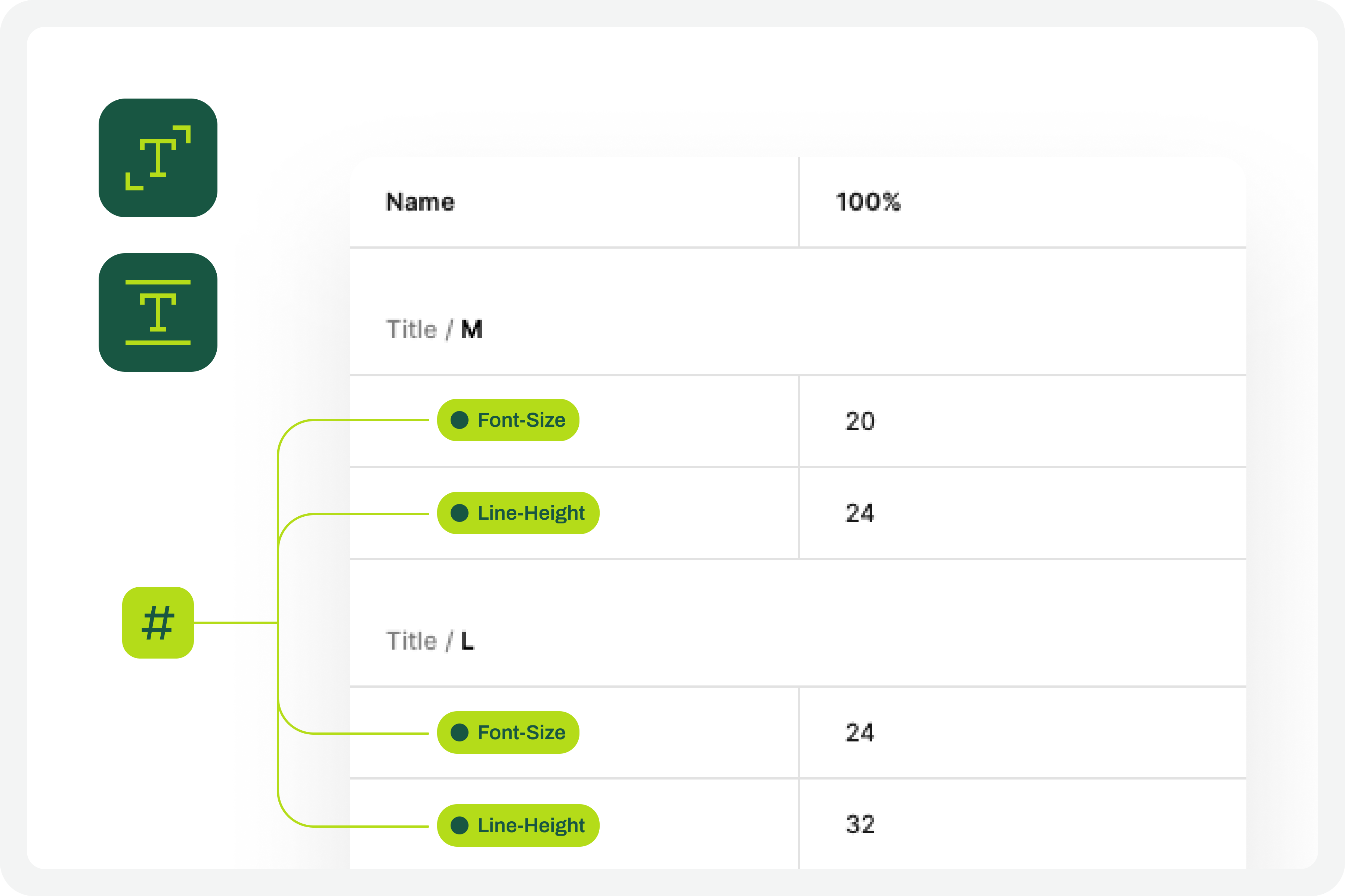
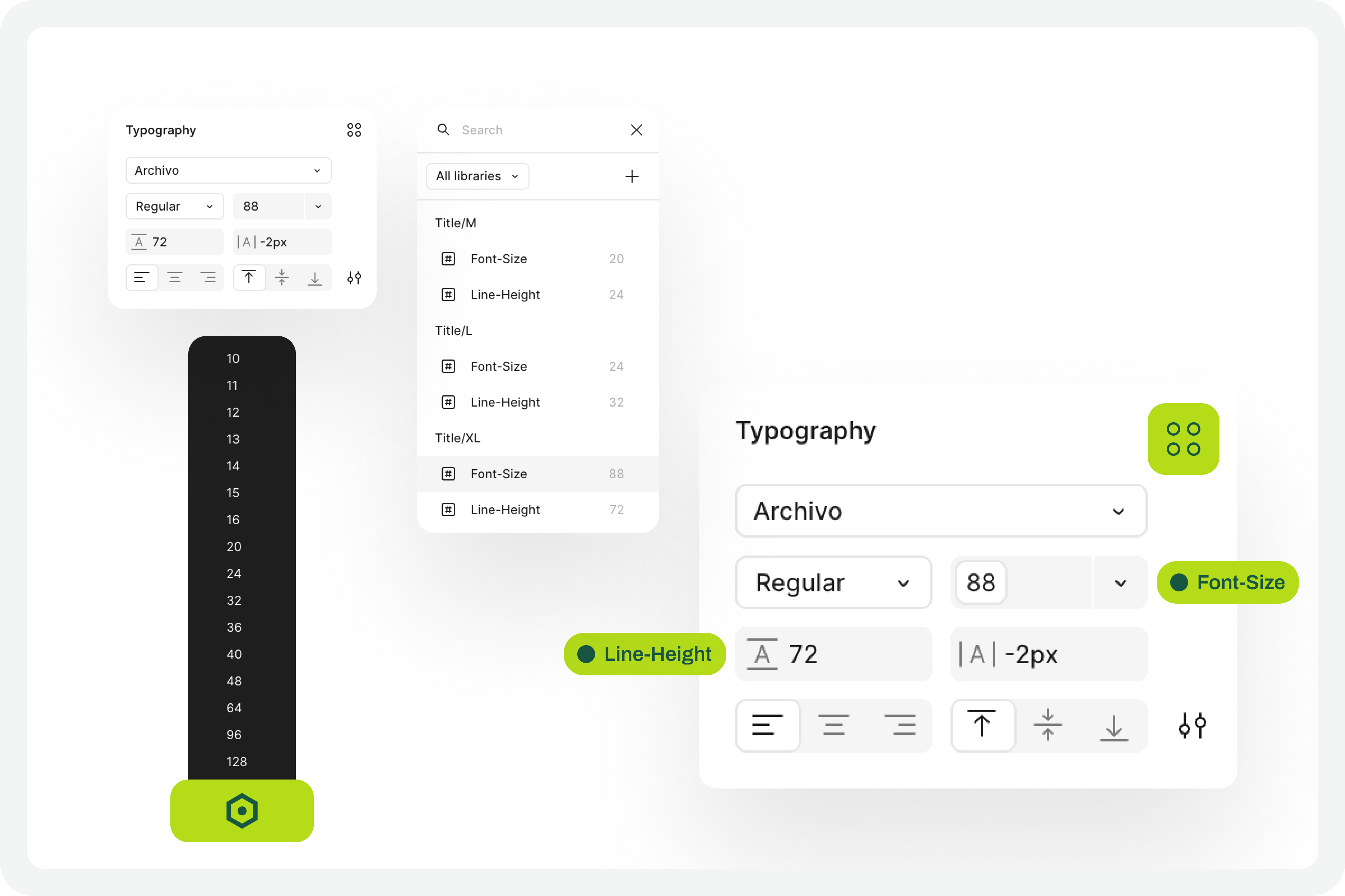
This test forces a fairly high degree of optimization. In practice, this means we will have to use Figma variables for all the characteristics of the text styles we have in the interface. At this stage, you must define Figma “number” variables for at least the font-size and line-height of the text styles you applied to the drawing. With this step, you are defining the font size increase scale values for a 100% visualization model, that is, the initial and reference version of the drawing. It is important that you structure these variables for each text style in the drawing because, subsequently, we will have to consider the enlargement scale of each of these text elements.

Defining the set of variables 100%
(Large preview)

5. Apply The Variables To The Text Styles 

Having defined the variables for the 100% scale text styles, you must now apply them to the elements of the text styles already created. Don’t forget to apply variables at least to the font-size and line-height characteristics. If you have more typographical variables, that’s fine. But you should at least have variables applied to font-size and line-height. This is really very important.

Applying variables to the text styles
(Large preview)

6. Define The Variables For Increasing The Text Size #

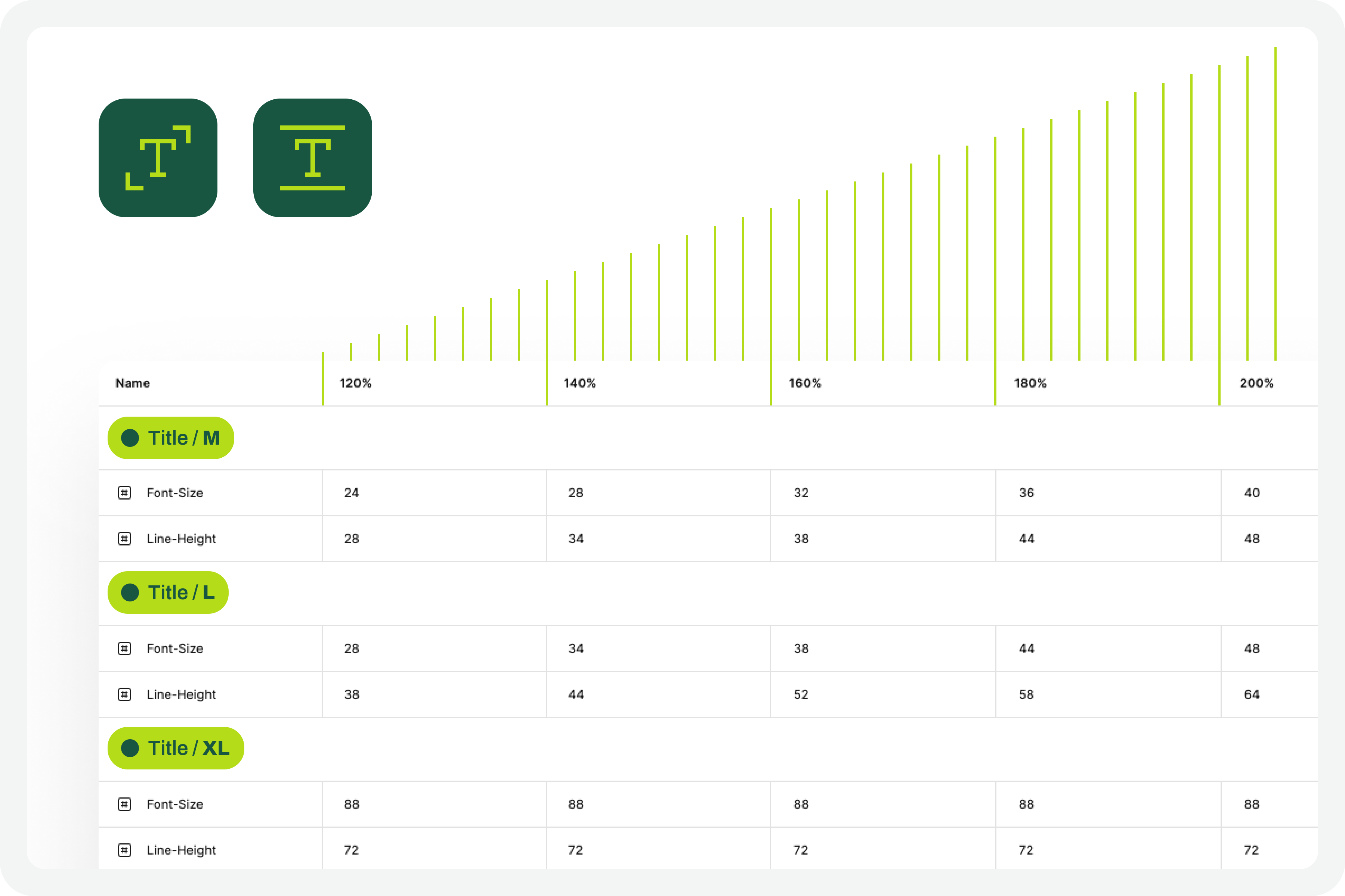
Now that you have the variables applied to the 100% scale text styles, the next step is to create the variables for the other font size increase scales. In practice, you have to create the variables that will tell the system what font size each text style will grow to when the increase scale is 120%, 140%, 160%, etc.

To define the font-size and line-height values, simply multiply the initial value by the scale percentage. For example, if a text style has a font-size of 16px, the size for the 120% scale will be 16 multiplied by 1.2, which gives a result of 19.2. Repeat this calculation for all font-size and line-height values of the font size increase scale percentages you choose.

You can also choose whether or not to apply rounding to the final values. This is an approximate test, and therefore any differences that may arise from rounding will not affect the final perception of the test result.

Font scalling variables
(Large preview)

7. Apply Variables To Different Scale Versions

The moment of truth has arrived. The next step is to understand if we have everything working so that the test runs perfectly. Therefore, you should copy the original interface and apply the set of variables for each of the font size increase rates that make sense to you. Repeat this process for all the font size increase percentages you have defined.

As a suggestion, you can use the 120%, 140%, 160%, 180%, and 200% increase percentages as a reference. If you want to simplify, you can reduce the number of scaling percentages you are working with. Regardless of the number of percentages you are working with, you should always work with the minimum of 100% and 200% scales.

Applied variables to different scale versions
(Large preview)

8. Identify Areas For Improvement #

By applying different font size increase scales to the same screen, it’s easy to understand where improvements might be needed. This is where the real test of increasing font size in interface design and the most interesting accessibility work begins.

In your analysis of the various screens, keep some important aspects in mind:

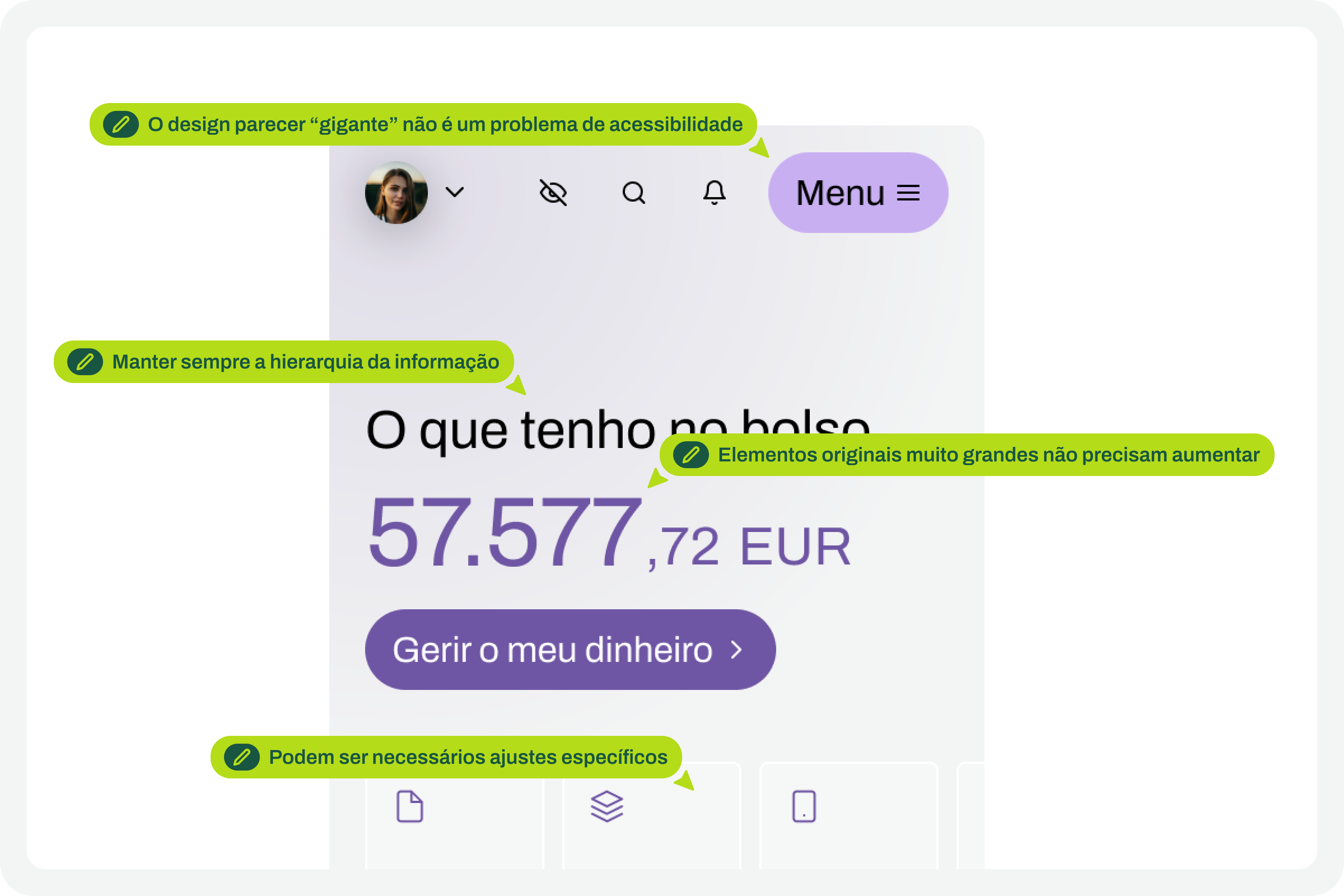
  • The fact that the text appears gigantic isn’t a problem and doesn’t “ruin” the design. Remember that this can mean the difference between someone being able to use a particular product or service or not.
  • An accessibility problem exists when increasing the font size makes it impossible for the user to read certain texts or to activate certain controls.
  • For text elements that are already very large, increasing the font size might not make sense. Doing so could make those elements disproportionate, which wouldn’t improve readability (since they are already a good size) and would occupy completely unnecessary space.
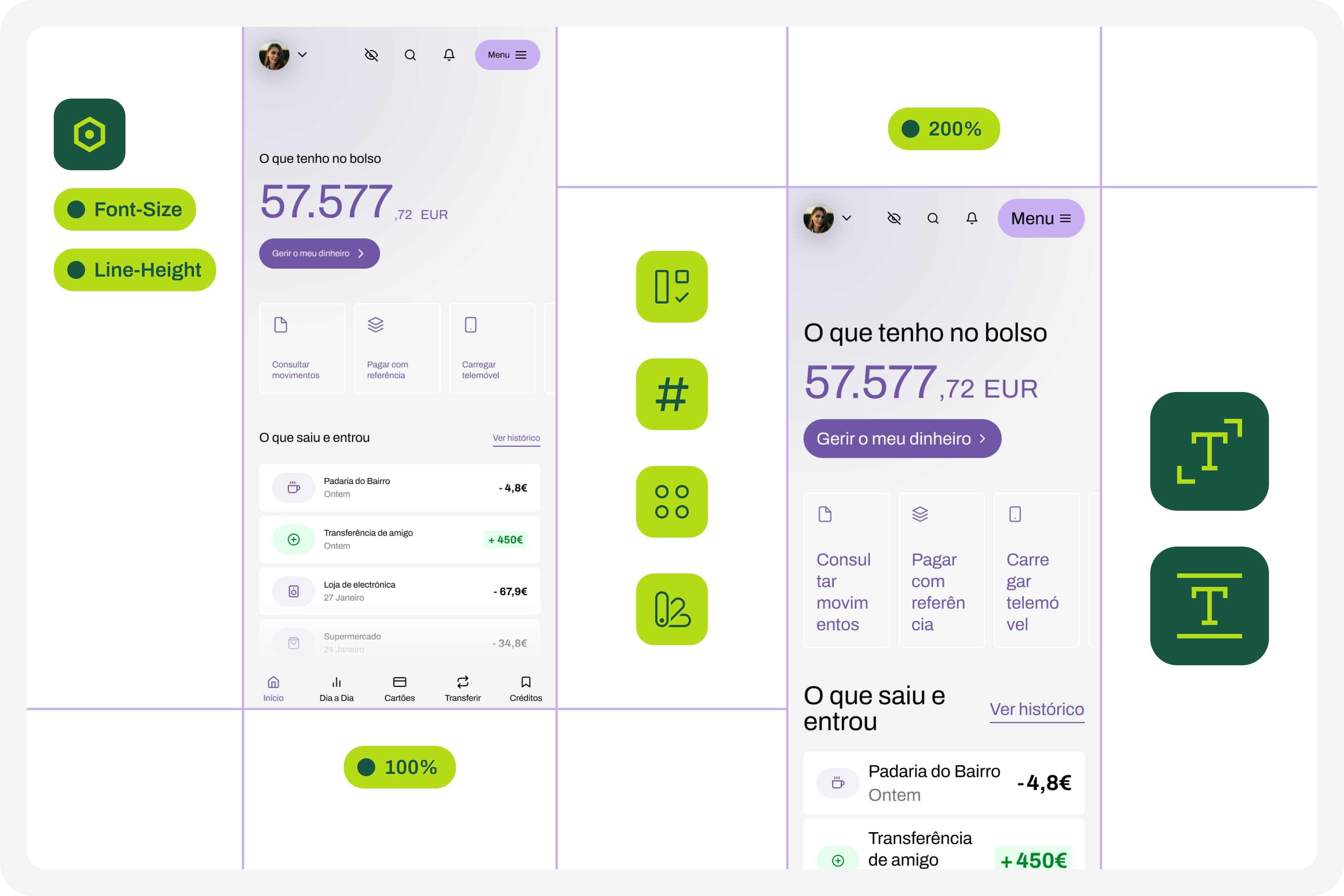
  • If there are elements that appear to be popping out of the screen, the first step is to confirm how you are applying auto layout. Many design aspects can be easily resolved with the proper use of auto layout.
  • Regardless of the scale of font size increase, it is essential to maintain the visual hierarchy of the typography, as this readability is important for perceiving the different levels of information present on the screen.
  • This test can help identify elements that may need adjustments directly in the code to function well at a given scale of increase. Not everything can be solved through design alone, and that’s perfectly fine. Accessibility is essentially a team effort.
Critical points for improvement
(Large preview)

9. Make Corrections And Adjustments To The Design

Finally, based on the various screens with different text enlargement scales applied, you can make the design changes that make sense. Some of these adjustments may only be necessary in code. In these cases, you document all these suggestions and pass them on to the development team. It is also crucial to reinforce (again) that some of the problems you may encounter in the design can be quickly resolved in the design process, with the simple and correct application of auto-layout properties.

Design changes to those critical points
(Large preview)

10. Go Back To The Beginning And Repeat The Process

This is a cyclical approach. This means you should repeat these steps, or variations thereof, as many times as necessary throughout the project. It’s natural that, over time and with process optimization, some of these steps will cease to make sense. That’s absolutely not a problem. But the most important thing to realize here is that accessibility and this process of testing font size increases shouldn’t be done just once, and that’s it. It’s a test to be done many, many times throughout the day-to-day work of each project and team.

Starting point
(Large preview)

The Role Of Design Systems #

At first glance, this list of steps might seem like a complex exercise. But it’s not. This is because the vast majority, if not all, of these steps are easy to execute in any context where a design system exists. In fact, design systems have become an unavoidable standard in the Product Design industry. We can discuss what each team calls a design system, but the truth is that it’s very difficult today to find a Product Design team that doesn’t have, at the very least, a minimally structured library of components and styles.

Visualization on design systems

With this foundation, whether more or less documented, it’s very easy to apply this type of font size increase test using Figma variables. Furthermore, if your design system already has, for example, structured variables for light and dark mode, it means you’re already applying the exact same principles we used to perform this test. So, nothing new.

Working with design systems involves a level of structuring and organization that is also very useful for creating this type of test. There’s a myth that design systems limit creativity. This is not true. Design systems help solve the “bureaucratic” part of design, so we can actually have more time for what matters: in this case, testing accessibility and building more and more products and services that are truly accessible to the greatest number of people.

Example File

It’s always easier to see an example than just read a description of a process. If this is true in many disciplines of knowledge, in design, this premise makes even more sense. Therefore, in this Figma file, freely published and openly available to the community, you’ll find a practical example of the entire testing process described here. Remember that this is just an example. There may be countless ways to perform this type of test within the context of a Figma file.

Visualization for the Figma file on testing font scaling
(Large preview)

Be sure to look at this approach with a critical eye. It’s a suggestion for testing font size increases that follows a specific process. Despite this, the approach should be adapted to your team’s specific reality, processes, and level of maturity. Simply copying formulas from other teams without understanding if they make sense in our own context is a sure way to make accessibility efforts disproportionate. Every situation is unique. This approach attempts to simplify accessibility work as much as possible in this specific context. And remember: if something happens, however small, it’s a step forward, not a step backward. And that should be celebrated by everyone on the team.

Saturday, April 4, 2026

Dropdowns Inside Scrollable Containers: Why They Break And How To Fix Them Properly


Dropdowns often work perfectly until they’re placed inside a scrollable panel, where they can get clipped, and half the menu disappears behind the container’s edge. Godstime Aburu explains why this happens and offers practical solutions to fix it.

The scenario is almost always the same, which is a data table inside a scrollable container. Every row has an action menu, a small dropdown with some options, like Edit, Duplicate, and Delete. You build it, it seems to work perfectly in isolation, and then someone puts it inside that scrollable div and things fall apart. I’ve seen this exact bug in three different codebases: the container, the stack, and the framework, all different. The bug, though, is totally identical.

The dropdown gets clipped at the container’s edge. Or it shows up behind content that should logically be below it. Or it works fine until the user scrolls, and then it drifts. You reach for z-index: 9999. Sometimes it helps, but other times it does absolutely nothing. That inconsistency is the first clue that something deeper is happening.

The reason it keeps coming back is that three separate browser systems are involved, and most developers understand each one on its own but never think about what happens when all three collide: overflow, stacking contexts, and containing blocks.

Three browser systems: overflow clipping, stacking contexts, and containing blocks.
Three browser systems: overflow clipping, stacking contexts, and containing blocks. (Large preview)

Once you understand how all three interact, the failure modes stop feeling random. In fact, they become predictable.

The Three Things Actually Causing This

Let’s look at each of those items in detail.

The Overflow Problem

When you set overflow: hidden, overflow: scroll, or overflow: auto on an element, the browser will clip anything that extends beyond its bounds, including absolutely positioned descendants.

.scroll-container {
  overflow: auto;
  height: 300px;
  /* This will clip the dropdown, full stop */
}

.dropdown {
  position: absolute;
  /* Doesn't matter -- still clipped by .scroll-container */
}

That surprised me the first time I ran into it. I’d assumed position: absolute would let an element escape a container’s clipping. It doesn’t.

In practice, that means an absolutely positioned menu can be cut off by any ancestor that has a non-visible overflow value, even if that ancestor isn’t the menu’s containing block. Clipping and positioning are separate systems. They just happen to collide in ways that look completely random until you understand both.

See the Pen Overflow & Clipping [forked] by BboyGT.

This is also an accessibility problem, not just a visual one. When a dropdown is clipped, it’s still in the DOM. A keyboard user can still focus on it. They just can’t see what they’re focusing on. In my testing, I saw screen readers announce menu items that were invisible to sighted users. That disconnect is a real problem. It’s also the kind of thing that passes a visual review completely fine.

The Stacking Context Trap

Think of a stacking context as a sealed layer. Whatever is inside it is painted together, as one block. Nothing inside it can escape above something outside it, no matter what z-index you use.

The thing is, a lot of CSS properties create a new stacking context. I didn’t know half of these triggered a new context until I started debugging z-index issues and had to look them up.

  • position with a z-index value other than auto;
  • opacity less than 1;
  • transform, filter, perspective, clip-path, or mask;
  • will-change referencing any of the above;
  • isolation: isolate;
  • contain: layout or paint.

This is exactly why z-index: 9999 sometimes does nothing. If your dropdown is trapped inside a stacking context that paints below another stacking context, its z-index value doesn’t matter at all. z-index is only compared between siblings in the same stacking context. That’s how a modal with z-index: 1 can sit on top of your dropdown with z-index: 9999. They are not in the same context. The comparison never happens.

That kind of z-index war is never going to be won. You’re fighting in the wrong arena.

The dropdown’s z-index: 9999 only competes inside the card’s stacking context. The card paints below the modal, so the fight never happens.
The dropdown’s z-index: 9999 only competes inside the card’s stacking context. The card paints below the modal, so the fight never happens. (Large preview)
See the Pen Stacking Contexts [forked] by BboyGT.

The Containing Block Surprise

I learned something uncomfortable about containing blocks early on: Absolute positioning does not mean “position anywhere.” The browser finds the nearest positioned ancestor and treats it as the reference frame for that element’s coordinates and dimensions.

If that ancestor is deep inside a scroll container, the dropdown’s coordinates are calculated relative to it. When the container scrolls, those coordinates don’t update. The trigger moves. The dropdown stays put.

Why Absolute Positioning Fails Alone

For a long time, position: absolute was my default answer for dropdowns. It works in isolation. The moment you put it inside a real application, though, things start breaking in ways that don’t feel connected to anything you changed.

In a clean DOM, position: absolute works fine. Real applications are just messier. There’s almost always something up the ancestor tree that creates an unexpected stacking context or clips descendants.

I ran into this with a dropdown inside a table, which lived inside a scrollable div, where a card component somewhere up the tree had transform: translateZ(0) applied as a GPU compositing hint. That transform created a new stacking context. The dropdown was trapped below everything outside the card that had a non-auto z-index. And the scroll container was clipping it regardless.

Debugging this felt like following a trail of ghosts with three different ancestors, three different failure modes, and one invisible dropdown. Once I stopped trying to patch the symptom and started tracing which ancestor was responsible, the root cause became obvious.

The Fixes That Actually Work

Here’s what does work.

Portals: The Fix That Ultimately Worked For Me

What finally worked for me was getting the dropdown out of the problematic part of the DOM entirely, rendering it directly as a child of document.body instead. In React and Vue, this is called a portal. In vanilla JavaScript, it’s just document.body.appendChild().

Once it’s at the body level, none of the ancestor clipping or stacking context problems apply. The dropdown is outside all of it. z-index works the way you expect it to.

Portal Pattern: DOM structure before vs. after
Portalling moves the dropdown out of the ancestor tree entirely. The overflow and stacking context problems don’t follow it because it’s no longer a descendant of either ancestor. (Large preview)

Here’s a React example using createPortal:

import { createPortal } from 'react-dom';
import { useState, useEffect, useRef } from 'react';

function Dropdown({ anchorRef, isOpen, children }) {
  const [position, setPosition] = useState({ top: 0, left: 0 });

  useEffect(() => {
    if (isOpen && anchorRef.current) {
      const rect = anchorRef.current.getBoundingClientRect();
      setPosition({
        top: rect.bottom + window.scrollY,
        left: rect.left + window.scrollX,
      });
    }
  }, [isOpen, anchorRef]);

  if (!isOpen) return null;

  return createPortal(
    <div
      id="dropdown-demo"
      role="menu"
      className="dropdown-menu"
      style={{ position: 'absolute', top: position.top, left: position.left }}
    >
      {children}
    </div>,
    document.body
  );
}
See the Pen Portal Fix [forked] by BboyGT.

In my case, the fix required explicit accessibility work. When I portal-led the menu out of the DOM to escape clipping, I also had to restore the logical relationship for keyboard and screen reader users, move focus into the menu when it opens, and reliably return focus to the trigger on close. That extra bit of JavaScript fixes the accessibility gap the portal creates.

<button
  id="dropdown-toggle"
  aria-haspopup="menu"
  aria-expanded="false"
  aria-controls="dropdown-demo"
>
  Actions
</button>

<ul id="dropdown-demo" role="menu" hidden>
  <li role="menuitem">Edit</li>
  <li role="menuitem">Duplicate</li>
  <li role="menuitem">Delete</li>
</ul>

Portals fixed the clipping quickly, but they came with trade-offs, and I learned the hard way. In one repo, the dropdown lost theme context because it rendered outside the provider. In another repo, the close animation felt detached because events were routed differently. Each required a small targeted fix, context forwarding, explicit focus restoration, or moving the animation into the portal, but together they show portals are a surgical tool, not a one-click replacement.

Fixed Positioning (And Why It’s Trickier Than It Looks) #

Fixed positioning can feel like a simple solution. Instead of being positioned relative to an ancestor, the element is positioned relative to the viewport itself. But transforms, and other properties as we saw earlier, create containing blocks that can prevent a position: fixed element from escaping a container.

.dropdown-menu {
  position: fixed;
  /* Coordinates set via JavaScript */
}


function positionDropdown(trigger, dropdown) {
  const rect = trigger.getBoundingClientRect();
  dropdown.style.top = `${rect.bottom}px`;
  dropdown.style.left = `${rect.left}px`;
}

While debugging, I found a transform on an ancestor that stole the containing block, which explained why the menu behaved as if it were stuck even though it was supposedly fixed.

Fixed Positioning
position: fixed uses the viewport as its containing block — until an ancestor has transform, filter, or will-change.

And, of course, we can’t ignore accessibility. Fixed elements that appear over content must still be keyboard-reachable. If the focus order doesn’t naturally move into the fixed dropdown, you’ll need to manage it using code. It’s also worth checking that it doesn’t sit over other interactive content with no way to dismiss it. That one bites you in keyboard testing.

CSS Anchor Positioning: Where I Think This Is Heading

CSS Anchor Positioning is the direction I’m most interested in right now. I wasn’t sure how much of the spec was actually usable when I first looked at it. It lets you declare the relationship between a dropdown and its trigger directly in CSS, and the browser handles the coordinates.

.trigger {
  anchor-name: --my-trigger;
}

.dropdown-menu {
  position: absolute;
  position-anchor: --my-trigger;
  top: anchor(bottom);
  left: anchor(left);
  position-try-fallbacks: flip-block, flip-inline;
}

The position-try-fallbacks property is what makes this worth using over a manual calculation. The browser tries alternative placements before giving up, so a dropdown at the bottom of the viewport automatically flips upward instead of getting cut off.

Browser support is solid in Chromium-based browsers and growing in Safari. Firefox needs a polyfill. The @oddbird/css-anchor-positioning package covers the core spec. I’ve hit layout edge cases with it that required fallbacks I didn’t anticipate, so treat it as a progressive enhancement or pair it with a JavaScript fallback for Firefox.

In short, promising but not universal yet. Test in your target browsers.

And as far as accessibility is concerned, declaring a visual relationship in CSS doesn’t tell the accessibility tree anything. aria-controls, aria-expanded, aria-haspopup — that part is still on you.

Sometimes The Fix Is Just Moving The Element

Before reaching for a portal or making coordinate calculations, I always ask one question first: Does this dropdown actually need to live inside the scroll container?

If it doesn’t, moving the markup to a higher-level wrapper eliminates the problem entirely, with no JavaScript and no coordinate calculations.

This isn’t always possible. If the button and dropdown are encapsulated in the same component, moving one without the other means rethinking the whole API. But when you can do it, there’s nothing to debug. The problem just doesn’t exist.

What Modern CSS Still Doesn’t Solve

CSS has come a long way here, but there are still places it lets you down.

The position: fixed and transform issues are still there. It’s in the spec intentionally, which means no CSS workaround exists. If you’re using an animation library that wraps your layout in a transformed element, you’re back to needing portals or anchor positioning.

CSS Anchor Positioning is promising, but new. As mentioned earlier, Firefox still needs a polyfill at the time I’m writing this. I’ve hit layout edge cases with it that required fallbacks I didn’t anticipate. If you need consistent behavior across all browsers today, you’re still reaching for JavaScript for the tricky parts.

The addition I’ve actually changed my workflow for is the HTML Popover API, now available in all modern browsers. Elements with the popover attribute render in the browser’s top layer, above everything, with no JavaScript positioning needed.

<button popovertarget="dropdown-demo">Open</button>
<div id="dropdown-demo" popover="manual" role="menu">Popover content</div>

Escape handling, dismiss-on-click-outside, and solid accessibility semantics come free for things like tooltips, disclosure widgets, and simple overlays. It’s the first tool I reach for now.

That said, it doesn’t solve positioning. It solves layering. You still need anchor positioning or JavaScript to align a popover to its trigger. The Popover API handles the layering. Anchor positioning handles the placement. Used together, they cover most of what you’d previously reach for a library to do.

A Decision Guide For Your Situation

After going through all of this the hard way, here’s how I actually think about the choice now.

A decision guide for broken dropdown.
Four questions that cover most real-world dropdown bugs. Accessibility applies regardless of which path you take. (Large preview)
  • Use a portal.
    I’d use this when the trigger lives deep in nested scroll containers. I used this pattern for table action menus and paired it with focus restoration and accessibility checks. It’s the most reliable option, but budget time for the extra wiring.
  • Use fixed positioning.
    This is for when you’re in vanilla JavaScript or a lightweight framework and can verify no ancestor applies transforms or filters. It’s simple to set up and simple to debug, as long as that one constraint holds.
  • Use CSS Anchor Positioning.
    Reach for this when your browser support allows it. If Firefox support is required, pair it with the @oddbird polyfill. This is where the platform is ultimately heading and will eventually become your go-to approach.
  • Restructure the DOM.
    Use this when the architecture permits it, and you want zero runtime complexity. I believe it’s likely the most underrated option.
  • Combine patterns.
    Do this when you want anchor positioning as your primary approach, paired with a JavaScript fallback for unsupported browsers. Or a portal for DOM placement paired with getBoundingClientRect() for coordinate accuracy.

Conclusion

I used to treat this bug as a one-off issue — something to patch and move on from. But once I sat with it long enough to understand all three systems involved — overflow clipping, stacking contexts, and containing blocks — it stopped feeling random. I could look at a broken dropdown and immediately trace which ancestor was responsible. That shift in how I read the DOM was the real takeaway.

There’s no single right answer. What I reached for depended on what I could control in the codebase: portals when the ancestor tree was unpredictable; fixed positioning when it was clean and simple; moving the element when nothing was stopping me; and anchor positioning now, where I can.

Whatever you end up choosing, don’t treat accessibility as the last step. In my experience, that’s exactly when it gets skipped. The ARIA relationships, the focus management, the keyboard behavior — those aren’t polish. They’re part of what makes the thing actually work.

Check out the full source code in my GitHub repo.

Further Reading

These are the references I kept coming back to while working through this:

Modal vs. Separate Page: UX Decision Tree


You probably have been there before. How do we choose between showing a modal to users, and when do we navigate them to a separate, new page? And does it matter at all?

Actually, it does. The decision influences users’ flow, their context, their ability to look up details, and with it error frequency and task completion. Both options can be disruptive and frustrating — at the wrong time, and at the wrong place.

So we’d better get it right. Well, let’s see how to do just that.

Modals vs. Dialogs vs. Overlays vs. Lightboxes

While we often speak about a single modal UI component, we often ignore fine, intricate nuances between all the different types of modals. In fact, not every modal is the same. Modals, dialogs, overlays, and lightboxes — all sound similar, but they are actually quite different:

A 2x2 grid illustrating four types of dialog boxes: nonlightbox modal, nonlightbox nonmodal, lightbox modal, and lightbox nonmodal. Each shows a modal window on a browser interface.
Understanding modal vs. nonmodal and lightbox vs. nonlightbox dialog boxes for good UX. (Image source: Popups by NN/g
  • Dialog
    A generic term for “conversation” (user ↔ system).
  • Overlay
    A small content panel displayed on top of a page.
  • Modal
    User must interact with overlay + background disabled.
  • Nonmodal
    User must interact with overlay + background enabled.
  • Lightbox
    Dimmed background to focus attention on the modal.

As Anna Kaley highlights, most overlays appear at the wrong time, interrupt users during critical tasks, use poor language, and break users’ flow. They are interruptive by nature, and typically with a high level of severity without a strong need for that.

A diagram categorizing overlay types into modal and non-modal components, with examples like dialogs, navigation drawers, snackbars, and tooltips.
The many sides of modals and overlays. A little tree to understand the differences for UI components. (Image source: Ryan Neufeld) (Large preview)

Surely users must be slowed down and interrupted if the consequences of their action have a high impact, but for most scenarios non-modals are much more subtle and a more friendly option to bring something to the user’s attention. If anything, I always suggest it to be a default.

Modals → For Single, Self-Contained Tasks

As designers, we often dismiss modals as irrelevant and annoying — and often they are! — yet they have their value as well. They can be very helpful to warn users about potential mistakes or help them avoid data loss. They can also help perform related actions or drill down into details without interrupting the current state of the page.

But the biggest advantage of modals is that they help users keep the context of the current screen. It doesn’t mean just the UI, but also edited input, scrolling position, state of accordions, selection of filters, sorting, and so on.

Equity filters panel showing categories and a modal interface to set intraday price change conditions.
Nonmodal in action: large and small overlays for filters and a modal for customization work well on Yahoo! Finance. (Large preview)

At times, users need to confirm a selection quickly (e.g., filters as shown above) and then proceed immediately from there. Auto-save can achieve the same, of course, but it’s not always needed or desired. And blocking the UI is often not a good idea.

However, modals aren’t used for any tasks. Typically, we use them for single, self-contained tasks where users should jump in, complete a task, and then return to where they were. Unsurprisingly, they do work well for high-priority, short interactions (e.g., alerts, destructive actions, quick confirmations).

When modals help:

🚫 Modals are often disruptive, invasive, and confusing.
🚫 They make it difficult to compare and copy-paste.
✅ Yet modals allow users to maintain multiple contexts.
✅ Useful to prevent irreversible errors and data loss.
✅ Useful if sending users to a new page would be disruptive.

✅ Show a modal only if users will value the disruption.
✅ By default, prefer non-blocking dialogs (“nonmodals”).
✅ Allow users to minimize, hide, or restore the dialog later.
✅ Use a modal to slow users down, e.g., verify complex input.
✅ Give a way out with “Close”, ESC key, or click outside the box.

Pages → For Complex, Multi-Step Workflows

Wizards or tabbed navigation within modals doesn’t work too well, even in complex enterprise products — there, side panels or drawers typically work better. Troubles start when users need to compare or reference data points — yet modals block this behavior, so they re-open the same page in multiple tabs instead.

A modal with the text saying ‘We use too many damn modals. Let us just not’.
Perhaps, we use Too Many Modals. A not-very-modal-friendly project by Adrian Egger.

For more complex flows and multi-step processes, standalone pages work best. Pages also work better when they demand the user’s full attention, and reference to the previous screen isn’t very helpful. And drawers work for sub-tasks that are too complex for a simple modal, but don’t need a full page navigation.

When to avoid modals:

🚫 Avoid modals for error messages.
🚫 Avoid modals for feature notifications.
🚫 Avoid modals for onboarding experience.
🚫 Avoid modals for complex, lengthy multi-step-tasks.
🚫 Avoid multiple nested modals and use prev/next instead.
🚫 Avoid auto-triggered modals unless absolutely necessary.

Avoid Both For Repeated Tasks

In many complex, task-heavy products, users will find themselves performing the same tasks repeatedly, over and over again. There, both modals and new page navigations add friction because they interrupt the flow or force users to gather missing data between all the different tabs or views.

Too often, users end up with a broken experience, full of never-ending confirmations, exaggerated warnings, verbose instructions, or just missing reference points. As Saulius Stebulis mentioned, in these scenarios, expandable sections or in-place editing often work better — they keep the task anchored to the current screen.

In practice, in many scenarios, users don’t complete their tasks in isolation. They need to look up data, copy-paste values, refine entries in different places, or just review similar records as they work through their tasks.

Overlays and drawers are more helpful in maintaining access to background data during the task. As a result, the context always stays in its place, available for reference or copy-paste. Save modals and page navigation for moments where the interruption genuinely adds value — especially to prevent critical mistakes.

Modals vs. Pages: A Decision Tree

A while back, Ryan Neufeld put together a very helpful guide to help designers choose between modals and pages. It comes with a handy PNG cheatsheet and a Google Doc template with questions broken down across 7 sections.

It’s lengthy, extremely thorough, but very easy to follow:

A decision tree diagram for UI design, asking questions to determine whether to use a Page, Non-Modal Component, Dialog, or Sheet Nav Drawer.
A flowchart to choose between page vs. modal, with the page being the default, and modals reserved for interruption and focus. Put together by wonderful Ryan Neufeld

It might look daunting, but it’s a quite simple 4-step process:

  1. Context of the screen.
    First, we check if users need to maintain the context of the underlying screen.
  2. Task complexity and duration.
    Simpler, focused, non-distracting tasks could use a modal, but long, complex flows need a page.
  3. Reference to underlying page.
    Then, we check if users often need to refer to data in the background or if the task is a simple confirmation or selection.
  4. Choosing the right overlay.
    Finally, if an overlay is indeed a good option, it guides us to choose between modal or nonmodal (leaning towards a nonmodal).

Wrapping Up

Whenever possible, avoid blocking the entire UI. Have a dialog floating, partially covering the UI, but allowing navigation, scrolling, and copy-pasting. Or show the contents of the modal as a side drawer. Or use a vertical accordion instead. Or bring users to a separate page if you need to show a lot of detail.

But if you want to boost users’ efficiency and speed, avoid modals at all costs. Use them to slow users down, to bundle their attention, to prevent mistakes. As Therese Fessenden noted, no one likes to be interrupted, but if you must, make sure it’s absolutely worth the cost.

Meet “Smart Interface Design Patterns” #

You can find a whole section about modals and alternatives in Smart Interface Design Patterns, our 15h-video course with 100s of practical examples from real-life projects — with a live UX training later this year. Everything from mega-dropdowns to complex enterprise tables — with 5 new segments added every year. Jump to a free preview. Use code BIRDIE to save 15% off.


Video + UX Training

$ 579.00 $ 699.00 Get Video + UX Training

25 video lessons (15h) + Live UX Training.
100 days money-back-guarantee.

Video only

$ 275.00$ 350.00
Get the video course

40 video lessons (15h). Updated yearly.
Also available as a UX Bundle with 2 video courses.

Useful Resources

Friday, April 3, 2026

Anime vs. Marvel/DC: Designing Digital Products With Emotion In Flow


Design is about pacing and feelings as much as pixels and patterns. Alan Cohen explores Emotion in Flow and Emotion in Conflict, showing how anime like Dan Da Dan and superhero films like James Gunn’s Superman manage emotional shifts and translating those ideas into practical patterns for product design.

Design isn’t only pixels and patterns. It’s pacing and feelings, too. Some products feel cinematic as they guide us through uncertainty, relief, confidence, and calm without yanking us around. That’s Emotion in Flow. Others undercut their own moments with a joke in the wrong place, a surprise pop-up, or a jumpy transition. That’s Emotion in Conflict.

These aren’t UX-only ideas. You can see them everywhere in entertainment. And the clearest way to feel the difference is to compare how anime handles emotional shifts versus how Marvel and DC films stumble. We’ll use two specific examples, one from Dan da Dan (anime series on Netflix) and one from James Gunn’s Superman movie, to define the two concepts, and then translate them into practical product design patterns you can apply right away.

Note: We’ll focus on digital products, including apps, SaaS, and web.

Emotion In Flow (Anime: Dan da Dan)

In Dan da Dan, the tonal range is wild, horror, comedy, tenderness, yet it flows.

Example: In one arc, the protagonists are on a bizarre, comedic quest involving the “golden genitals” of one of the main characters (yes, really), and in another, we’re drawn into a heartbreaking story of a mother whose child is kidnapped. On paper, that shift should be a car crash. On screen, it’s coherent and emotionally legible.

Why does this work on screen?

  • Continuity of stakes.
    Even when a gag lands, the characters’ goals and danger stay intact. Humor releases tension after a mini‑resolution; it doesn’t deny the threat.
  • Clear mood cues.
    Music, framing, pacing, and character reactions telegraph the next feeling. You’re primed for the shift, so you ride it rather than getting yanked.
  • One emotional anchor.
    Relationships remain the North Star, so the scene’s heart doesn’t get lost when the tone moves.

How does this translate to UX?

Good products do the same: prepare, transition, resolve, so users stay immersed as the emotional tone shifts.

Dan da Dan from humor to empathy flawlessly.
Dan da Dan: from humor to empathy, flawlessly.

Emotion In Conflict (Marvel/DC: James Gunn’s Superman) 

Lois & Clark are having a heartfelt, intimate conversation, a slow, human moment, while in the background a running gag plays out (a monster getting clobbered with a giant baseball bat). The gag steals the focus right when the scene asks you to feel something real. The result is a tonal clash that punctures the emotion instead of releasing it.

Why does this fail on screen?

  • Increased cognitive load.
    What’s happening here maps directly to cognitive load theory. When a scene (or interface) asks users to process two competing emotional signals at once, it introduces extraneous cognitive load, mental effort that has nothing to do with the task or moment itself. Instead of focusing on the emotional beat, attention is split between signals that don’t resolve each other. In products, this is what happens when humor, promotions, or unexpected UI changes intrude on high-stakes moments: users are forced to interpret tone and intent at the same time they’re trying to act, which slows comprehension and increases stress.
  • Competing beats at the same time.
    The joke overlaps the climax of a serious beat; the audience pays attention to the switch rather than the feeling.
  • No tonal handoff.
    There’s no transition that lands the intimacy before humor arrives, so the moment feels undercut rather than resolved.

How does this translate to UX?

In products, this is the confetti-before-confirmation problem, the cheeky error in a money flow, or the promo modal that appears right in the middle of a critical task. This also spikes cognitive load: users must process the humor while trying to fix a problem, which slows them down and increases stress.

Heartfelt conversation disrupted by background gag in James Gunn’s Superman.
Heartfelt conversation disrupted by background gag in James Gunn’s Superman. 

Quick Definitions 

Emotion in Flow
Emotional shifts feel earned, telegraphed, and timed so they resolve prior beats. Immersion holds.

Emotion in Conflict
A jarring switch (or hard cut) that punctures a live emotional beat. Immersion breaks.

Now that we’ve named it: how does this connect to UX?

How Emotions Shape Product Memorability 

People don’t remember the average of an experience; they remember peaks and the ending. If your flow’s peak is frustration, or your ending is messy, that’s what sticks. So design the emotional curve on purpose.

Emotions live across three layers (from Don Norman’s Emotional Design), and your product needs to line them up:

  • Visceral (gut): First-impression signals: visuals, motion, haptics, sound.
    Examples: A steady skeleton loader calms more than a jittery spinner; a gentle success chime/haptic tap lets the win land without shouting; consistent easing/direction tells the eye what changed.
  • Behavioral (doing): Can I complete my task smoothly? Friction here means stress.
    Examples: Three clear payment steps with predictable progress; error states that explain what happened and how to recover; inline validation instead of end-of-form explosions.
  • Reflective (meaning): The story I tell myself after, “Was that worth it? Do I trust this?”
    Examples: A tidy wrap-up screen (“Done. You’ll get X by Friday.”) gives closure; a small recap (“You saved €18 this year”) creates pride without fireworks.

Microinteractions are the emotional glue. Each one has a trigger (I tap Pay), rules (what the system does), feedback (progress and a clear result), and loops or modes (what happens if the user tries again). Get these right, and your transitions bridge feelings. Get them wrong, and they break the flow.

The beat sheet: uncertainty → clarity → anticipation → achievement → calm.
The beat sheet: uncertainty → clarity → anticipation → achievement → calm. 

The emotional beat sheet maps cleanly onto Norman’s layers of experience:

  • Uncertainty lives in the visceral and early behavioral layers, where users rely on sensory cues (motion, clarity, feedback) to understand what’s happening.
  • Clarity is firmly in the behavioral layer, the moment when the system’s intent and the user’s next action lock into place.
  • Anticipation is a blend of behavioral (the user is doing something with purpose) and reflective (the user is already predicting the outcome and imagining what comes next).
  • Achievement is a reflective peak, where the user evaluates success, trust, and whether the experience “felt right.”
  • Calm/Closure is primarily reflective, helping users wrap up the meaning of the interaction and decide if the product is trustworthy and worth returning to.

In real products, this sequence doesn’t disappear when things go wrong. Errors, latency, and degraded states are not exceptions to the emotional arc — they are part of it. Seen through a narrative lens, these moments are the obstacles in the hero’s journey. A well-designed recovery state acknowledges the setback, clarifies what happened, and guides the next step without introducing new emotional noise. When failure is treated as a beat instead of a rupture, emotional flow can be preserved even under stress.

UX Examples: Emotion In Flow vs. Emotion In Conflict

Emotion In Flow

Checkout done right (Stripe/Apple Pay style): short steps, clear progress, and a crisp success state (a checkmark with an optional soft haptic). The peak (success) lands, and the end gives closure (receipt or next step).

Two screens: Review & Pay → Payment Successful.

Pickup status (ride‑hailing apps, e.g., Uber, Free Now, or Bolt): progressive updates maintain orientation and reduce anxiety (“Driver arriving”, “2 min away”, “Arrived”). Uncertainty turns into clarity, with gentle motion preparing each transition.

Pickup status from the Uber app
Pickup status from the Uber app.

Emotion In Conflict 

Note: We’re not naming specific products here — we respect the work behind them. Instead, we’re showing the patterns that cause emotional conflict and exactly how to fix them.

  • Jokes in serious moments.
    Cheeky copy-in-error states for money/health/security. Users are stressed; humor amplifies irritation.
  • Celebration before resolution.
    Confetti, fireworks, or loud sounds before confirmation. The party interrupts the climax.
  • Hard state jumps.
    Surprise modals/promos mid‑task, full‑screen takeovers without preparation. Feels like an abrupt cut during an emotional beat.
Examples of Emotion in Conflict in product design
Examples of Emotion in Conflict in product design: joking tone in a high-stakes error, premature celebration before confirmation, surprise promo takeover mid-checkout. All three break the emotional arc and disrupt user trust.

What You Can Do To Ensure Emotion in Flow

Here’s a Notion page with the full template you can duplicate:

1. Write The Emotional Beat Sheet First

For each core flow (onboarding, payment, recovery), map the feelings per step: uncertainty → clarity → anticipation → achievement → calm. Attach copy, motion, and microinteractions to each beat. (Who carries the emotion where?)

2. Align Tone With Task Risk

Create a tone matrix (risk level × state). In high‑risk errors, be calm, plain, and solution‑oriented. Save playfulness for low‑risk contexts.

Template snippets:

  • High‑risk error: “We couldn’t verify your ID. Try again or contact support.”
  • Low‑risk empty state: “Nothing here yet. Want to start with a sample?”

This is where many mature products quietly drift into emotional conflict. Over time, teams add delight by habit rather than intent.

A useful self-check is to ask: If we removed every playful or celebratory element from this step, would the flow still feel humane — or were those elements masking friction?

Good emotional design clarifies experience; great emotional design doesn’t need decoration to compensate for confusion.

3. Design Peak And End On Purpose

Engineer one clear peak (the moment of success) and one clean end (confirmation and what happens next). Measure recall and satisfaction at both points.

4. Use Microinteractions As Bridges, Not Spotlights

  • Prepare: Small, consistent motion hints before a big state change.
  • Confirm: Success gets a subtle settle, with a slightly slower ease-out and an optional light haptic.
  • Recover: Repeated failure gracefully shifts tone from upbeat to supportive and guides the next step.

5. Test For Emotional Continuity

In usability sessions, don’t just ask “Was that easy?” Instead, you can ask “What feeling changed here?” If you hear “confused → amused → confused,” you’ve got conflict, not flow. Iterate transitions, not just screens.

How To Avoid Emotion in Conflict: Fast Checklist

Red flags → fixes:

  • Jokes in serious moments → swap for calm, direct language, and a clear recovery path.
  • Celebration before resolution → move celebration to after confirmation; tone it down for high‑risk tasks.
  • Hard state jumps → pre‑announce transitions; keep framing consistent; use meaningful motion to preserve continuity.
  • Cross‑team tone drift → centralize voice & tone guidelines with examples per risk level and state.

There are moments when breaking emotional flow is intentional and necessary. Security warnings, legal confirmations, and safety-critical alerts often benefit from abrupt tonal shifts. In these cases, disruption signals importance and demands attention. The problem isn’t emotional conflict itself; it’s accidental conflict. When designers choose disruption deliberately, users understand the stakes instead of feeling whiplash.

Conclusion 

Great experiences are directed experiences. Dan da Dan shows how to move through feelings without losing us: it prepares, transitions, and resolves. The Superman scene shows the opposite: a gag colliding with a heartfelt beat.

Do the former. Map your emotional beats, align tone to task risk, and let microinteractions bridge feelings so users remember the right peak and the right end, not the whiplash in the middle.