I would like to keep up with that topic and go over 20 do’s and
don’ts of effective web typography. It’s an important part of designing
for the web, yet it’s often overlooked (even by me previously). Below
are the 20 do’s and don’ts and in the comments section, you’re free to
let us know of any of the items we might have missed.
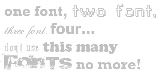

DO NOT use too many different font faces on the page
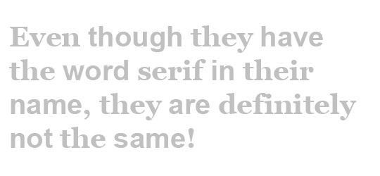
You may have 1,000+ fonts downloaded on your computer, but when they’re being displayed all on the screen at the same time, you’re not going to have many people impressed. Not only will this cause your website visitors to have a hard time reading, it’s also going to just make you look tacky.DO NOT switch from serif and sans serif fonts multiple times
Sticking with the theme from above, switching from Serif and Sans Serif fonts multiple times per page will do you more harm than good. Readibility is the #1 thing you need to be worried about with your website, because no matter how “cool” it looks, if the visitor can’t read whats on the page easily, they’re going to leave.DO NOT ignore planning for font increase by the viewer
Older audiences will adjust the font size view on their screens in their internet browsers settings, so no matter what font you default the text at, it might not be showing this way for the visitor. This can cause errors if you aren’t taking larger fonts into account for headers and other various items which might break the design if they break into two lines.DO NOT use Sans Serif fonts for large bodies of text
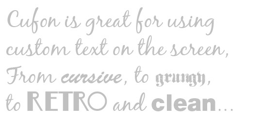
Sans Serif fonts are great for the clean, uniform look – but when you’re putting together large bodies of text (10+ lines), switching your fonts to a serif font will allow for better readability as the curves and shapes help guide the eyes better than the straight, uniform lines of the Sans Serif fonts.DO NOT overuse font replaces like Cufón and siFr
Cufón and SiFR are just two of the various ways you can replace text in your browser to give off a more custom look, but use it wisely. Using the font replacement for the entire web page is going to be a bit overload and will distract the visitor from the actual reason you’re typing on the page in the first place – you want them to be able to read it. I would advise to generally stick with headings and calls to action for your font replacements and leave the major bodies of text as regular, web safe fonts.DO NOT overdo the emphasis in your text
A good writer will be able to emphasize the words they want without using bold, italics or underlines. If you’re text is littered with tons of strong and italics and underlines, you might want to rethink what you’re doing. Utilizing the codes to emphesize specific items wisely will make things look – and read – thousands of times better.DO NOT forget to utilize font stacks in your css codes
When I’m building websites, I tend to like using helvetica for the text of specific items. I realized early on that not a lot of people will have purchased helvetica, so the font won’t display properly on their page if I simple use “font: helvetica;” in my css, so I read up on font stacks and use them religiously now. Basically, it gives you the option to use any font you want, and also allows for back ups in case the visitor doesn’t have the specific font you give first. An example would be like this: “font: Helvetica, Arial, sans-serif”, which basically says that you want the page to display helvetica for the text, and if thats not available on the visitors computer, you want the page to use arial – and if for some reason that isn’t available, it gives a generica sans-serif font.DO NOT type in all caps – use text-transform when you need it
So, lets just say that you want your headings to all be capitalized – how do you do it? DO YOU EXCESSIVELY TYPE IN ALL CAPS? There are a few problems with that. First, it’s annoying. Second, it’s not easy to edit them out later on if you redesign your site and do not want all caps anymore. So what do you do? Utilize the text-transform css code. Here’s an example.text-transform: uppercase;DO NOT forget to use accent characters when needed
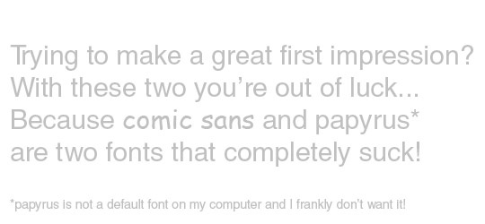
Typing words like Cufón numerous times on the page without the accent characters will make you look sloppy and uneducated. Yes, it’s true. So utilizing the accent characters will allow you to display the words properly (it’s really polite to do so) and it also is a lot easier than you’d think. You can get a full list of accent characters by visiting this article from w3.org.DO NOT – I repeat – DO NOT use comic sans or papyrus on anything!
This is actually a rule across all forms of design that use typography – web, print, ect. Never – I repeat – never use comic sans or papyrus on anything. It’s tacky and deserves to be lumped in with IE6 – and we all know how bad people hate IE6, right?DO use line height to your advantage
Relying on the default line height for your text will bite you in the ass in the long run because it’s honestly just not enough room between lines and will not allow you to work with a proper baseline grid (more on that below). I tend to keep my line height 5-6 px larger than the font size I choose – so if my font size is set to 13px, I will make the line-height 18px.DO use the proper text colors on the page background
The best thing to do (in my opinion) is to utilize an off-white (#F8F8F8) font on a black background and a dark gray (#252525) font on a white background. It helps the contrast become minimal and doesn’t strain the eyes as much for your visitors when they’re reading your content.DO use web safe fonts as often as possible
When you’re building your font stacks, make sure you’re using the web safe fonts as much as possible. The fonts that are installed on both PC and MAC can be found by reading this article on ampsoft.net. When you have a knowledge of what web safe fonts are out there, you can better prepare your website for the break down from your original fonts to the fonts that are most common and would be used if the visitor didn’t have your font installed.DO use a proper hierarchy for your pages
Utilizing a great hierarchy for your web pages will allow your visitors to quickly scan your content and find the most important items. Nothing is worse than getting to a page and having to spend 30-60 seconds looking for the content and finding out what it’s even about. Use proper title tags for the most important sections and smaller title tags for less important sections. You can also use different colors and spacing to vary the hierarchy for your pages.DO make use of a baseline grid
A consistent vertical grid will help readability for your web page and also increase the visual appeal of the overall design. Proportion and balance shouldn’t be broken by font sizes, so sticking to a proper vertical baseline grid will allow your page to flow naturally from top to bottom as well as from left to right. Acheiving this effect is as simple as these few lines of code below. Notice that the line height for the text is the same size as the margin for the bottom of the paragraph blocks of text (you should also keep this in mind for header tags as well as images).body {
font-family: Helvetica, Arial, sans-serif;
font-size: 13px;
line-height: 18px;
}
p { margin: 0 0 18px 0; }DO utilize white space as much as possible
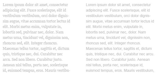
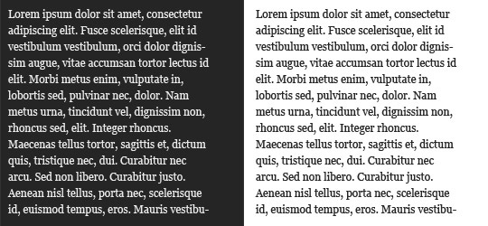
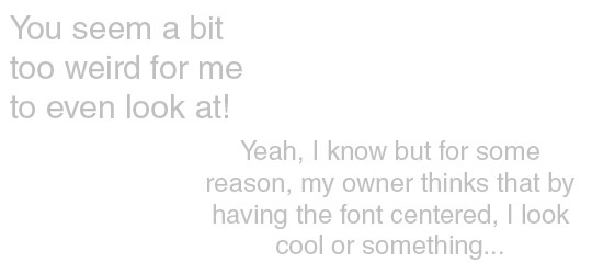
Keeping up with the above do, utilizing white space in your design will help your pages readability. It will allow your page to breathe and give your visitors eyes a rest. Don’t believe me? check out the image below and let me know which item you think is best for readability.DO keep the use of centered text to a minimum
Centering text is good for one line or maybe a speech bubble in your design, but requiring your visitors to read large blocks of text will cause their eyes to drift and not follow line by line as easily as if the text were aligned to the left or right.DO use shade variations to help areas stand out more
When designing your next site, keep this in mind – if your body text is black and your sidebar text is a medium gray color, your content will visually stand out and be read faster than the sidebar items. The same goes for blockquotes and other non-essential items that you do not want to take away from the attention of your main content areas.DO make sure you know about, and use, proper letter spacing for titles
This is an item I didn’t think about very often – until recently. If you are utilizing the text-transform css code I wrote about above, you’re going to notice that the text might be a bit hard to read. Utilizing the letter-spacing property in your css will help curve that problem. There is an example below but please know that the letter spacing is relative to your fonts default letter spacing so it might work differently for various fonts and font sizes.h1 { text-transform:uppercase; letter-spacing: 1.25em }DO make use of a typographic scale in your css codes
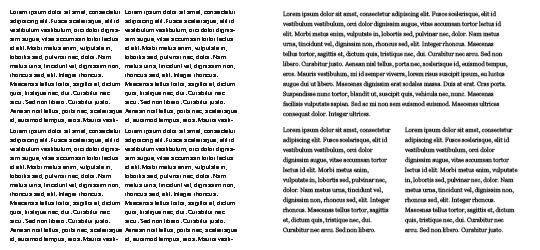
Using a proper typographic scale will allow your page to be read easily by the visitor and will allow you to keep the hierarchy in tact that we spoke about above because if your main text is 12 pixels, then the blockquote and paragraph fonts will be 125% larger by using the 1.25em code in your css. If you properly use a typographic scale, it will actually look like a flieght of stairs – like the image below.body { font-size: 12px; }
h1 { font-size: 5.0em; }
h2 { font-size: 4.0em; }
h3 { font-size: 3.0em; }
h4 { font-size: 2.0em; }
blockquote { font-size: 1.5em; }
p { font-size: 1.25em; }
input { font-size: 1.0em; }
small { font-size: 0.75em; }
The most clever thing is to start with the definition of the body text, as it will occur most often on the page. This can be done in the bodyelement, as well as in the paragraph element (the HTML element like a paragraph ).
ReplyDeleteOnly when the text is easy to read, you should design the other elements, which are usually larger same as in this chiropractic web sites. Legibility should always be BEFORE the visual-aesthetic effect.
As a guideline or base value, one can start with a font size of approx. 16 - 18 pixels. Below that, it is quite small. This was certainly commonplace in earlier times, but due to the variety of devices and the wide variety of usage scenarios, a font size below 16 pixels would be borderline.
If you have found a suitable size for the text, you can gradually design the other elements. Not infrequently, that then the largest headline (usually the h1) is then well over 30 pixels.