Learn why flip phones still matter in 2025, and how you can build and launch web apps for these tiny devices.
Flip phones aren’t dead. On the contrary, 200+ million non-smartphones are sold annually. That’s roughly equivalent to the number of iPhones sold in 2024. Even in the United States, millions of flip phones are sold each year. As network operators struggle to shut down 2G service,
new incentives are offered to encourage device upgrades that further
increase demand for budget-friendly flip phones. This is especially true
across South Asia and Africa, where an iPhone is unaffordable for the
vast majority of the population (it takes two months of work on an average Indian salary to afford the cheapest iPhone).
Like
their “smart” counterparts, flip phones (technically, this category is
called “Feature Phones”) are becoming increasingly more capable. They
now offer features you’d expect from a smartphone, like 4G, WiFi,
Bluetooth, and the ability to run apps. If you are targeting users in
South Asia and Africa, or niches in Europe and North America, there are
flip phone app platforms like Cloud Phone and KaiOS.
Building for these platforms is similar to developing a Progressive Web
App (PWA), with distribution managed across several app stores.
Jargon Busting Flip
phones go by many names. Non-smartphones are jokingly called “dumb
phones”. The technology industry calls this device category “feature
phones”. Regionally, they are also known as button phones or basic
mobiles in Europe, and keypad mobiles in India. They all share a few
traits: they are budget phones with small screens and physical buttons.
Why Build Apps For Flip Phones?
It’s
a common misconception that people who use flip phones do not want
apps. In fact, many first-time internet users are eager to discover new
content and services. While this market isn’t as lucrative as Apple’s
App Store, there are a few reasons why you should build for flip phones.
Organic Growth You do not need to pay to acquire flip phone users. Unlike Android or IOS, where the cost per install (CPI) averages around $2.5-3.3 per install according to GoGoChart, flip phone apps generate substantial organic downloads.
Brand Introduction When
flip phone users eventually upgrade to smartphones, they will search
for the apps they are already familiar with. This will, in turn,
generate more installs on the Google Play Store and, to a lesser extent,
the Apple App Store.
Low Competition There are ~1,700 KaiOS apps and fewer Cloud Phone widgets. Meanwhile, Google Play has over 1.55 million Android apps to choose from. It is much easier to stand out as one in a thousand than one in a million.
Technical Foundations
Flip phones could not always run apps. It wasn’t until the Ovi Store
(later renamed to the “Nokia Store”) launched in 2009, a year after
Apple’s flagship iPhone launched, that flip phones got installable,
third-party applications. At the time, apps were written for the
fragmented Java 2 Mobile Edition (J2ME) runtime, available only on
select Nokia models, and often required integration with
poorly-documented, proprietary packages like the Nokia UI API.
Today, flip phone platforms have rejected native runtimes in favor of standard web technologies
in an effort to reduce barriers to entry and attract a wider pool of
software developers. Apps running on modern flip phones are primarily
written in languages many developers are familiar with — HTML, CSS, and
JavaScript — and with them, a set of trade-offs and considerations.
Hardware
Flip
phones are affordable because they use low-end, often outdated,
hardware. On the bottom end are budget phones with a real-time operating
system (RTOS) running on chips like the Unisoc T107
with as little as 16MB of RAM. These phones typically support Opera
Mini and Cloud Phone. At the upper end is the recently-released TCL Flip 4 running KaiOS 4.0 on the Qualcomm Snapdragon 4s with 1GB of RAM.
While
it is difficult to accurately compare such different hardware, Apple’s
latest iPhone 16 Pro has 500x more memory (8GB RAM) and supports
download speeds up to 1,000x faster than a low-end flip phone (4G LTE
CAT-1).
Performance
You might think that
flip phone apps are easily limited by the scarce available resources of
budget hardware. This is the case for KaiOS, since apps are executed on
the device. Code needs to be minified, thumbnails downsized, and
performance evaluated across a range of real devices. You cannot simply
test on your desktop with a small viewport.
However, as remote browsers,
both Cloud Phone and Opera Mini overcome hardware constraints by
offloading computationally expensive rendering to servers. This means performance is generally comparable to modern desktops, but can lead to a few quirky and, at times, unintuitive characteristics.
For
instance, if your app fetches a 1MB file to display a data table, this
does not consume 1MB of the user’s mobile data. Only changes to the
screen contents get streamed to the user, consuming bandwidth. On the
other hand, data is consumed by complex animations and page transitions,
because each frame is at least a partial screen refresh. Despite this
quirk, Opera Mini estimates it saves up to 90% of data compared to conventional browsers.
Security
Do not store sensitive data
in browser storage. This holds true for flip phones, where the security
concerns are similar to those of traditional web browsers. Although
apps cannot generally access data from other apps, KaiOS does not
encrypt client-side data. The implications are different for remote
browsers.
Despite
their staying power, these devices go largely ignored by nearly every
web development framework and library. Popular front-end web frameworks
like Bootstrap v5 categorize all screens below 576px as extra small. Another popular choice, Tailwind,
sets the smallest CSS breakpoint — a specific width where the layout
changes to accommodate an optimal viewing experience across different
devices — even higher at 40em (640px). Design industry experts like Norman Nielsen suggest the smallest breakpoint,
“is intended for mobile and generally is up to 500px.” Standards like
these advocate for a one-size-fits-all approach on small screens, but
some small design changes can make a big difference for new internet
users.
Small screens vary considerably in size, resolution, contrast, and brightness.
Shrinks poorly: Screenshots of A List Apart, Chrome for Developers, and MDN Web Docs on Cloud Phone. (Large preview)Shrinks well: Screenshots of Rest of World, BBC News, and TED Talks on Cloud Phone.
Most websites render too large for flip phones.
They use fonts that are too big, graphics that are too detailed, and
sticky headers that occupy a quarter of the screen. To make matters
worse, many websites disable horizontal scrolling
by hiding content that overflows horizontally. This allows for smooth
scrolling on a touchscreen, but also makes it impossible to read text
that extends beyond the viewport on flip phones.
The table below
includes physical display size, resolution, and examples to better
understand the diversity of small screens across flip phones and budget
smartphones.
Note: Flip
phones have small screens typically between 1.8”–2.8” with a resolution
of 240x320 (QVGA) or 128x160 (QQVGA). For comparison, an Apple Watch
Series 10 has a 1.8” screen with a resolution of 416x496. By modern
standards, flip phone displays are small with low resolution, pixel
density, contrast, and brightness.
Develop For Small Screens
Add
custom, named breakpoints to your framework’s defaults, rather than
manually using media queries to override layout dimensions defined by
classes.
Bootstrap v5
Bootstrap defines a map, $grid-breakpoints, in the _variables.scss Sass file that contains the default breakpoints from SM (576px) to XXL (1400px). Use the map-merge() function to extend the default and add your own breakpoint.
Successful
flip phone apps support keyboard navigation using the directional pad
(D-pad). This is the same navigation pattern as TV remotes: four arrow
keys (up, down, left, right) and the central button. To build a great
flip phone-optimized app, provide a navigation scheme
where the user can quickly learn how to navigate your app using these
limited controls. Ensure users can navigate to all visible controls on
the screen.
Navigating PodLP using d-pad (left) and a virtual cursor (right).
Although
some flip phone platforms support spatial navigation using an emulated
cursor, it is not universally available and creates a worse user
experience. Moreover, while apps that support keyboard navigation will
work with an emulated cursor, this isn’t necessarily true the other way
around. Opera Mini Native only offers a virtual cursor, Cloud Phone only
offers spatial navigation, and KaiOS supports both.
If you develop with keyboard accessibility in mind, supporting flip phone navigation is easy. As general guidelines, never remove a focus outline. Instead, override default styles and use box shadows
to match your app’s color scheme while fitting appropriately. Autofocus
on the first item in a sequence — list or grid — but be careful to
avoid keyboard traps. Finally, make sure that the lists scroll the newly-focused item completely into view.
Don’t Make Users Type
If
you have ever been frustrated typing a long message on your smartphone,
only to have it accidentally erased, now imagine that frustration when
you typed the message using T9
on a flip phone. Despite advancements in predictive typing, it’s a
chore to fill forms and compose even a single 180-character Tweet with
just nine keys.
Whatever you do, don’t make flip phone users type!
Fortunately, it is easy to adapt designs to require less typing. Prefer numbers whenever possible.
Allow users to register using their phone number (which is easy to
type), send a PIN code or one-time password (OTPs) that contains only
numbers, and look up address details from a postal code. Each of these
saves tremendous time and avoids frustration that often leads to user
attrition.
Alternatively, integrate with single-sign-on (SSO)
providers to “Log in with Google,” so users do not have to retype
passwords that security teams require to be at least eight characters
long and contain a letter, number, and symbol. Just keep in mind that
many new internet users won’t have an email address. They may not know
how to access it, or their phone might not be able to access emails.
Finally, allow users to search by voice
when it is available. As difficult as it is typing English using T9,
it’s much harder typing a language like Tamil, which has over 90M
speakers across South India and Sri Lanka. Despite decades of
advancement, technologies like auto-complete and predictive typing are
seldom available for such languages. While imperfect, there are AI
models like Whisper Tamil that can perform speech-to-text, thanks to researchers at universities like the Speech Lab at IIT Madras.
Flip Phone Browsers And Operating Systems
Another challenge with developing web apps for flip phones is their fragmented ecosystem.
Various companies have used different approaches to allow websites and
apps to run on limited hardware. There are at least three major
web-based platforms that all operate differently:
Cloud Phone is the most recent solution, launched in December 2023, using a modern Puffin (Chromium) based remote browser that serves as an app store.
KaiOS, launched in 2016 using Firefox OS as its foundation, is a mobile operating system where the entire system is a web browser.
Opera Mini Native is by far the oldest, launched in 2005 as an ad-supported remote browser that still uses the decade-old, discontinued Presto engine.
Although both platforms are remote browsers, there are significant differences between Cloud Phone and Opera Mini that are not immediately apparent.
Left to right: Nokia 6300 4G (KaiOS), Viettel Sumo 4G V1S (Cloud Phone), and Itel Neo R60+ (Opera Mini).
Flip
phones have come a long way, but each platform supports different
capabilities. You may need to remove or scale back features based on
what is supported. It is best to target the lowest common denominator that is feasible for your application.
For
information-heavy news websites, wikis, or blogs, Opera Mini’s outdated
technology works well enough. For video streaming services, both Cloud
Phone and KaiOS work well. Conversely, remote browsers like Opera Mini
and Cloud Phone cannot handle high frame rates, so only KaiOS is
suitable for real-time interactive games. Just like with design, there
is no one-size-fits-all approach to flip phone development. Even though
all platforms are web-based, they require different tradeoffs.
Tiny Screens, Big Impact
The
flip phone market is growing, particularly for 4G-enabled models.
Reliance’s JioPhone is among the most successful models, selling more
than 135 million units
of its flagship KaiOS-enabled phone. The company plans to increase 4G
flip phone rollout steadily as it migrates India’s 250 million 2G users
to 4G and 5G.
Estimates
of the total active flip phone market size are difficult to come by,
and harder still to find a breakdown by platform. KaiOS claims to enable
“over 160 million phones worldwide,” while “over 300 million people use Opera Mini to stay connected.” Just a year after launch, Cloud Phone states that, “one million Cloud Phone users
already access the service from 90 countries.” By most estimates, there
are already hundreds of millions of web-enabled flip phone users eager
to discover new products and services.
Conclusion
Hundreds
of millions still rely on flip phones to stay connected. Yet, these
users go largely ignored even by products that target emerging markets. Modern software development often prioritizes the latest and greatest over finding ways to affordably serve more than 2.6 billion unconnected people. If you are not designing for small screens using keyboard navigation, you’re shutting out an entire population from accessing your service.
Flip phones still matter in 2025.
With ongoing network transitions, millions will upgrade, and millions
more will connect for the first time using 4G flip phones. This creates
an opportunity to put your app into the hands of the newly connected.
And thanks to modern remote browser technology, it is now easier than
ever to build and launch your app on flip phones without costly and
time-consuming optimizations to function on low-end hardware.
Designing a new AI feature? Where do you even begin? Here’s a simple,
practical overview with useful design patterns for better AI
experiences.
So you need to design a new AI feature for your
product. How would you start? How do you design flows and interactions?
And how do you ensure that that new feature doesn’t get abandoned by
users after a few runs?
In this article, I’d love to share a very simple but systematic approach to how I think about designing AI experiences. Hopefully, it will help you get a bit more clarity about how to get started.
The Receding Role of AI Chat
One of the key recent shifts is a slow move away from traditional “chat-alike” AI interfaces. As Luke Wroblewski wrote, when agents can use multiple tools, call other agents and run in the background, users orchestrate AI work more — there’s a lot less chatting back and forth.
In fact, chatbots are rarely a great experience paradigm
— mostly because the burden of articulating intent efficiently lies on
the user. But in practice, it’s remarkably difficult to do well and very
time-consuming.
Chat doesn’t go away, of course, but it’s being complemented with task-oriented UIs
— temperature controls, knobs, sliders, buttons, semantic spreadsheets,
infinite canvases — with AI providing predefined options, presets, and
templates.
There,
AI emphasizes the work, the plan, the tasks — the outcome, instead of
the chat input. The results are experiences that truly amplify value for users by sprinkling a bit of AI in places where it delivers real value to real users.
To design better AI experiences, we need to study 5 key areas that we need to shape.
Input UX: Expressing Intent
Conversational AI is a very slow way of helping users express and articulate their intent. Usability tests show
that users often get lost in editing, reviewing, typing, and re-typing.
It’s painfully slow, often taking 30-60 seconds for input.
As it
turns out, people have a hard time expressing their intent well. In
fact, instead of writing prompts manually, it’s a good idea to ask AI to write a prompt to feed itself.
With Flora AI, users can still write prompts, but they visualize their intent
with nodes by connecting various sources visually. Instead of
elaborately explaining to AI how we need the pipeline to work, we attach
nodes and commands on a canvas.
With Krea.ai, users can move abstract shapes (on the left) to explain their goal to AI and study the outcome (on the right).
With input for AI, being precise is slow and challenging. Instead, we can abstract away the object we want to manipulate, and give AI precise input by moving that abstracted object on a canvas. That’s what Krea.ai does.
In summary, we can minimize the burden of typing prompts manually — with AI-generated pre-prompts, prompt extensions, query builders, and also voice input.
Output UX: Displaying Outcomes
AI output doesn’t have to be merely plain text or a list of bullet points. It must be helpful to drive people to insights, faster. For example, we could visualize output by creating additional explanations based on the user’s goal and motivations.
Visualizing outcome through style lenses. By Amelia Wattenberger. (Large preview)
For example, Amelia Wattenberger visualized AI output for her text editor PenPal by adding style lenses to explore the content from. The output could be visualized in sentence lengths and scales Sad — Happy, Concrete — Abstract, and so on.
The outcome could also be visualized on a map, which, of course, is expected for an AI GIS analyst. Also, users can access individual data layers, turn them on and off, and hence explore the data on the map.
We can also use forced ranking and prioritizations to suggest best options
and avoid choice paralysis — even if a user asks for top 10
recommendations. We can think about ways to present results as a data
table, or a dashboard, or a visualization on a map, or as a structured
JSON file, for example.
Refinement UX: Tweaking Output
Users often need to cherry-pick some bits from the AI output and bring them together in a new place — and often they need to expand on one section, synthesize bits from another section, or just refine the outcome to meet their needs.
Refinement is usually the most painful part of the experience,
with many fine details being left to users to explain elaborately. But
we can use good old-fashioned UI controls like knobs, sliders, buttons,
and so on to improve that experience, similar to how Adobe Firefly does
it (image above).
Presets living on the side in Elicit, an example by Maggie Appleton.
We can also use presets, bookmarks, and allow users to highlight specific parts of the outcome that they’d like to change — with contextual prompts acting on highlighted parts of the output, rather than global prompts.
With AI agents, we can now also allow users to initiate tasks that AI can perform on their behalf, such as scheduling events, planning, and deep research. We could also ask to sort results or filter them in a specific way.
Suggesting actions on Elicit, an example by Maggie Appleton.
But we can also add features to help users use AI output better — e.g., by visualizing it, making it shareable, allowing transformations between formats, or also posting to Slack, Jira, and so on.
AI Integration: Where Work Happens
Many AI interactions are locked within a specific product, but good AI experiences happen where the actual work happens. It would be quite unusual to expect a dedicated section for Autocomplete, for example, but we do so for AI features.
(Large preview)DoveTail AI integrates in plenty of platforms, from Jira and Notion to Slack and Teams, where the actual work happens.
The actual boost in productivity comes when users rely on AI as a co-pilot or little helper in the tools they use daily for work. It’s seamless integrations into Slack, Teams, Jira, GitHub, and so on — the tools that people use anyway. Dia Browser and Dovetail are great examples of it in action.
Wrapping Up
Along these five areas, we can explore ways to minimize the cost of interaction
with a textbox, and allow users to interact with the points of interest
directly, by tapping, clicking, selecting, highlighting, and
bookmarking.
Many products are obsessed with being AI-first. But you might be way better off by being AI-second
instead. The difference is that we focus on user needs and sprinkle a
bit of AI across customer journeys where it actually adds value.
And
AI products don’t have to be AI-only. There is a lot of value in
mapping into the mental models that people have adopted over the years,
and enhance them with AI, similar to how we do it with browsers’ autofill, rather than leaving users in front of a frightening and omnipresent text box.
Event listeners are essential for interactivity in JavaScript, but they
can quietly cause memory leaks if not removed properly. And what if your
event listener needs parameters? That’s where things get interesting. It shares which JavaScript features make handling
parameters with event handlers both possible and well-supported.
JavaScript event listeners are very important, as they exist in
almost every web application that requires interactivity. As common as
they are, it is also essential for them to be managed properly.
Improperly managed event listeners can lead to memory leaks and can
sometimes cause performance issues in extreme cases.
Here’s the real problem: JavaScript event listeners are often not removed after they are added.
And when they are added, they do not require parameters most of the
time — except in rare cases, which makes them a little trickier to
handle.
A common scenario where you may need to use parameters
with event handlers is when you have a dynamic list of tasks, where each
task in the list has a “Delete” button attached to an event handler
that uses the task’s ID as a parameter to remove the task. In a
situation like this, it is a good idea to remove the event listener once
the task has been completed to ensure that the deleted element can be
successfully cleaned up, a process known as garbage collection.
A Common Mistake When Adding Event Listeners
A very common mistake when adding parameters to event handlers is calling the function with its parameters inside the addEventListener() method. This is what I mean:
The browser responds to this line by immediately calling
the function, irrespective of whether or not the click event has
happened. In other words, the function is invoked right away instead of
being deferred, so it never fires when the click event actually occurs.
You may also receive the following console error in some cases:
Uncaught TypeError: Failed to execute. addEventListener on EventTarget: parameter is not of type Object
This error makes sense because the second parameter of the addEventListener method can only accept a JavaScript function, an object with a handleEvent() method, or simply null. A quick and easy way to avoid this error is by changing the second parameter of the addEventListener method to an arrow or anonymous function.
The only hiccup with using arrow and anonymous functions is that they cannot be removed with the traditional removeEventListener() method; you will have to make use of AbortController, which may be overkill for simple cases. AbortController shines when you have multiple event listeners to remove at once.
For simple cases where you have just one or two event listeners to remove, the removeEventListener()
method still proves useful. However, in order to make use of it, you’ll
need to store your function as a reference to the listener.
Using Parameters With Event Handlers
There
are several ways to include parameters with event handlers. However,
for the purpose of this demonstration, we are going to constrain our
focus to the following two:
Option 1: Arrow And Anonymous Functions
Using arrow and anonymous functions is the fastest and easiest way to get the job done.
To
add an event handler with parameters using arrow and anonymous
functions, we’ll first need to call the function we’re going to create
inside the arrow function attached to the event listener:
After that, we can create the function with parameters:
function handleClick(event, param1, param2) {
  console.log(param1, param2, event.type, event.target);
}
Note that with this method, removing the event listener requires the AbortController. To remove the event listener, we create a new AbortController object and then retrieve the AbortSignal object from it:
const controller = new AbortController();
const { signal } = controller;
Next, we can pass the signal from the controller as an option in the removeEventListener() method:
Now we can remove the event listener by calling AbortController.abort():
controller.abort()
Option 2: Closures
Closures
in JavaScript are another feature that can help us with event handlers.
Remember the mistake that produced a type error? That mistake can also
be corrected with closures. Specifically, with closures, a function can
access variables from its outer scope.
In other words, we can access the parameters we need in the event handler from the outer function:
This establishes a function that returns another
function. The function that is created is then called as the second
parameter in the addEventListener() method so that the
inner function is returned as the event handler. And with the power of
closures, the parameters from the outer function will be made available
for use in the inner function.
Notice how the event
object is made available to the inner function. This is because the
inner function is what is being attached as the event handler. The event
object is passed to the function automatically because it’s the event
handler.
To remove the event listener, we can use the AbortController like we did before. However, this time, let’s see how we can do that using the removeEventListener() method instead.
In order for the removeEventListener method to work, a reference to the createHandler function needs to be stored and used in the addEventListener method:
It is good practice
to always remove event listeners whenever they are no longer needed to
prevent memory leaks. Most times, event handlers do not require
parameters; however, in rare cases, they do. Using JavaScript features
like closures, AbortController, and removeEventListener, handling parameters with event handlers is both possible and well-supported.
Ensuring your product communicates clearly to a global audience is not
just about localisation. Even for products that have a proper
localisation process, English often remains the default language for UI
and communications. This article focuses on how you can make English
content clear and inclusive for non-native users. It offers a
practical guide based on his own experience as a non-native
English-speaking content designer, defining the user experience for
international companies.
A few years ago, I was in a design review at a fintech company,
polishing the expense management flows. It was a routine session where
we reviewed the logic behind content and design decisions.
While
looking over the statuses for submitted expenses, I noticed a label
saying ‘In approval’. I paused, re-read it again, and asked myself:
“Where is it? Are the results in? Where can I find them? Are they sending me to the app section called “Approval”?”
This tiny label made me question what was happening with my money, and this feeling of uncertainty was quite anxiety-inducing.
My
team, all native English speakers, did not flinch, even for a second,
and moved forward to discuss other parts of the flow. I was the only
non-native speaker in the room, and while the label made perfect sense
to them, it still felt off to me.
After a quick discussion, we
landed on ‘Pending approval’ — the simplest and widely recognised option
internationally. More importantly, this wording makes it clear that
there’s an approval process, and it hasn’t taken place yet. There’s no
need to go anywhere to do it.
Some might call it nitpicking, but
that was exactly the moment I realised how invisible — yet powerful —
the non-native speaker’s perspective can be.
Native
speakers often write on instinct, which works much like autopilot. This
can often lead to overconfidence in content that, in reality, is too
culturally specific, vague, or complex. And that content may not be
understood by 3 in 4 people who read it.
If your team shares the same native language, content clarity remains assumed by default rather than proven through pressure testing.
The price for that is the accessibility of your product. A study by National Library of Medicine
found that US adults who had proficiency in English but did not use it
as their primary language were significantly less likely to be insured,
even when provided with the same level of service as everyone else.
In
other words, they did not finish the process of securing a healthcare
provider — a process that’s vital to their well-being, in part, due to
unclear or inaccessible communication.
If people abandon the
process of getting something as vital as healthcare insurance, it’s easy
to imagine them dropping out during checkout, account setup, or app
onboarding.
Leaving
a large portion of your audience outside of the “clarity zone” limits
your global growth, and the issue will only expand over time. (Large preview)
Non-native
content designers, by contrast, do not write on autopilot. Because of
their experience learning English, they’re much more likely to tune into
nuances, complexity, and cultural exclusions that natives often
overlook. That’s the key to designing for everyone rather than 1 in 4.
Non-native Content Designers Make Your UX Global
Spotting The Clutter And Cognitive Load Issues
When
a non-native speaker has to pause, re-read something, or question the
meaning of what’s written, they quickly identify it as a friction point
in the user experience.
Why it’s important: Every
extra second users have to spend understanding your content makes them
more likely to abandon the task. This is a high price that companies pay
for not prioritising clarity.
Cognitive load is not just about complex sentences but also about the speed. There’s plenty of research confirming that non-native speakers read more slowly than native speakers.
This is especially important when you work on the visibility of system
status — time-sensitive content that the user needs to scan and
understand quickly.
One example you can experience firsthand is an
ATM displaying a number of updates and instructions. Even when they’re
quite similar, it still overwhelms you when you realise that you missed
one, not being able to finish reading.
This kind of rapid-fire updates can increase frustration and the chances of errors.
ATM giving 6 variations of content within less than 8 seconds.
Always Advocating For Plain English
They
tend to review and rewrite things more often to find the easiest way to
communicate the message. What a native speaker may consider clear
enough might be dense or difficult for a non-native to understand.
Why it’s important: Simple content better scales across countries, languages, and cultures.
Catching Culture-specific Assumptions And References
When
things do not make sense, non-native speakers challenge them. Besides
the idioms and other obvious traps, native speakers tend to fall into
considering their life experience to be shared with most
English-speaking users.
Cultural differences might even exist
within one globally shared language. Have you tried saying ‘soccer’
instead of ‘football’ in a conversation with someone from the UK? These
details may not only cause confusion but also upset people.
Why it’s important:
Making sure your product is free from culture-specific references makes
your product more inclusive and safeguards you from alienating your
users.
They Have Another Level Of Empathy For The Global Audience
Being
a non-native speaker themselves, they have experience with products
that do not speak clearly to them. They’ve been in the global user’s
shoes and know how it impacts the experience.
Why it’s important:
Empathy is a key driver towards design decisions that take into account
the diverse cultural and linguistic background of the users.
How Non-native Content Design Can Shape Your Approach To Design
Your
product won’t become better overnight simply because you read an
inspiring article telling you that you need to have a more diverse team.
I get it. So here are concrete changes that you can make in your design
workflows and hiring routines to make sure your content is accessible
globally.
Run Copy Reviews With Non-native Readers
When
you launch a new feature or product, it’s a standard practice to run QA
sessions to review visuals and interactions. When your team does not
include the non-native perspective, the content is usually overlooked
and considered fine as long as it’s grammatically correct.
I know,
having a dedicated localisation team to pressure-test your content for
clarity is a privilege, but you can always start small.
At one of my previous companies, we established a ‘clarity heroes council’
— a small team of non-native English speakers with diverse cultural and
linguistic backgrounds. During our reviews, they often asked questions
that surprised us and highlighted where clarity was missing:
What’s a “grace period”?
What will happen when I tap “settle the payment”?
These
questions flag potential problems and help you save both money and
reputation by avoiding thousands of customer service tickets.
Review Existing Flows For Clarity
Even
if your product does not have major releases regularly, it accumulates
small changes over time. They’re often plugged in as fixes or small
improvements, and can be easily overlooked from a QA perspective.
A
good start will be a regular look at the flows that are critical to
your business metrics: onboarding, checkout, and so on. Fence off some
time for your team quarterly or even annually, depending on your product
size, to come together and check whether your key content pieces serve
the global audience well.
Usually, a proper review is conducted by
a team: a product designer, a content designer, an engineer, a product
manager, and a researcher. The idea is to go over the flows, research
insights, and customer feedback together. For that, having a non-native
speaker on the audit task force will be essential.
If you’ve never done an audit before, try this template as it covers everything you need to start.
Make Sure Your Content Guidelines Are Global-ready
If
you haven’t done it already, make sure your voice & tone
documentation includes details about the level of English your company
is catering to.
This might mean working with the brand team to
find ways to make sure your brand voice comes through to all users
without sacrificing clarity and comprehension. Use examples and showcase
the difference between sounding smart or playful vs sounding clear.
Leaning
too much towards brand personality is where cultural differences
usually shine through. As a user, you might’ve seen it many times.
Here’s a banking app that wanted to seem relaxed and relatable by
introducing ‘Dang it’ as the only call-to-action on the screen.
Sometimes even bank apps accidentally sacrifice clarity to showcase brand personality.
However,
users with different linguistic backgrounds might not be familiar with
this expression. Worse, they might see it as an action, leaving them
unsure of what will actually happen after tapping it.
Considering
how much content is generated with AI today, your guidelines have to
account for both tone and clarity. This way, when you feed these
requirements to the AI, you’ll see the output that will not just be
grammatically correct but also easy to understand.
Incorporate Global English Heuristics Into Your Definition Of Success
Basic heuristic principles are often documented as a part of overarching guidelines to help UX teams do a better job. The Nielsen Norman Group usability heuristics cover the essential ones, but it doesn’t mean you shouldn’t introduce your own. To complement this list, add this principle:
Aim
for global understanding: Content and design should communicate clearly
to any user regardless of cultural or language background.
You can suggest criteria to ensure it’s clear how to evaluate this:
Action transparency: Is it clear what happens next when the user proceeds to the next screen or page?
Minimal ambiguity: Is the content open to multiple interpretations?
International clarity: Does this content work in a non-Western context?
Bring A Non-native Perspective To Your Research, Too
This one is often overlooked, but collaboration between the research team and non-native speaking writers
is super helpful. If your research involves a survey or interview, they
can help you double-check whether there is complex or ambiguous
language used in the questions unintentionally.
In a study by the Journal of Usability Studies,
37% of non-native speakers did not manage to answer the question that
included a word they did not recognise or could not recall the meaning
of. The question was whether they found the system to be “cumbersome to
use”, and the consequences of getting unreliable data and measurements
on this would have a negative impact on the UX of your product.
Another study by UX Journal of User Experience highlights how important clarity is in surveys. While most people in their study interpreted the question “How do you feel about … ?” as “What’s your opinion on …?”, some took it literally and proceeded to describe their emotions instead.
This
means that even familiar terms can be misinterpreted. To get precise
research results, it’s worth defining key terms and concepts to ensure
common understanding with participants.
Globalise Your Glossary
At
Klarna, we often ran into a challenge of inconsistent translation for
key terms. A well-defined English term could end up having from three to
five different versions in Italian or German. Sometimes, even the same
features or app sections could be referred to differently depending on
the market — this led to user confusion.
To address this, we introduced a shared term base — a controlled vocabulary that included:
English term,
Definition,
Approved translations for all markets,
Approved and forbidden synonyms.
Importantly, the term selection was dictated by user research, not by assumption or personal preferences of the team.
This Notion template shows how a controlled vocabulary can look
We
used a similar setup. Our new glossary was shared internally across
teams, from product to customer service. Results? Reducing the support
tickets related to unclear language used in UI (or directions in the
user journey) by 18%. This included tasks like finding instructions on
how to make a payment (especially with the least popular payment methods
like bank transfer), where the late fee details are located, or whether
it’s possible to postpone the payment. And yes, all of these features
were available, and the team believed they were quite easy to find.
A
glossary like this can live as an add-on to your guidelines. This way,
you will be able to quickly get up to speed new joiners, keep product
copy ready for localisation, and defend your decisions with
stakeholders.
Approach Your Team Growth With An Open Mind
‘Looking
for a native speaker’ still remains a part of the job listing for UX
Writers and content designers. There’s no point in assuming it’s
intentional discrimination. It’s just a misunderstanding that stems from
not fully accepting that our job is more about building the user experience than writing texts that are grammatically correct.
Here are a few tips to make sure you hire the best talent and treat your applicants fairly:
Remove the ‘native speaker’ and ‘fluency’ requirement.
Instead,
focus on the core part of our job: add ‘clear communicator’, ‘ability
to simplify’, or ‘experience writing for a global audience’.
Judge the work, not the accent.
Over
the years, there have been plenty of studies confirming that the accent
bias is real — people having an unusual or foreign accent are
considered less hirable. While some may argue that it can have an impact
on the efficiency of internal communications, it’s not enough to
justify the reason to overlook the good work of the applicant.
My
personal experience with the accent is that it mostly depends on the
situation you’re in. When I’m in a friendly environment and do not feel
anxiety, my English flows much better as I do not overthink how I sound.
Ironically, sometimes when I’m in a room with my team full of British
native speakers, I sometimes default to my Slavic accent. The question
is: does it make my content design expertise or writing any worse? Not
in the slightest.
Therefore, make sure you judge the portfolios,
the ideas behind the interview answers, and whiteboard challenge
presentations, instead of focusing on whether the candidate’s accent
implies that they might not be good writers.
Good Global Products Need Great Non-native Content Design
Non-native
content designers do not have a negative impact on your team’s writing.
They sharpen it by helping you look at your content through the lens of
your real user base. In the globalised world, linguistic purity no longer benefits your product’s user experience.
Try
these practical steps and leverage the non-native speaking lens of your
content designers to design better international products.
If you haven’t encountered ARIA before, great! It’s a chance to learn
something new and exciting. If you have heard of ARIA before, this
might help you better understand it or maybe even teach you something
new!
These are all things I wish someone had told me when I was getting started on my web accessibility journey. This post will:
Provide a mindset for how to approach ARIA as a concept,
Debunk some common misconceptions, and
Provide some guiding thoughts to help you better understand and work with it.
It
is my hope that in doing so, this post will help make an oft-overlooked
yet vital corner of web design and development easier to approach.
What This Post Is Not
This is not
a recipe book for how to use ARIA to build accessible websites and web
apps. It is also not a guide for how to remediate an inaccessible
experience. A lot of accessibility work is highly contextual.
I do not know the specific needs of your project or organization, so
trying to give advice here could easily do more harm than good.
Instead,
think of this post as a “know before you go” guide. I’m hoping to give
you a good headspace to approach ARIA, as well as highlight things to
watch out for when you undertake your journey. So, with that out of the
way, let’s dive in!
So, What Is ARIA?
ARIA
is what you turn to if there is not a native HTML element or attribute
that is better suited for the job of communicating interactivity,
purpose, and state.
Think of it like a spice that you sprinkle into your markup to enhance things.
Adding ARIA to your HTML markup is a way of providing additional information to a website or web app for screen readers and voice control software.
Interactivity means the content can be activated or manipulated. An example of this is navigating to a link’s destination.
Purpose means what something is used for. An example of this is a text input used to collect someone’s name.
State means the current status content has been placed in and controlled by states, properties, and values. An example of this is an accordion panel that can either be expanded or collapsed.
Here is an illustration to help communicate what I mean by this:
The presence of HTML’s button element
will instruct assistive technology to report it as a button, letting
someone know that it can be activated to perform a predefined action.
The
presence of the text string “Mute” will be reported by assistive
technology to clue the person into what the button is used for.
The presence of aria-pressed="true"
means that someone or something has previously activated the button,
and it is now in a “pushed in” state that sustains its action.
This overall pattern will let people who use assistive technology know:
If something is interactive,
What kind of interactive behavior it performs, and
The latest version of ARIA is version 1.2, published on June 6th, 2023. Version 1.3 is slated to be released relatively soon, and you can read more about it in this excellent article by Craig Abbott.
You may also see it referred to as WAI-ARIA, where WAI stands for “Web Accessibility Initiative.” The WAI is part of the W3C,
the organization that sets standards for the web. That said, most
accessibility practitioners I know call it “ARIA” in written and verbal
communication and leave out the “WAI-” part.
The Spirit Of ARIA Reflects The Era In Which It Was Created
The
reason for this is simple: The web was a lot less mature in the past
than it is now. The most popular operating system in 2006 was Windows XP. The iPhone didn’t exist yet; it was released a year later.
From a very high level, ARIA is a snapshot of the operating system interaction paradigms of this time period. This is because ARIA recreates them.
Smartphones with features like tappable,
swipeable, and draggable surfaces were far less commonplace. Single
Page Application “web app” experiences were also rare, with Ajax-based approaches being the most popular. This means that we have to build the experiences of today using the technology of 2006. In a way, this is a good thing. It forces us to take new and novel experiences and interrogate them.
Interactions
that cannot be broken down into smaller, more focused pieces that map
to ARIA patterns are most likely inaccessible. This is because they
won’t be able to be operated by assistive technology or function on
older or less popular devices.
I may be biased, but I also think
these sorts of novel interactions that can’t translate also serve as a
warning that a general audience will find them to be confusing and, therefore, unusable. This belief is important to consider given that the internet serves:
An unknown number of people,
Using an unknown number of devices,
Each with an unknown amount of personal customizations,
Who have their own unique needs and circumstances and
Have unknown motivational factors.
Interaction Expectations
Contemporary
expectations for keyboard-based interaction for web content —
checkboxes, radios, modals, accordions, and so on — are sourced from
Windows XP and its predecessor operating systems. These interaction
models are carried forward as muscle memory for older people who use
assistive technology. Younger people who rely on assistive technology
also learn these de facto standards, thus continuing the cycle.
Home and End to jump to the start or end of a list of items, and so on.
It’s Also A Living Document
This
is not to say that ARIA has stagnated. It is constantly being worked on
with new additions, removals, and clarifications. Remember, it is now
at version 1.2, with version 1.3 arriving soon.
In
parallel, HTML as a language also reflects this evolution. Elements
were originally created to support a document-oriented web and have been
gradually evolving to support more dynamic, app-like experiences. The great bit here is that this is all conducted in the open and is something you can contribute to if you feel motivated to do so.
Use a native element whenever possible. An example would be using an anchor element (<a>) for a link rather than a div with a click handler and a role of link.
A Role is what assistive technology reads and then announces. A lot of people refer to this in shorthand as semantics. HTML elements have implied roles, which is why an anchor element will be announced as a link by screen readers with no additional work.
Implied roles are almost always better to use if the use case calls for them. Recall the first rule of ARIA here. This is usually what digital accessibility practitioners refer to when they say, “Just use semantic HTML.”
There
are many reasons for favoring implied roles. The main consideration is
better guarantees of support across an unknown number of operating
systems, browsers, and assistive technology combinations.
Abstract roles are used for the ontology. Authors MUST NOT use abstract roles in content.
<!-- This won't work, don't do it --><h2role="sectionhead">
Anatomy and physiology
</h2><!-- Do this instead --><sectionaria-labeledby="anatomy-and-physiology"><h2id="anatomy-and-physiology">
Anatomy and physiology
</h2></section>
Additionally, in the same way, you can only declare ARIA on certain things, you can only declare some ARIA as children of other ARIA declarations. An example of this is the the listitem role, which requires a role of list to be present on its parent element.
So, what’s the best way to determine if a role requires a parent declaration? The answer is to review the official definition.
Implicit roles are provided by semantic HTML, and explicit roles are provided by ARIA. Both describe what an element is. States describe that element’s characteristics in a way that assistive technology can understand. This is done via property declarations and their companion values.
ARIA
states can change quickly or slowly, both as a result of human
interaction as well as application state. When the state is changed as a
result of human interaction, it is considered an “unmanaged state.”
Here, a developer must supply the underlying JavaScript logic to control
the interaction.
When the state changes as a result of the application (e.g., operating system, web browser, and so on), this is considered “managed state.” Here, the application automatically supplies the underlying logic.
For the examples in the previous graphic, the polite value for aria-live is one of the three predefined values (off, polite, and assertive). For aria-label, “Save” is a text string manually supplied by the author.
You declare ARIA on HTML elements the same way you declare other attributes:
<!--
Applies an id value of
"carrot" to the div
--><divid="carrot"></div><!--
Hides the content of this paragraph
element from assistive technology
--><paria-hidden="true">
Assistive technology can't read this
</p><!--
Provides an accessible name of "Stop",
and also communicates that the button
is currently pressed. A type property
with a value of "button" prevents
browser form submission.
--><buttonaria-label="Stop"aria-pressed="true"type="button"><!-- SVG icon --></button>
Other usage notes:
You can place more than one ARIA declaration on an HTML element.
The order of placement of ARIA when declared on an HTML element does not matter.
There is no limit to how many ARIA declarations can be placed on an element. Be aware that the more you add, the more complexity you introduce, and more complexity means a larger chance things may break or not function as expected.
You can declare ARIA on an HTML element and also have other non-ARIA declarations, such as class or id. The order of declarations does not matter here, either.
In this context, “hardcoding” means directly writing a static attribute or value declaration into your component, view, or page.
A lot of ARIA is designed to be applied or conditionally modified dynamically based on application state or as a response to someone’s action. An example of this is a show-and-hide disclosure pattern:
ARIA’s aria-expanded attribute is toggled from false to true to communicate if the disclosure is in an expanded or collapsed state.
HTML’s hidden attribute is conditionally removed or added in tandem to show or hide the disclosure’s full content area.
<divclass="disclosure-container"><buttonaria-expanded="false"class="disclosure-toggle"type="button">
How we protect your personal information
</button><divhiddenclass="disclosure-content"><ul><li>Fast, accurate, thorough and non-stop protection from cyber attacks</li><li>Patching practices that address vulnerabilities that attackers try to exploit</li><li>Data loss prevention practices help to ensure data doesn't fall into the wrong hands</li><li>Supply risk management practices help ensure our suppliers adhere to our expectations</li></ul><p><ahref="/security/">Learn more about our security best practices</a>.
</p></div></div>
<buttontype="button>
<svg aria-hidden="true"><!-- SVG code --></svg>
Save
</button>
Here,
the string “Save” is what is required for someone to understand what
the button will do when they activate it. The accompanying icon helps
that understanding visually but is considered redundant and therefore decorative.
Declaring An Aria Role On Something That Already Uses That Role Implicitly Does Not Make It “Extra” Accessible
An
implied role is all you need if you’re using semantic HTML. Explicitly
declaring its role via ARIA does not confer any additional advantages.
<!--
You don't need to declare role="button" here.
Using the <button> element will make assistive
technology announce it as a button. The
role="button" declaration is redundant.
--><buttonrole="button">
Save
</button>
You might occasionally run into these redundant declarations on HTML sectioning elements, such as <main role="main">, or <footer role="contentinfo">. This isn’t needed anymore, and you can just use the <main> or <footer> elements.
The
reason for this is historic. These declarations were done for support
reasons, in that it was a stop-gap technique for assistive technology
that needed to be updated to support these new-at-the-time HTML elements.
Contemporary
assistive technology does not need these redundant declarations. Think
of it the same way that we don’t have to use vendor prefixes for the CSS border-radius property anymore.
Note: There
is an exception to this guidance. There are circumstances where certain
complex and complicated markup patterns don’t work as expected for
assistive technology. In these cases, we want to hardcode the implicit
role as explicit ARIA to ensure it works. This assistive technology
support concern is covered in more detail later in this post.
You Don’t Need To Say What A Control Is; That Is What Roles Are For
Both
implicit and explicit roles are announced by screen readers. You don’t
need to include that part for things like the interactive element’s text
string or an aria-label.
<!-- Don't do this --><buttonaria-label="Save button"type="button"><!-- Icon SVG --></button><!-- Do this instead --><buttonaria-label="Save"type="button"><!-- Icon SVG --></button>
Had
we used the string value of “Save button” for our Save button, a screen
reader would announce it along the lines of, “Save button, button.”
That’s redundant and confusing.
ARIA Roles Have Very Specific Meanings
We sometimes refer to website and web app navigation colloquially as menus, especially if it’s an e-commerce-style mega menu.
In ARIA, menus mean something very specific.
Don’t think of global or in-page navigation or the like. Think of menus
in this context as what appears when you click the Edit menu button on
your application’s menubar.
Using
a role improperly because its name seems like an appropriate fit at
first glance creates confusion for people who do not have the context of
the visual UI. Their expectations will be set with the announcement of the role, then subverted when it does not act the way it is supposed to.
Imagine
if you click on a link, and instead of taking you to another webpage,
it sends something completely unrelated to your printer instead. It’s
sort of like that.
Declaring role="menu" is a common example of a misapplied role, but there are others. The best way to know what a role is used for? Go straight to the source and read up on it.
Certain Roles Are Forbidden From Having Accessible Names
These roles are caption, code, deletion, emphasis, generic, insertion, paragraph, presentation, strong, subscript, and superscript.
This means you can try and provide an accessible name for one of these elements — say via aria-label — but it won’t work because it’s disallowed by the rules of ARIA’s grammar.
<!-- This won't work--><strongaria-label="A 35% discount!">
$39.95
</strong><!-- Neither will this --><codetitle="let JavaScript example">
let submitButton = document.querySelector('button[type="submit"]');
</code>
For these examples, recall that the role is implicit, sourced from the declared HTML element.
Note
here that sometimes a browser will make an attempt regardless and
overwrite the author-specified string value. This overriding is a
confusing act for all involved, which led to the rule being established
in the first place.
You Can’t Make Up ARIA And Expect It To Work
I’ve witnessed some developers guess-adding CSS classes, such as .background-red or .text-white, to their markup and being rewarded if the design visually updates correctly.
The
reason this works is that someone previously added those classes to the
project. With ARIA, the people who add the content we can use are the Accessible Rich Internet Applications Working Group.
This means each new version of ARIA has a predefined set of properties
and values. Assistive technology is then updated to parse those
attributes and values, although this isn’t always a guarantee.
Declaring
ARIA, which isn’t part of that predefined set, means assistive
technology won’t know what it is and consequently won’t announce it.
<!--
There is no "selectpanel" role in ARIA.
Because of this, this code will be announced
as a button and not as a select panel.
--><buttonrole="selectpanel"type="button">
Choose resources
</button>
ARIA Fails Silently
This speaks to the previous section, where ARIA won’t understand words spoken to it that exist outside its limited vocabulary.
There are no console errors for malformed ARIA.
There’s also no alert dialog, beeping sound, or flashing light for your
operating system, browser, or assistive technology. This fact is yet
another reason why it is so important to test with actual assistive technology.
You don’t have to be an expert here, either. There is a good chance your code needs updating if you set something to announce as a specific state and assistive technology in its default configuration does not announce that state.
ARIA Only Exposes The Presence Of Something To Assistive Technology
Applying ARIA to something does not automatically “unlock” capabilities. It only sends a hint to assistive technology about how the interactive content should behave.
For assistive technology like screen readers, that hint could be for how to announce something. For assistive technology like refreshable Braille displays, it could be for how it raises and lowers its pins. For example, declaring role="button" on a div element does not automatically make it clickable. You will still need to:
This all makes me wonder why you can’t save yourself some work and use a button element in the first place, but that is a different story for a different day.
Additionally, adjusting an element’s role via ARIA does not modify the element’s native functionality. For example, you can declare role="image" on a div element. However, attempting to declare the alt or src attributes on the div won’t work. This is because alt and src are not supported attributes for div.
Declaring an ARIA Role On Something Will Override Its Semantics, But Not Its Behavior #
This speaks to the previous section on ARIA only exposing something’s presence. Don’t forget that certain HTML elements have primary and secondary interactive capabilities built into them.
For example, an anchor element’s primary capability is navigating to whatever URL value is provided for its href
attribute. Secondary capabilities for an anchor element include copying
the URL value, opening it in a new tab or incognito window, and so on.
Chrome on macOS. Note the support for user-installed browser extensions. (Large preview)
These
secondary capabilities are still preserved. However, it may not be
apparent to someone that they can use them — or use them in the way that
they’d expect — depending on what is announced.
The opposite is
also true. When an element has no capabilities, having its role adjusted
does not grant it any new abilities. Remember, ARIA only announces. This is why that div with a role of button assigned to it won’t do anything when clicked if no companion JavaScript logic is also present.
You Will Need To Declare ARIA To Make Certain Interactions Accessible #
A
lot of the previous content may make it seem like ARIA is something you
should avoid using altogether. This isn’t true. Know that this guidance
is written to help steer you to situations where HTML does not offer the capability to describe an interaction out of the box. This space is where you want to use ARIA.
Knowing
how to identify this area requires spending some time learning what
HTML elements there are, as well as what they are and are not used for. I
quite like HTML5 Doctor’s Element Index for upskilling on this.
Certain ARIA States Require Certain ARIA Roles To Be Present
Learning what states require which roles can be achieved by reading the official reference. Check for the “Used in Roles” portion of each entry’s characteristics:
Automated code scanners — like axe, WAVE, ARC Toolkit, Pa11y, equal-access,
and so on — can catch this sort of thing if they are written in error.
I’m a big fan of implementing these sorts of checks as part of a continuous integration strategy, as it makes it a code quality concern shared across the whole team.
ARIA Is More Than Web Browsers
Speaking of technology that listens, it is helpful to know that the ARIA you declare instructs the browser to speak to the operating system the browser is installed on. Assistive technology then listens to what the operating system reports. It then communicates that to the person using the computer, tablet, smartphone, and so on.
This interaction model is by design.
It is done to make interaction from assistive technology
indistinguishable from interaction performed without assistive
technology.
Just Because It Exists In The ARIA Spec Does Not Mean Assistive Technology Will Support It #
This support issue was touched on earlier and is a difficult fact to come to terms with.
Contemporary developers enjoy the hard-fought, hard-won benefits of the web standards movement. This means you can declare HTML and know that it will work with every major browser out there. ARIA does not have this. Each assistive technology vendor has its own interpretation of the ARIA specification. Oftentimes, these interpretations are convergent. Sometimes, they’re not.
Assistive technology vendors also have support roadmaps for their products. Some assistive technology vendors:
Will eventually add support,
May never, and some
Might do so in a way that contradicts how other vendors choose to implement things.
There
is also the operating system layer to contend with, which I’ll cover in
more detail in a little bit. Here, the mechanisms used to communicate
with assistive technology are dusty, oft-neglected areas of software
development.
With these layers comes a scenario where the
assistive technology can support the ARIA declared, but the operating
system itself cannot communicate the ARIA’s presence, or vice-versa.
The reasons for this are varied but ultimately boil down to a historic
lack of support, prioritization, and resources. However, I am optimistic that this is changing.
Additionally, there is no equivalent to Caniuse, Baseline, or Web Platform Status for assistive technology. The closest analog we have to support checking resources is a11ysupport.io,
but know that it is the painstaking work of a single individual. Its
content may not be up-to-date, as the work is both Herculean in its
scale and Sisyphean in its scope. Because of this, I must re-stress the importance of manually testing with assistive technology to determine if the ARIA you use works as intended.
How To Determine ARIA Support
There are three main layers to determine if something is supported:
Some assistive technology is incompatible with certain operating systems. An example of this is not being able to use VoiceOver with Windows, or JAWS
with macOS. Furthermore, each version of each operating system has
slight variations in what is reported and how. Sometimes, the operating
system needs to be updated to “teach” it the updated AIRA vocabulary.
Also, do not forget that things like bugs and regressions can occur.
2. Assistive Technology And Version
There is no “one true way” to make assistive technology.
Each one is built to address different access needs and wants and is
done so in an opinionated way — think how different web browsers have
different features and UI.
Each piece of assistive technology that consumes web content has its own way of communicating this information, and this is by design. It works with what the operating system reports, filtered through things like heuristics and preferences.
The “Show names” command in macOS Voice Control, which displays the accessible names of these icon buttons. The accessible name has been supplied by aria-label. (Large preview)
Like
operating systems, assistive technology also has different versions
with what each version is capable of supporting. They can also be
susceptible to bugs and regressions.
Another two factors worth pointing out here are upgrade hesitancy and lack of financial resources.
Some people who rely on assistive technology are hesitant to upgrade
it. This is based on a very understandable fear of breaking an important
mechanism they use to interact with the world. This, in turn,
translates to scenarios like holding off on updates until absolutely
necessary, as well as disabling auto-updating functionality altogether.
Some assistive technology works better with one browser compared to another. This is due to the underlying mechanics of how the browser reports its content to assistive technology. Using Firefox with NVDA is an example of this.
Additionally,
the support for this reporting sometimes only gets added for newer
versions. Unfortunately, it also means support can sometimes
accidentally regress, and people don’t notice before releasing the
browser update — again, this is due to a historic lack of resources and
prioritization.
The Less Commonly-Used The ARIA You Declare, The Greater The Chance You’ll Need To Test It
Common ARIA declarations you’ll come across include, but are not limited to:
Newer,
more esoteric ARIA, or historically deprioritized declarations, may not
have that support yet or may never. An example of how complicated this
can get is aria-controls.
aria-controls is a part of ARIA that has been around for a while. JAWS had support for aria-controls, but then removed it after user feedback. Meanwhile, every other screen reader I’m aware of never bothered to add support.
What does that mean for us? Determining support, or lack thereof, is best accomplished by manual testing with assistive technology.
The More ARIA You Add To Something, The Greater The Chance Something Will Behave Unexpectedly
This
fact takes into consideration the complexities in preferences,
different levels of support, bugs, regressions, and other concerns that
come with ARIA’s usage.
Philosophically, it’s a lot like adding
more interactive complexity to your website or web app via JavaScript.
The larger the surface area your code covers, the bigger the chance something unintended happens.
Consider
the amount of ARIA added to a component or discrete part of your
experience. The more of it there is declared nested into the Document Object Model (DOM),
the more it interacts with parent ARIA declarations. This is because
assistive technology reads what the DOM exposes to help determine
intent.
A lot of contemporary development efforts are isolated,
feature-based work that focuses on one small portion of the overall
experience. Because of this, they may not take this holistic nesting
situation into account. This is another reason why — you guessed it —
manual testing is so important.
Anecdotally, WebAIM’s annual Millions report — an accessibility evaluation of the top 1,000,000 websites — touches on this phenomenon:
Increased
ARIA usage on pages was associated with higher detected errors. The
more ARIA attributes that were present, the more detected accessibility
errors could be expected. This does not necessarily mean that
ARIA introduced these errors (these pages are more complex), but pages
typically had significantly more errors when ARIA was present.
Assistive Technology May Support Your Invalid ARIA Declaration
There
is a chance that ARIA, which is authored inaccurately, will actually
function as intended with assistive technology. While I do not recommend betting on this fact to do your work, I do think it is worth mentioning when it comes to things like debugging.
This is due to the wide range of familiarity there is with people who author ARIA.
Some
of the more mature assistive technology vendors try to accommodate the
lower end of this familiarity. This is done in order to better enable the people who use their software to actually get what they need.
There isn’t an exhaustive list of what accommodations each piece of assistive technology has. Think of it like the forgiving nature of a browser’s HTML parser, where the ultimate goal is to render content for humans.
aria-label Is Tricky
aria-label is one of the most common ARIA declarations you’ll run across. It’s also one of the most misused.
<!-- Also don't do this --><aaria-label="Click this link to learn more about our unique and valuable services"href="/services/">
Services
</a>
These factors — along with other considerations — are why I consider aria-label a code smell.
aria-live Is Even Trickier
Live region announcements are powered by aria-live and are an important part of communicating updates to an experience to people who use screen readers.
Believe me when I say that getting aria-live to work properly is tricky, even under the best of scenarios. I won’t belabor the specifics here. Instead, I’ll point you to “Why are my live regions not working?”, a fantastic and comprehensive article published by TetraLogical.
The ARIA Authoring Practices Guide Can Lead You Astray
The guide was originally authored to help demonstrate ARIA’s capabilities. As a result, its code examples near-exclusively, overwhelmingly, and disproportionately favor ARIA.
Unfortunately,
the APG’s latest redesign also makes it far more approachable-looking
than its surrounding W3C documentation. This is coupled with demonstrating UI patterns in a way that signals it’s a self-serve resource whose code can be used out of the box.
These factors create a scenario where people assume everything can be used as presented. This is not true.
In
my experience, this has led to developers assuming they can copy-paste
code examples or reference how it’s structured in their own efforts, and
everything will just work. This leads to mass frustration:
Digital accessibility practitioners have to explain that “doing the right thing” isn’t going to work as intended.
Developers then have to revisit their work to update it.
Most importantly, people who rely on assistive technology risk not being able to use something.
This is to say nothing about things like timelines and resourcing, working relationships, reputation, and brand perception.
The APG’s main strength is highlighting what keyboard keypresses people will expect to work on each pattern.
Consider the listbox pattern. It details keypresses you may expect (arrow keys, Space, and Enter), as well as less-common ones (typeahead selection and making multiple selections). Here, we need to remember that ARIA is based on the Windows XP era.
The keyboard-based interaction the APG suggests is built from the
muscle memory established from the UI patterns used on this operating
system.
While your tree view component may look visually different from the one on your operating system, people will expect it to be keyboard operable in the same way. Honoring this expectation will go a long way to ensuring your experiences are not only accessible but also intuitive and efficient to use.
When
it comes to digital accessibility, these terms all have specific
meanings, as well as expectations that come with them. Having a common
vocabulary when discussing how an experience should work goes a long way
to ensuring everyone will be on the same page when it comes time to make and maintain things.
The
bulk of web development efforts are conducted on macOS. This means that
well-intentioned developers will reach for VoiceOver, as it comes
bundled with macOS and is therefore more convenient. However, macOS
VoiceOver usage has a drastic minority share for desktops and laptops.
It is under 10% of usage, with Windows-based JAWS and NVDA occupying a
combined 78.2% majority share:
The
sad, sorry truth of the matter is that macOS VoiceOver, in its current
state, has a lot of problems. It should only be used to confirm that it
can operate the experience the way Windows-based screen readers can.
This means testing on Windows with NVDA or JAWS will create an experience that is far more accurate to what most people who use screen readers on a laptop or desktop will experience.
macOS VoiceOver testing is still important to do,
as it is not the fault of the person who uses macOS VoiceOver to get
what they need, and we should ensure they can still have access.
Despite sharing the same name, VoiceOver on iOS is a completely different animal. As software, it is separate from its desktop equivalent and also enjoys a whopping 70.6% usage share.
With this knowledge, know that it’s also important to test the ARIA you write on mobile to make sure it works as intended.
You Can Style ARIA
ARIA
attributes can be targeted via CSS the way other HTML attributes can.
Consider this HTML markup for the main navigation portion of a small
e-commerce site:
We
can also tie that indicator of being the current part of the site into
something that is shown visually. Here’s how you can target the
attribute in CSS:
Tests are great. They help guarantee that the code you work on will continue to do what you intended it to do.
A lot of web UI-based testing will use the presence of classes (e.g., .is-expanded) or data attributes (ex, data-expanded)
to verify a UI’s existence, position and states. These types of
selectors also have a far greater likelihood to be changed as time goes
on when compared to semantic code and ARIA declarations.
This is something my coworker Cam McHenry touches on in his great post, “How I write accessible Playwright tests”. Consider this piece of Playwright code, which checks for the presence of a button that toggles open an edit menu:
// Selects an element with a role of `button` // that has an accessible name of "Edit"const editMenuButton =await page.getByRole('button',{ name:"Edit"});// Requires the edit button to have a property // of `aria-haspopup` with a value of `true`expect(editMenuButton).toHaveAttribute('aria-haspopup','true');
The test selects UI based on outcome rather than appearance. That’s a far more reliable way to target things in the long-term.
This
all helps to create a virtuous feedback cycle. It enshrines semantic
HTML and ARIA’s presence in your front-end UI code, which helps to
guarantee accessible experiences don’t regress. Combining this with
styling, you have a powerful, self-contained system for building robust, accessible experiences.
ARIA Is Ultimately About Caring About People
Web
accessibility can be about enabling important things like scheduling
medical appointments. It is also about fun things like chatting with
your friends. It’s also used for every web experience that lives in
between.
Using semantic HTML — supplemented with a judicious
application of ARIA — helps you enable these experiences. To sum things
up, ARIA:
Has been around for a long time, and its spirit reflects the era in which it was first created;
Has a governing taxonomy, vocabulary, and rules for use and is declared in the same way HTML attributes are;
Is mostly used for dynamically updating things, controlled via JavaScript;
Has highly specific use cases in mind for each of its roles;
Fails silently if mis-authored;
Only exposes the presence of something to assistive technology and does not confer interactivity;
Requires input from the web browser, but also the operating system, in order for assistive technology to use it;
Has a range of actual support, complicated by the more of it you use;
Has some things to watch out for, namely aria-label, the ARIA Authoring Practices Guide, and macOS VoiceOver support;
Can also be used for things like visual styling and writing resilient tests;
Is best evaluated by using actual assistive technology.
Viewed
one way, ARIA is arcane, full of misconceptions, and fraught with
potential missteps. Viewed another, ARIA is a beautiful and elegant way
to programmatically communicate the interactivity and state of a user
interface.
I choose the second view. At the end of the day, using ARIA helps to ensure that disabled people can use a web experience the same way everyone else can.
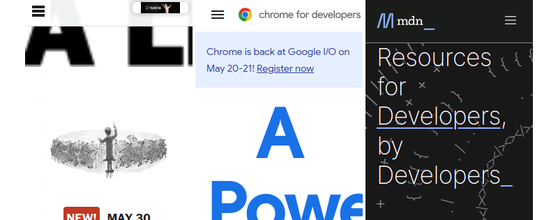
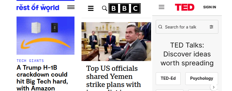
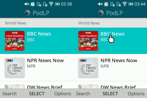
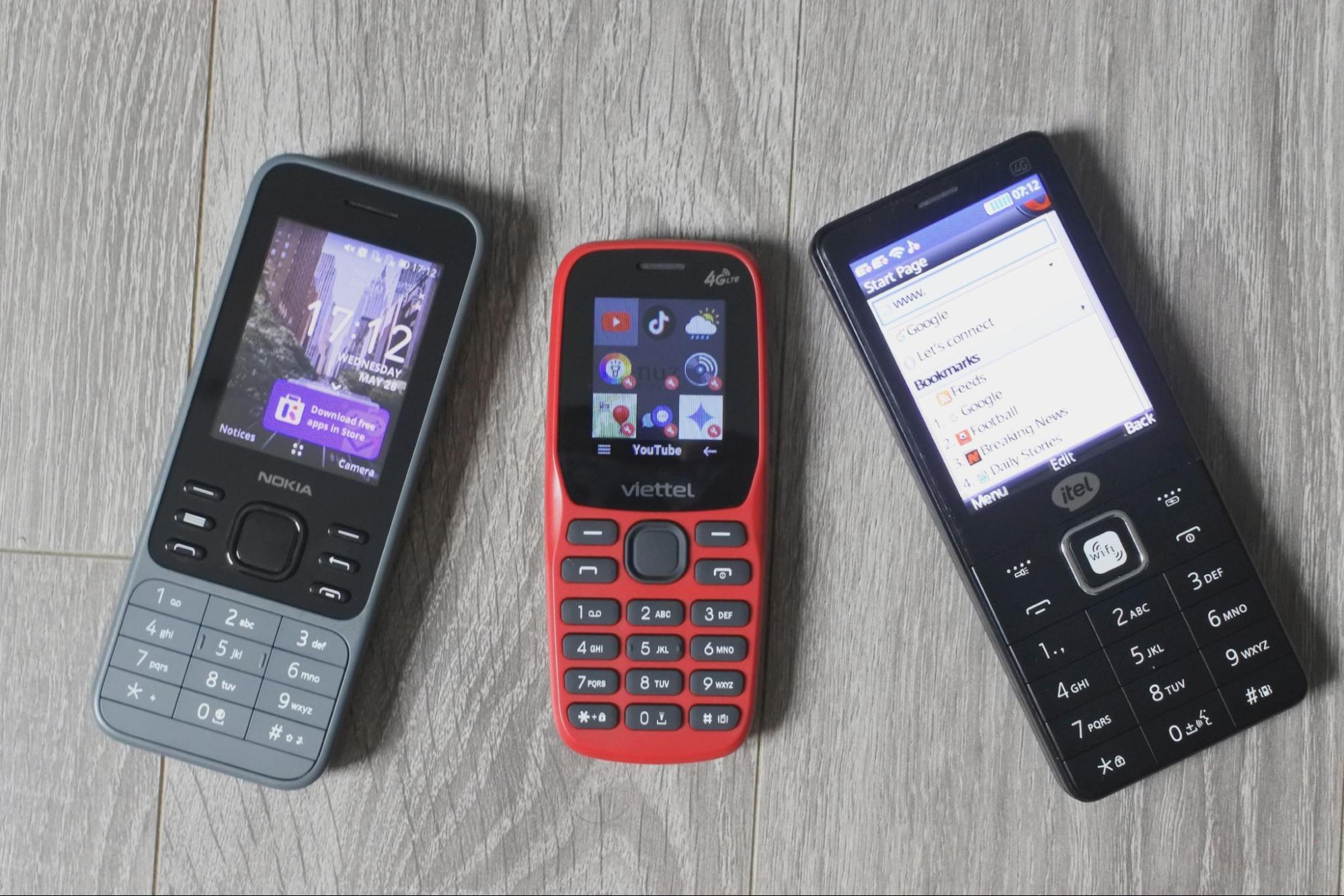
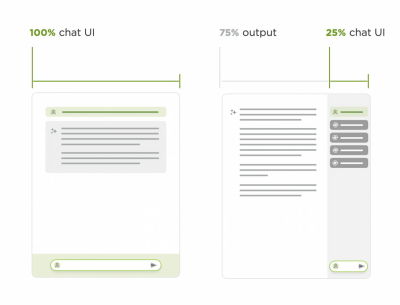
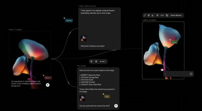
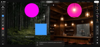

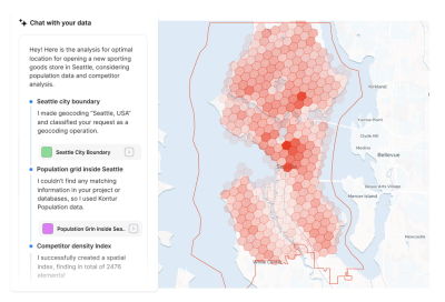
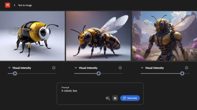
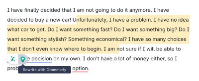
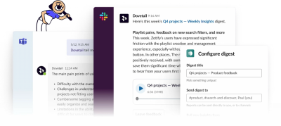
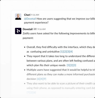

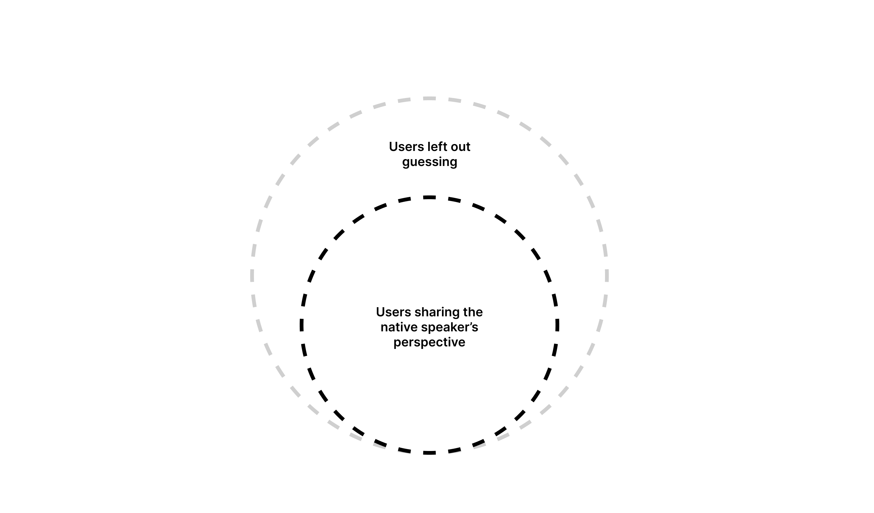
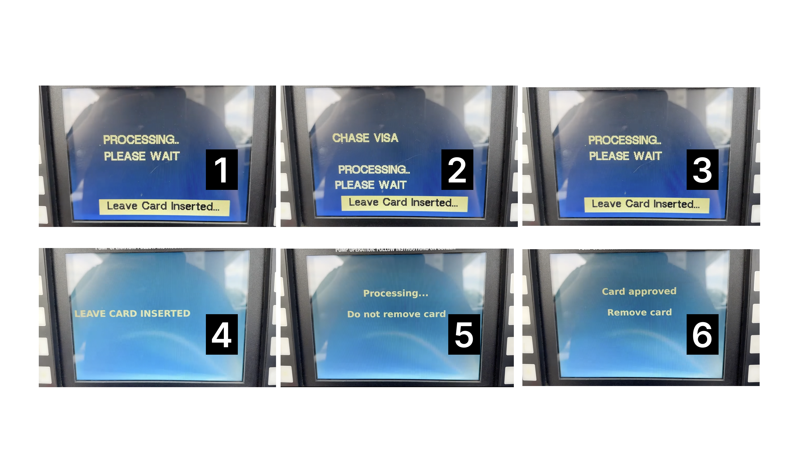
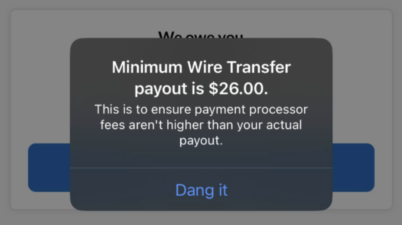
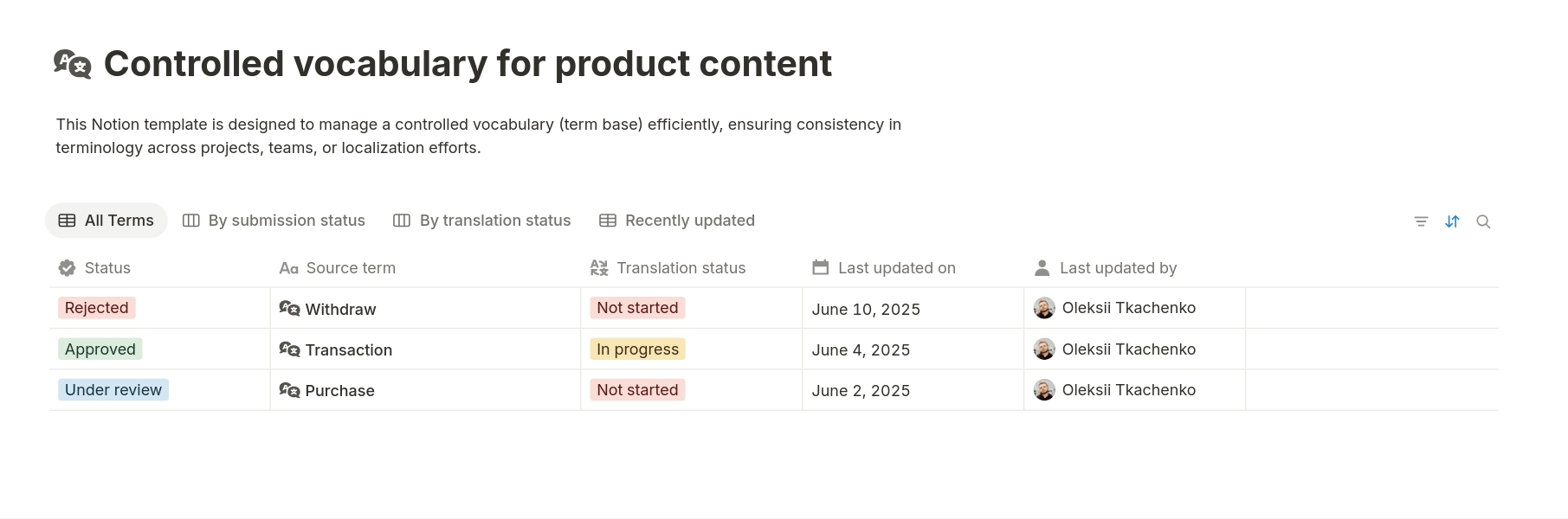


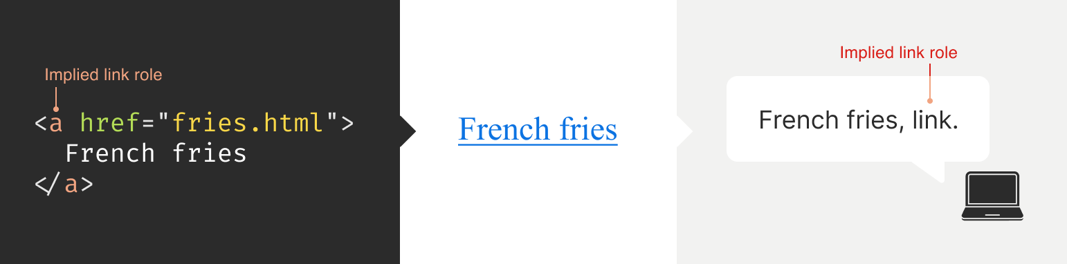


