⭐ If you would like to buy me a coffee, well thank you very much that is mega kind! : https://www.buymeacoffee.com/honeyvig Hire a web Developer and Designer to upgrade and boost your online presence with cutting edge Technologies
Showing posts with label Storytelling. Show all posts

Monday, April 3, 2023

Five Steps To Design Your Product With Powerful Storytelling


I can’t imagine the digital world without the magic of storytelling. While I consider storytelling as an art, it is also a discipline that has its roots in Ancient Greece and Aristotle’s writing: Poetics:

“A whole [story] is what has a beginning and middle and end.”

In this essay, the Greek philosopher identified for the first time the three main components of a story: beginning, middle, and end, and how they each related to one another.

“A beginning is that which is not itself necessarily after anything else, and which has naturally something else after it. An end is that which is naturally after something itself, either as its necessary or usual consequent and with nothing else after it. And a middle, that which is by nature after one thing and also has another after it.”
Aristotle’s three act structure
Aristotle’s three act structure (Large preview)

Aristotle’s three-act structure has remained unchanged since 300 BC. Although many writers, screenwriters, and film directors have conducted a variety of complex experiments, the most successful stories never stray from this basic root.

Today, designers use the same structure to map user experiences and design user-centered products. A remarkable and memorable example of the power of storytelling is the change in Apple’s direction of communication on Steve Jobs’ return. He had spent some time running Pixar, and his experience with the company’s storytellers was essential to what happened next at Apple: the belief that by focusing on customers’ needs and tapping into their stories, they would sell more computers. (They did, of course!)

However, designers cannot become good storytellers by using Aristotle’s three-act structure alone. We must also identify specific storytelling elements to help develop our narrative.

In the following five steps, we will tap into each of the different elements of storytelling, with a running example of the approach I used to design the experience and interface behind the video course landing page.
Smart Interface Design Patterns
Meet Smart Interface Design Patterns, our new video course on interface design & UX.

Step 1: Understand Your Protagonist And The Purpose Of The Product #

As designers of experiences, we need to build beautiful interfaces that create meaningful interactions with our audience. So before imagining the layout of the landing page, I needed to find an answer to a critical question: who is our protagonist?

The protagonist is the hero of our story. The story, therefore, is never about the product we sell. It is always about the protagonist, who reflects the audience’s own interaction with that product.

So to answer the first question, we need to know our protagonist’s needs, goals, fears, and frustrations. This is the rule number one for every UX designer, just as it is for any storyteller.

When you need insights about your protagonist, you can use a set of questions to conjure a most likely persona. If the product already exists in the market, you can use other research tools, like usability testing or heat maps. In my case, Vitaly Friedman, the creator of the video course, had already identified his target ahead of time, during the workshops and conferences he had completed in the past year.

Watching the video chapters of the course, I understood that our story’s protagonists would be UX and UI designers with a beginner to advanced level of knowledge about design and interface design patterns.

The frustration of these protagonists is usually the lack of time to research and learn. Specifically, those who are trying to fully embrace the world of UX design wish to learn design patterns quickly, so they can figure out the reasons why one might offer a better experience than another. On the other hand, a more experienced target group doesn’t have time to stay updated with the latest UX best practices between projects.

A scheme of two personas for the landing page: young and experienced target
Our story’s protagonists: UX and UI designers (and students), with a basic to intermediate level of knowledge about design patterns. (Large preview)

Our protagonists’ needs and story, therefore, define our story’s purpose: Why does this story matter to them?

Defining the why of the story is always a challenging step of storytelling. It only becomes easy once you know your protagonist well. The audience will only stick around if the story resonates with them. Additionally, a story without a clear purpose is hazy and irrelevant, so the story’s intention must be defined upfront.

Re-articulating Simon Sinek’s Golden Circle, a stickable story needs to know the purpose of its existence, i.e. the audience problem it is trying to solve (why), what sets it apart from others (how), and at the end, the product and service it is selling to solve the problem (what).

This is what the Golden Circle looks like when applied to the experience design for the landing page:
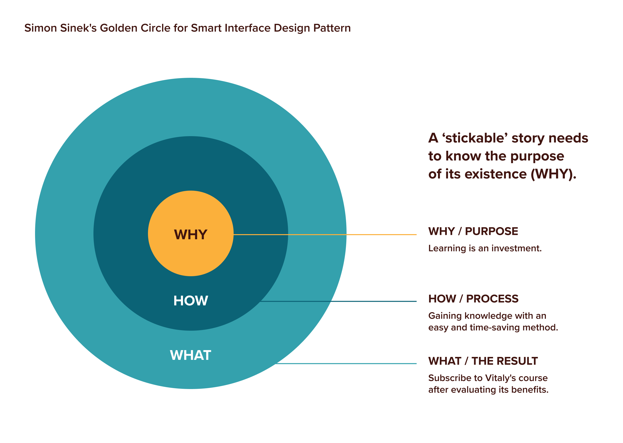
A scheme of the Golden Circle for the video course
Why does this story matter to them? Always find your story’s purpose. (Large preview)
  • The why of our story tapped into our protagonists’ frustrations about the lack of time. So our story is first about communicating that learning is an investment. Secondly, through Vitaly’s own experience and research, they will save time and effort.
  • The how reflects on their learning goals and staying up to date: if they are hungry for knowledge, they will be satisfied.
  • The what is a reflection on the WHY and HOW. We want people to subscribe to the video course only after evaluating its benefits and tasting the material (adding some valuable features during navigation with free samples, previews, extra gifts, and persuasive elements, like testimonials).

The protagonist and the purpose are the elements that propel us to the next step of our narrative: the plot.

Step 2: Define The Structure Of Your Narrative #

Aristotle teaches us that stories must be a chain of cause-and-effect moments. Each scene must lead to what happens next and not work as a standalone episode, no matter how attractive and well-executed it is. Remember, the plot must also have a beginning, middle, and end.

In his book, Building a Story Brand, Donald Miller examines the cause-and-effect structure as follows: a protagonist aims for something, but in her quest, she encounters a problem. During her journey, a guide steps into her life and shows her a plan that invites her to action. By acting, the protagonist will avoid failure and end her story in a success. He calls this structure the StoryBrand Structure.

The StoryBrand
The StoryBrand structure as explained by Donald Miller in his book, Building a Story Brand. (Large preview)

For every project, whether a digital product or brand design, I combine Miller’s StoryBrand format with Aristotle’s three-act structure to convey a clear sense of continuity throughout the narrative.

The StoryBrand combined with the 3-act structure
Combining Miller’s StoryBrand format with Aristotle’s three-act structure conveys a clear sense of continuity to the narrative. (Large preview)

Then I work on each act individually, analyzing every element of the narrative.

The Beginning #

The beginning, also known as the first act, is the setup.

In UX design, this is the moment where we meet our protagonist (the hero) with her problems and goals, as analyzed in the previous step.

At the end of Act I, our protagonist meets a guide. The guide is not another hero. They simply act as a helping hand, showing the protagonist how to move forward in her transformational journey. You could use the plot of your favorite movie as an example of how this occurs.

Here’s an example from my own favorite childhood movie, The Neverending Story. The child-protagonist, Bastian, is neglected by his father and bullied at school (problem). Trying to escape the bullies, Bastian enters a bookstore, annoying the bookseller (the guide) who is reading an interesting book that is not for children. Secretly, Bastian takes the book, titled The Neverending Story, and reads it in the school’s attic.

The book describes the fantasy world of Fantasia, which is slowly being devoured by a malevolent force called “The Nothing”. The Childlike Empress, who rules Fantasia, has fallen ill, and the young warrior Atreyu is tasked to discover a cure, believing that once the Empress is well, The Nothing will no longer be a threat.

Bastian soon understands that the book he is reading will save Fantasia from disappearing (the plan), and he needs to give a new name to the princess (Action) to help Atreyu win his battle against The Nothing (avoid failure). Then, he will save the Childlike Empress and her Empire (success).

An image of StoryBrand applied to Neverending Story
Combining the StoryBrand and the 3-act structure of Aristotle for the plot of my favorite childhood movie, The Neverending Story. (Large preview)

So, when identifying the guide of your story, whether a person, a service, a product, or a brand, ensure it is someone the audience will trust and follow because they feel understood and in safe hands. The guide’s inner qualities are empathy and authority, which should be reflected in every communication material they share with their audience.

In the landing page example, our story’s guide is Vitaly Friedman. Investigating his profile, I established a past of remarkable work sharing resources and best practices in Smashing Magazine and many conferences, workshops, and online. On social media, Vitaly has built a strong reputation in his community as a UX expert and extremely knowledgeable in this field. He, therefore, possesses all the traits of a guide.
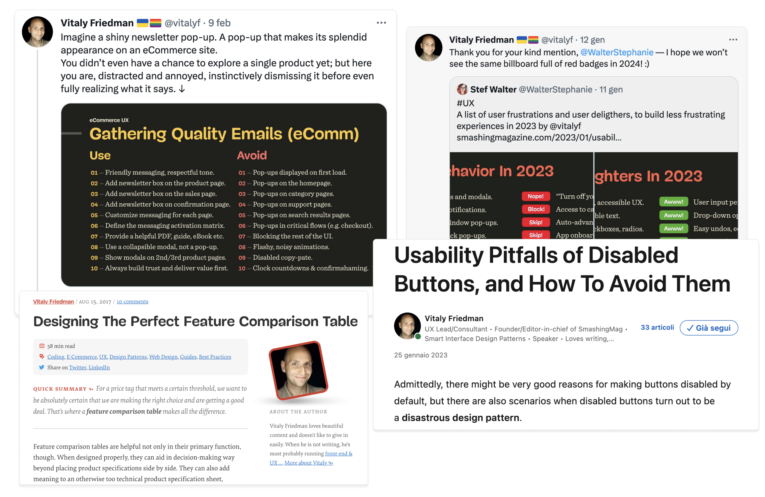
Sharing some screenshots of Vitaly’s recent tweets and blog posts
From Twitter to Linkedin and Smashing Magazine, Vitaly has been active in the field of web design and UX for more than 15 years. (Large preview)

The Middle #

The middle, also known as the second act, is the confrontation. In this specific part of the story, we assist the transformation of the protagonist and her emotional state (this transformation is also known as the character arc).

At the beginning of the second act, the guide gives the protagonist a plan. The question the protagonist expects the guide to answer is, “What do you want me to do now?”

In the middle of The Neverending Story, we discover that Bastian needs to follow a precise plan: he needs to give a new name to the Childlike Empress to prevent the dissolving of Fantasia.

So the plan needs to be clear, highlighting every step and removing any sense of risk or doubt that our protagonist may have in considering it. By giving your users a plan, you set a clear path to help them move forward in their journey.

In the case of the landing page, I asked Vitaly to list the content of his offer and explain the simple steps that must be taken to subscribe to the available plans. I then underlined the unique values and the plan for each subscription and designed a simple overview.
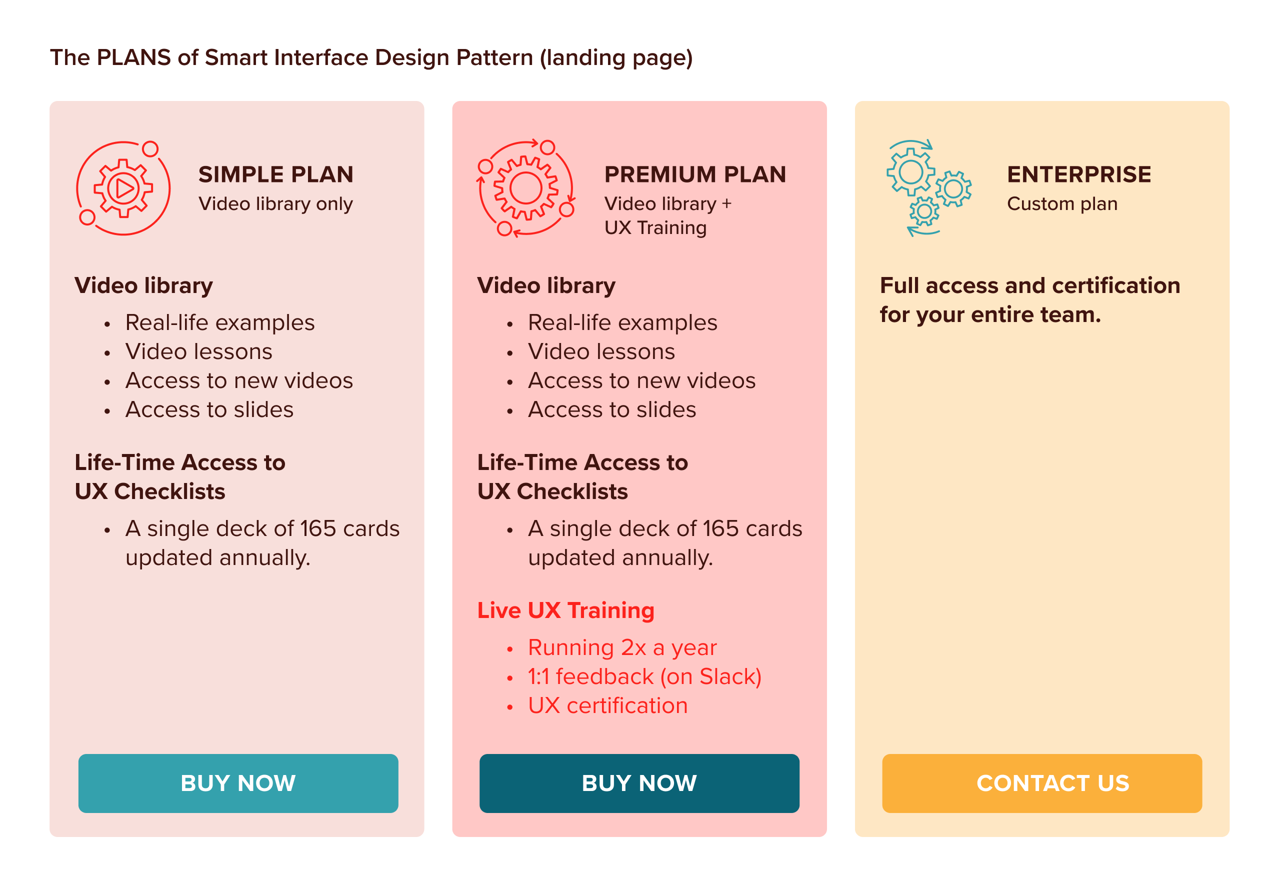
A scheme of the available plans, with the course content listed and the differentiation between the two plans. Also, present a third plan for a license available for big teams with direct contact
The content of the different offers, with available and possible actions. (Large preview)

At the end of the second act, the guide must clearly communicate what action the protagonist needs to perform with the plan.

In The Neverending Story, the protagonist Bastian is in complete disbelief that he is part of the solution, and moved by the Empress begging, he calls out the new name, running to the attic window to call out “Moon Child”.

In the same way, when we sell a service or a product, we need to invite the users to take a journey with us, just as we have via the landing page. If we plainly tell them, they will know what to do with our well-laid plan.

Vitaly invites the audience to act in two ways. One is a direct call to action through a “Buy”-button that is positioned on different parts of the landing page. The other is a transitional call to action through free video episodes, email newsletter and content samples.

Transitional actions also come in other forms:

  • testimonials from other experts in the field, and
  • unlimited access to the UX checklists, an elegant deck of 165 cards to learn and recall basic design patterns for successful digital experiences.
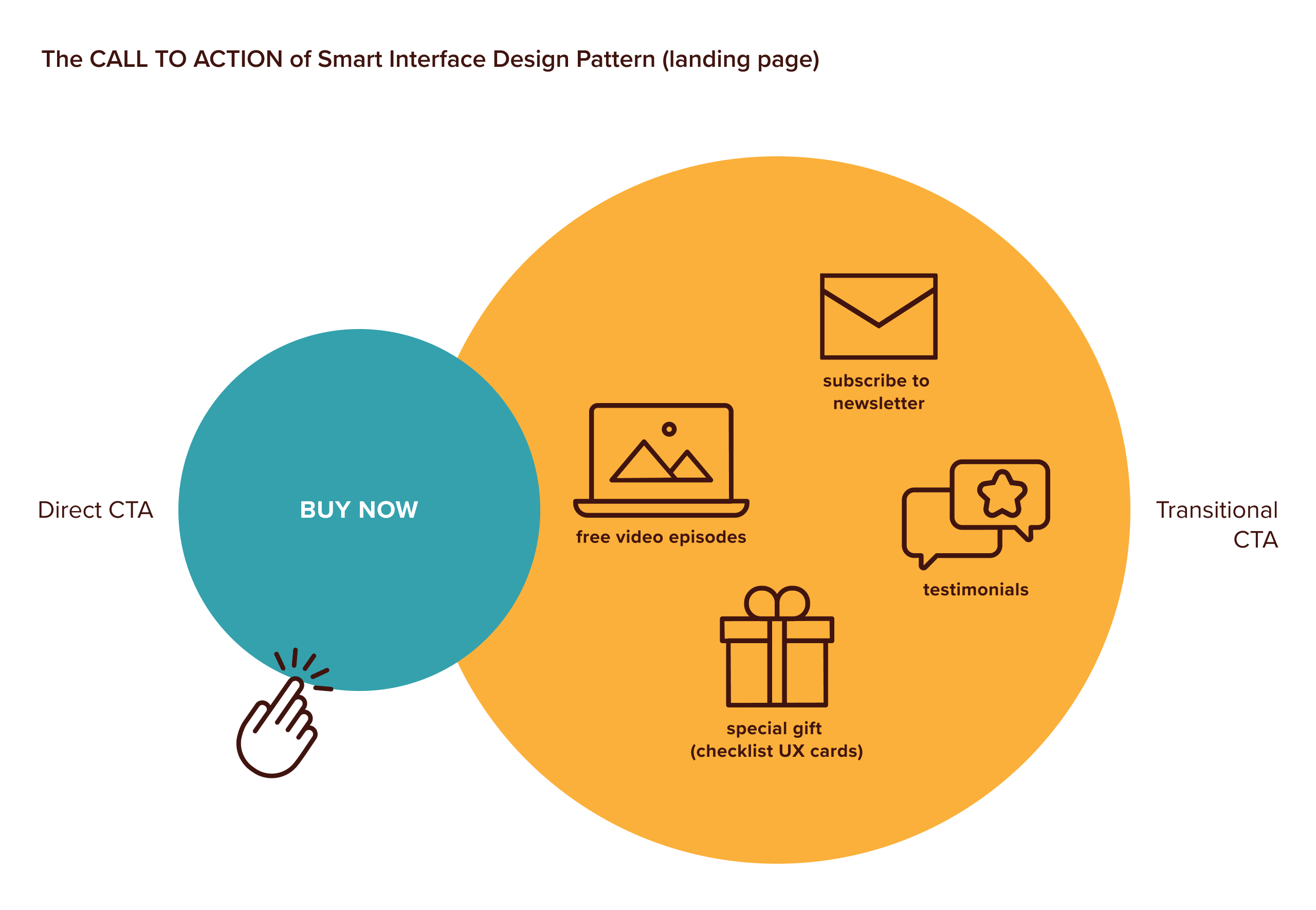
A scheme of the call to an action divided by direct and transitional
Two ways to invite the users to take a journey with us: direct and transitional actions. (Large preview)

The End #

The ending is the story’s third and final act.

It is here that we will decide how our protagonist will succeed in her goal or avoid failing. In doing so, we need to achieve the peak of our story or climax by specifying what’s at stake if the user (or the protagonist) doesn’t engage with us.

It is essential to find the right balance in how we introduce negative consequences, so we can avoid generating fear that will parallyze and freeze the protagonist from moving forwards in her journey.

In The Neverending Story, when the Childlike Empress begs Bastian, she tells him that Fantasia will disappear without his help, and so will his favorite hero, Atreyu, and his dragon Falkor. She taps into Bastian’s wishes of belonging to something bigger than himself, thereby proving that he is worthy. This a desire we sense the protagonist seems to aspire to since the beginning of the movie when he seeks his father’s attention or tries to escape his bullies.

For the video course, we remind the user that she can only become an expert after a while and that it would probably take many years of research and reading and studying to become good at UX. So why not build the knowledge on top of well-explained, curated foundation and jump into a course with Vitaly, who has “cooked” the best recipes and bulletproof design patterns over 15 years?

We should remember that our story’s goal is to motivate our users to become better versions of themselves, and that they need only start this journey with us to achieve such an incredible transformation!

For this particular reason, the third act is also called the resolution. When designing a user journey, we also define a list of resolutions to the protagonist’s problem. In designing the user experience for the landing page, the list was created from a mix of status and inspirational resolutions:

  • Self-improvement: Become an influential and more knowledgeable UX designer, and receive a UX certificate.
  • Networking opportunities: Join an advanced UX workshop where you will meet Vitaly, get feedback from him personally and work with other designers around the world.
  • Improve the web: Work confidently towards designing better digital experiences on the web.

These resolutions were presented in different parts of the landing page to remind the user why she is on this journey with us, and where we wish to take her.
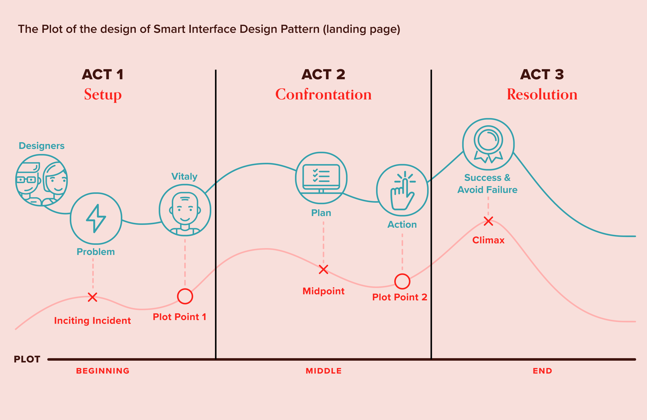
The StoryBrand for SIPD with acts and different acts and StoryBrand elements together
The plot of the Smart Interface Design Patterns with both the 3-act structure and the StoryBrand. (Large preview)

Step 3: Connect The Plot With A Wireframe #

Now that all of the story elements are in place, it is essential to understand how they will fit together and connect on the landing page. I usually think about each page of the website as a single shot with its beginning, middle, and end scenes. Many of these shots make a scene, and a series of scenes make an entire website or application.

Showing the landing page’s general structure and the division in the beginning, middle and final shot and how it relates to scenes and sequences
The structure of a plot divided by acts, sequences, scenes, and shots. (Large preview)

Following the plot I created in the previous step, I started out by organizing the content and adding critical plot points.

Plot points in dramaturgy are incidents that directly impact what happens next in a story. When used well, they help the protagonist move forward in her journey. In UX, the plot points work precisely in the same way. They are actions (for example, “buy now” buttons), barriers (logins or forms to fill), delights (unexpected interactions or free samples), system events (confirmation messages and emails), and triggers (notifications) that the user needs to perform to move forward in their journey.

A scheme of the most common plot points in UX Design
The most common plot points that the user needs to move forward in their journey. (Large preview)

Using a simple piece of dotted paper, I usually start sketching how my story’s content will ideally be displayed between the different parts of the page. You may wonder about the mobile-first approach at this point. When designing an experience as we are doing right now, what matters is ensuring it is consistent with our story and that it can be replicated on every media, no matter the pixel size or the support used.

So if you wish to start with mobile or a large screen, our aim is to define the user journey in a way that could be transformed into an interface for the landing page (as in our case), in a leaflet, or in a marketing campaign.

Opening Scene #

The opening scene sets up the story’s premise and is the first element of the page that the user will see, regardless of which website or application she lands on. The upper area of the page presents the product or service to the audience.

We wanted to induce curiosity in our protagonist in this specific part of the page. For this reason, the content needs to be engaging and compelling, prompting the user to scroll down for more. I would add a trigger that actively invites the user to “scroll down” to the next part of the shot, the middle scene.
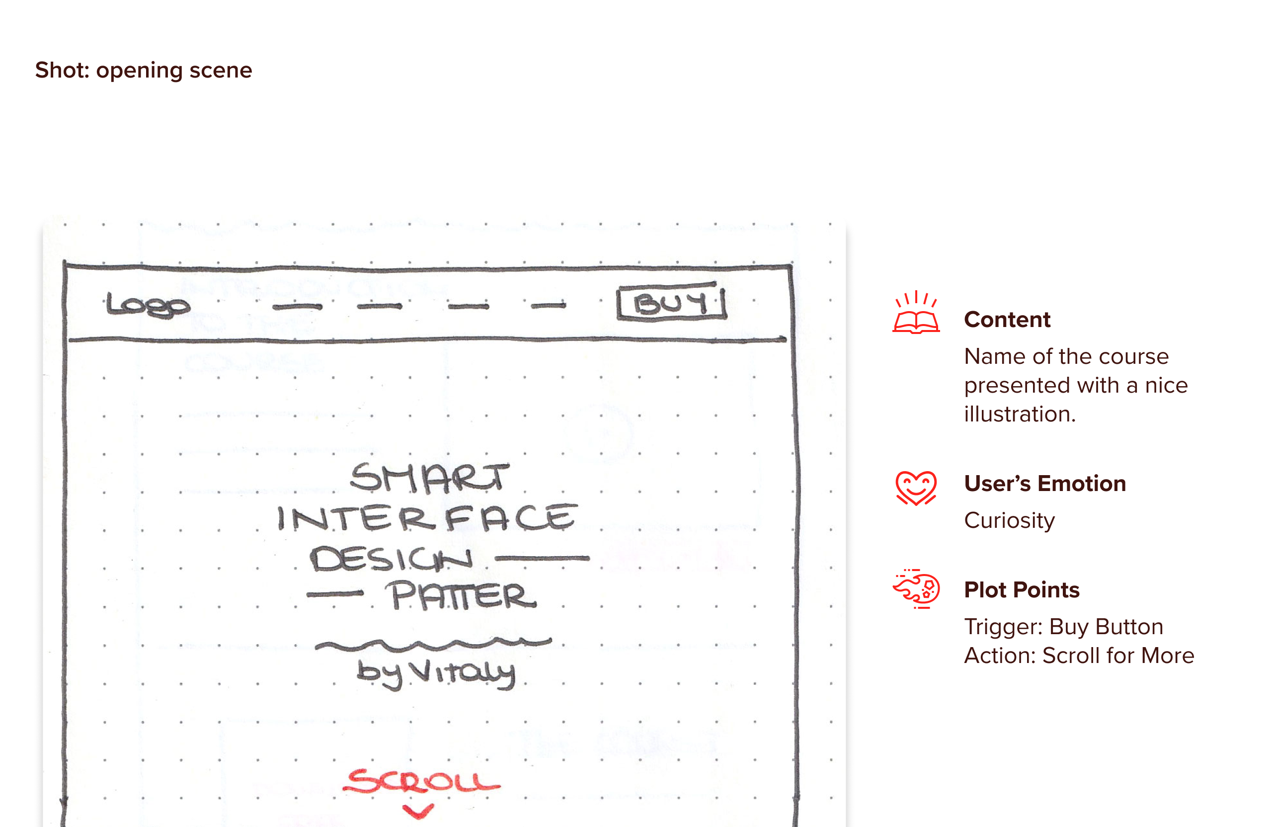
Zoom into the opening scene and define: content, emotion, and plot point
The opening scene sets up the story’s premise. (Large preview)

Middle Scene #

The middle scene of our shot is the place where most of our narrative will happen. We will introduce our protagonist to the guide, the plan, and the action we wish them to perform. There will be a section that explains the video course and the content in full detail, with content samples and other elements that will help users better understand and explore the video course.

To build authority and trust around our experience, we do not simply introduce Vitaly but also a series of testimonials from other experts. Our protagonist is no longer curious but armed with relevant information! She needs a clear reason to engage with our product. For this reason, any action or plot point added should satisfy this specific emotional aim.

Zoom into the middle scene and define: content, emotion, and plot point
The middle scene is the place where most of our narrative will happen. (Large preview)

Closing Scene #

The closing scene is the resolution of our plot.

As previously explained, we offer two plans that evoke two specific outcomes; we are not simply asking which plans our protagonist wants, but what kind of transformation she is aiming for. Here the user is mindful, so we need to ensure nothing distracts her from the decision-making.

So in this specific scene, the “Buy”-button is the one and only action we wish our user to focus on.
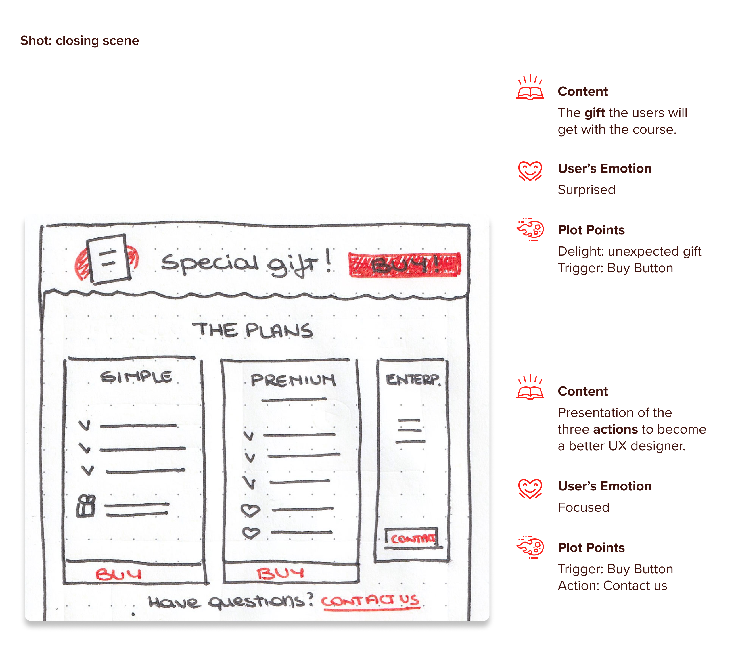
Zoom into the closing scene and define: content, emotion, and plot point
The closing scene is the resolution of our plot. (Large preview)

The footer and the top navigation are complementary elements of our narrative. The navigation facilitates the journey, while the footer provides more engagement in case our hero needs additional time to decide or wishes to join the larger community that Vitaly is serving.

With content, plot points and user’s emotion in the header and footer navigation.
Header and footer: complementary elements of the narrative. (Large preview)

Step 4: Add Emotional Connection To Create A Memorable Story #

The first three steps focused on the user journey and page content. In this step, we think about making the story memorable for our users. Otherwise, our landing page will look like any other random page!

Emotional connection is an essential part of the storytelling process and can be conveyed through visual elements like colors, sounds, illustrations, animations, and images. These play a huge role in motivating and giving intention to the actions taken by the user.

To find the central theme of our landing page, I focused on critical elements and designed a map with keywords to help me create a forced connection, another wonderful aspect of storytelling that is based on combining disparate functions, materials, or processes.

This process is used to generate disruptive ideas and original concepts:

  • Our users’ needs (hungry users): learning fast, getting the best lessons in UX, and hungry for knowledge.
  • The set (kitchen): a friendly and informal kitchen.
  • Vitaly’s role (chef): experienced teacher, UX expert and guide.
  • The tools (recipes): real-time examples, blackboard, notes, video courses, and slides.
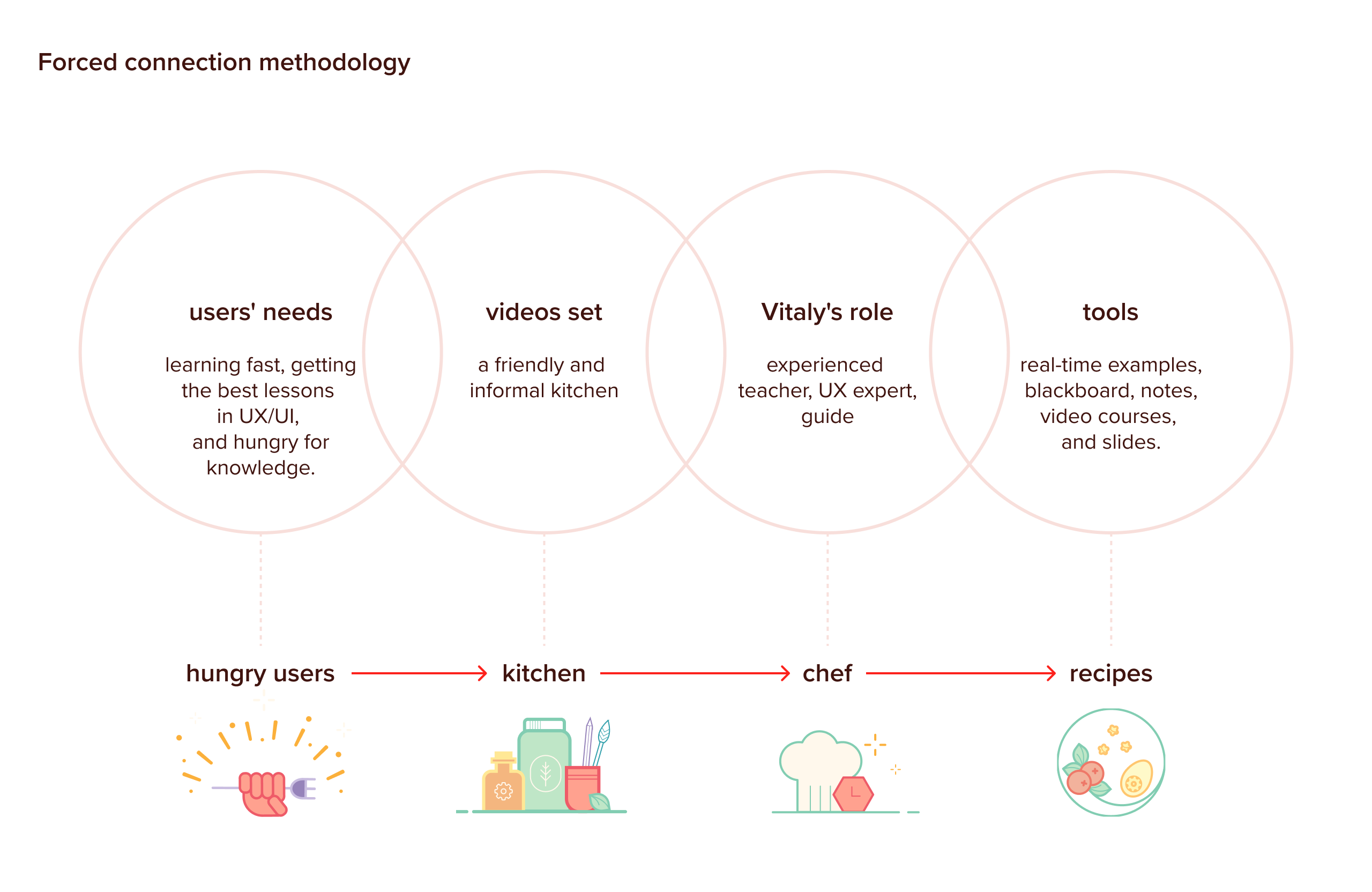
A map of the different keywords divided by the four elements: user, set, Vitaly, tools, and a horizontal line that transform these elements to food-related things
A map with keywords, processes and materials to help me create a central theme of the landing page. (Large preview)

These elements all remind me of a well-designed food experience conveniently delivered right to your door: our “knowledge-hungry” users can follow Vitaly’s recipes (the videos) at their own pace. Each recipe has been prepared and cooked by Vitaly, packed with the best nutritional elements (tips, tools, examples. slides, and so on) that create strong and compelling designs.

The color palette is a mix of inspiration from the blackboard that opens each episode of the course, the primary red of the Smashing Magazine theme, and the wonderful video course illustrations by Guillaume Kurkdijan.

Colour palette and values associated with each color
The color palette is a mix of inspiration from existing elements (the blackboard, the Smashing Magazine red color and the illustrations of Guillaume Kurkdijan). (Large preview)

I then used the previous wireframe and enriched it with sketches that could complete and clarify the scene. These sketches served as a blueprint for the final illustrations.

Sketches of the illustrations
Some sketches on paper of some of the most critical illustrations used on the landing page. (Large preview)

Opening Scene #

A rich starter to introduce some of the design patterns taught in the course is accordion UX (the spring with fish), reviews and ratings (stars), cookies (the biscuit), hamburger menu (the spaghetti), adding personality to the web (salt and pepper).

The illustration matches the user’s emotional state, curiosity, by surprising her with an unexpected food theme.

The main motive of the page explained
The main illustration that steals the scene. (Large preview)

Middle Scene #

We decided to introduce Vitaly with images showing him involved in teaching, while the course chapters are like cookbooks on the shelf, shown through a carousel.
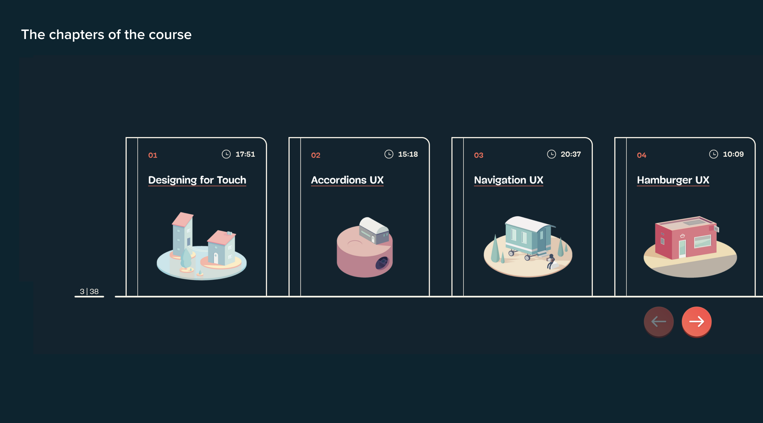
Details of the pictures chosen for Vitaly by showing the design of the slider with books
Chapters are presented like cookbooks on the shelf. (Large preview)

My favorite illustration is the Buddha Bowl, which is used to introduce all the content provided during the course. This illustration satisfies our protagonist’s need for more information. It is interactive so that from the ravioli to the small bottle of oil, the audience can explore the nutritional elements that make this course so unique and flavourful!

The Buddha Bowl explained
A delicious Buddha Bowl to introduce the content of the course. (Large preview)

End Scene #

Three small illustrations introduce the available plans that tap into the resolutions we mention in step 2. The illustrations for each plan are relevant to the plans but presented small to avoid interfering with the focused state of our protagonist.

An illustration for Sous Chef, Master Chef and Enterprise
What kind of transformation are you aiming for? The illustrations tap into the resolutions. (Large preview)

An empty bowl suggests that our users have now eaten a part of the content, but if they are still hungry, there are more ways to engage with Vitaly.
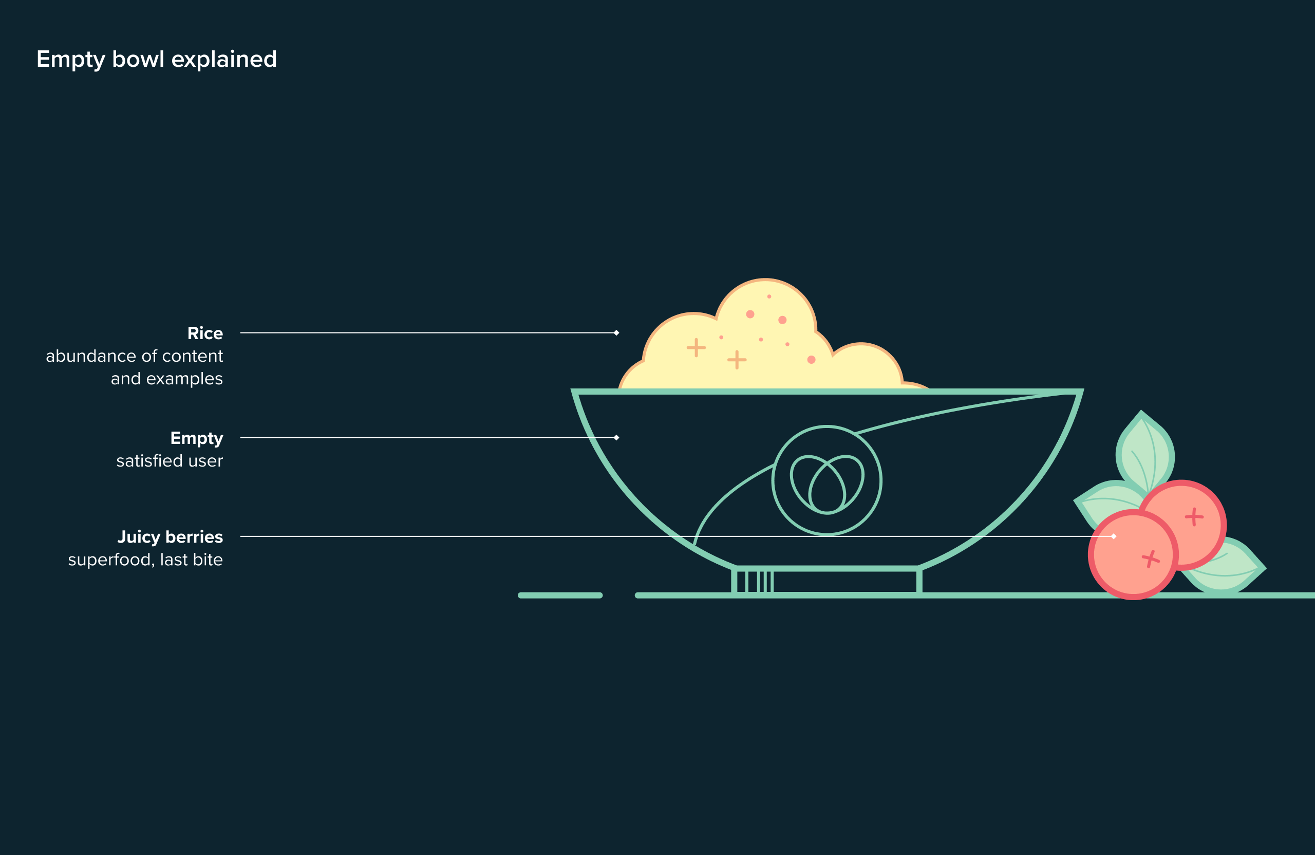
An empty bowl being shown in the footer
Still hungry? The final illustration of the landing page suggests there is more to “eat”. (Large preview)

Additional small illustrations, all food related, introduce the different sections of the landing page and their content. Talented animator, Cassie Evans, brought these illustrations to life with subtle animations so that the entire landing page is playful and appealing.
A grid with small illustrations and the chapter they refer to
Different illustrations that introduce the different sections of the landing page. (Large preview)

Step 5: Test Our Narrative Before Engaging With Our Customers #

Before presenting an idea to customers, I usually follow a detailed check to ensure that the final design still represents the user’s story, as outlined during the previous steps.

Some of the questions I ask myself are the following:

What Primary Action Do I Want The User To Take On This Page? #

The answer references the story element action. I usually check if there are enough plot points, like buttons and triggers, on the page to engage the user at different stages of her journey.

Underline the different CTA buttons with BUY NOW available on the landing page
Direct action: the Buy-button. (Large preview)

What Secondary Action Do I Want The User To Take? #

This answer relates to the transitional actions, which means anything that invites the user to engage with us in other ways before they click the “Buy”-button.

Underlining the different transitional actions on the page
Different transitional actions available on the landing page. (Large preview)

How Am I Supporting The Need To Scroll For More Details? #

In this case, my attention switches to the plot and the cause-effect element that define the narrative. Looking at the structure laid out in step 2, I check if the scenes included in the landing page still follow the logic of the user’s journey and if there are enough plot points to carry the narrative.

Dividing the mockup into the different acts and underline the StoryBrand elements presentation of the problem and the eventual solution, the guide, the plan, and the action
Other plot points that carry the narrative. (Large preview)

Does Any Content Distract The User, Or Prevent Her From Completing Her Task? #

This question focuses on the clarity of the message and our resolutions. In general, each page should focus on a specific outcome. Anything that blurs our intentions should therefore be removed.

Different parts of the landing page refer to our three resolutions, with the entire page built around them.
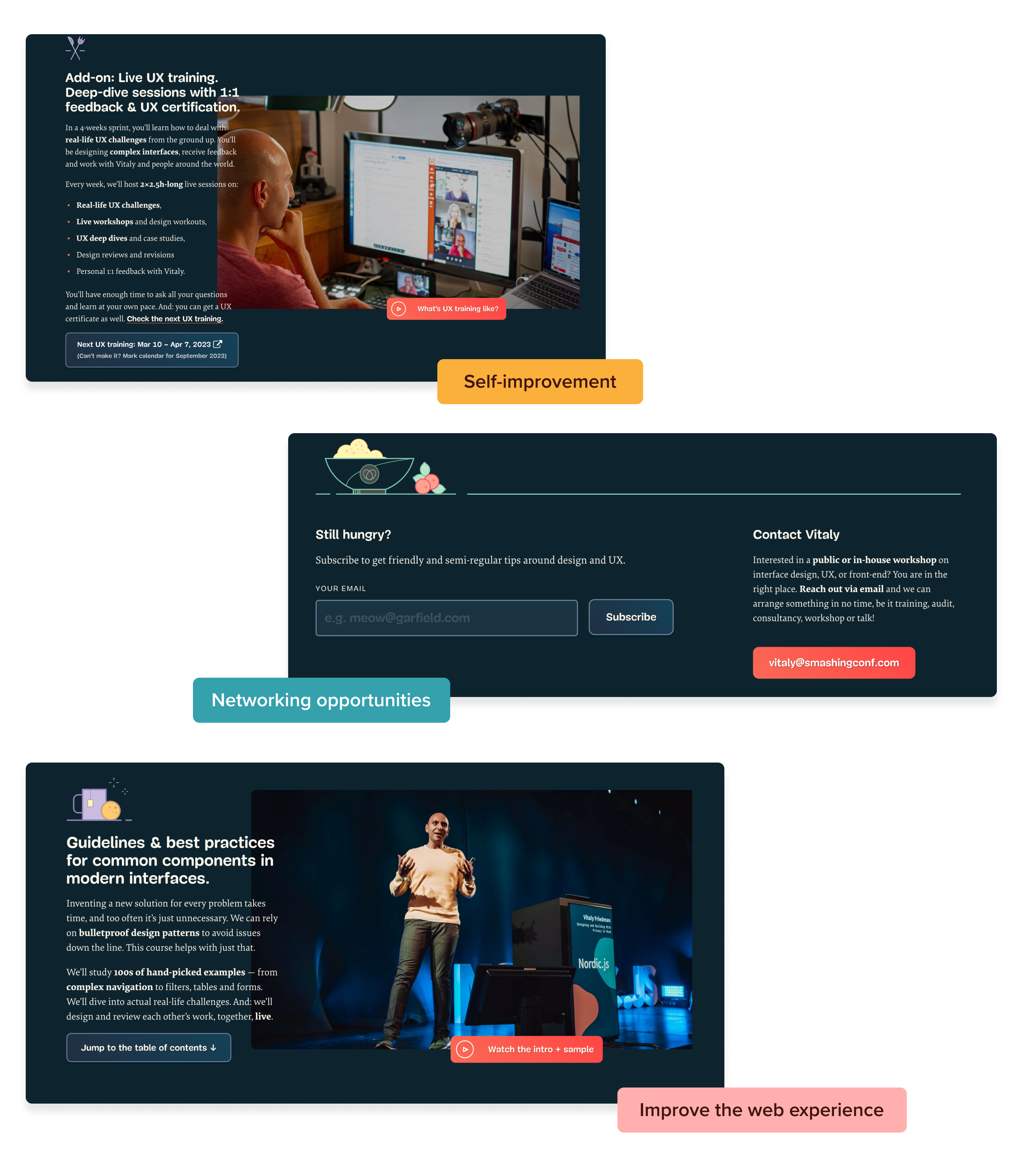
Underlining the different resolutions on the page, Self-improvement: live UX training section; Networking opportunities: meet Vitaly, footer connection link, newsletter; Improve the web experience: introduction, special plans
Different parts of the landing page that refer to our three resolutions. (Large preview)

Can We Anticipate The Final Action? #

The answer to this question usually relies on the user’s ability to jump into the climax of the story quickly, to the action (in our case: available plans with “Buy”-buttons). Think about fast-forwarding your favorite movie to get to the most thrilling scene or leafing to the last page of a book to discover who the killer is!

In the case of a landing page, the “Buy”-button is at the beginning of the navigation and follows the user as she scrolls… so she can jump to the story’s third act at any time she likes.

BUY BUTTON at the above-the-fold section and in both mobile and desktop view navigation
Both on desktop and mobile views, the user can jump into the climax of the story quickly! (Large preview)

Conclusion #

As we have discovered, storytelling is more than just another business buzzword. Storytelling is an exciting and strategic approach with rules and clear principles that, when used well, can help brands stand out from the crowd with a clear message and a user-centric approach. It’s an essential skill that designers should embrace, no matter their specialization or profile.

As such, the different steps I have illustrated will help you to:

  • Identify your protagonist and build a powerful, purposeful story that speaks to their frustrations and goals.
  • Create a user journey that directly relates to the protagonist’s story.
  • Structure that journey as a wireframe to identify your chosen story content based on the narrative structure.
  • Create an emotional bond with the user by adding meaningful illustrations.
  • Check the story’s narrative with questions that evaluate your use of the wider storytelling process.

Precisely as it occurs in the world’s most acclaimed movies, building a solid narrative structure guides you in creating scenes and chapters that are consistent with the user’s own story.

In this way, you can use the plot of a solid, recognizable, and popular narrative as a base from which to create additional scenes and chapters, and even successive sequels — as a great many movie franchises have achieved with thrilling effects.

In fact, the same plot illustrated in this post for the landing page helped me to create a warm and instantly recognizable design for Vitaly’s upcoming secretive new project. Still, as the narrative voice of The Neverending Story reminds us, “that is another story, and shall be told another time!”

Monday, May 9, 2022

How To Use Storytelling In UX

 Storytelling is a powerful tool for any UX designer. It helps create a product and understand the people who use it. In this article, Marli Mesibov takes a real-life example of an app she helped to build in 2017 and explains five steps you can use to help you build a story into your user experience.

As human beings, we love stories. And stories come in all shapes and sizes. Children love fairy tales; teenagers ask “and then what happened?” when their friends recount gossip; history buffs explore biographies for insight into famous personalities; science lovers enjoy documentaries that offer explanations of the world around us; and everyone likes a satisfying conclusion to a good workplace drama or romantic exploit — be it fiction or fact.

We tell stories in our day-to-day lives. In fact, according to Scientific American, 65% of the conversation is stories! They’re in commercials to grab attention, in nonfiction books to make learning more personal, and in meetings — think of how storyboards help sell management on new product features. Magazines and news shows also tell stories rather than simply listing facts to make readers and viewers care about the information.

This is why, to quote Conversion Rate Experts on websites:

“You cannot have a page that’s too long — only one that’s too boring.”

We use storytelling skills to create positive user experiences as well, though it looks a little different when a story is a part of a product. Learning how to tell a good story with a digital experience will help people care about and engage more deeply with the experience. What’s more, using the same concepts that help create a good story will help you build a better product. A good story will influence marketing material, create a product that fits into the user journey, and highlight the opportunities that need more descriptive content or a more emotional connection to the end-user.

In this article, we’ll go over five steps to building a good experience using the steps an author uses. For consistency’s sake, we’ll also look at a single product to see how their choices can be evaluated through the five steps. I’ve chosen Sanofi’s Rheumatoid Arthritis Digital Companion, an app I helped to build in 2017. This product is a beneficial example to follow because it followed best-in-class storytelling practices, and also because it is no longer available in the app store, so we can look at it at a moment in time.

But before we get into any of that… why does storytelling work?

Why Does Storytelling Work?

In “Thinking, Fast and Slow” (Ch. 4, The Associative Machine), psychologist Daniel Kahneman explains how our brains make sense of information:

[…] look at the following words:

Bananas Vomit

[…] There was no particular reason to do so, but your mind automatically assumed a temporal sequence and a causal connection between the words bananas and vomit forming a sketchy scenario in which bananas caused the sickness. As a result, you experience a temporary aversion to bananas (don’t worry, it will pass).

Kahneman refers to the mind “assum[ing] a temporal sequence and a causal connection” between words. Put another way, even when there is no story, the human brain makes sense of information in two ways:

  • Temporal Sequence
    Assuming things happen linearly, or one after another.
  • Causal Connection
    When one thing causes another to happen.

Hubspot’s “Ultimate Guide to Storytelling” says the same thing as Kahneman, in a more readable way:

“Stories solidify abstract concepts and simplify complex messages.”

Our brains are built to find and understand stories. Therefore, it’s no wonder that a story can improve UX. UX is all about connecting an experience to a person’s mental model.

But writing a story is easier said than done. A story is more than just a list of things. It requires the “causal connection” that Kahneman referenced, and it must be emotionally charged in some way. Let’s review five steps that authors use which will also help you build a story into your user experience:

  1. Choose your genre;
  2. Create context;
  3. Follow the hero’s journey;
  4. Revise, revise, revise;
  5. Write the sequel.

Step 1: Choose Your Genre

Let’s forget about UX and digital products for a moment. Just think about your favorite story. Is it a murder mystery? Is it a sitcom? A romantic comedy? It’s probably not a murdery-mystery-romantic-comedy-sitcom-movie-newspaper-article. That’s because stories have genres.

Before beginning work on a product, it’s important to identify the genre. But where an author calls it a genre, in UX we might call it a “niche” or a “use case”. This is different from an industry — it’s not enough to be creating something “for healthcare” or “for finances.” Your product “genre” is the space in which it exists and can make a difference for the target audience.

One way to determine your product’s genres is to create an elevator pitch. The team at Asana suggests that the core of an elevator pitch is the problem, solution, and value proposition.

Another way to find the “genre” of your product is to fill in the blanks:

“We want to be the _____ of __________.”

Next, write a sentence or two explaining what that means to you. The key is specificity: the second blank should specifically describe what your organization does. This is your genre.

Here’s an example:

“We want to be the Amazon of find-a-doctor apps. That means we want to be known for offering personalized recommendations.” or “We want to be the Patagonia of ticket sales. We want people to know us for not only what we sell, but the ways that we care for the environment and the world.”

When my UX team worked on Sanofi’s Rheumatoid Arthritis (RA) Digital Companion, we took this approach to identify what features to include, and what a “digital companion” should do for someone with RA. We knew our audience needed a simple way to manage their RA symptoms, track their medication, and exercise their joints. But they also needed to feel supported.

Thus, the genre needed to reinforce that mentality. Internally, our UX team chose to focus on being “the Mary Poppins of medication adherence apps. That means we anticipate what the patient needs, we’re generally cheerful (though, not cheesy), and we focus on what works — not what’s expected.”

Step 2: Create Context

Step two is to add context to the experience. Context is everything that surrounds us. When I use an app I use it differently if I’m sitting at home giving it my full attention than if I’m at the grocery store. The noise, the visual stimuli, and the reason I’m logging in are all context. A UX designer also creates visual context by including headers at the top of screens or breadcrumbs to show someone on a website where they are in the grand scheme of things.

In Lisa Cron’s book Story Genius, she has a section called “What Kindergarten Got (And Still Gets) Very Very Wrong.” In it, Cron explains that too many people mistake a list of things that happen for an actual story. The difference is this idea of context: a good story is not just a sentence, but a descriptive sentence: the descriptors add the context.

To give a product context, it needs to be developed with an understanding of what the background of the audience is and the context in which they’ll be using the product. For UX, some of this comes from personas. But there’s more to it than that.

In storytelling, Cron believes the problem starts in kindergarten when students are given “What ifs” like these, which are used in a school in New Jersey:

  • What if Jane was walking along the beach and she found a bottle with a message in it? Write a story about what would happen next…
  • What if Freddy woke up and discovered that there’s a castle in his backyard? He hears a strange sound coming from inside, and then…
  • What if Martha walks into class and finds a great big sparkly box on her desk? She opens it and inside she finds….
[…] The problem is, these surprises don’t lead anywhere, because they lack the essential element we were talking about earlier: context.

[…]Because so what if Freddy discovers a castle, or Martha finds a big box on her desk or Jane finds a message in a bottle? Unless we know why these things would matter to Freddy, Martha, or Jane, they’re just a bunch of unusual things that happen, even if they do break a well-known external pattern. Not only don’t they suggest an actual story, but they also don’t suggest anything at all, other than the reaction: Wow, that’s weird!

— Lisa Cron, Story Genius

Cron suggests amending a “what if” to have a simple line providing context for the character. Joseph Campbell would call this “equilibrium” or “stability” in his well-known story structure, the Hero’s Journey (more on this in the next section). Both Campbell and Cron are saying that an author must show what stability looks like before the hero receives their call to adventure (or “what if”).

For example:

  • What if Jane, who had been waiting for years to hear from her long-lost father, was walking along the beach and she found a bottle with a message in it? Write a story about what would happen next…
  • What if Freddy, who dreamed of adventure in his small town, woke up and discovered that there was a castle in his backyard? He hears a strange sound coming from inside, and then…
  • What if Martha, who believed she had no friends and hated school, walks into class and finds a great big sparkly box on her desk? She opens it and inside she finds…

For your product, context means going beyond the moment someone uses your product. The UX context includes the problem that someone has, what prompts them to find the product, and where they are when they use the product. Simply having a new tool or product won’t help someone to use it or feel connected to it.

Make sure to ask these questions instead:

  • Who is my audience?
  • Where do they spend their time?
  • What were they thinking, feeling, and doing before seeing my product?

These questions will start to create a context for use. For the RA Digital Companion, we began by creating a journey map to pinpoint all the things someone with RA experiences in their daily life. We sketched out the steps of the journey map on a storyboard, focusing on moments of pain, frustration, or concern. These became the areas where we thought our app could have the most impact.

For example, we wrote the story by starting with Grace (our person with RA) waking up in the morning, her hands already hurting. We hypothesized that she reaches for her phone first thing, maybe turning off the alarm on her phone. This became an opportunity to suggest a quick “game” on her phone which would challenge her to exercise her fingers. While we might have thought of the game without the journey map or storyboard, we also might have missed this opportunity to connect to a moment in Grace’s life.

Step 3: Follow The Hero’s Journey #

As exciting as a story that goes on forever might seem, ultimately it would bore the audience. A good book — and a good product — has a flow that eventually ends. The author or UX team needs to know what that flow is and how to end the experience gracefully.

In his book, The Hero with a Thousand Faces, Joseph Campbell outlines 17 steps that make up a hero’s journey (a common template of storytelling). While the hero’s journey is very detailed, the overarching concept is applicable to UX design:

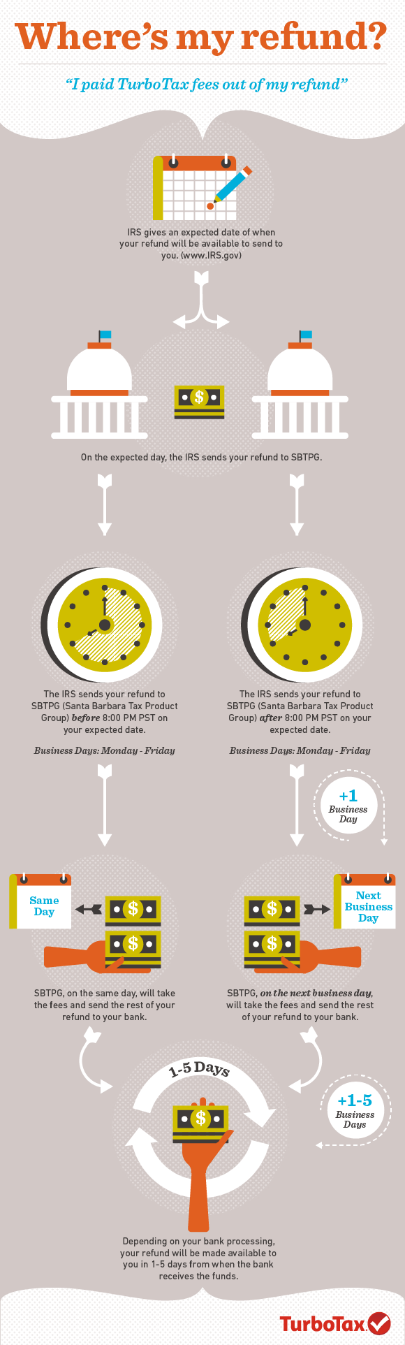
So, where does your story end? At what point will your product’s story reach its climax and successfully allow your end-user to be a hero? For a tax accounting software like Turbotax, the climax might be the moment that the taxes are filed. But the story isn’t over there; people need to track their refunders. Even though Turbotax doesn’t have that information in their product, they still help set expectations by creating infographics and other content that benefits their users as an “offboarding” process. In other words, where some products would leave users on their own as soon as they don’t physically need the product anymore, Turbotax offers materials to benefit users even when they’re done using the Turbotax product.

Designing for this type of offboarding is just as important as designing for onboarding. When someone uses TurboTax, they don’t want to feel harassed to come back to the app long after tax season is over. TurboTax is better off letting users stop using their product and return on their own when they need to. That’s how they keep their users happy.

When your design team identifies your offboarding point, you might try creating your user’s Hero Journey. One way to do this is to literally write a story about the user’s hero journey. Feel free to be silly, and position the user of your product as a knight in shining armor. Use the Hero’s Journey template to think about the emotional, mental, and physical state of the person using your product (remember your context from before!).

For example, let’s take a closer look at the well-known laundry detergent brand Tide and one of their commercials, “Princess Dress”:

“Princess Dress” Tide commercial (Watch on YouTube)

We could break it down like this:

StepObservation
Call to AdventureLily’s princess dress getting dirty.
Refusal of the CallLily’s procrastination: she doesn’t want to change out of her princess dress.
Road of TrialsThe father collecting the dress and giving Lily her sheriff’s costume, plus her accompanying power trip (a true trial for every parent).
ApotheosisWhen the wash is dry and can be worn again.
Refusal of the ReturnThe parent wanting to leave everything nice and clear in the basket.
Crossing the Return ThresholdWhen Lily gets her princess dress back.
Master of Two WorldsLily is wearing clean clothes that are not yet dirty and having to be washed.

Important note: Notice where the product is used and where the user steps away from Tide and continues on with their life.

Ideally, with an app like the Digital Companion, a user could use our app for years. But there will be ebbs and flows. Building off our storyboard we created numerous vignettes for our user “Grace”.

When Grace needs to take her injection, we knew from user research she would be worried, uncertain, and even likely to skip the medication. Instead of seeing this as a static phase in her life, we imagined her on the “Road of Trials” in the Adventure of the Hero. This imagery became a part of the language we used to encourage users to overcome their fears and bravely give themselves their injections. Over time, as the app encouraged “Grace” to build a habit of taking and recording her injections, our app copy treated her like a conquering hero, moving through the Hero’s Journey to become a “Master of Two Worlds”.

Step 4: Revise, Revise, Revise

“Good writing is good editing,” so the saying goes. The same is true with UX. For an author, finishing the story is only the first step. They then work with an editor to get more feedback and make numerous revisions. In UX, we rely on user research, and instead of “revisions,” we have iterations. Usability testing, A/B testing, user research, and prototype testing are all ways to get feedback from the target audience.

But in UX we have a major advantage. Once a book is published, the feedback can’t be acted on. But digital products can be adapted and improved even after launch. Websites get redesigns, and apps get bug fixes.

For example, when healthcare.gov launched, it immediately crashed. Harvard Business School reported:

“The key issues discussed above resulted in the rollout of the healthcare.gov website ballooning the initial $93.7M budget to an ultimate cost of $1.7B. It is easy to observe that the launch of healthcare.gov was a major failure.”

Yet healthcare.gov didn’t fail. The website still exists, and in 2021 alone more than 2.5 million people gained health coverage during the special enrollment period, allowed by the website. A failed story is simply a failure. A failed product can be iterated on.

In some cases, even a physical product can be updated to succeed. Consider a product like the Garmin watch. Even within one year there are multiple designs and styles. Some are flops, and others are major successes. The product designers learn from the flops and improve on each watch style every few years.

Although the Digital Companion is no longer available on the app store, we did have multiple releases after the initial launch. Even before that first release came out, we had ideas about how to build on the product and expand its capabilities. For example, we were able to start desirability testing on having multiple “finger stretching” game options and A/B testing video instructions for taking injections. These concepts didn’t need to wait on results from our initial release — such is the way of UX work!

Step 5: Write The Sequel

Once a product is out in the world, it’s time for the sequel. Many great stories have excellent sequels. Sometimes it’s a planned sequel like adding a new beverage to the Starbucks line. Other times it’s more of an add-on based on demand or need. A good sequel either completes a planned series or builds off the previous story. Think of these like the Star Wars trilogies versus the movies labeled “a Star Wars story.” A trilogy is a planned storyline. A one-off film may be built on the previous story and add to the world.

But some sequels do a bad job of building on the original story. Specifically, they erase characters or facts. Many Game of Thrones fans, for example, were furious with the last few episodes of the series. They saw the episodes of ignoring a key character’s growth, ignoring the rest of the series to create a nice ending.

This can happen to products as well. The tobacco industry had to find a new story for the problem their product solved after the 1964 Surgeon General’s report labeled smoking a health risk. It wasn’t the sequel they had planned, but in the words of their fictional ad man Don Draper:

“If you don’t like what people are saying, change the conversation.”

Mad Men: Change the Conversation

As a result, they changed the product itself (adding filters to more cigarettes) as well as the advertising around it, to claim that filters were healthier and protected the smoker from tar and nicotine (they do not). And it worked!

According to an article in the medical journal BMJ Journals:

“The marketplace response was a continuation of smoking rates with a dramatic conversion from “regular” (short length, unfiltered) products to new product forms (filtered, king-sized, menthol, 100 mm).”

Each UX designer, UX writer, and engineer on the RA Digital Companion product has gone on to make our own sequels. What I learned from the RA Digital Companion — about user needs, rheumatoid arthritis, and behavior change — has played into my work, most recently at Verily. That product created a story to be shared with the end-user, but the sequels may affect health-tech as a whole.

Tell A Story And Connect

Ultimately, telling a story is how we connect to one another as humans. Whether you use Lisa Cron’s Storygenius, Joseph Campbell’s Hero with a Thousand Faces, or simply the mindset of Daniel Kahneman, you can use storytelling to adapt your product to your user’s needs and wants.

As a Forbes article stated back in 2018:

“As human beings, we’re often drawn to the narrative; in part, because our complex psychological makeup wires us for the sharing of information through storytelling and in part due to our natural curiosity.”

Products are no exception: a good user experience takes the form of a story. The IA feels familiar and gives context and flow. The product itself will fit into a user’s sense of their own life story, and users are drawn to that.

To tell a story, you need to focus on a genre or a type of product and audience. You need to build out a world or context for your audience. Limit your scope to where you can have the most impact, revise with user feedback, and then think about the sequels. All in all, storytelling is a powerful tool for any UX designer. It will help you to create your product and understand the people who use it.