⭐ If you would like to buy me a coffee, well thank you very much that is mega kind! : https://www.buymeacoffee.com/honeyvig Hire a web Developer and Designer to upgrade and boost your online presence with cutting edge Technologies
Showing posts with label Browsers. Show all posts

Thursday, January 5, 2023

Deploying CSS Logical Properties On Web Apps

 You may have already heard of CSS logical properties or RTL adaptations but are still deciding whether to deploy them widely. To help raise your awareness of their possibilities, Nicolas Hoffmann shares his experience of how he and his team at Proton carried out a massive move from CSS logical props to production and how you can consider them from a different perspective in your very own projects.

Localization is one of the most interesting fields in terms of user interface: text length may be different depending on the language, default alignments for text might vary, reading direction can be mirrored or vertical, and so many other different cases. In short, it’s an incredible source of diversity, which makes our interfaces and our front-end work way stronger, more reliable, and more challenging.

The Need For Right-To-Left Interfaces #

Most languages, like French or English, are meant to be read for Left-To-Right (LTR). However, in these cases, some languages like Farsi (Persian), Arabic, and Hebrew have a different reading direction — Right-To-Left (RTL).

The question is how can we adapt our interfaces to this huge change?

Before CSS Logical Properties #

Before CSS Logical Properties, we could make RTL adaptations with different methods:

  • Adding a dedicated CSS file only for RTL surcharge/layout;
  • Surcharging only parts that need to be adapted in the same CSS, e.g. [dir="rtl"] .float-left { float: right; }.

Even if these methods are doing the work — I used the second one to create an Arabic version of the Stand Up for Human rights website a few years ago — both of them are quite sub-optimal:

  • You need to maintain another file for the first one;
  • The CSS file for the second one is a bit heavier, and there might be some issues to deal with (specificity, more properties to add, and so on).

For sure, we can create huge machinery with Sass to produce several builds and use some tools like UnCSS to remove what is not needed, but let’s be honest: this is boring, and it can lead to “non-natural” pieces of code, like in the previous example.

Why CSS Logical Properties Are A Perfect Fit/Promising #

This is where the CSS Logical Properties module comes into the game. The main idea of this CSS module is to have a logical abstraction that enables us to produce one layout that will adapt itself depending on the text direction and writing mode (properties like writing-mode, direction, and text-orientation, or dir attribute in HTML). This gives us possibilities like horizontal right-to-left or left-to-right, vertical RTL, and so on.

Implementation In Practice #

How It Works #

There are a few concepts to understand, already explained by Rachel Andrews here in “Understanding Logical Properties And Values”:

  • We no longer think in terms of left/right but start/end (the same goes for top/bottom):
  • We no longer say width or height but instead inline and block — quite classical. (You’ve probably heard of default inline or block elements. 😉)

This idea of start/end is not new. You use it probably every day with things like justify-content: start.

Congratulations, you now know — almost — everything! 🎉 Let’s see some practical examples.

Examples #

Let’s start with the basics:

Classical PropertyLogical Property
widthinline-size
heightblock-size
min-widthmin-inline-size
min-heightmin-block-size
max-widthmax-inline-size
max-heightmax-block-size

Margins follow the same logic:

Classical PropertyLogical Property
margin-topmargin-block-start
margin-bottommargin-block-end
margin-leftmargin-inline-start
margin-rightmargin-inline-end

The same goes for padding. Let’s move to the positioning:

Classical PropertyLogical Property
topinset-block-start
bottominset-block-end
leftinset-inline-start
rightinset-inline-end

Simple, isn’t it? float, text-align, and border follow the same path:

Classical Property/ValueLogical Property
float: left;float: inline-start;
float: right;float: inline-end;
text-align: left;text-align: start;
text-align: right;text-align: end;
border-topborder-block-start
border-bottomborder-block-end
border-leftborder-inline-start
border-rightborder-inline-end

I won’t detail some others like resize or scroll-margin-top, but instead, let’s look at the particular case of border-radius:

Classical PropertyLogical Property
border-top-left-radiusborder-start-start-radius
border-top-right-radiusborder-start-end-radius
border-bottom-left-radiusborder-end-start-radius
border-bottom-right-radiusborder-end-end-radius

A bit different, but easily understandable anyway.

Some possibilities with values are really cool — you can simplify some notations. Here are some further examples:

Classical Property/ValueLogical Property
margin-left: auto;
margin-right: auto;
margin-inline: auto;
margin-top: 0;
margin-bottom: 0;
margin-block: 0;
margin-top: 1em;
margin-bottom: 2em;
margin-block: 1em 2em;
top: 0;
left: 0;
bottom: 0;
right: 0;
inset: 0; 🎉
left: 10%;
right: 10%;
inset-inline: 10%;

This is pure gold in the best world, right? Less code for perfect support of RTL languages! 🎉

Now I’m sorry to brush away some of the stars in your eyes — there are indeed some limitations.

More after jump! Continue reading below ↓

Some Limitations #

Missing Syntaxes #

CSS Logical Properties are quite new, even if the support is good on recent browsers. However, the CSS Logical Properties module is kind of “young” and needs a level 2.

To give a simple example: our toggle component is using CSS transforms between different states (loading, active, and so on), mostly because transform is a reliable way to have fluid transitions or animations.

So, we have something like this:

.element {
   transform: translateX(#{$toggle-width - $toggle-width-button});
}

Unfortunately, there is no flow-relative syntax for transform. So, we have to do something like the following:

[dir='rtl'] .element {
    transform: translateX(-#{$toggle-width - $toggle-width-button});
}

If you want to get an idea of missing stuff like this, you can check opened issues on CSS logical props.

Shorthand Properties #

Some shorthand notations are not supported for the moment, like the 2, 3, or 4 values for margin:

Classical Property/ValueLogical Property
margin: 1em 2em;margin-block: 1em; /* top and bottom */
margin-inline: 2em /* left and right */
margin: 1em 2em 3em;margin-block: 1em 3em; /* top, bottom */
margin-inline: 2em /* left, right */
margin: 1em 2em 3em 4em;margin-block: 1em 3em; /* top, bottom */
margin-inline: 4em 2em /* left, right */

Don’t use these classic examples with logical needs. You will encounter issues as it’s actually not working. It’s better to be explicit. Also, it’s more readable, in my opinion.

Showing Some Real Issues And Some Solutions #

Images Where Reading Direction Is Important #

Some images have a direct meaning. Let’s take the example of theme cards:

Proton themes in LTR
Proton themes in LTR (Large preview)

In this case, if we just apply RTL stuff to this, we would get this:

Proton themes in RTL, done wrong
Proton themes in RTL, done wrong. (Large preview)

The order is RTL, but each image does not look like the interface of an RTL user. It’s the LTR version! In this case, it’s because the image reading direction conveys information.
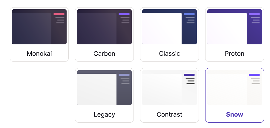
Proton themes in RTL
(Large preview)

We have a CSS class helper that makes it really simple to achieve this fix:

[dir="rtl"] .on-rtl-mirror {
  transform: rotateY(180deg);
}

This also applies to any image with a reading direction, like an arrow or double chevron icon showing or pointing to something.

Styles/Values Computed Via JavaScript #

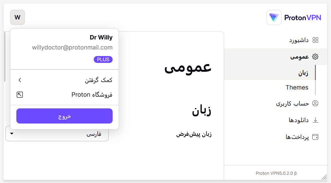
Let’s imagine you have a plugin that calculates some positioning in JavaScript and provides the value you can use in JS or CSS. The dropdown library that we’re using provides only the left value in both RTL/LTR contexts, and we transfer to CSS using a CSS Custom property.

So, if we were using this with Logical Properties, i.e. inset-inline-start: calc(var(--left) * 1px);, we would get the following by clicking on the user dropdown:

User dropdown is opened to the opposite side of the interface, not near its opening button
(Large preview)

The solution is simple here. We keep the non-logical property:
/* stylelint-disable */
top: calc(var(--top) * 1px);
left: calc(var(--left) * 1px); // JS provide left value only
/* stylelint-enable */
User dropdown is opened near its opening button
(Large preview)

And we disable our linting for this particular case.

Mixing RTL And LTR content #

Even with the best CSS modules, anyone who has already made some RTL adaptations will say that mixing RTL and LTR content sometimes (often) gives crazy stuff.

Let’s take an example on Proton Drive with a component called MiddleEllipsis. The goal of this component is to apply ellipsis before the extension of the file to get something like my-filename-blahblahblah…blah.jpg.

Nothing crazy: we split the content into two parts and apply text-overflow: ellipsis on the first one. You can check the source of this MiddleEllipsis component.

Let’s apply some good ol’ RTL — we should then get the following:
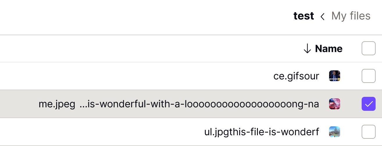
File display in Proton Drive, better displayed
(Large preview)

Strange, right? This is simple to explain, however:

  • MiddleEllipsis structure is RTL;
  • And we inject LTR content. (Remember, we did RTL-cut this LTR content.)

The browser does its best, and what is displayed is not wrong from its point of view, but this makes no sense to a person. In this case, we chose to keep the LTR display to keep the purpose of the filenames but aligned it to the right:

File display in Proton Drive, better displayed
(Large preview)

Searching For Native LTR Patterns #

The MiddleEllipsis example showed that if user-generated content is LTR, then it’s better to display it as LTR.

But we can wonder if there are some patterns that are naturally LTR. The short answer is yes. Below you can find an example.

Phone Number #

The phone number might be the most obvious case here as it’s usually using western numbers, which are meant to be read LTR.

If we apply Logical props directly to it, it might give the following:

Phone input displayed in RTL, weird display
(Large preview)

While it’s technically not false, it’s a bit weird to display +33 6 12 34 56 78 like this. In this case, we decided to keep the LTR alignment by default to avoid this strange result.

Phone input displayed in LTR
(Large preview)

We have the same case for a 2FA input using western numbers. We don’t yet have the case but imagine a 4-part input to enter an IP address. This would not make sense to display it fully RTL as people would understand 1.0.163.192 instead of 192.163.0.1.

Compatibility #

The biggest issue we faced was mostly in regards to compatibility. This can be seen on Can I Use tables for Logical Props:

Can I Use tables for Logical Props
Can I Use tables for Logical Props (Large preview)

If the target is only recent modern browsers, there is no problem. But if there is a need for older versions of Safari, for example, the support is pretty bad. And in this case, CSS Logical Properties are not gracefully degraded. Thus everything might look broken.

Several options are possible:

  • Serve a CSS build for modern browsers and another one for older ones;
  • Transpile everything for each case.

In Proton’s case, as we were not totally ready to ship an RTL language when we merged it, and for other reasons, the decision was taken to transpile everything to good ol’ classical CSS properties. Recently, we found a solution for one case that did need RTL support for Farsi language (VPN account):

  1. We build two CSS files: one modern with Logical props and one legacy;
  2. We load the modern one;
  3. We test the correct support of border-start-start-radius;
  4. If it’s not supported, we fall back to legacy.

Conclusion #

Even if absolute perfection is out of this world, moving to CSS Logical properties is a really interesting move and a good bet for the future: we write less code with these CSS Logical Props, and we reduce the amount of future work by using them, so it really goes in an exciting direction.

As the last takeaway, and even if it would need more work, we did some tests of a vertical RTL display to test further CSS Logical properties.

Vertical Right-to-left display, using writing-mode
(Large preview)

Looks quite interesting, doesn’t it? 😉

Sunday, November 20, 2022

Databases For Front-End Developers: The Rise Of Serverless Databases


As front-end developers, we understand the foundational role data plays in our daily jobs. It may come from an external API, a CMS, or even a spreadsheet. But god forbid we need to talk about setting up databases.

Those days are over. With serverless databases becoming popular by the day, it has never been easier to create a full-stack architecture with both vertical and horizontal scaling, high availability, and bulletproof consistency.

To fully reap the benefits of such an architecture, it’s essential to understand what decisions are made for you. In the same way that the “learn JavaScript, not a framework” mantra became popular, we also ought to understand the concepts behind database architecture in order to use them reliably. So, welcome to the first part of our “Databases for Front-end Developers” series.

This series is not going to make you an expert on distributed systems or capable of jumping into a database admin role, but it will shed some light on the concepts, terms, and acronyms you will face when getting ready to choose your next stack. See it as a primer on (serverless) databases. Hopefully, it will give you a push into the rabbit hole and make you confident in joining conversations to evaluate tradeoffs for different solutions.

Spreadsheets And Content Management Systems

What?! Spreadsheets? Well, yes. The user interface (you and I, or U and I, or UI) is quite similar to that of a database. Spreadsheets give you a table in which to store data. In some cases, they will only allow you to define specific data types per column. The familiarities are there, but spreadsheets find an abrupt end once we pop the hood.

The availability is questionable: spreadsheets are not meant to serve content, only store content. For starters, they will not fuel an app as it scales, and they may not obey certain best practices when it comes to assuring data integrity. Up to very recently, they were the quickest way to get started with some data layer. But now, there is no point for an app not to use a real (serverless) database (more on this later).

A Content Management System (CMS) is another kind of database. “Content” is a special kind of data that the CMS specializes in. It will provide the user (developer) with enough abstractions to facilitate managing such data to a point where the underlying database is not a concern. It will handle the deliverability, availability, and integrity of your data. But the heavier the abstraction is, the higher the tradeoff. The data types are limited to what the CMS will give you, with most even imposing their own architecture for handling relations, queries, types, etc. Of course, there are still significant and viable use cases for CMSs, and they aren’t going anywhere. So, as long as you’re sure that’s your use case, you’ll be fine with one.

Growth Pains

If you choose the simpler, “abstractionful” route of a spreadsheet or a CMS as your source of truth and your data begins to diversify, obstacles will show up. The first issue with a spreadsheet is usually about the underlying API, it’s often not intended for most average-sized apps’ traffic, and then there are the first refactoring conversations.

With a CMS, APIs are usually not the problem, but managing the data can be. As an app grows and data diversifies, some of it ends up not being content anymore and may be more related to application logic.

When data is not content, managing it in a CMS is not ideal. It’s less flexible and often doesn’t fit the owner-team workflow. Now, while it is perfectly possible for other databases and CMSs to coexist, it’s up to the developers to understand the pros and cons of each solution and decide what is best for their app’s delivery and user experience.

More after jump! Continue reading below ↓

Database Admin Is Hard

As front-end developers, the first time we talk about databases is usually a conversation about “relational vs. non-relational.” From then on, while trying to figure out the differences, we loosely hear a myriad of terms, such as ACID, BASE, and even CAP Theorem. This article will skip a thorough explanation of these differences. We will look better into them in the next part of this series. For now, it is sufficient to say “non-relational” databases impose eventual consistency on an app.

Eventual consistency can also be unwrapped into a longer discussion, but let’s take it as this:

Eventual consistency means that in certain special conditions, the data received is stale.

Like comments in a blog post, they won’t affect your app if a few seconds after a write you still don’t see the latest one. But password updates need to be strongly consistent always, not eventually consistent.

Of course, those are not the only differences. Query performance is different between each type of database. One can imagine being eventually consistent allows for quicker reads because there is less assurance involved.

More Growth Pains

Once the database is decided, the app can grow steadily and smoothly for a while. As an app gets big, data complexity grows, and as data complexity grows, the database becomes slower. At scale, how do we make a database faster?

  • Do you add more resources to a single server? (vertical scale)
  • How do you replicate data across a cluster of machines?
    • Do you split your database into smaller partitions (shards) instead? (horizontal scale, more about this in part 2)
  • Do you add a faster in-memory database in front of it for common queries? (key-value store)

Those are not easy questions to answer. It depends on the user base, the type of data, the amount, frequency, and origin of queries. Is your database read-heavy or write-heavy? And though there is a multitude of factors impacting this decision, there’s also a high cost attached to making the wrong choice.

Additionally, some use cases may even require searching through data easier from user-land. A search engine is not an easy problem to solve and often requires an additional type of database to properly index your data (if sharded, it’s even harder). Having all this around your user’s data also brings a whole set of tools around it just to make it maintainable.

Even more, keeping an eye on our databases (now “data infrastructure” if we’ve got a search engine in the mix) requires a high level of observability and OLAP (Online Analytical Processing). This introduces a whole new level of complexity!

As you may have noticed, very high stakes are associated with creating, maintaining, and growing a database. Decisions that can make or break an app, decisions that are costly to go back on, and that must be made relatively early.

Serverless Databases Are Fun

Because of all the complexity mentioned above, many investors and incubators have their eyes turned to startups creating serverless databases. They are a whole new category of databases. The concepts of traditional ones still apply, but differently.

Serverless Databases

To understand what a “serverless database” really is, we first need to deconstruct the term. It is a common joke that “serverless” is a misnomer. Still, the point of a serverless architecture is to abstract away from the consumer (developer) the complexity of handling site reliability and server maintenance provided by a serverless vendor, such as Netlify, Vercel, Amazon Web Services (AWS), and so many others. I tend to like Xata’s definition of “serverless database”.

A “serverless database” does for databases what serverless does for servers. The complexity is lifted away (to different degrees depending on the chosen platform). Some, like Supabase and Firebase, will offer a multitude of serverless related features to couple with your database; others, like AWS Aurora or PlanetScale, focus on making it easier to use and scale PostgreSQL and MySQL DBs. And finally, there are others that abstract the database entirely, like Xata. They provide you with an ORM-like SDK, keep the database behind an API, and are able to offer a complex set of database features, bending the current limitations of traditional relational and non-relational databases.

Once we get to the next part of this series, we will talk about different kinds of databases. Then you will be ready to pop the hood on any serverless database offering you want and understand the differences for yourself. Meanwhile, let’s keep it superficial.

Batteries Included

Don’t take the “serverless” prefix lightly; these databases are from a different breed. They are able to offer guarantees and performance that “traditional” databases require some effort to reach, sometimes not even so. This is because on serverless databases, the work has been done, just not by your team.

The same way “serverless” means you don’t need to handle your server, “serverless database” means you don’t need to handle your database. The platform will handle it for you.

Because of this, the decisions about scalability and deliverability are often made external to your team. What your team gets is the assurance that any request will receive a response in a timely manner and that data will respect the consistency guarantees. Again, different solutions have different tradeoffs. It’s important to check what each offering imposes before jumping in.

See You On The Next One 

Hopefully, this has been enough to spark your curiosity. This is the first article of a 3-part series. In the next ones, we will cover more in-depth information about what databases actually are. Specifically, we’ll look into:

  • Schemas,
  • Theorems and models,
  • Types of databases,
  • whatever you suggest in the comments below!

All that necessary knowledge will enable you to choose the best solution for your app. Understanding the tradeoffs of different serverless solutions and surrounding yourself with the right kind of help is crucial to setting your app up for success. Reach out to me if you need anything meanwhile. Otherwise, see you in a few days!

Tuesday, November 15, 2022

Databases For Front-End Developers: The Concepts Under The Hood

 we talked about the hurdles and traps of scaling and maintaining your databases. We went from simpler and specialized alternatives like Content Management Systems and spreadsheets to self-hosted databases and, finally, to Serverless Databases.

Today, we go deeper into the rabbit hole. We will explore concepts to equip you to have your own opinions about which kinds of databases suit your specific needs. And this is important to stress up front: there is no right answer. Each database carries its own set of tradeoffs and advantages. If something looks like a “one-size-fits-all” solution, be careful: you might be missing something!

Anatomy Of A Database

Before we begin, it’s important to highlight that what we loosely refer to as “databases” are actually “Database Management Systems (DBMS).” A DBMS is a piece of software that enables the user to more ergonomically write, read, delete, or update information in a given set of data. For this series, we will focus mainly on Relational and Non-Relational DBMSs. There are many other types, all categorized by their data structures, but relational and non-relational are the most common for web development by any measure.

Both Relational (R) and Non-Relational (NR) DBMS have different terms for the parts that compose them. Such components are almost interchangeable in definition, and that’s why you can commonly hear a developer referring to a Document (NR term) as “Table,” which is its Relational equivalent structure. Don’t be afraid of confusing them; they appear often enough for this cognitive overload to disappear quickly with usage. Additionally, once you get more familiar with the differences of each data structure, you will realize they probably shouldn’t be used interchangeably because there are differences among them. But for now, and for the sake of simplicity, let’s focus on the similarities:

  • Schema
    It’s the description of the database (like a blueprint), describing the landscape of the database in a supported language. This is required by relational databases, and though not required by non-relational DBMS, many interfaces offer a possibility to define it too.
  • Tables (R/NR), Collections (NR)
    It’s the logical data structure, unsorted. A relatable example of this would be a spreadsheet table or a group (collection) of JSON objects.
  • Databases (R/NR)
    It’s the logical grouping of data. You group your tables in databases (user database, invoices databases) and your documents in indexes based on how you intend to query them.

Keys And Columns

To use a more familiar example, let’s take a JSON object as an example:

{
  "name": "Atila"
  "role": "DX Engineer at Xata"
}

Given that JSON, a column would be represented by the key-value pair (column name has value “Atila”), and the key follows the same meaning as the JSON spec, key name will access the value “Atila.”

A table has columns, and each column’s name determines the key with which you can access a value in a record.

In addition to the above definition, there are special kinds of keys. Such keys play a special role in the schema of your database and how you will interact with your data. Define these wisely: any minimal change to them can be considered a breaking change to your data layer.

  • Unique Keys (UK)
    The keys that are unique between records on a table. They also accept null.
  • Primary Keys (PK)
    It’s a special kind of Unique Key. There can only be one Primary Key per table, and it can never be null (Primary Keys are always considered required). Primary Keys are also indexed by default, helping with queries that want to filter on the value.
  • Foreign Keys (FK)
    When there is a relation between tables, the keys are represented as foreign keys at the extraneous table.

Example of Foreign Key: if each author in an authors table has posts (and posts is another table), post.title will be a FK at authors. And the junction between authors and posts is called a relation.

Mapping Your DBMS

Once you look at the different data structures and choose your DBMS, you are ready to draw the first connection from your data layer to your application layer. And suddenly, you noticed it isn’t quite straightforward to bring data from the database to your client-side (or even to your server-side API in some cases).

Here comes ORM (Object Relational Mapping) and ODM (Object Document Mapping) to assist your developer experience. Prisma is probably the most widely used ORM at the moment, while Mongoose has the largest ODM user base. It’s important to note they are not a requirement for connecting to databases. Still, if you keep an eye on how they build your queries (some specific cases can present performance issues on the account of the abstraction), they tend to make your life easier and fetching or writing data much more ergonomic.

When it comes to serverless databases, the need for them becomes a bit more questionable. And this is because many of these databases provide the users with an officially supported Software Development Kit (SDK). Your mileage will vary depending on the SDK, but they tend to have a big feature overlap with ORMs and ODMs, especially on databases that will keep the data layer behind an API (Xata, for example). This way, you won’t need to worry about translating your queries, and you can demand equivalent ergonomics between the SDK and an ORM.

Common Concepts

In this part of our series, we are learning what to look for when choosing the stack for our data layers. It is essential to understand common concepts around maintaining and choosing a DBMS (from here on out, we’re back into referring to them as “databases” to remain consistent with the rest of the world).

The next sections will not go so deep that you jump out and find a job as Database Administrator (DBA), but hopefully, it will offer you enough ammo to engage in conversation with experts and identify the best solution for your use cases. These concepts are common for every kind of data layer, from a spreadsheet to a self-hosted database and even to a serverless database. What will vary is how each solution will balance the variables intertwined in these paradigms.

As Thanos (from Marvel: Infinity Wars) would say: “perfectly balanced, like all things should be.”

The most important concepts, to begin with, are Consistency, Availability, and Partition Tolerance. They’re better understood if presented together because the balance between them will guide how predictable your data is in different contexts.

CAP Theorem

This theorem describes the relationship between 3 components in a distributed system: Consistency, Availability, and Partition tolerance (C.A.P). The overall conclusion is easy to summarize: any system is only able to contemplate 2 of these components at the same time. Though just a simple sentence, this idea requires a bit of unpacking.

Consistency (C)

Within the CAP Theorem constraints, “consistency” refers directly to the data. When different clients make the same request, they will get the same response. When a written request is accepted and confirmed, all users will have access to this updated information at the same time.

Availability (A)

Every request will receive a response with data. No errors. However, this comes with no promises on whether the data is up to date or not. Depending on whether this is paired with consistency © or partition tolerance (P), you will get different behavior.

Partition Tolerance (P)

A “partition” is when the connection between two nodes in a system is broken. The CAP Theorem essentially describes how a system will tolerate the partition: enforcing availability (AP system) or enforcing consistency (CP system). Regardless of how small a system is, partitions can always happen. Therefore there is no such thing as a CA system.

To provide a more graphical example of each system, we can consider:

  • AP System
    Another node has a copy of the data. The user will get information back but without promises of it being 100% correct (up-to-date). It’s commonly implemented with DynamoDB, Cassandra, and so on.
  • CP System
    To return an error and accept the transaction is impossible. It’s commonly implemented with traditional sharded DBs, Citus, for example.

Though popular and very often referred to, the CAP Theorem can be considered incomplete because it doesn’t consider situations beyond the network partition. Especially today, with high-availability content delivery networks (CDN), and extreme connectivity, it’s crucial to take into consideration latency and deeper aspects of consistency (linearizability and serializability).

Consistency Confusion

It’s funny how “consistency” is a term that switches meanings based on the context. So, in the CAP Theorem, as we just saw, it’s all about data and how reliably a user will get the same response to the same request regardless of which partition they reach. Once we take a step away from our own system, a new perspective makes us ask: “how consistently will we handle concurrent operations?”. And just like that, the CAP Theorem does not sufficiently describe the intricacies of operating at scale.

There is a third meaning of “consistency,” which we will save for later; it’s part of yet another acronym (ACID). If the last paragraph left you scratching your head, I can’t recommend enough “Inconsistent Thoughts on Database Consistency” by Alex DeBrie.

PACELC Theorem

The first three letters are the same as CAP, just reordered. The “consistency” in the PACELC Theorem goes deeper than in the CAP Theorem. It follows the Consistency Model, which determines the contract between a data store and a system. To make things less complicated, consider the PACELC an extension of the CAP Theorem.

Beyond asking the developer to strategize for the event of a network partition, the PACELC also considers what happens when the system has no partitions (healthy network).

ELC stands for Else: Latency or Consistency?

  • Latency: Can you accept an occasional stale response for the sake of performance?
  • Consistency:
    • Linearizability: Will you accept a higher latency to sync data in all nodes of a network before considering the transaction done?
    • Serializability: In the event of concurrent transactions on the same data, will you handle them in parallel or in a queue?

Because of this, I consider the PACELC carries a better mental model for this new era of Serverless Databases. When healthy, it’s not a scalar classification “AP” or “CP”; it accepts a spectrum because latency can be high or not, and consistency can have different levels as well.

Once we start talking about the types of databases and their data structures and which guarantees each can give, we will also talk about a bit of system architecture and how your architecture can reduce the tradeoffs when even by enforcing consistency, you can strive for a low latency scenario.

See You Next Time

With that, I believe we are ready to start narrowing down our discussions on the differences between each database type. Moreover, it’s possible to discuss and level expectations on each solution taken and analyze architectures individually. From now on, we will focus on Relational and Non-Relational databases.

In a few days, on our season finale, we will cover the differences between NoSQL and SQL: what guarantees to expect, what that means to your data, and how that affects development workflow. Then we will be ready to jump right into Serverless Databases and what to expect going forward. I can’t wait!

Thursday, October 27, 2022

What’s New In DevTools

 Our friendly DevTools at Mozilla, Google, Microsoft, and Apple have once again been hard at work. And in this article, I’ll attempt to summarize the most impactful new features that are now available in browser developer tools.

So much has happened over these past few months that I may have missed a few things, but hopefully, you’ll find something that helps you in this article. There should be a little bit for everyone, whatever your level of experience with web development is, and whatever browser you use.

So, without further ado, let’s jump right in.

Note: Because Edge is based on Chromium, the open-source browser engine that also powers Chrome, all of the Chrome features listed below are also available in Edge (unless otherwise noted).

CSS Debugging

We’ve got a lot of long-awaited and profoundly impacting new features in CSS lately.

To name just a few:

  • Container Queries help us style components based on the size of their containers,
  • The :has() pseudo-class lets us style elements based on what they contain, and
  • CSS Cascade Layers make it easy to gracefully handle increasing complexity in our websites’ code.

But, although these features are amazing, shipping support for them in browsers is only part of the story. For people to comfortably use them, documentation and tooling are necessary too.

We’re in luck because both Container Queries and CSS Cascade Layers have associated DevTools features now.

Specifically, Container Queries are supported in Safari WebInspector and Chrome DevTools where information about the corresponding @container at-rules is displayed when viewing CSS in the Styles sidebar.

Chrome, Safari, and Firefox DevTools also now have support for CSS Cascade layers in their Elements (or Inspector) tools. The layer to which a particular rule belongs is now displayed next to that rule:

Maybe a little less popular, but still very useful, the hwb() CSS function makes it possible to express colors in a more natural way based on hue and an amount of whiteness and blackness.

hwb() is now supported in all major browsers, and Chrome (and Chromium-based browsers), as well as Firefox, both have support for it in DevTools. That means they will show hwb in the autocomplete list when editing CSS in the Styles (or Rules) sidebar and will show the same color swatch used for other color formats too.

Next, it has also become easier to edit CSS in the Styles sidebar and get meaningful autocompletion results across browsers.

Chrome now previews all CSS variable values when autocompleting the var() function, not just colors, and it also displays @supports and @scope at-rules.

Safari now uses fuzzy matching when auto-completing CSS, making it much faster to type property names and values.

And Firefox added support for the color-mix() function in its auto-complete too.

Talking about Firefox, the browser has had the amazing Inactive CSS feature since 2019, which lets you know when a particular CSS declaration doesn’t have an impact on the current element.

Firefox continued to improve this feature over time and recently added more coverage for use cases such as warning when border-image-* is used on elements within a table with border-collapse or warning when width or height are used on ruby elements.

And, while we’re on the topic of inactive CSS, the Chrome team is actually working on a similar feature. In fact, it’s already available in Chrome (and all Chromium-based browsers) by enabling the CSS authoring hints experiment under Settings (F1) > Experiments in DevTools and should become available by default with Chrome 108.

Over the past few years, browser DevTools has gotten fantastic layout debugging tools to inspect, understand, and tweak grid and flex layouts. More recently, Safari has been adding more features in this area as well.

You can now use CSS alignment controls in the Styles sidebar and inspect Flexbox layouts too.

JavaScript Debugging

Let’s change gears a bit and talk about JavaScript debugging.

It’s very common to use external libraries and frameworks in a JavaScript codebase, to avoid having to re-implement things that have already been solved. For some years already, DevTools have allowed users to ignore third-party scripts when debugging (see docs for Chrome, Edge, Firefox).

Hiding scripts makes it easier to debug your code. It avoids ending up in foreign-looking library code when stepping through your own logic.

Recently, Firefox shipped a new feature that builds on top of this. You can now ignore pieces of code within a file. If you have a function that keeps getting called all the time but isn’t interesting for what you’re trying to debug, you can simply ignore that one function now.

Over in Chrome (and Chromium), a whole lot of small and not-so-small JavaScript debugging improvements were made:

The Page source tree was improved, and there’s now a way to group sources by authored (to show the original source files, thanks to source maps) or deployed (to show the actual files on the server).

It is now also possible to live edit the code of a function while debugging. If you’re paused at a breakpoint inside a function and want to test a quick fix, you can edit the code right there and save the file. The function will be restarted with the new code.

Next, stack traces for asynchronous operations are now reported entirely, showing you the full story of what happened before your current breakpoint, even if those things happened asynchronously.

Stack traces now also automatically ignore known third-party scripts, making it much easier to debug your own code.

Performance Investigation

Web performance is probably an area where we depend on tools even more than in other areas. You can’t really guess what’s running slow or eating too much memory until you profile your webpage. Fortunately, we keep on getting new options to investigate performance and memory problems, making our lives easier.

In fact, Chrome shipped an entirely new panel dedicated just to this!

Note: This panel is available in Chrome only and not in other Chromium-based browsers.

The Performance Insights panel shipped with Chrome 102 and has gradually gotten better and better, with recent additions like First Contentful Paint, Last Contentful Paint, Time To Interactive metrics and text flashes identification.

Think of the Performance Insights panel as a simpler version of the (sometimes scary) Performance panel:

Talking about the Performance panel, it recently got a brand new Interactions track in Chromium-based browsers, giving you a way to know when user events occur and how long they last, making it easier to debug responsiveness issues.

Edge has also been busy shipping new features in this area.

In the Performance tool, source maps can now be used to display original function names, even when sharing recorded profiles with other people:

In the Memory tool, you now get a summary of your heap snapshots organized by node types. Heap snapshots are hard to dig through, and these node types make it easier to see what is using the most memory on your webpage. There are also new ways to filter memory retainers to find memory leak culprits quickly.

Finally, Firefox has also been active in this area over the past few months. A number of years ago, Firefox created a brand new Performance tool for its own use. The idea, at the time, was to have a tool to debug performance problems in the browser code itself. But over time, the tool was adapted to become useful to web developers too.

And now, the final changes have been made, and the old Firefox DevTools’ Performance panel has fully been replaced with the new one:

Network Debugging

Debugging your frontend code is important, but sometimes problems can happen in the network layer of your app when communicating with your server. Thankfully, a few very useful features were recently added to the Network tools in various browsers.

In Edge, a new column was added to the Network log. The Fulfilled by column makes it easier to debug your service worker logic and Progressive Web Apps.

You can now discover straight away whether a request was handled by the service worker, the browser cache, or your server.

Firefox just shipped a completely redesigned version of its Edit and Resend feature. This feature has been available in Firefox for a long time already and is a great way to debug your server-side APIs or just test something quickly.

With it, you can right-click on any HTTP request displayed in the Network tool, select Edit and Resend, then manipulate the request parameters, headers, and body, and finally send the modified request.

Firefox completely redesigned it recently. It’s now much easier to edit the parameters before sending a new request.

And finally, Safari has added quite a few great features in this area too. You can now block network requests entirely, and you can also locally override requests by using regular expressions.

Editor Integration

Microsoft also does VSCode, which is a very popular code editor amongst web developers, and some time ago, the Edge team released the Edge Tools extension for VS Code. The extension gives you an embedded browser and the browser DevTools right in VS Code alongside your code.

This year, the team continued to work on the extension and added more features. In particular, the following things are now possible:

  • The extension now has the Console and Application tools available. Previously, only the Elements and Network tools were available. Console logs used to go to VSCode’s output, but now they also go to the Console tool in the embedded DevTools.
  • The embedded browser has been completely redesigned and features a lot of emulation and rendering options to test your webpage under different conditions. For example, you can emulate different media types or the prefers-code-scheme media feature. You can also emulate different color vision deficiencies.
  • Next, you can launch the embedded browser and DevTools simply by right-clicking an HTML file in VS Code.
  • Finally, you can use VS Code’s Quick Fix options to automatically fix a number of issues reported by the extension in your code.

One more thing, if you like using Visual Studio (not VS Code), note that the team released an extension for it too. Check out the Edge Developer Tools for Visual Studio extension.

Test Automation

It’s possible to automate browsers nowadays, and it can be very useful for testing. With browser automation libraries such as WebDriver, Puppeteer, and Playwright, you can write tests that mimic what users would do on your website and verify that these scenarios continue working over time, as you make changes to your product.

This area is in constant evolution; in particular, the WebDriver spec is evolving with a new bi-directional version. Also, the Chrome DevTools team has been innovating quite a lot lately. They shipped a new tool called the Recorder last year and have been improving it over time.

Here are some of the new features that got added to the panel in recent months:

  • It’s now possible to wait until elements are visible and clickable before continuing a recording.
  • Element selectors are better supported.
  • You can import and export recorded flows as JSON.
  • Double-click, mouse over, and right-click events can be recorded too.
  • There’s also an option to replay a recording slowly or step-by-step.
  • And, finally, the Recorder tool now supports extensions to export recordings to a variety of test automation formats, such as Cypress, WebPageTest, Nightwatch, or WebdriverIO.

Miscellaneous Updates

Phew, that was a lot! But we’re not done. Let’s wrap this up with a list of somewhat random but very useful features.

Chrome made a lot of source maps and stack traces improvements, providing a more stable and easier-to-use debugging experience. If you usually debug your JavaScript code with logs, now may be a good time to give breakpoint debugging a try and see if it speeds things up for you.

Talking about logging, they also made it possible to properly style logs with ANSI escape codes.

Next, you can now pick colors from anywhere on your screen when changing colors in the Styles sidebar.

Note: This was made possible thanks to the EyeDropper API, which you can also use on your web pages.

Edge shipped a feature to publish and retrieve production source maps from Azure, making it much easier to securely debug your code in production even when you don’t want to publish source maps and original source code to your server.

Read more about publishing your source maps and consuming them from DevTools.

The team also opened a new public feedback repository on GitHub which you can use to report ideas, issues, and features or just discuss them.

Finally, they shipped a redesigned Welcome tool where you can find all sorts of useful videos and links to documentation.

Switching to Firefox, the DevTools team continued to keep their Compatibility panel up to date with new browser compatibility data, so you can get relevant cross-browser support issues right when debugging your CSS.

The team also made it possible to disable and re-enable any event listener for a given element in the Inspector.

Finally, Edge just shipped a cool new experimental feature that enables one to type commands and access common browser and DevTools features from one keyboard shortcut.

The Command palette experiment lets you enter commands in the browser by pressing Ctrl+Q (note that prior to Edge 108, the shortcut was Ctrl+Shift+Space).


And that’s it for today. I hope you found a few things that will be useful for your web development projects.

DevTools has gotten impressively full of features over the years, and it’s hard to keep track, but here are a few pointers that I hope will make it easier to discover new features:

And with this, thanks for reading, and if you have great DevTools tips you want to share with everyone, please drop us a comment!

Tuesday, July 26, 2022

CTA Modal: How To Build A Web Component

  In this article, Nathan Smith explains how to create modal dialog windows with rich interaction that will only require authoring HTML in order to be used. They are based on Web Components that are currently supported by every major browser.

I have a confession to make — I am not overly fond of modal dialogs (or just “modals” for short). “Hate” would be too strong a word to use, but let’s say that nothing is more of a turnoff when starting to read an article than being “slapped in the face” with a modal window before I have even begun to comprehend what I am looking at.

Or, if I could quote Andy Budd:

That said, modals are everywhere among us. They are a user interface paradigm that we cannot simply disinvent. When used tastefully and wisely, I dare say they can even help add more context to a document or to an app.

Throughout my career, I have written my fair share of modals. I have built bespoke implementations using vanilla JavaScript, jQuery, and more recently — React. If you have ever struggled to build a modal, then you will know what I mean when I say: It is easy to get them wrong. Not only from a visual standpoint but there are plenty of tricky user interactions that need to be accounted for as well.

I am the type of person who likes to “go deep” on topics that vex me — especially if I find the topic resurfacing — hopefully in an effort to avoid revisiting them ever again. When I started to get more into Web Components, I had an “a-ha!” moment. Now that Web Components are widely supported by every major browser (RIP, IE11), this opens up a whole new door of opportunity. I thought to myself:

“What if it were possible to build a modal that, as a developer authoring a page or app, I would not have to fuss with any additional JavaScript config?”

Write once and run everywhere, so to speak, or at least that was my lofty aspiration. Good news. It is indeed possible to build a modal with rich interaction that only requires authoring HTML to use.

Note: In order to benefit from this article and code examples you will need some basic familiarity with HTML, CSS, and JavaScript.

A screenshot of the CTA Modal dialog displaying a form.
CTA Modal — displaying a form. (Large preview)
A screenshot of the CTA Modal dialog displaying a scrollable piece of content.
CTA Modal — scrollable content. (Large preview)

Before We Even Begin #

If you are tight on time and just want to see the finished product, check it out here:

Use The Platform #

Now that we have covered the “why” of scratching this particular itch, throughout the rest of this article I will explain the “how” of building it.

First, a quick crash course on Web Components. They are bundled snippets of HTML, CSS, and JavaScript that encapsulate scope. Meaning, no styles from outside of a component will affect within, nor vice versa. Think of it like a hermetically sealed “clean room” of UI design.

At first blush, this may seem nonsensical. Why would we want a chunk of UI that we cannot control externally via CSS? Hang onto that thought, because we will come back to it soon.

The best explanation is reusability. Building a component in this manner means we are not beholden to any particular JS framework du jour. One common phrase that gets bandied about in conversations around web standards is “use the platform.” Now more than ever, the platform itself has superb cross-browser support.

Deep Dive #

For reference, I will be referring to this code example — cta-modal.ts.

Note: I am using TypeScript here, but you absolutely do not need any additional tooling to create a Web Component. In fact, I wrote my initial proof-of-concept in vanilla JS. I added TypeScript later, to bolster confidence in others using it as an NPM package.

The cta-modal.ts file is chunked apart into several sections:

  1. Conditional wrapper;
  2. Constants:
  3. CtaModal class:
  4. DOM loaded callback:
    • Waits for the page to be ready,
    • Registers the <cta-modal> tag.
More after jump! Continue reading below ↓

Conditional Wrapper #

There is a single, top level if that wraps the entirety of the file’s code:

// ===========================
// START: if "customElements".
// ===========================

if ('customElements' in window) {
  /* NOTE: LINES REMOVED, FOR BREVITY. */
}

// =========================
// END: if "customElements".
// =========================

The reason for this is twofold. We want to ensure that there is browser support for window.customElements. If so, this gives us a handy way to maintain variable scope. Meaning, that when declaring variables via const or let, they do not “leak” outside of the if {…} block. Whereas using an old school var would be problematic, inadvertently creating several global variables.

Reusable Variables #

Note: A JavaScript class Foo {…} differs from an HTML or CSS class="foo".

Think of it simply as: “A group of functions, bundled together.”

This section of the file contains primitive values that I intend to reuse throughout my JS class declaration. I will call out a few of them as being particularly interesting.

// ==========
// Constants.
// ==========

/* NOTE: LINES REMOVED, FOR BREVITY. */

const ANIMATION_DURATION = 250;
const DATA_HIDE = 'data-cta-modal-hide';
const DATA_SHOW = 'data-cta-modal-show';
const PREFERS_REDUCED_MOTION = '(prefers-reduced-motion: reduce)';

const FOCUSABLE_SELECTORS = [
  '[contenteditable]',
  '[tabindex="0"]:not([disabled])',
  'a[href]',
  'audio[controls]',
  'button:not([disabled])',
  'iframe',
  "input:not([disabled]):not([type='hidden'])",
  'select:not([disabled])',
  'summary',
  'textarea:not([disabled])',
  'video[controls]',
].join(',');
  • ANIMATION_DURATION
    Specifies how long my CSS animations will take. I also reuse this later within a setTimeout to keep my CSS and JS in sync. It is set to 250 milliseconds, which is a quarter of a second.
    While CSS allows us to specify animation-duration in whole seconds (or milliseconds), JS uses increments of milliseconds. Going with this value allows me to use it for both.
  • DATA_SHOW and DATA_HIDE
    These are strings for the HTML data attributes 'data-cta-modal-show' and 'data-cta-modal-hide' that are used to control the show/hide of modal, as well as adjust animation timing in CSS. They are used later in conjunction with ANIMATION_DURATION.
  • PREFERS_REDUCED_MOTION
    A media query that determines whether or not a user has set their operating system’s preference to reduce for prefers-reduced-motion. I look at this value in both CSS and JS to determine whether to turn off animations.
  • FOCUSABLE_SELECTORS
    Contains CSS selectors for all elements that could be considered focusable within a modal. It is used later more than once, via querySelectorAll. I have declared it here to help with readability, rather than adding clutter to a function body.

It equates to this string:

[contenteditable], [tabindex="0"]:not([disabled]), a[href], audio[controls], button:not([disabled]), iframe, input:not([disabled]):not([type='hidden']), select:not([disabled]), summary, textarea:not([disabled]), video[controls]

Yuck, right!? You can see why I wanted to break that into multiple lines.

As an astute reader, you may have noticed type='hidden' and tabindex="0" are using different quotation marks. That is purposeful, and we will revisit the reasoning later on.

Component Styles #

This section contains a multiline string with a <style> tag. As mentioned before, styles contained within a Web Component do not affect the rest of the page. It is worth noting how I am using embedded variables ${etc} via string interpolation.

  • We reference our variable PREFERS_REDUCED_MOTION to forcibly set animations to none for users who prefer reduced motion.
  • We reference DATA_SHOW and DATA_HIDE along with ANIMATION_DURATION to allow shared control over CSS animations. Note the use of the ms suffix for milliseconds, since that is the lingua franca of CSS and JS.
// ======
// Style.
// ======

const STYLE = `
  <style>
    /* NOTE: LINES REMOVED, FOR BREVITY. */

    @media ${PREFERS_REDUCED_MOTION} {
      *,
      *:after,
      *:before {
        animation: none !important;
        transition: none !important;
      }
    }

    [${DATA_SHOW}='true'] .cta-modal__overlay {
      animation-duration: ${ANIMATION_DURATION}ms;
      animation-name: SHOW-OVERLAY;
    }

    [${DATA_SHOW}='true'] .cta-modal__dialog {
      animation-duration: ${ANIMATION_DURATION}ms;
      animation-name: SHOW-DIALOG;
    }

    [${DATA_HIDE}='true'] .cta-modal__overlay {
      animation-duration: ${ANIMATION_DURATION}ms;
      animation-name: HIDE-OVERLAY;
      opacity: 0;
    }

    [${DATA_HIDE}='true'] .cta-modal__dialog {
      animation-duration: ${ANIMATION_DURATION}ms;
      animation-name: HIDE-DIALOG;
      transform: scale(0.95);
    }
  </style>
`;

Component Markup #

The markup for the modal is the most straightforward part. These are the essential aspects that make up the modal:

  • slots,
  • scrollable area,
  • focus traps,
  • semi-transparent overlay,
  • dialog window,
  • close button.

When making use of a <cta-modal> tag in one’s page, there are two insertion points for content. Placing elements inside these areas cause them to appear as part of the modal:

  • <div slot="button"> maps to <slot name='button'>,
  • <div slot="modal"> maps to <slot name='modal'>.

You might be wondering what “focus traps” are, and why we need them. These exist to snag focus when a user attempts to tab forwards (or backwards) outside of the modal dialog. If either of these receives focus, they will place the browser’s focus back inside.

Additionally, we give these attributes to the div we want to serve as our modal dialog element. This tells the browser that the <div> is semantically significant. It also allows us to place focus on the element via JS:

  • aria-modal='true',
  • role='dialog',
  • tabindex'-1'.
// =========
// Template.
// =========

const FOCUS_TRAP = `
  <span
    aria-hidden='true'
    class='cta-modal__focus-trap'
    tabindex='0'
  ></span>
`;

const MODAL = `
  <slot name='button'></slot>

  <div class='cta-modal__scroll' style='display:none'>
    ${FOCUS_TRAP}

    <div class='cta-modal__overlay'>
      <div
        aria-modal='true'
        class='cta-modal__dialog'
        role='dialog'
        tabindex='-1'
      >
        <button
          class='cta-modal__close'
          type='button'
        >×</button>

        <slot name='modal'></slot>
      </div>
    </div>

    ${FOCUS_TRAP}
  </div>
`;

// Get markup.
const markup = [STYLE, MODAL].join(EMPTY_STRING).trim().replace(SPACE_REGEX, SPACE);

// Get template.
const template = document.createElement(TEMPLATE);
template.innerHTML = markup;

You may be wondering: “Why not use the dialog tag?” Good question. At the time of this writing, it still has some cross-browser quirks. For more on that, read this article by Scott O’hara. Also, according to the Mozilla documentation, dialog is not allowed to have a tabindex attribute, which we need to put focus on our modal.

Constructor #

Whenever a JS class is instantiated, its constructor function is called. That is just a fancy term that means an instance of the CtaModal class is being created. In the case of our Web Component, this instantiation happens automatically whenever a <cta-modal> is encountered in a page’s HTML.

Within the constructor we call super which tells the HTMLElement class (which we are extend-ing) to call its own constructor. Think of it like glue code, to make sure we tap into some of the default lifecycle methods.

Next, we call this._bind() which we will cover a bit more later. Then we attach the “shadow DOM” to our class instance and add the markup that we created as a multiline string earlier.

After that, we get all the elements — from within the aforementioned component markup section — for use in later function calls. Lastly, we call a few helper methods that read attributes from the corresponding <cta-modal> tag.

// =======================
// Lifecycle: constructor.
// =======================

constructor() {
  // Parent constructor.
  super();

  // Bind context.
  this._bind();

  // Shadow DOM.
  this._shadow = this.attachShadow({ mode: 'closed' });

  // Add template.
  this._shadow.appendChild(
    // Clone node.
    template.content.cloneNode(true)
  );

  // Get slots.
  this._slotForButton = this.querySelector("[slot='button']");
  this._slotForModal = this.querySelector("[slot='modal']");

  // Get elements.
  this._heading = this.querySelector('h1, h2, h3, h4, h5, h6');

  // Get shadow elements.
  this._buttonClose = this._shadow.querySelector('.cta-modal__close') as HTMLElement;
  this._focusTrapList = this._shadow.querySelectorAll('.cta-modal__focus-trap');
  this._modal = this._shadow.querySelector('.cta-modal__dialog') as HTMLElement;
  this._modalOverlay = this._shadow.querySelector('.cta-modal__overlay') as HTMLElement;
  this._modalScroll = this._shadow.querySelector('.cta-modal__scroll') as HTMLElement;

  // Missing slot?
  if (!this._slotForModal) {
    window.console.error('Required [slot="modal"] not found inside cta-modal.');
  }

  // Set animation flag.
  this._setAnimationFlag();

  // Set close title.
  this._setCloseTitle();

  // Set modal label.
  this._setModalLabel();

  // Set static flag.
  this._setStaticFlag();

  /*
  =====
  NOTE:
  =====

    We set this flag last because the UI visuals within
    are contingent on some of the other flags being set.
  */

  // Set active flag.
  this._setActiveFlag();
}

Binding this Context #

This is a bit of JS wizardry that saves us from having to type tedious code needlessly elsewhere. When working with DOM events the context of this can change, depending on what element is being interacted with within the page.

One way to ensure that this always means the instance of our class is to specifically call bind. Essentially, this function makes it, so that it is handled automatically. That means we do not have to type things like this everywhere.

/* NOTE: Just an example, we don't need this. */
this.someFunctionName1 = this.someFunctionName1.bind(this);
this.someFunctionName2 = this.someFunctionName2.bind(this);

Instead of typing that snippet above, every time we add a new function, a handy this._bind() call in the constructor takes care of any/all functions we might have. This loop grabs every class property that is a function and binds it automatically.

// ============================
// Helper: bind `this` context.
// ============================

_bind() {
  // Get property names.
  const propertyNames = Object.getOwnPropertyNames(
    // Get prototype.
    Object.getPrototypeOf(this)
  ) as (keyof CtaModal)[];

  // Loop through.
  propertyNames.forEach((name) => {
    // Bind functions.
    if (typeof this[name] === FUNCTION) {
      /*
      =====
      NOTE:
      =====

        Why use "@ts-expect-error" here?

        Calling `*.bind(this)` is a standard practice
        when using JavaScript classes. It is necessary
        for functions that might change context because
        they are interacting directly with DOM elements.

        Basically, I am telling TypeScript:

        "Let me live my life!"

        😎
      */

      // @ts-expect-error bind
      this[name] = this[name].bind(this);
    }
  });
}

Lifecycle Methods #

By nature of this line, where we extend from HTMLElement, we get a few built-in function calls for “free.” As long as we name our functions by these names they will be called at the appropriate time within the lifecycle of our <cta-modal> component.

// ==========
// Component.
// ==========

class CtaModal extends HTMLElement {
  /* NOTE: LINES REMOVED, FOR BREVITY. */
}
  • observedAttributes
    This tells the browser which attributes we are watching for changes.
  • attributeChangedCallback
    If any of those attributes change, this callback will be invoked. Depending on which attribute changed, we call a function to read the attribute.
  • connectedCallback
    This is called when a <cta-modal> tag is registered with the page. We use this opportunity to add all our event handlers.
    If you are familiar with React, this is similar to the componentDidMount lifecycle event.
  • disconnectedCallback
    This is called when a <cta-modal> tag is removed from the page. Likewise, we remove all obsolete event handlers when/if this occurs.
    It is similar to the componentWillUnmount lifecycle event in React.

Note: It is worth pointing out that these are the only functions within our class that are not prefixed by an underscore (_). Though not strictly necessary, the reason for this is twofold. One, it makes it obvious which functions we have created for our new <cta-modal> and which are native lifecycle events of the HTMLElement class. Two, when we minify our code later the prefix denotes they can be mangled. Whereas the native lifecycle methods need to retain their names verbatim.

// ============================
// Lifecycle: watch attributes.
// ============================

static get observedAttributes() {
  return [ACTIVE, ANIMATED, CLOSE, STATIC];
}

// ==============================
// Lifecycle: attributes changed.
// ==============================

attributeChangedCallback(name: string, oldValue: string, newValue: string) {
  // Different old/new values?
  if (oldValue !== newValue) {
    // Changed [active="…"] value?
    if (name === ACTIVE) {
      this._setActiveFlag();
    }

    // Changed [animated="…"] value?
    if (name === ANIMATED) {
      this._setAnimationFlag();
    }

    // Changed [close="…"] value?
    if (name === CLOSE) {
      this._setCloseTitle();
    }

    // Changed [static="…"] value?
    if (name === STATIC) {
      this._setStaticFlag();
    }
  }
}

// ===========================
// Lifecycle: component mount.
// ===========================

connectedCallback() {
  this._addEvents();
}

// =============================
// Lifecycle: component unmount.
// =============================

disconnectedCallback() {
  this._removeEvents();
}

Adding And Removing Events #

These functions register (and remove) callbacks for various element and page-level events:

  • buttons clicked,
  • elements focused,
  • keyboard pressed,
  • overlay clicked.
// ===================
// Helper: add events.
// ===================

_addEvents() {
  // Prevent doubles.
  this._removeEvents();

  document.addEventListener(FOCUSIN, this._handleFocusIn);
  document.addEventListener(KEYDOWN, this._handleKeyDown);

  this._buttonClose.addEventListener(CLICK, this._handleClickToggle);
  this._modalOverlay.addEventListener(CLICK, this._handleClickOverlay);

  if (this._slotForButton) {
    this._slotForButton.addEventListener(CLICK, this._handleClickToggle);
    this._slotForButton.addEventListener(KEYDOWN, this._handleClickToggle);
  }

  if (this._slotForModal) {
    this._slotForModal.addEventListener(CLICK, this._handleClickToggle);
    this._slotForModal.addEventListener(KEYDOWN, this._handleClickToggle);
  }
}

// ======================
// Helper: remove events.
// ======================

_removeEvents() {
  document.removeEventListener(FOCUSIN, this._handleFocusIn);
  document.removeEventListener(KEYDOWN, this._handleKeyDown);

  this._buttonClose.removeEventListener(CLICK, this._handleClickToggle);
  this._modalOverlay.removeEventListener(CLICK, this._handleClickOverlay);

  if (this._slotForButton) {
    this._slotForButton.removeEventListener(CLICK, this._handleClickToggle);
    this._slotForButton.removeEventListener(KEYDOWN, this._handleClickToggle);
  }

  if (this._slotForModal) {
    this._slotForModal.removeEventListener(CLICK, this._handleClickToggle);
    this._slotForModal.removeEventListener(KEYDOWN, this._handleClickToggle);
  }
}

Detecting Attribute Changes #

These functions handle reading attributes from a <cta-modal> tag and setting various flags as a result:

  • Setting an _isAnimated boolean on our class instance.
  • Setting title and aria-label attributes on our close button.
  • Setting an aria-label for our modal dialog, based on heading text.
  • Setting an _isActive boolean on our class instance.
  • Setting an _isStatic boolean on our class instance.

You may be wondering why we are using aria-label to relate the modal to its heading text (if it exists). At the time of this writing, browsers are not currently able to correlate an aria-labelledby="…" attribute — within the shadow DOM — to an id="…" that is located in the standard (aka “light”) DOM.

I will not go into great detail about that, but you can read more here:

// ===========================
// Helper: set animation flag.
// ===========================

_setAnimationFlag() {
  this._isAnimated = this.getAttribute(ANIMATED) !== FALSE;
}

// =======================
// Helper: add close text.
// =======================

_setCloseTitle() {
  // Get title.
  const title = this.getAttribute(CLOSE) || CLOSE_TITLE;

  // Set title.
  this._buttonClose.title = title;
  this._buttonClose.setAttribute(ARIA_LABEL, title);
}

// ========================
// Helper: add modal label.
// ========================

_setModalLabel() {
  // Set later.
  let label = MODAL_LABEL_FALLBACK;

  // Heading exists?
  if (this._heading) {
    // Get text.
    label = this._heading.textContent || label;
    label = label.trim().replace(SPACE_REGEX, SPACE);
  }

  // Set label.
  this._modal.setAttribute(ARIA_LABEL, label);
}

// ========================
// Helper: set active flag.
// ========================

_setActiveFlag() {
  // Get flag.
  const isActive = this.getAttribute(ACTIVE) === TRUE;

  // Set flag.
  this._isActive = isActive;

  // Set display.
  this._toggleModalDisplay(() => {
    // Focus modal?
    if (this._isActive) {
      this._focusModal();
    }
  });
}

// ========================
// Helper: set static flag.
// ========================

_setStaticFlag() {
  this._isStatic = this.getAttribute(STATIC) === TRUE;
}

Focusing Specific Elements #

The _focusElement function allows us to focus an element that may have been active before a modal became active. Whereas the _focusModal function will place focus on the modal dialog itself and will ensure that the modal backdrop is scrolled to the top.

// ======================
// Helper: focus element.
// ======================

_focusElement(element: HTMLElement) {
  window.requestAnimationFrame(() => {
    if (typeof element.focus === FUNCTION) {
      element.focus();
    }
  });
}

// ====================
// Helper: focus modal.
// ====================

_focusModal() {
  window.requestAnimationFrame(() => {
    this._modal.focus();
    this._modalScroll.scrollTo(0, 0);
  });
}

Detecting “Outside” Modal #

This function is handy to know if an element resides outside the parent <cta-modal> tag. It returns a boolean, which we can use to take appropriate action. Namely, tab trapping navigation inside the modal while it is active.

// =============================
// Helper: detect outside modal.
// =============================

_isOutsideModal(element?: HTMLElement) {
  // Early exit.
  if (!this._isActive || !element) {
    return false;
  }

  // Has element?
  const hasElement = this.contains(element) || this._modal.contains(element);

  // Get boolean.
  const bool = !hasElement;

  // Expose boolean.
  return bool;
}

Detecting Motion Preference #

Here, we reuse our variable from before (also used in our CSS) to detect if a user is okay with motion. That is, they have not explicitly set prefers-reduced-motion to reduce via their operating system preferences.

The returned boolean is a combination of that check, plus the animated="false" flag not being set on <cta-modal>.

// ===========================
// Helper: detect motion pref.
// ===========================

_isMotionOkay() {
  // Get pref.
  const { matches } = window.matchMedia(PREFERS_REDUCED_MOTION);

  // Expose boolean.
  return this._isAnimated && !matches;
}

Toggling Modal Show/Hide #

There is quite a bit going on in this function, but in essence, it is pretty simple.

  • If the modal is not active, show it. If animation is allowed, animate it into place.
  • If the modal is active, hide it. If animation is allowed, animate it disappearing.

We also cache the currently active element, so that when the modal closes we can restore focus.

The variables used in our CSS earlier are also used here:

  • ANIMATION_DURATION,
  • DATA_SHOW,
  • DATA_HIDE.
// =====================
// Helper: toggle modal.
// =====================

_toggleModalDisplay(callback: () => void) {
  // @ts-expect-error boolean
  this.setAttribute(ACTIVE, this._isActive);

  // Get booleans.
  const isModalVisible = this._modalScroll.style.display === BLOCK;
  const isMotionOkay = this._isMotionOkay();

  // Get delay.
  const delay = isMotionOkay ? ANIMATION_DURATION : 0;

  // Get scrollbar width.
  const scrollbarWidth = window.innerWidth - document.documentElement.clientWidth;

  // Get active element.
  const activeElement = document.activeElement as HTMLElement;

  // Cache active element?
  if (this._isActive && activeElement) {
    this._activeElement = activeElement;
  }

  // =============
  // Modal active?
  // =============

  if (this._isActive) {
    // Show modal.
    this._modalScroll.style.display = BLOCK;

    // Hide scrollbar.
    document.documentElement.style.overflow = HIDDEN;

    // Add placeholder?
    if (scrollbarWidth) {
      document.documentElement.style.paddingRight = `${scrollbarWidth}px`;
    }

    // Set flag.
    if (isMotionOkay) {
      this._isHideShow = true;
      this._modalScroll.setAttribute(DATA_SHOW, TRUE);
    }

    // Fire callback.
    callback();

    // Await CSS animation.
    this._timerForShow = window.setTimeout(() => {
      // Clear.
      clearTimeout(this._timerForShow);

      // Remove flag.
      this._isHideShow = false;
      this._modalScroll.removeAttribute(DATA_SHOW);

      // Delay.
    }, delay);

    /*
    =====
    NOTE:
    =====

      We want to ensure that the modal is currently
      visible because we do not want to put scroll
      back on the `<html>` element unnecessarily.

      The reason is that another `<cta-modal>` in
      the page might have been pre-rendered with an
      [active="true"] attribute. If so, we want to
      leave the page's overflow value alone.
    */
  } else if (isModalVisible) {
    // Set flag.
    if (isMotionOkay) {
      this._isHideShow = true;
      this._modalScroll.setAttribute(DATA_HIDE, TRUE);
    }

    // Fire callback?
    callback();

    // Await CSS animation.
    this._timerForHide = window.setTimeout(() => {
      // Clear.
      clearTimeout(this._timerForHide);

      // Remove flag.
      this._isHideShow = false;
      this._modalScroll.removeAttribute(DATA_HIDE);

      // Hide modal.
      this._modalScroll.style.display = NONE;

      // Show scrollbar.
      document.documentElement.style.overflow = EMPTY_STRING;

      // Remove placeholder.
      document.documentElement.style.paddingRight = EMPTY_STRING;

      // Delay.
    }, delay);
  }
}

Handle Event: Click Overlay #

When clicking on the semi-transparent overlay, assuming that static="true" is not set on the <cta-modal> tag, we close the modal.

// =====================
// Event: overlay click.
// =====================

_handleClickOverlay(event: MouseEvent) {
  // Early exit.
  if (this._isHideShow || this._isStatic) {
    return;
  }

  // Get layer.
  const target = event.target as HTMLElement;

  // Outside modal?
  if (target.classList.contains('cta-modal__overlay')) {
    this._handleClickToggle();
  }
}

Handle Event: Click Toggle #

This function uses event delegation on the <div slot="button"> and <div slot="modal"> elements. Whenever a child element with the class cta-modal-toggle is triggered, it will cause the active state of the modal to change.

This includes listening for various events that are considered activating a button:

  • mouse clicks,
  • pressing the enter key,
  • pressing the spacebar key.
// ====================
// Event: toggle modal.
// ====================

_handleClickToggle(event?: MouseEvent | KeyboardEvent) {
  // Set later.
  let key = EMPTY_STRING;
  let target = null;

  // Event exists?
  if (event) {
    if (event.target) {
      target = event.target as HTMLElement;
    }

    // Get key.
    if ((event as KeyboardEvent).key) {
      key = (event as KeyboardEvent).key;
      key = key.toLowerCase();
    }
  }

  // Set later.
  let button;

  // Target exists?
  if (target) {
    // Direct click.
    if (target.classList.contains('cta-modal__close')) {
      button = target as HTMLButtonElement;

      // Delegated click.
    } else if (typeof target.closest === FUNCTION) {
      button = target.closest('.cta-modal-toggle') as HTMLButtonElement;
    }
  }

  // Get booleans.
  const isValidEvent = event && typeof event.preventDefault === FUNCTION;
  const isValidClick = button && isValidEvent && !key;
  const isValidKey = button && isValidEvent && [ENTER, SPACE].includes(key);

  const isButtonDisabled = button && button.disabled;
  const isButtonMissing = isValidEvent && !button;
  const isWrongKeyEvent = key && !isValidKey;

  // Early exit.
  if (isButtonDisabled || isButtonMissing || isWrongKeyEvent) {
    return;
  }

  // Prevent default?
  if (isValidKey || isValidClick) {
    event.preventDefault();
  }

  // Set flag.
  this._isActive = !this._isActive;

  // Set display.
  this._toggleModalDisplay(() => {
    // Focus modal?
    if (this._isActive) {
      this._focusModal();

      // Return focus?
    } else if (this._activeElement) {
      this._focusElement(this._activeElement);
    }
  });
}

Handle Event: Focus Element #

This function is triggered whenever an element receives focus on the page. Depending on the state of the modal, and which element was focused, we can trap tab navigation within the modal dialog. This is where our FOCUSABLE_SELECTORS from early comes into play.

// =========================
// Event: focus in document.
// =========================

_handleFocusIn() {
  // Early exit.
  if (!this._isActive) {
    return;
  }

  // prettier-ignore
  const activeElement = (
    // Get active element.
    this._shadow.activeElement ||
    document.activeElement
  ) as HTMLElement;

  // Get booleans.
  const isFocusTrap1 = activeElement === this._focusTrapList[0];
  const isFocusTrap2 = activeElement === this._focusTrapList[1];

  // Set later.
  let focusListReal: HTMLElement[] = [];

  // Slot exists?
  if (this._slotForModal) {
    // Get "real" elements.
    focusListReal = Array.from(
      this._slotForModal.querySelectorAll(FOCUSABLE_SELECTORS)
    ) as HTMLElement[];
  }

  // Get "shadow" elements.
  const focusListShadow = Array.from(
    this._modal.querySelectorAll(FOCUSABLE_SELECTORS)
  ) as HTMLElement[];

  // Get "total" elements.
  const focusListTotal = focusListShadow.concat(focusListReal);

  // Get first & last items.
  const focusItemFirst = focusListTotal[0];
  const focusItemLast = focusListTotal[focusListTotal.length - 1];

  // Focus trap: above?
  if (isFocusTrap1 && focusItemLast) {
    this._focusElement(focusItemLast);

    // Focus trap: below?
  } else if (isFocusTrap2 && focusItemFirst) {
    this._focusElement(focusItemFirst);

    // Outside modal?
  } else if (this._isOutsideModal(activeElement)) {
    this._focusModal();
  }
}

Handle Event: Keyboard #

If a modal is active when the escape key is pressed, it will be closed. If the tab key is pressed, we evaluate whether or not we need to adjust which element is focused.

// =================
// Event: key press.
// =================

_handleKeyDown({ key }: KeyboardEvent) {
  // Early exit.
  if (!this._isActive) {
    return;
  }

  // Get key.
  key = key.toLowerCase();

  // Escape key?
  if (key === ESCAPE && !this._isHideShow && !this._isStatic) {
    this._handleClickToggle();
  }

  // Tab key?
  if (key === TAB) {
    this._handleFocusIn();
  }
}

DOM Loaded Callback #

This event listener tells the window to wait for the DOM (HTML page) to be loaded, and then parses it for any instances of <cta-modal> and attaches our JS interactivity to it. Essentially, we have created a new HTML tag and now the browser knows how to use it.

// ===============
// Define element.
// ===============

window.addEventListener('DOMContentLoaded', () => {
  window.customElements.define('cta-modal', CtaModal);
});

Build Time Optimization #

I will not go into great detail about this aspect, but I think it is worth calling out.

After transpiling from TypeScript to JavaScript, I run Terser against the JS output. All the aforementioned functions that begin with an underscore (_) are marked as safe to mangle. That is, they go from being named _bind and _addEvents to single letters instead.

That step brings the file size down considerably. Then I run the minified output through a minifyWebComponent.js process that I created, which compresses the embedded <style> and markup even further.

For example, class names and other attributes (and selectors) are minified. This happens in the CSS and HTML.

  • class='cta-modal__overlay' becomes class=o. The quotes are removed as well because the browser does not technically need them to understand the intent.
  • The one CSS selector that is left untouched is [tabindex="0"], because removing the quotes from around the 0 seemingly makes it invalid when parsed by querySelectorAll. However, it is safe to minify within HTML from tabindex='0' to tabindex=0.

When it is all said and done, the file size reduction looks like this (in bytes):

  • un-minified: 16,849,
  • terser minify: 10,230,
  • and my script: 7,689.

To put that into perspective, the favicon.ico file on Smashing Magazine is 4,286 bytes. So, we are not really adding much overhead at all, for a lot of functionality that only requires writing HTML to use.

Conclusion #

If you have read this far, thanks for sticking with me. I hope that I have at least piqued your interest in Web Components!

I know we covered quite a bit, but the good news is: That is all there is to it. There are no frameworks to learn unless you want to. Realistically, you can get started writing your own Web Components using vanilla JS without a build process.

There really has never been a better time to #UseThePlatform. I look forward to seeing what you imagine.

Further Reading #

I would be remiss if I did not mention that there are a myriad of other modal options out there.

While I am biased and feel my approach brings something unique to the table — otherwise I would not have tried to “reinvent the wheel” — you may find that one of these will better suit your needs.

The following examples differ from CTA Modal in that they all require at least some additional JavaScript to be written by the end-user developer. Whereas with CTA Modal, all you have to author is the HTML code.

Flat HTML & JS:

Web Components:

jQuery:

React:

Vue: