Since the introduction of CSS viewport units in 2012, many of us have been using width: 100vw as a way to set an element’s width to the full width of the viewport. But, as Šime Vidas explains in this deep dive, 100vw
does not always represent the full width of the viewport due to
differences in how browsers handle scrollbars. Learn why this is an
issue, how to avoid it, and what approaches we may have to completely
solve it in the future.
Browsers shipped a new set of CSS viewport units in 2022. These units make it easier to size elements in mobile browsers, where the browser’s retractable UI affects the height of the viewport as the user scrolls the page. Unfortunately, the new units do not make it easier to size elements in desktop browsers, where classic scrollbars affect the width and height of the viewport.
The
following video shows a desktop browser with classic scrollbars. As we
resize the viewport (dashed line) in different ways, the CSS length 100dvw matches the width of the viewport in all situations except when a vertical classic scrollbar is present on the page. In that case, 100dvw is larger than the viewport width. This is the classic scrollbar problem of CSS viewport units. When the page has a vertical classic scrollbar, the length 100dvw is larger than the viewport width. In fact, all viewport units have this problem.
100dvw is larger than the viewport width. All viewport units have this problem.Before discussing the solutions and workarounds to the classic scrollbar problem, we should familiarize ourselves with all the relevant concepts, which include the visual and layout viewport, the two types of zoom, the initial containing block, the original and new viewport units, and the two types of scrollbars.
The Visual And Layout Viewports #
The viewport is the rectangular section of the web browser in which the web page is rendered. For example, when a web page loads in Safari on an iPhone SE, the viewport has a width of 375 CSS pixels1 and a height of 548 CSS pixels. This size is called the “small viewport size”. If the user then scrolls the page, causing the browser’s UI to retract, the height of the viewport increases to 626 CSS pixels, an additional 78 pixels. This size is called the “large viewport size”.
1 The width and height of the viewport are measured in CSS pixels, not device pixels. On most modern displays, especially on mobile devices, one CSS pixel consists of two or more device pixels.
If the user rotates their device and the operating system switches to landscape mode, the size of the viewport changes (it becomes wider than it is tall), but there is again a small and large viewport size.

In desktop browsers, the size of the viewport can change as well (e.g., when the user resizes the browser window, opens the browser’s sidebar, or zooms the page), but there is no separate “small viewport size” and “large viewport size” like in mobile browsers.
So far, I’ve only talked about the “viewport,” but there are, in fact, two different viewports in web browsers: the visual viewport and the layout viewport. When the page initially loads in the browser, the visual viewport and the layout viewport have the exact same size and position. The two viewports diverge in the following two cases:
- When the user zooms in on a part of the page via a pinch-to-zoom or double-tap gesture, the part of the page that is visible on the screen is the visual viewport. The size of the visual viewport (in CSS pixels) decreases because it shows a smaller part of the page. The size of the layout viewport has not changed.
- When the browser’s virtual keyboard appears on mobile platforms, the smaller part of the page that is visible on the screen above the keyboard is once again the visual viewport. The height of the visual viewport decreases with the height of the virtual keyboard. The size of the layout viewport has again not changed.
It’s worth noting that as part of shipping the new viewport units in 2022, Chrome stopped resizing the layout viewport and initial containing block (ICB) when the virtual keyboard is shown. This behavior is considered the “the best default”, and it ensures that the new viewport units are consistent across browsers. This change also made the mobile web feel less janky because resizing the ICB is a costly operation. However, the virtual keyboard may still resize the layout viewport in some mobile browsers.
In these two cases, the visual viewport continues to be “the rectangular section of the web browser in which the web page is rendered,” while the layout viewport becomes a larger rectangle that is only partially visible on the screen and that completely encloses the visual viewport. In all other situations, both viewports have the same size and position.
One benefit of the two-viewport system is that when the user pinch-zooms and pans around the page, fixed-positioned elements don’t stick to the screen, which would almost always be a bad experience. That being said, there are valid use cases for positioning an element above the virtual keyboard (e.g., a floating action button). The CSS Working Group is currently discussing how to make this possible in CSS.
CSS viewport units are based on the layout viewport, and they are unaffected by changes to the size of the visual viewport. Therefore, I will focus on the layout viewport in this article. For more information about the visual viewport, see the widely supported Visual Viewport API.
The Two Types Of Zoom #
The two types of zoom are defined in the CSSOM View module:
“There are two kinds of zoom: page zoom, which affects the size of the initial viewport, and the visual viewport scale factor, which acts like a magnifying glass and does not affect the initial viewport or actual viewport.”
Page zoom is available in desktop browsers, where it can be found in the browser’s menu under the names “Zoom in” and “Zoom out” or just “Zoom”. When the page is “zoomed in,” the size of the layout viewport shrinks, which causes the page to reflow. If the page uses CSS media queries to adapt to different viewport widths (i.e., responsive web design), those media query breakpoints will be triggered by page zoom.
Scale-factor zoom is available on all platforms. It is most commonly performed with a pinch-to-zoom gesture on the device’s touch screen (e.g., smartphone, tablet) or touchpad (e.g., laptop). As I mentioned in the previous section, the size of the layout viewport does not change when zooming into a part of the page, so the page does not reflow.
| Page Zoom | Visual Viewport Scale Factor | |
|---|---|---|
| Available on | Desktop platforms | All platforms |
| Activated by | Keyboard command, menu option | Pinch-to-zoom or double-tap gesture |
| Resizes | Both layout and visual viewport | Only visual viewport |
| Does it cause reflow? | Yes | No |
The Layout Viewport And The Initial Containing Block #
The layout viewport is the “containing block” for fixed-positioned elements. In other words, fixed-positioned elements are positioned and sized relative to the layout viewport. For this reason, the layout viewport can be viewed as the “position fixed viewport,” which may even be a better name for it.
Here’s a tip for you: Instead of top: 0, bottom: 0, left: 0, and right: 0 in the snippet above, we can write inset: 0. The inset property is a shorthand property for the top, bottom, left, and right properties, and it has been supported in all major browsers since April 2021.
The initial containing block (ICB) is a rectangle that is positioned at the top of the web page. The ICB has a static size, which is the “small viewport size.” When a web page initially loads in the browser, the layout viewport and the ICB have the exact same size and position. The two rectangles diverge only when the user scrolls the page: The ICB scrolls out of view, while the layout viewport remains in view and, in the case of mobile browsers, grows to the “large viewport size.”
The ICB is the default containing block for absolutely positioned elements. In other words, absolutely positioned elements are, by default, positioned and sized relative to the ICB. Since the ICB is positioned at the top of the page and scrolls out of view, so do absolutely-positioned elements.
The ICB is also the containing block for the <html>
element itself, which is the root element of the web page. Since the
ICB and the layout viewport initially have the same size (the “small
viewport size”), authors can make the <body> element as tall as the initial viewport by setting height to 100% on both the <html> and <body> element.
Some websites, such as Google Search, use this method to position the page footer at the bottom of the initial viewport. Setting height to 100% is necessary because, by default, the <html> and <body> elements are only as tall as the content on the page.
| Layout Viewport | Initial Containing Block | |
|---|---|---|
| Containing block for | position: fixed elements | position: absolute elements |
| Is it visible? | Always in view (at least partially2). | Scrolls out of view (positioned at the top of the page). |
| Size | Small or large viewport size (depending on the browser UI) | Small viewport size |
2 The layout viewport is not fully visible when the user zooms in on the part of the page and when the browser’s virtual keyboard is shown.
The New Viewport Units #
The CSS viewport units are specified in the CSS Values and Units Module, which is currently at Level 4. The original six viewport units shipped in browsers a decade ago. The new units shipped in major browsers over the past year, starting with Safari 15.4 in May 2022 and ending with Samsung Internet 21 in May 2023.
Note: The new viewport units may not be correctly implemented in some mobile browsers.
| Layout Viewport | Original Units (2013) | New Unit Equivalent (2022) |
|---|---|---|
| Width | vw | svw, lvw, dvw |
| Height | vh | svh, lvh, dvh |
| Inline Size | vi | svi, lvi, dvi |
| Block Size | vb | svb, lvb, dvb |
| Smaller Size | vmin | svmin, lvmin, dvmin |
| Larger Size | vmax | svmax, lvmax, dvmax |
A few clarifications:
- The
“inline size” and “block size” are either the width or the height,
depending on the writing direction. For example, in writing systems with
a left-to-right writing direction, the inline size is the width (
viis equivalent tovw), and the block size is the height (vbis equivalent tovh). - The
”smaller size” and “larger size” are either the width or the height,
depending on which one is larger. For example, if the viewport is rather
tall than it is wide (e.g., a smartphone in portrait mode), then the
smaller size is the width (
vminis equivalent tovw), and the larger size is the height (vmaxis equivalent tovh). - Each viewport unit is equal to one-hundredth of the corresponding viewport size. For example,
1vwis equal to one-hundredth of the viewport width, and100vwis equal to the entire viewport width.
For each of the six original units, there are three new variants with the prefixes s, l, and d (small, large, and dynamic, respectively). This increases the total number of viewport units from 6 to 24.
- The
s-prefixed units represent the “small viewport size.”
This means that100svhis the height of the initial layout viewport when the browser’s UI is expanded. - The
l-prefixed units represent the “large viewport size.”
This means that100lvhis the height of the layout viewport after the browser’s UI retracts. The height difference between the large and small viewport sizes is equivalent to the collapsible part of the browser’s UI:
100lvh - 100svh = how much the browser’s UI retracts
- The old unprefixed units (i.e.,
vw,vh, and so on) are equivalent to thel-prefixed units in all browsers, which means that they also represent the “large viewport size.” For example,100vhis equivalent to100lvh. - The
d-prefixed units represent the current size of the layout viewport, which can be either the “small viewport size” or the “large viewport size.” This means that100dvhis the actual height of the layout viewport at any given point in time. This length changes whenever the browser’s UI retracts and expands.
Why Do We Have New CSS Units? #
In previous years, the Android version of Chrome would resize the vh unit whenever the browser’s UI retracted and expanded as the user scrolled the page. In other words, vh behaved like dvh. But then, in February 2017, Chrome turned vh into a static length that is based on the “largest possible viewport”. In other words, vh started behaving like lvh. This change was made in part to match Safari’s behavior on iOS, which Apple implemented as a compromise:
“Dynamically updating the [100vh] height was not working. We had a few choices: drop viewport units on iOS, match the document size like before iOS 8, use the small view size, or use the large view size.
From the data we had, using the larger view size was the best compromise. Most websites using viewport units were looking great most of the time.”
With this
change in place, the same problem that occurred in iOS Safari also
started happening in Chrome. Namely, an element with height: 100vh, which is now the “large viewport size,” is taller
than the initial viewport, which has the “small viewport size.” That
means the bottom part of the element is not visible in the viewport when
the web page initially loads. This prompted discussions about creating a
solution that would allow authors to size elements based on the small
viewport size. One of the suggestions was an environment variable, but the CSS Working Group ultimately decided to introduce a new set of viewport units.
The same height can be achieved by setting height to 100% on the .hero element and all its ancestors, including the <body> and <html> elements, but the svh unit gives authors more flexibility.
I wasn’t able to find any good use cases for the dvh unit. It seems to me that sizing elements with dvh is not a good idea because it would cause constant layout shifts as the user scrolled the page. I had considered dvh for the following cases:
- For fixed-positioned elements, such as modal dialogs and sidebars,
height: 100%behaves the same asheight: 100dvhbecause the containing block for fixed-positioned elements is the layout viewport, which already has a height of100dvh. In other words,height: 100%works because100%of100dvhis100dvh. This means that thedvhunit is not necessary to make fixed-positioned elements full-height in the dynamic viewport of mobile browsers. - For vertical scroll snapping, setting the individual “pages” to
height: 100dvhresults in a glitchy experience in mobile browsers. That being said, it is entirely possible that mobile browsers could fix this issue and make scroll snapping withheight: 100dvha smooth experience.
There
is no concept of a “small viewport size” and a “large viewport size” in
desktop browsers. All viewport units, new and old, represent the
current size of the layout viewport, which means that all width units
are equivalent to each other (i.e., vw= svw = lvw = dvw), and all height units are equivalent to each other (i.e., vh = svh = lvh = dvh). For example, if you replaced 100vh with 100svh in your code, nothing would change in desktop browsers.
This
behavior isn’t exclusive to desktop platforms. It also occurs on mobile
platforms in some cases, such as when a web page is embedded in an <iframe> element and when an installed web app opens in standalone mode.
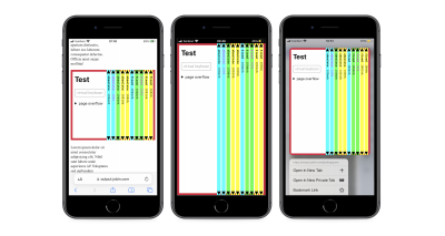
It is possible for the small and large viewport sizes to be equivalent even during regular web browsing in mobile browsers. I have found two such cases:
- In Safari on iOS, if the user chooses the “Hide Toolbar” option from the page settings menu, the browser’s UI will retract and stay retracted while the user scrolls the page and navigates to other web pages.
- In Firefox on Android, if the user disables the “Scroll to hide toolbar” option in Settings → Customize, the browser’s UI will completely stop retracting when the user scrolls web pages.
The Two Types Of Scrollbars #
In a web browser, scrollbars can be either classic or overlay. On mobile platforms, scrollbars are exclusively overlay. On desktop platforms, the user can choose the scrollbar type in the operating system’s settings. The classic scrollbar option is usually labeled “Always show scrollbars.” On Windows, scrollbars are classic by default. On macOS, scrollbars are overlay by default (since 2011), but they automatically switch to classic if the user connects a mouse.
The main difference between these two types of scrollbars is that classic scrollbars are placed in a separate ”scrollbar gutter” that consumes space when present, which reduces the size of the layout viewport; meanwhile, overlay scrollbars, as the name suggests, are laid over the web page without affecting the size of the layout viewport.
When a (vertical) classic scrollbar appears on the
page in a desktop browser with classic scrollbars, the width of the
layout viewport shrinks by the size of the scrollbar gutter, which is
usually 15 to 17 CSS pixels. This causes the page to reflow. The size
and position of absolutely and fixed-positioned elements may also
change. By default, the browser only shows a classic scrollbar when the
page overflows, but the page can force the scrollbar (or empty scrollbar
track) to be shown and hidden via the CSS overflow property.
To prevent the page from reflowing whenever a vertical classic scrollbar is shown or hidden, authors can set scrollbar-gutter: stable on the <html> element. This declaration tells the browser to always reserve space for the classic scrollbar. The declaration has no effect in browsers with overlay scrollbars. The scrollbar-gutter property is not supported in Safari at the time of writing this article.
A benefit of classic scrollbars is that they make it clear when an element on the page has a scrollable overflow. In comparison, overlay scrollbars are not shown unless the user actually attempts to scroll an element that is a scroll container with overflow. This can be a problem because the user may not even notice that an element contains more content than initially visible. Chrome for Android mitigates this problem by showing the overlay scrollbar until the user scrolls the element at least once.
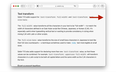
Even if the Windows operating system switches to overlay scrollbars by default in the future, some users prefer classic scrollbars and will turn them on if possible. Therefore, developers should test in browsers with classic scrollbars and ensure that their websites remain usable.
Issues Related To Classic Scrollbars #
When testing your website in a desktop browser with classic scrollbars, the two main issues to look out for are unexpected extra scrollbars caused by small amounts of overflow and empty scrollbar tracks that serve no real purpose. These are usually not major issues, but they make the website appear not quite right, which may confuse or even annoy some visitors.
Issue 1: Setting overflow To scroll Instead Of auto #
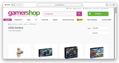
Whether
or not a scroll container has overflow depends on the content length,
viewport width, and other factors. In situations when there is no
overflow, it’s usually better to hide the scrollbar than to show an
empty scrollbar track in browsers with classic scrollbars. Such an
automatic scrollbar behavior can be enabled by setting overflow to auto on the scroll container.
When a website is developed on macOS, which uses overlay scrollbars by default, the developer may mistakenly set overflow to scroll instead of auto. Overlay scrollbars behave in the same manner whether overflow is set to auto or scroll.
The scrollbar only appears when the user attempts to scroll an element
that is a scroll container with overflow. Classic scrollbars behave
differently. Notably, if overflow is set to scroll but the element does not overflow, then the browser will show empty scrollbar tracks. To avoid this problem, set overflow to auto instead of scroll.
Auto
scrollbars trade the problem of empty scrollbar tracks with the problem
of content reflow, but the latter problem can be avoided by setting scrollbar-gutter to stable on the scroll container, as I previously mentioned.
Issue 2: Assuming That The Full Width Of A Media Query Is Available #
CSS
media queries don’t take into account the fact that classic scrollbars
reduce the width of the viewport. In other words, media queries assume
scrollbars never exist. For example, if the width of the layout viewport
is 983 pixels, and the page has a vertical classic scrollbar that is 17
pixels wide, the media query (min-width: 1000px) is true
because it “pretends” that the scrollbar isn’t there. And indeed, if we
were to hide the scrollbar, the viewport width would grow to 1,000
pixels (983 + 17 = 1000).
This behavior is by design. Media queries “assume scrollbars never exist” in order to prevent infinite loops. Web developers should not assume that the entire width of a media query is available on the web page. For example, avoid setting the width of the page to 1000px inside a @media (min-width: 1000px) rule.3
3 Apple does not seem to agree with this reasoning. In Safari, media queries take scrollbars into account, which means that the appearance and disappearance of a classic scrollbar can trigger media query breakpoints, although the browser seems to guard against infinite loops. Nonetheless, Safari’s behavior is considered a bug.
Issue 3: Using 100vw to make an element full width #
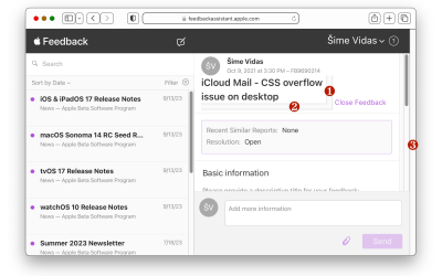
The length 100vw is equivalent to the width of the layout viewport, except in one case. If the page has a vertical classic scrollbar, 100vw is larger than the viewport width. Due to this anomaly, setting an element to width: 100vw causes the page to overflow horizontally by a small amount in browsers with classic scrollbars.
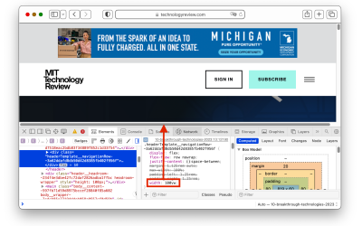
This is a known issue. The CSS Values and Units module includes the following note:
“Issue: Level 3 assumes scrollbars never existed because it was hard to implement, and only Firefox bothered to do so. This is making authors unhappy. Can we improve here?”
The note is referring to Firefox’s past behavior, where the browser would reduce the size of 100vw on pages that set overflow to scroll on the <html> element. Such pages had a stable scrollbar track, and in that case, 100vw matched the actual viewport width. This behavior was removed from Firefox in 2017, and it was dropped from the CSS specification shortly after. In a recent change of heart, the CSS Working Group decided to revert their earlier decision and reinstate the behavior:
“RESOLVED: Ifoverflow: scrollis set on the root element (not propagated from<body>), account for the default scrollbar width in the size ofvw. Also, takescrollbar-gutter[…] into account on the root.”
At the time of writing this article, this change has not yet made it into the CSS specification. It will take some time until all the major browsers ship the new behavior.
Solving The Classic Scrollbar Problem #
As the title of this article states, the new viewport units did not solve the classic scrollbar problem. The new svw, dvw, and lvw units are equivalent to the original vw unit in browsers (i.e., 100svw = 100dvw = 100lvw = 100vw). At first glance, this may seem like a missed opportunity to solve the classic scrollbar problem with the new viewport units. For example, the length 100dvw
could have represented the actual viewport width as it dynamically
changes in response to the appearance and disappearance of a vertical
classic scrollbar. This would have allowed developers to make any element on the page as wide as the viewport more easily.
There are at least two reasons why the new viewport units did not solve the classic scrollbar problem:
- The new viewport units were introduced to solve the problem of
100vhbeing taller than the initial viewport in mobile browsers. A small mobile viewport due to the browser’s expanded UI is different from a small desktop viewport due to the presence of classic scrollbars on the page, so the sames-prefixed viewport units cannot represent the small viewport in both cases. If they did, then, for example, using100svhto solve a layout issue in mobile browsers would have potentially unwanted side effects in desktop browsers and vice-versa. - The position of the CSS Working Group is that viewport units should be “resolvable at a computed-value time” and that they should “not depend on layout”. Implementing units that depend on a layout is “relatively hard” for browsers.
The CSS Working Group recently decided to mitigate the classic scrollbar problem by making 100vw smaller in browsers with classic scrollbars when the scrollbar-gutter property is set to stable on the <html>
element. The idea is that when the page has a stable scrollbar gutter,
the space for the scrollbar is reserved in advance, so the appearance of
the scrollbar does not decrease the viewport width. In other words, the
viewport has a static width that isn’t affected by the scrollbar. In
that case, the length 100vw can safely match the viewport
width at all times, whether the scrollbar is present or not. Once this
behavior makes it into browsers, developers will be able to use scrollbar-gutter: stable to prevent width: 100vw from horizontally overflowing the page.
Avoiding The Classic Scrollbar Problem #
Since at least 2018,
developers have been using CSS custom properties that are dynamically
updated via JavaScript to get the actual size of the viewport in CSS. In
the following example, the custom property --vw is a dynamic version of the vw
unit that is correctly updated when the viewport width changes due to
the appearance or disappearance of a vertical classic scrollbar. The CSS
variable falls back to 1vw when JavaScript fails to execute or doesn’t load at all.
In the JavaScript code, document.documentElement.clientWidth returns the width of the ICB, which is also the width of the layout viewport. Since the global resize event does not fire when a classic scrollbar changes the viewport width, I’m instead using a resize observer on the <html> element.
With the introduction of CSS container queries to browsers over the past year, another solution that doesn’t require JavaScript became available. By turning the <body> element into an inline-size query container, the length 100cqw — which is the width of <body> in this case — can be used instead of 100vw to get the desired result. Unlike 100vw, 100cqw becomes smaller when a vertical classic scrollbar appears on the page.
Container
queries have been supported in all desktop browsers since February
2023. If the page has additional nested query containers, the <body> element’s width (100cqw) can be stored in a registered custom property to make it available inside those query containers. Registered custom properties are not supported in Firefox at the time of writing this article.
Conclusion #
If you’d like to learn more about the concepts discussed in this article, I recommend the viewport investigation project, which was a collaboration between browser vendors to “research and improve the state of interoperability of existing viewport measurement features.” The new viewport units were, in fact, one of the focus areas of Interop 2022.
No comments:
Post a Comment