Accessibility goes beyond making products user-friendly. It can significantly impact the quality of life for people with disabilities. Kate Kalcevich shares lessons she learned from assistive technology users — challenges and barriers they encounter on mobile devices.
I often hear that native mobile app accessibility is more challenging than web accessibility. Teams don’t know where to start, where to find guidance on mobile accessibility, or how to prevent mobile-specific accessibility barriers.
As someone who works for a company with an active community of mobile assistive technology users, I get to learn about the challenges from the user’s perspective. In fact, I recently ran a survey with our community about their experiences with mobile accessibility, and I’d like to share what I learned with you.
If you only remember one thing from this article, make it this:
Half of assistive technology users said that accessibility barriers have a significant impact on their day-to-day well-being.
Accessibility goes beyond making products user-friendly. It can impact the quality of life for people with disabilities.
Types Of Mobile Assistive Technology #
I typically group assistive technologies into three categories:
- Screen readers: software that converts information on a screen to speech or braille.
- Screen magnifiers: software or system settings to magnify the screen, increase contrast, and otherwise modify the content to make it easier to see.
- Alternative navigation: software and/or hardware that replaces an input device such as a keyboard, mouse, or touchscreen.
Across all categories of assistive technology, 81% of the people I surveyed change the accessibility settings on their smartphone and/or tablet. Examples of accessibility settings include the following:
- Increasing the font size;
- Turning on captions;
- Extending the tap duration;
- Inverting colours.
There are smartphone settings such as dark mode that benefit people with disabilities even though they aren’t considered accessibility settings.
Now, let’s dive into the specifics of each assistive technology category and learn more about the user preferences that shape their digital experiences.
Screen Reader Users #
Both iPhone and Android smartphones come with a screen reader installed. On iPhone, the screen reader is VoiceOver, and on Android, it is TalkBack. Both screen readers allow users to explore by touching and dragging their fingers to hear content under their fingers read out loud or to swipe forwards and backward through all elements on the screen in a linear fashion. Both screen readers also let users navigate by headings or other types of elements.
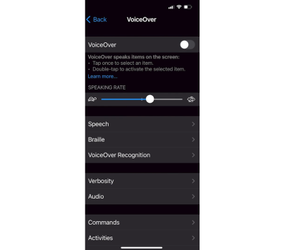
The mobile screen reader users I surveyed tend to have several devices that work together to cover all their accessibility needs, and they support businesses that prioritize mobile accessibility.
- Nearly half of screen reader users also own a smartwatch.
- Half use an external keyboard with their smartphone, and a third use a braille display.
- Almost all factor the accessibility of apps and mobile sites into deciding which businesses to support.
That last point is really important! Accessibility truly inspires purchasing decisions and brand loyalty.
Screen Magnification Users #
In addition to magnification, Android smartphones also have a variety of vision-related accessibility features that allow users to change screen colours and text sizes. The iPhone Magnifier app lets users apply colour filters, adjust brightness or contrast, and detect people or doors nearby.
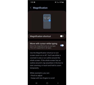
My survey showed that screen magnification users had the highest percentage of tablet ownership, with 77% owning both a smartphone and a tablet. Alternative navigation users followed closely, with 62% owning a tablet, but only 42% of the screen reader users I surveyed own a tablet.
Screen magnification users are less likely to investigate the accessibility of paid apps before purchasing (63%) compared to screen reader and alternative navigation users (89% and 91%, respectively). I suspect this is because device magnification, contrast, and colour inversion settings may allow users to work around some design choices that make an app inaccessible.
Alternative Navigation Users #
Switch Access (Android) and Switch Control (iOS) let users interact with their devices using one or more switches instead of the touchscreen. There are a variety of things you can use as a switch: an external device, keyboard, sounds, or the smartphone camera or buttons.
Item scan allows users to highlight items one by one and select an item in focus by activating the switch. Point and scan moves a horizontal line down from the top of the screen. When this line is over the desired element, the user selects their switch to stop it. A vertical line then moves from the left of the screen. When this line is also over the element, the user stops it with their switch. The user can then select the element in the cross hairs of the two lines. In addition to these two methods, users can also customize buttons to perform gestures such as swipe down or swipe left.
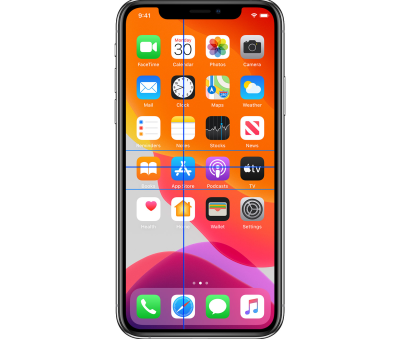
Android and iPhone devices can be controlled through Voice Access and Voice Control. Both allow users to speak commands to interact with their smartphone instead of using the touchscreen. The command “Say names” can expose labels that aren’t obvious. The command “Show numbers” allows users to say “tap two” to select the element labeled with the number 2. “Show grid” is a command often used as a last resort to select an element. This approach overlays a grid across their screen area and allows users to select the grid square where the element is in focus.
Alternative navigation users were least likely to own a smartwatch (26%) out of all three assistive technology categories, according to my survey. All the alternative navigation users that own a smartwatch, except for one, use it for health tracking. 24% use an external switch device with their smartphone.
Most Common Mobile Accessibility Barriers #
Now that you know about some of the assistive technologies available on Android and iPhone devices, we can explore some specific challenges commonly encountered by users when navigating websites and native apps on their smartphones.
I’ll outline an inclusive development process that can help you discover barriers that are specific to your own app. If you need general tips on what to avoid right now, here are common mobile accessibility issues that assistive technology users encounter. To get this list, I asked the community to select up to three of their most challenging accessibility barriers on mobile.
Unlabelled Buttons Or Links #
Unlabelled buttons and links are the number one challenge reported by assistive technology users. Screen reader users are impacted the most by unlabelled elements, but also people who use voice commands to interact with their smartphone.
Small Buttons Or Links #
Buttons and links that are too small to tap with a finger or require great precision to select using switch functions are a challenge for anyone with mobility issues. Tiny buttons and links are also hard to see for anyone with low vision.

Gesture Interactions #
Gestures like swipe to delete, tap and drag, and anything more complex than a simple tap or double tap can cause problems for many users. Gestures can be difficult to discover, and if you’re not a power mobile user, you may never figure them out. Your best bet is to include a button to perform the same action that a gesture can perform. Custom actions can expose more options, but only to assistive technology users and not to people with disabilities that may not use assistive technology, for example, cognitive disabilities.
Elements Blocking Parts Of The Screen #
A chat button that is always hovering and may cover parts of the content. A sticky header or footer that takes up a big portion of the screen when the user zooms in or magnifies their screen. These screen blockers can make it very difficult or impossible for some users to view content.
Missing Error Messages #
Keeping a submit button inactive until a form is correctly filled out is often used as an alternative to providing error messages. That approach can be a challenge for assistive technology users in particular, but also anyone with a cognitive disability or who isn’t tech-savvy. Sometimes, error messages exist, but they aren’t announced to screen reader users.

Resizing Text And Pinch And Zoom #
When an app doesn’t respect the font size increases set by a user through accessibility settings, people who need larger text must find alternative ways to read content. Some websites disable pinch and zoom — a feature that is not just useful for enlarging text but is often used to see images better.
Other Mobile Accessibility Barriers #
The accessibility barriers that weren’t mentioned as often but still represent significant challenges for assistive technology users include:
- Low contrast
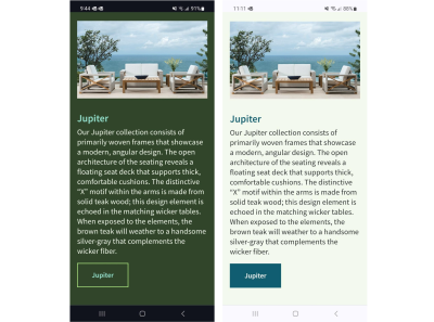
If the contrast between text and background is low, it makes it harder for folks with low vision to read. Customizing contrast settings can make content more legible for a broader range of people. - No dark mode
For some people, black text on a white background can be painful to the eyes or trigger migraines. - Fixed orientation
Not being able to rotate from portrait to landscape can impact people who have their device in a fixed position on a wheelchair or people with low vision who use landscape mode to make text and images appear larger. - Missing captions
No captions on videos were also cited as a barrier. This is one that I relate to personally, as I rely on captions myself because of my hearing disability.
I knew I couldn’t capture all of the mobile accessibility barriers in my list of choices, so I gave the survey respondents a free text field to enter their own. Here’s what they said:
- Screen reader users encounter unlabelled images or labels that don’t make sense. AI-based image recognition technology can help but often can’t provide the same context that a designer would. Screen reader users also run into apps that unexpectedly move their screen reader’s focus, changing their location on the screen and causing confusion.
- Voice Control users find apps and sites that aren’t responsive to their voice commands. They have to try alternate commands to activate interactive elements, sometimes slowing them down significantly.
- Complex navigation, such as large, dynamic lists or menus that expand and collapse automatically, can be challenging to use with assistive technologies. There aren’t often workarounds to interacting with navigation, so this can influence whether a user will abandon an app or website.
Inclusive Design Approaches For Mobile #
It’s important to avoid getting overwhelmed and not doing anything at all because mobile accessibility seems hard. Instead, focus on fixing the most critical issues first, then release, celebrate, and repeat the process.
Ideally, you’ll want to change your processes to avoid creating more accessibility issues in the future. Here’s a high-level process for inclusive app development:
- Do research with users to understand how their assistive technology works and what challenges they have with your existing app.
- Create designs for accessibility features such as font scaling and state and focus indicators.
- Revise designs and get feedback from users that can be applied in development.
- Annotate design files for accessibility based on user feedback and best practices.
- Create a new build and use automated testing tools to find barriers.
- Do manual QA testing on the new build using your phone’s accessibility settings.
- Release a private build and test with users again before the production release.

Conclusion #
Fixing and, more importantly, avoiding mobile accessibility barriers can be easier if you understand how assistive technologies work and the common challenges users encounter on mobile devices. Remember the key takeaway from the beginning of this article: half of the people surveyed felt accessibility barriers had a significant impact on their well-being. With that in mind, I encourage you not to let a lack of understanding of technical accessibility compliance hold you back from building inclusive apps and mobile-friendly websites.
When you look at accessibility from the lens of usability for everyone and learn from assistive technology users, you take a step towards empowering everyone to independently interact with your products and services, playing your part in building a more equitable Internet.
No comments:
Post a Comment