When installing Drupal, you can choose a “demo” profile that showcases various functionalities. It’s a fun and safe way to try out various features. If you do that and test your site’s performance, you’re likely to find that the background image used in the hero component is slow to load. This is a very common problem with any component that uses a large image file as a background image. In this article, Mike Herchel walks you through how to tackle this common performance issue using modern techniques.
Let’s start with a fairly common example of a hero component on the homepage of Drupal’s demo installation of the Umami theme.
The image in this hero component is loaded by CSS via the background-image property. In order for the browser to display the image, it has a fairly long chain of dependencies:
- Download the HTML.
- Download and parse the CSS.
- Reconcile the CSS ruleset with the DOM.
- Download the image.
- Display the image.

While browsers are generally pretty fast, these steps still take time to load, typically in seconds, and even longer on slower, high-latency network connections. And because this image is within the initial viewport, it’s very noticeable.
So noticeable, in fact, that Core Web Vitals has a metric all about it called Largest Contentful Paint (LCP). This metric measures the time it takes, in seconds, to render the largest image or text block that is visible on the initial load. We can test for LCP in a number of ways. The following screenshot is taken from a test I ran through WebPageTest, resulting in an LCP of 2.4 seconds.
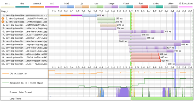
The image file used for the hero component’s background is the ninth item in the report, taking 1,041 milliseconds to even begin the download.
In case you’re wondering, 2.4 seconds is not great. That’s practically an eternity when talking about page speed performance. And since the image file used for the background appears to be making up about 50% of that time, it’s a prime target for optimization.
Here’s how we are approaching it.
Step 1: Use An <img> Tag Instead Of A Background Image #
To
avoid the five-step dependency chain I outlined above, we want to
prevent loading the image with CSS. Instead, we’re going to load the
image as a standard HTML <img> tag in the markup.
This allows the browser’s preload scanner to detect and download the image early in the process — something it cannot parse from a CSS file. The preload scanner does pretty much what you think it does: it scans the HTML as it’s still being downloaded and starts to pull down additional assets that it thinks are important.
How do we use an HTML <img> as a replacement for a CSS background-image?
We’re unable to simply drop an image in the markup and use it as a true
background, at least in the CSS sense. Instead, we have to establish a
container element — let’s give it a class name of .hero —
and position the image in a way that stacks on top of it, and
subsequently, allow other elements such as the hero content to stack on
top of it. This gives us the illusion of a background image.
This requires us to use absolute positioning in CSS. This takes the image out of the normal document flow, which is a fancy way of saying that the elements surrounding it act as if it’s not there. The image is there, of course, but its physical dimensions are ignored, allowing elements to flow right on top of it rather than around it.
This works! The <img> element now stacks on top of the .hero container. But now we have a couple of new issues that need to be addressed.
The first is that the image is squished and distorted. You might think this is a bug, but we’ve set the image to take up width: 100% and height: 100% of the .hero container, and it is merely adjusting its aspect ratio to the aspect ratio of the container, as it’s being told to do.

If we were still loading the image with the CSS background-image property, we could fix this by setting background-size: cover on the image. But we don’t get that luxury when working with HTML images.
Fortunately, the object-fit property can solve this for us. It works pretty similarly to the background-size property and actually takes the same cover keyword as a value. We set that on the image in CSS:
This brings us to the second issue we introduced when we applied absolute positioning to the image. Remember the content with the cool pink button that sat on top of the background image in the first screenshot at the beginning of the article? The image is completely covering it. It’s there, just not seen beneath the absolutely-positioned image.

The “problem” is that we get a stacking context anytime we explicitly declare a non-static position
on an element. The image is taken out of the normal flow but is still
visible even as elements that follow it in the markup flow right through
it. As such, the content elements flow under the image and are hidden
from view. I say “problem” in quotes because, again, this is expected
behavior that comes by explicitly declaring position: absolute in CSS.
The trick? We can give the .hero
element’s content container its own stacking context. We won’t use
absolute positioning, however, because we want it to remain in the
normal document flow. Otherwise, it, too, would obscure its surrounding
elements.
That’s where setting a relative position — position: relative — comes into play. Elements come with position: static by default. By when we declare position: relative, it produces a stacking context but also keeps the element within the normal flow.
Now the content sits properly on top of the image as though the image were a true background:

I’ll
note that your mileage may vary depending on the order of elements
inside the parent container. You may find yourself needing to set the
element’s level in the stacking context using z-index.
Step 2: Use A Modern Image Format #
The hero banner looks correct now, but we still have a bit of work to do. The current image is a highly-optimized JPG file, which isn’t horrible, but we can do better. The new-ish WebP image format is supported by all modern browsers and typically comes in at a very small file size. Let’s use that instead of a standard JPG.
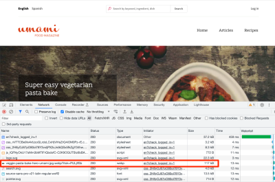
After configuring Drupal to serve WebP image formats, we can see the new image size is reduced by 10% with no noticeable loss of quality!
Note: In many cases, the file size will be reduced substantially more than that (frequently more than 50%), but in our case, the source image was already fairly optimized.
Step 3: Use Responsive Images #
We now have the image being downloaded immediately, and we’re also using the new WebP image format, which can save up to 50% on the file size. But we’re still not done, as the same image is being served for every screen size. If we serve smaller images to smaller screen sizes, the image will download even faster to those devices. To solve this, we’ll implement responsive images.
Responsive images have been supported in browsers for a long time. At its core, the markup contains paths to multiple images, and information on which screen sizes to serve each lets the browser know when to display. This enables the browser to automatically pull down the images that are sized appropriately for the screen size.
We set this up using the <picture> element, and it looks something like this:
Note: Drupal supports responsive images out of the box. If you’re CMS or framework does not, there are services such as Cloudinary that can handle this for you (for a fee, of course).
There’s Still More To Do #
We made significant improvements and improved the LCP by 58%, from 2.4s to 1.4s!

But there’s still more to do. Yet another, newer image format called AVIF can help reduce our image file sizes by another 20–30%. Similarly, there’s the new fetchpriority HTML attribute for images.
It’s worth mentioning that the attribute is still considered “experimental” at the moment, and browser support isn’t currently all the way there as I’m writing this.
That said, we’re currently working on a setting in the Drupal admin UI that adds fetchpriority
to images, and when that lands, we’ll use it to inform the browser of
the relative priority of the image (which in this case would be equal to
high).
Wrapping Up #
In this article, we identified, measured, and fixed a very common performance issue, not only in Drupal but in everyday front-end work.
“
Web developers should learn to use various testing tools such as Lighthouse and WebPageTest. We should learn common metrics, such as Time to First Byte, LCP, and other web vitals. And most of all, we need to care. There is a wealth of information on websites to help guide you along your learning path.
Additional Resources #
- Web Vitals (web.dev)
- Largest Contentful Paint (web.dev)
- “Improving Core Web Vitals, A Smashing Magazine Case Study,” Barry Pollard
- “Core Web Vitals Tools To Boost Your Web Performance Scores,” Zara Cooper
- “A Quick Overview of
object-fitandobject-position,” Robin Rendle
No comments:
Post a Comment