reviews various accessible text over images techniques for designing your content, including framing the image, soft-colored gradients technique, text styles and text position, solid color shapes, and use of colored backgrounds.
What is the text over images design pattern? How do we apply this pattern to our designs without sacrificing legibility and readability?
The text over images design pattern is a design technique used to place text on top of images. It is often used to provide information about the image or to serve as the main website navigation. However, this technique can quickly sacrifice legibility and readability if there is not enough contrast between the text and the image. To prevent this, designers need to ensure that the text and the image have a high enough contrast ratio to be legible and readable. Additionally, designers should also make sure the text is positioned in the right place, away from any image elements that might cause confusion, distraction, or make it difficult to read.
“Incorporating text with imagery is a balancing act. To create professional, compelling content, the image and text must reach a visual harmony. At the same time, strong contrast between text and image will increase legibility and will make your content stand out.”
— “Tips for Overlaying Text on Imagery,” Getty Images
In Part 1 of the series, we have reviewed in detail five techniques (using an overlay over the entire image, text with scrim overlay, strips/highlight, copy space, and text over blurred background effect) and now we’ll continue with reviewing in detail five more (frame the image, soft-colored gradients, text styles and text position, solid color shapes, use of colored backgrounds). In the end, I will also provide you with a long list of useful tools and resources related to this accessibility topic.
Frame That Image #
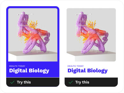
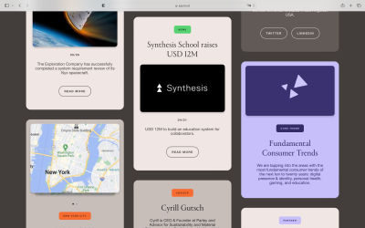
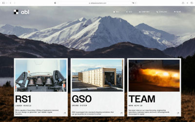
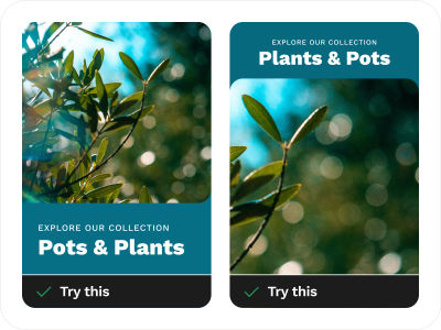
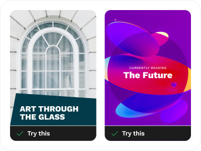
Another simple design technique you can try is by framing the image in a flat-colored shape that includes your text. This kind of style is mostly used in thumbnails and cards.
Examples From The Wild #
Additional Resources On This Topic #
- Bento Grids
Bento Grids is a nice curated collection of tiles-based layouts (that were initially popularized by Apple). The main idea behind this is to present the key takeaways in a visual and easy-to-consume way. Bento layouts are great for showcasing brand identity, summarizing product features, and much more. - Godly → Websites → Grid style
A large collection of some of the best grid-style websites.
Soft-colored Gradients Technique Over Images #
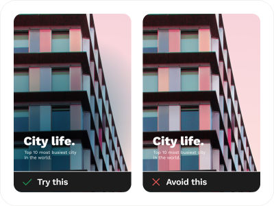
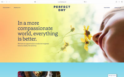
When black or white gradients don’t work well, you can use the soft-colored gradients text over image technique. These soft-colored gradients are created when two or more different colors are blended to create a soft and gentle transition from one color to another. They are commonly used on websites and page designs to make them look modern and creative.
Examples From The Wild #

Additional resources on this topic #
- Gradient Maker (by Angry Tools)
- CSS Gradients Generator (by Designstripe)
Play Around With Text Styles And Text Position #
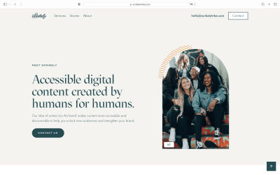
Achieving the 1.4.3 success criterion might be difficult even if we have used some of the techniques outlined in the examples above, or when any combination of those techniques still fails. In such cases, one of the safest options is to play around with text styles and with the text position outside of the image.
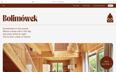
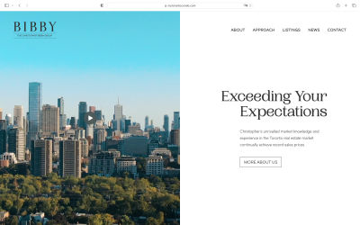
Various text styles (bigger or smaller text; emphasize, low-key, bold, regular, or light text style; playing with margins and letter spacing, etc.) and combining these text styles in different ways may help you achieve a powerful impact with regards to your design while not sacrificing any accessibility. You can also position your text to the left or right, the top or bottom, and you’ll have an accessible and visually appealing website or app.
This technique is great if you combine your text styling techniques and play around with the images. With text positioned outside of the image, you have control over how to make it more accessible by using real text that can be zoomed in to maximum for those people who may have trouble reading small text on the screen or for those who wish to use their voice assistants.
Examples From The Wild #
Additional Resources On This Topic #
- “Design Considerations: Text on Images,” by Chris Coyier (CSS Tricks)
Play With Solid Shapes #
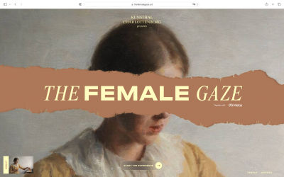
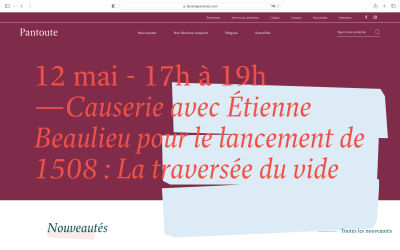
Using only simple shapes can make a lot of difference. Play around with solid shapes by creating strong harmony between the color of your text and the background colored shape. Once you learn how to balance the text styles and the colors, the readability of the text will greatly improve.
Examples From The Wild #
Additional Resources On This Topic #
- “The psychology behind shapes and colors,” by Rob Postema (UX Collective)
- “Apply color theory to your designs,” by Pranav Ambwani (UX Collective)
- “Your ultimate guide to background design” (Canva Design)
Ditch The Image And Just Use Colored Backgrounds #
In case you cannot fulfill the 1.4.3 success criterion, you have the option of replacing images with colored (uniform color) or gradient (two or more colors) backgrounds. This technique facilitates screen readers to read actual text instead of images, hence enhancing accessibility for visually impaired users. Furthermore, using this technique, you can adapt the text to meet your user’s preferences, optimize it for various screen sizes, and even adjust the size or zoom level without compromising its quality.
Furthermore, with this technique, you can easily customize real text according to the user’s requirements, such as colors or styles, and much more. It might be difficult to achieve this criterion in certain circumstances, but giving users an option to customize those things instead of using images would be better for everyone involved, and that is why this technique does not require much effort on your part at all.
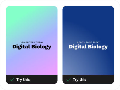
Examples From The Wild #
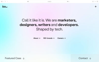
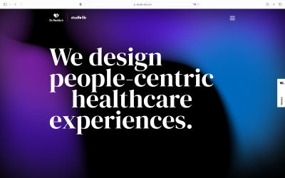
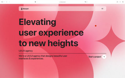
Additional Resources On This Topic #
- CSS Gradients Generator (by Designstripe)
- “How to add a gradient overlay to text with CSS,” a tutorial by Sarah Fossheim
Just Use The Actual Text! #
Lastly, while all of these design techniques will help you make the text over images more accessible, I still think that using the actual text is the way to go.
Providing special care to ensure that text over an image remains perfectly readable and accessible is a must, and, as you have seen in sections 1 — 10 of the article, there are plenty of design techniques for that purpose. But again, if you want to make your website or mobile app accessible right from the start, why not simplify things a bit and do it properly? Use real text, make sure there is plenty of contrast between the text and the background, and make your website or app accessible to everyone.
Using text over images provides a combination of benefits, and yet it has some limitations. Text placed over images is harder to read for visually impaired users, especially at smaller text sizes, because the content gets more compressed. There are also some accessibility requirements for different colors under the WCAG 2.1 guidelines. If you have trouble implementing the success criterion mentioned in the design techniques we’ve presented, ditching everything and just using real text will do the trick.
Conclusion #
As with any new design trends popping out in different places, we need to make sure that what we’re creating is not only pretty but is also helping our users. Always consider the accessibility aspect to be “baked in” right from the start rather than being an afterthought in your design process.
In any case, if someone asks you why the real text is better to use rather than text over images or images of text, here are a few key things to remember:
- Real text can be zoomed in to any size without distortion and pixelation, and (what’s also very important) it can be read by assistive tech software.
- Additionally, you can easily increase the contrast of the text, which will help your users access the content easier.
- With actual text, you have the freedom to create your own styling and make use of CSS to format the text elements. I can highly recommend you to read the very detailed hands-on tutorial on how to use CSS styling, “Handling Text Over Images in CSS” by Ahmad Shadeed.
Thank you for joining me in this accessibility journey. We covered many design techniques that will hopefully help you work better with accessible text over images. And if you have some additional tips or advice to share — please do so in the comment section below, or ping me on Twitter (@humbleuidesigns)!
Further Reading: Tools & Resources #
Useful Accessibility Tools
- Should I Use Carousel?
- Test Your Background Image Accessibility
- Rainbow Contrast Checker
- Tanagaru Contrast Finder
- Optimal Overlay Finder
- TPGi Color Contrast Checker
- Colorable
- Spelll
- Contrast
- Juliette
- Accessibility And Interactions Documentations Annotation Kit
Accessible Carousels
- “Creating An Accessible Image Carousel,” by Aleksandr Hovhannisyan
Accessible Images
- “Why Is It Important for Accessibility to Use Actual Text Instead of Images of Text?” (Bureau of Internet Accessibility)
- “Ensure High Contrast for Text Over Image,” by Aurora Harley (NN/g Nielsen Norman Group)
Accessible Text over Images through CSS and HTML
- “Handling text over images in CSS,” by Ahmad Shadeed
- “Design Considerations: Text on Images,” by Chris Coyier (CSS-Tricks)
Accessible Text and Typography
- “10 Typography Tricks to Make Your Text Much More Readable,” by Igor Ovsyannykov (Creative Market)
- “The UX Designer’s Guide to Typography,” by Molly Fitz-Patrick (IxDF)
Guides for Accessible Documentation And Annotations
- “A Designer’s Guide to Documenting Accessibility & User Interactions,” by Stéphanie Walter
- “Accessibility Guidelines,” by Ana Valjak (Figma Community)
WCAG Reference
Working with Color
- “The psychology behind shapes and colors,” by Rob Postema (UX Collective)
Design influences the way we perceive the world, the way we feel, and the choices we make. To communicate to your target audience effectively as a designer, having knowledge of the psychological principles of human behavior (revolving around the use of shapes, colors, typography, and compositions) can be very helpful. - “Apply color theory to your designs,” by Pranav Ambwani (UX Collective)
Color is a very strong tool that we can apply to solve many design challenges. Since color plays such a major role in shaping the aesthetics and usability of websites, changing a single color can change a user’s perception of the same design. - “Your ultimate guide to background design” (Canva Design)
The background design you choose can dramatically change your design and make your graphics feel complete. Colors can be used as overlays to enhance brand awareness amongst your audience, while images don’t need to just sit alongside your graphic elements — they make for excellent backgrounds when placed correctly. Backgrounds are the backbone of great design! - “Tips for Overlaying Text on Imagery” (Getty Images)
Pay attention to color, contrast, and brightness; blur the imagery; weigh your text correctly; put more thought into your image; utilize the image’s perspective to your advantage — this and several other tips, combined with some examples, are shared in this concise and practical article.
No comments:
Post a Comment