In this article, Ruslan Yevych will show you an easy way how to predict the appearance of a problem known as WCAG Failure Under 1.4.4 Resize Text (AA) while zooming the page. You will have a clear understanding of the possible risks of using responsive typography at the stage of development.
When I wrote my previous tutorial about the extended use of the CSS clamp function, I was surprised by the drawback of zooming of text in fluid typography.Thanks to Adrian Bece and Adrian Roselli, I now know that this problem is known as a WCAG Failure Under 1.4.4 Resize Text (AA).
But what does this exactly mean?
“When people zoom a page, it is typically because they want the text to be bigger. When we anchor the text to the viewport size, even with a (fractional) multiplier, we can take away their ability to do that. It can be as much a barrier as disabling zoom. If a user cannot get the text to 200% of the original size, you may also be looking at a WCAG 1.4.4 Resize text (AA) problem — check out Failure of Success Criterion 1.4.4 due to incorrect use of viewport units to resize text.”
— Adrian Roselli
The prominent example that demonstrates the problem is a simple demo from Adrian Roselli’s article, “Responsive Type and Zoom.” Make the viewport width to 800px and see how text gets smaller while zooming to 220%. If you continue zooming, the text will begin to increase again, but will never reach its 2× increase in size (browsers currently have a zoom limit of 500%).
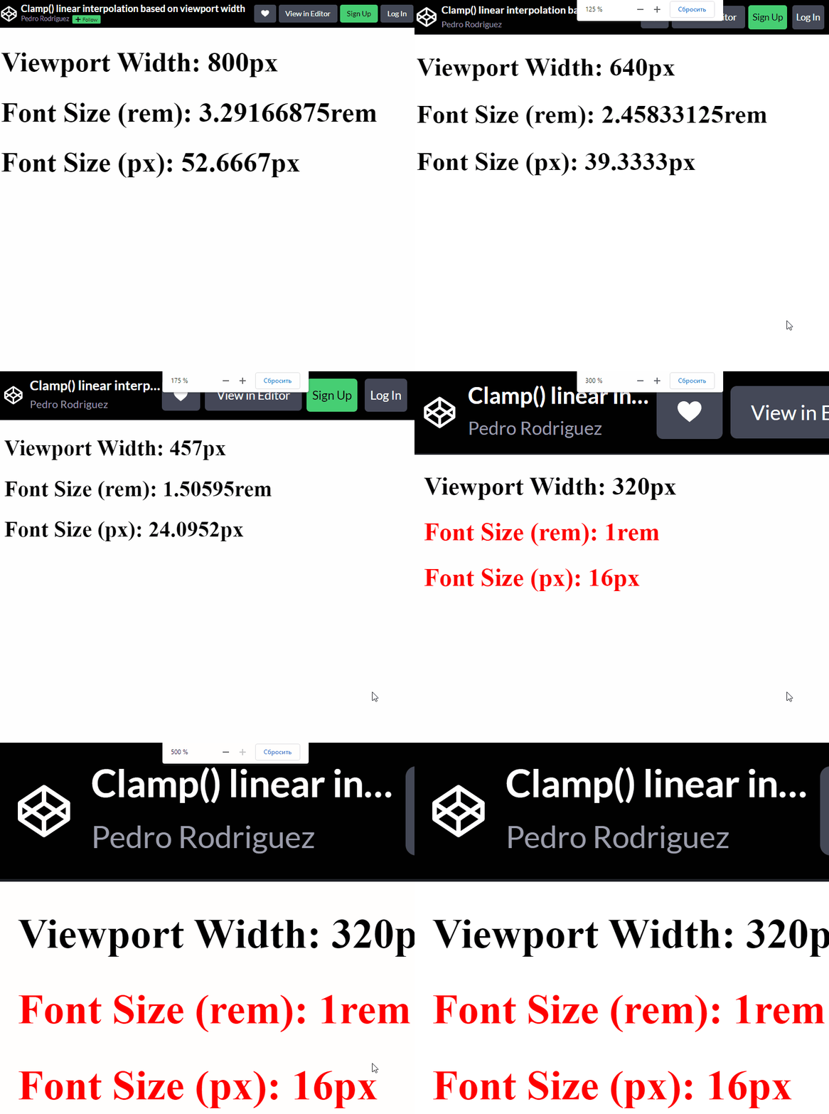
When I started to study this question intently, I found out that there is no solution at the time as well as detailed explanation. The great recommendation is:
“If you are going to use responsive typography techniques anyway, you must test it by zooming. Zoom across devices, across browsers, across viewport sizes (not everyone surfs full-screen), and across viewport orientations.”
— Adrian Roselli
So, if you want to be sure that the user will be able to zoom in the text to at least 200% of original size, you should make a huge amount of tests. In this article I propose the solution how to predict the mentioned WCAG Failure at the stage of development. And I am not sure that my findings will guarantee the 100% absence of the problem, but I am sure that it will be helpful to avoid developers from rough errors in the real use cases.
Not Responsive Typography #
So, what is really going on when users try to zoom the web page? The answer to this question is very simple: All modern browsers assume that pixel is stretchable. Therefore, the screen size “effectively” decreases on zooming.
Note: This article was written a few months ago, and OMG, Firefox now zooms pages correctly. The screen size doesn’t “effectively” decrease as you zoom in, but it is constant. Thus, the problem described in the article is still relevant for Chrome, Opera, but not for Firefox. So, while reading, you may find different behavior of the examples depending on the browser.
When we try to zoom the page to 200% of its original size, the pixel becomes twice as large in height and width. So, look at the code below:
Without zooming, we will see a text of this paragraph as text of some “visual-size”. Due to different physical size of pixels for different devices, this “visual-size” will change from one device to another. Really, if your 42-inch TV has a resolution of 1920×1080 pixels, then it contains 2073600 pixels, and your 6.1-inch iPhone 13, for example, has a resolution of 2532×1170 pixels and contains a whopping 2962440 pixels. Let introduce some coefficient k that is proportional coefficient between “visual-size” (what we see on screen) and “font-size” (what we set in CSS):
This coefficient depends on type of screen. But as we will see below, it does not effect on a final result.
Now let’s try zoom in and see what happens.

As we can see, the "visual-siz"e of the text monotonically increases while zooming, and we can describe this by introducing the "zoom-coefficient" (browser zoom) as the following:
The "zoom-coefficient" is equal to 1 for the original size (without zoom in), 2 — for 200% of browser zoom, 3 — for 300%, and so on, and "zoom-coefficient" < 1 when we zoom out. Now we can introduce and calculate a "visible-zoom" coefficient, which is a measure of the real visible increasing (decreasing) of a size of the text, as ratio:
As we can see from equation (3), the "visible-zoom" is equal to browser "zoom-coefficient". That is, to double the text size ("visible-size"
of text), we need to simple apply browser 200% zoom in. So, the
mentioned WCAG Failure Under 1.4.4 Resize Text (AA) will never be
observed in the case of not responsive typography (constant font size).
Fluid Typography #
So, what happens in the case of responsive typography? In the mentioned simple demo one can find the following record in CSS stylesheet:
It
is an example of fluid (responsive) typography. Fluid typography give
us the possibility to change text smoothly with viewport width. The
widespread implementation of such concept in CSS stylesheet is to use a clamp function. Using clamp you can smoothly change "font-size" between "min-value" and "max-value" in the given range of viewport width (from "start-width" to "end-width").
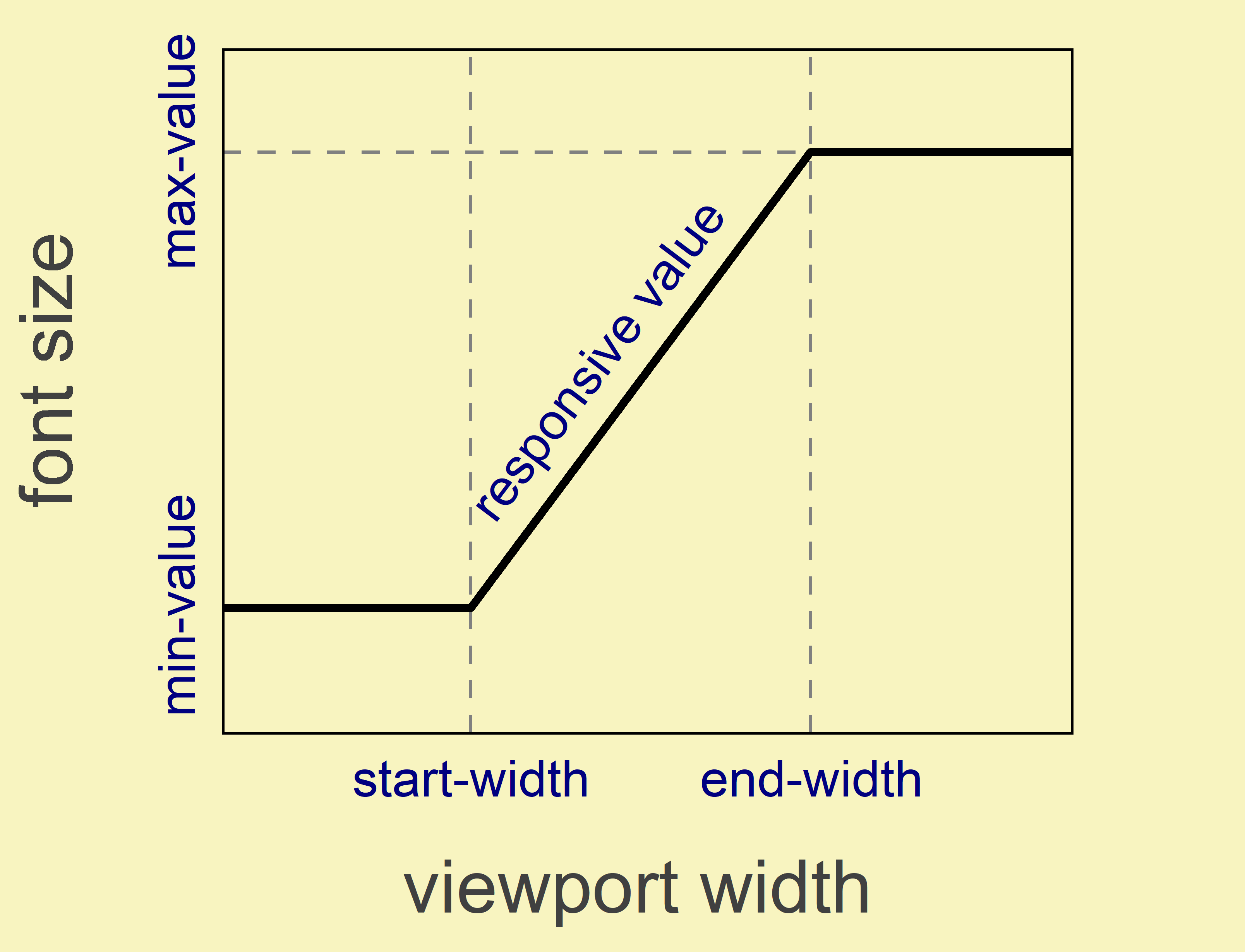
clamp function. (Large preview)In such the case, when font-size value depends on viewport width, equations (2) and (3) can be easily modified. In these equations we should take into account two facts:
"font-size"depends on (function of)"viewport-width", so"font-size"="font-size"("viewport-width");- The value of viewport width depends on
"zoom-coefficient".
The second fact is not so obvious like the first one. But we should remember that under zooming the viewport width “effectively” decreases. So, we will have the following transformation when zooming:
Using relation (4), equation (3) take the following form:
Equation (5) and a simple criterion (“minimum 200% zoom requirement”):
can
be used to check whatever users can get text to 200% of its original
size for the available range of browser zoom (up to 5 or 500% nowadays)
for the any value of viewport width. On a practice, it is better to
create some 3D plot in coordinates "visible-zoom" — "viewport-width" — "zoom-coefficient" or corresponding contour map. Such visualization is an easy way to estimate the extent of the problem if it exists.
Example: Let’s apply equation (5) to analyze the simple demo from Introduction. At first, we can reassemble the (*)
record for better understanding of the parent behavior (what developer
specified in). Here we will assume that browser’s default font size is 16px. The influence of browser default font size on our conclusion will be discussed latter. Keeping in the mind clamp("min-value", "responsive-value", "max-value") function record form, we have from (*)"min-value" = 1rem = 16px, "max-value" = 3.5rem = 56px. Taken into account that viewport width is equal to 100vw, we can write two equations to determine "start-width" and "end-width":
From these equations one can find that "start-width"= 22.5rem= 360px, and "end-width" = 52.5rem=840px, or represent the result graphically:
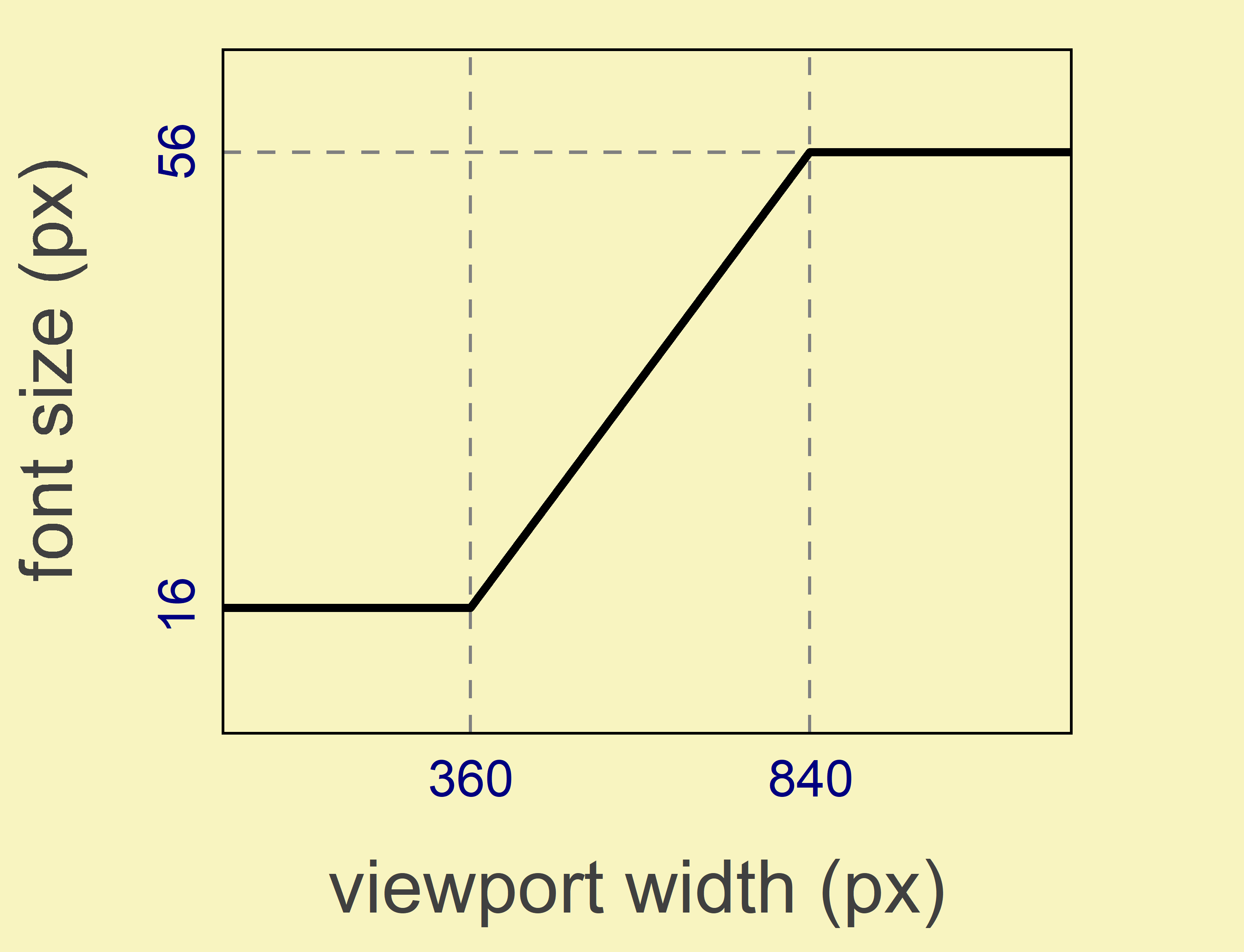
clamp(16px, -14px + 8.333333vw, 56px) function from simple demo. (Large preview)To obtain the calculated dependency of "visible-zoom" on "zoom-coefficient" at 800px of viewport width where anomalous behavior is observed, we can use equation (5) with fixed value of “viewport-width” = 800px and plot the corresponding curve (by Plotly JavaScript Open Source Graphing Library). Here you can see the result:
The "visible-zoom" and "zoom-coefficient"
are represented on graphics by percentage. So the 100% value mean the
original size. As you can see, the observed anomalous behavior, when
text becomes smaller as the zoom increases, is well reproduced.
Moreover, it is shown that "visible-zoom" coefficient will
never reach the value of 200%. Its maximum value is about 150% by
applying the maximum possible 500% browser zoom.
But what happens at other values of the viewport width? To explore this question one can create a 3D plot or corresponding projected contours:
As you can see, when the font size of the text is determined by the (*) record, "visible-zoom"
is less than 200% (grey color) when zooming for the wide range of the
viewport values — from about 650 to 1680px. According to the data,
this range for screen resolution is still very popular. Given the
above, it is very likely that users will have a problem while zooming. MinValue, maxValue, startWidth, endWidth constants in Codepen define the behavior of font size shown in Fig.4. You can change it to test your own cases.
So, using the equation (5) and the graphs built with it, we were able to easily explain the observed anomalous behavior of the font size while zooming.

Browser Default Font Size #
Let’s analyze the influence of browser default font size on the fulfillment of “minimum 200% zoom requirement” on the example of simple demo. Here one can change a value for browserDefaultFontSize variable from 16 to another values and see the changes. Figure 5 shows the result for browserDefaultFontSize = 16, …, 28 (px).

As you can see there is nothing but a “stretching” along “viewport-width”-axis only. By increasing of browser default font size, we just move the area of viewport widths where “minimum 200% zoom requirement” is failed. The main peculiarities of the text font size changing when zooming remain the same.
Media Queries #
Above we considered the case where there no media queries influent on text font size. It is time to analyze what will change in the opposite case? It is strongly recommended to use relative units in media query condition (read this article by Zell, for example). In such the cases, there will no difference how to define the fluid typography — using media queries or not. (You can find the algorithm how to specify an any complicated behavior of responsive font size without media queries in my previous tutorial.)
Now we can describe a usage of equation (5) for different cases:
- Without media queries — one can directly apply the equation (5).
- With media query/queries (features are in eIn
this article, Ruslan Yevych will show you an easy way how to predict
the appearance of a problem known as WCAG Failure Under 1.4.4 Resize
Text (AA) while zooming the page. You will have a clear understanding of
the possible risks of using responsive typography at the stage of
development.
When I wrote my previous tutorial about the extended use of the CSS
clampfunction, I was surprised by the drawback of zooming of text in fluid typography.Thanks to Adrian Bece and Adrian Roselli, I now know that this problem is known as a WCAG Failure Under 1.4.4 Resize Text (AA).But what does this exactly mean?
“When people zoom a page, it is typically because they want the text to be bigger. When we anchor the text to the viewport size, even with a (fractional) multiplier, we can take away their ability to do that. It can be as much a barrier as disabling zoom. If a user cannot get the text to 200% of the original size, you may also be looking at a WCAG 1.4.4 Resize text (AA) problem — check out Failure of Success Criterion 1.4.4 due to incorrect use of viewport units to resize text.”
— Adrian RoselliThe prominent example that demonstrates the problem is a simple demo from Adrian Roselli’s article, “Responsive Type and Zoom.” Make the viewport width to 800px and see how text gets smaller while zooming to 220%. If you continue zooming, the text will begin to increase again, but will never reach its 2× increase in size (browsers currently have a zoom limit of 500%).

The text becomes smaller as the zoom increases. (Large preview) When I started to study this question intently, I found out that there is no solution at the time as well as detailed explanation. The great recommendation is:
“If you are going to use responsive typography techniques anyway, you must test it by zooming. Zoom across devices, across browsers, across viewport sizes (not everyone surfs full-screen), and across viewport orientations.”
— Adrian RoselliSo, if you want to be sure that the user will be able to zoom in the text to at least 200% of original size, you should make a huge amount of tests. In this article I propose the solution how to predict the mentioned WCAG Failure at the stage of development. And I am not sure that my findings will guarantee the 100% absence of the problem, but I am sure that it will be helpful to avoid developers from rough errors in the real use cases.
Not Responsive Typography #
So, what is really going on when users try to zoom the web page? The answer to this question is very simple: All modern browsers assume that pixel is stretchable. Therefore, the screen size “effectively” decreases on zooming.
Note: This article was written a few months ago, and OMG, Firefox now zooms pages correctly. The screen size doesn’t “effectively” decrease as you zoom in, but it is constant. Thus, the problem described in the article is still relevant for Chrome, Opera, but not for Firefox. So, while reading, you may find different behavior of the examples depending on the browser.
When we try to zoom the page to 200% of its original size, the pixel becomes twice as large in height and width. So, look at the code below:
Without zooming, we will see a text of this paragraph as text of some “visual-size”. Due to different physical size of pixels for different devices, this “visual-size” will change from one device to another. Really, if your 42-inch TV has a resolution of 1920×1080 pixels, then it contains 2073600 pixels, and your 6.1-inch iPhone 13, for example, has a resolution of 2532×1170 pixels and contains a whopping 2962440 pixels. Let introduce some coefficient k that is proportional coefficient between “visual-size” (what we see on screen) and “font-size” (what we set in CSS):
This coefficient depends on type of screen. But as we will see below, it does not effect on a final result.
Now let’s try zoom in and see what happens.

Fig.2. Increasing of “visual-size” of text while zooming. (Large preview) As we can see, the
"visual-siz"eof the text monotonically increases while zooming, and we can describe this by introducing the"zoom-coefficient"(browser zoom) as the following:The
"zoom-coefficient"is equal to 1 for the original size (without zoom in), 2 — for 200% of browser zoom, 3 — for 300%, and so on, and"zoom-coefficient"< 1 when we zoom out. Now we can introduce and calculate a"visible-zoom"coefficient, which is a measure of the real visible increasing (decreasing) of a size of the text, as ratio:As we can see from equation (3), the
"visible-zoom"is equal to browser"zoom-coefficient". That is, to double the text size ("visible-size"of text), we need to simple apply browser 200% zoom in. So, the mentioned WCAG Failure Under 1.4.4 Resize Text (AA) will never be observed in the case of not responsive typography (constant font size).More after jump! Continue reading below ↓Fluid Typography #
So, what happens in the case of responsive typography? In the mentioned simple demo one can find the following record in CSS stylesheet:
It is an example of fluid (responsive) typography. Fluid typography give us the possibility to change text smoothly with viewport width. The widespread implementation of such concept in CSS stylesheet is to use a
clampfunction. Usingclampyou can smoothly change"font-size"between"min-value"and"max-value"in the given range of viewport width (from"start-width"to"end-width").
Fig.3. Behavior of font size with viewport width defined by clampfunction. (Large preview)In such the case, when font-size value depends on viewport width, equations (2) and (3) can be easily modified. In these equations we should take into account two facts:
"font-size"depends on (function of)"viewport-width", so"font-size"="font-size"("viewport-width");- The value of viewport width depends on
"zoom-coefficient".
The second fact is not so obvious like the first one. But we should remember that under zooming the viewport width “effectively” decreases. So, we will have the following transformation when zooming:
Using relation (4), equation (3) take the following form:
Equation (5) and a simple criterion (“minimum 200% zoom requirement”):
can
be used to check whatever users can get text to 200% of its original
size for the available range of browser zoom (up to 5 or 500% nowadays)
for the any value of viewport width. On a practice, it is better to
create some 3D plot in coordinates "visible-zoom" — "viewport-width" — "zoom-coefficient" or corresponding contour map. Such visualization is an easy way to estimate the extent of the problem if it exists.
Example: Let’s apply equation (5) to analyze the simple demo from Introduction. At first, we can reassemble the (*)
record for better understanding of the parent behavior (what developer
specified in). Here we will assume that browser’s default font size is 16px. The influence of browser default font size on our conclusion will be discussed latter. Keeping in the mind clamp("min-value", "responsive-value", "max-value") function record form, we have from (*)"min-value" = 1rem = 16px, "max-value" = 3.5rem = 56px. Taken into account that viewport width is equal to 100vw, we can write two equations to determine "start-width" and "end-width":
From these equations one can find that "start-width"= 22.5rem= 360px, and "end-width" = 52.5rem=840px, or represent the result graphically:
clamp(16px, -14px + 8.333333vw, 56px) function from simple demo. (Large preview)To obtain the calculated dependency of "visible-zoom" on "zoom-coefficient" at 800px of viewport width where anomalous behavior is observed, we can use equation (5) with fixed value of “viewport-width” = 800px and plot the corresponding curve (by Plotly JavaScript Open Source Graphing Library). Here you can see the result:
The "visible-zoom" and "zoom-coefficient"
are represented on graphics by percentage. So the 100% value mean the
original size. As you can see, the observed anomalous behavior, when
text becomes smaller as the zoom increases, is well reproduced.
Moreover, it is shown that "visible-zoom" coefficient will
never reach the value of 200%. Its maximum value is about 150% by
applying the maximum possible 500% browser zoom.
But what happens at other values of the viewport width? To explore this question one can create a 3D plot or corresponding projected contours:
As you can see, when the font size of the text is determined by the (*) record, "visible-zoom"
is less than 200% (grey color) when zooming for the wide range of the
viewport values — from about 650 to 1680px. According to the data,
this range for screen resolution is still very popular. Given the
above, it is very likely that users will have a problem while zooming. MinValue, maxValue, startWidth, endWidth constants in Codepen define the behavior of font size shown in Fig.4. You can change it to test your own cases.
So, using the equation (5) and the graphs built with it, we were able to easily explain the observed anomalous behavior of the font size while zooming.
Browser Default Font Size #
Let’s analyze the influence of browser default font size on the fulfillment of “minimum 200% zoom requirement” on the example of simple demo. Here one can change a value for browserDefaultFontSize variable from 16 to another values and see the changes. Figure 5 shows the result for browserDefaultFontSize = 16, …, 28 (px).
As you can see there is nothing but a “stretching” along “viewport-width”-axis only. By increasing of browser default font size, we just move the area of viewport widths where “minimum 200% zoom requirement” is failed. The main peculiarities of the text font size changing when zooming remain the same.
Media Queries #
Above we considered the case where there no media queries influent on text font size. It is time to analyze what will change in the opposite case? It is strongly recommended to use relative units in media query condition (read this article by Zell, for example). In such the cases, there will no difference how to define the fluid typography — using media queries or not. (You can find the algorithm how to specify an any complicated behavior of responsive font size without media queries in my previous tutorial.)
Now we can describe a usage of equation (5) for different cases:
- Without media queries — one can directly apply the equation (5).
- With media query/queries (features are in em, recommended), “font-size” depends on viewport width as:
- You can exclude it by using the algorithm proposed in my previous article and return to pt. 1;
- For given
"viewport-width"and"zoom-coefficient", we should transform the equation (7) to use as numerator in equation (5) like:
It is your choice how to use equation (5), but I recommend to reduce the task to pt. 1⁄2(i).
It
should be noted that we did not consider operating system zoom here.
When user applied it this will also affect on “effective” screen size.
As a result, the "zoom-coefficient" should be represented
as a product of browser and operating system zoom. Such influence on
final prediction will be similar to the case of changing browser default
font size.
Conclusion #
Now we are able to predict the behavior of text size changing while zooming to avoid the WCAG Failure Under 1.4.4 Resize Text (AA). Equation (5) and “minimum 200% zoom requirement” (6) give us an easy way to anticipate a problem on the stage of development and analyze it. Due to a variety of possible dependencies for a text font size on viewport width that developer can implement, there is no general solution of a problem. But you can slightly change the input parameters and view the predictions. In most cases, such corrections will give the desired result. We should make a choice in favor of completely eliminating possible problems with text scaling.
- m, recommended), “font-size” depends on viewport width as:
- You can exclude it by using the algorithm proposed in my previous article and return to pt. 1;
- For given
"viewport-width"and"zoom-coefficient", we should transform the equation (7) to use as numerator in equation (5) like:
It is your choice how to use equation (5), but I recommend to reduce the task to pt. 1⁄2(i).
It
should be noted that we did not consider operating system zoom here.
When user applied it this will also affect on “effective” screen size.
As a result, the "zoom-coefficient" should be represented
as a product of browser and operating system zoom. Such influence on
final prediction will be similar to the case of changing browser default
font size.
Conclusion #
Now we are able to predict the behavior of text size changing while zooming to avoid the WCAG Failure Under 1.4.4 Resize Text (AA). Equation (5) and “minimum 200% zoom requirement” (6) give us an easy way to anticipate a problem on the stage of development and analyze it. Due to a variety of possible dependencies for a text font size on viewport width that developer can implement, there is no general solution of a problem. But you can slightly change the input parameters and view the predictions. In most cases, such corrections will give the desired result. We should make a choice in favor of completely eliminating possible problems with text scaling.

