Don’t let images slow you down. Learn how to optimize images for faster load times, better rankings, and improved accessibility in search results.
You might be staring at your SEO checklist in disbelief right now. Rightfully so. You’re already optimized the metadata, headers, internal links, copy, and even done some technical setup for every single page.
And now you’re supposed to optimize the images?
Don’t worry. Image SEO isn’t quite as hard as you’re picturing (get it?). This guide will break down exactly what image SEO is, why you should care, and how to check it off your long list of to-dos.
What is image optimization for SEO?
SEO image optimization is key to getting search engines to find, understand, and show your images for relevant queries.
But what exactly does that entail?
Basically, you need to make your images:
- Fast-loading so they don’t hurt user experience
- Easy for search engines (and users) to discover
- Highly accessible by including alternative text (alt text) that describes the image
- Goldilocks-perfect size
Does that sound like a lot of work for just a bunch of pictures? Yes. Is it well worth it? Also yes.
And we’re not just talking about Google Images here. Say you’re selling yellow daffodil seeds. Your product picture of yellow daffodils will appear like this in Google Images:

And it also appears when users do image searches like this with Google Lens, a visual search tool that lets you use your phone’s camera to search for identify clothing, furniture, landmarks, and in this case, flowers:

But you should know that image optimization isn’t just about getting better rankings—it’s about giving users the best possible experience. Faster, more accessible, easier to load images mean users get what they want, and they get it fast.
Let’s take a closer look at what benefits users get exactly when you do image SEO right.
The SEO toolkit you know, plus the AI visibility data you need.

Benefits of image optimization in modern SEO
One of the biggest lessons in SEO is picking which tasks make the most impact—and, because of the way the world works, you’re typically looking for things that cost the least amount of effort. Image SEO often gets missed because, despite the internet being such a visual medium, the benefits of optimization can be more subtle.
Here are the most common rewards you can reap if you take your image optimizations seriously:
Better Core Web Vitals
Core Web Vitals indicate your site load time’s health, and large, unoptimized images are often the silver bullet when it comes to page speed, especially for metrics like largest contentful paint (LCP), which measures how long it takes for the largest element, like an image or a block of text, to load on your page.
Why does Google care so much about how long it takes for a page to load? A slow site can appear unprofessional—whereas a fast site that gets the user what they need right away? That’s a positive user experience, which is exactly what Google likes to see.
Say you’re a business with a regular blog. That enormous hero image that you post at the top of every weekly post? It’s a huge lag.
That image has to load for every search engine and user that lands on your site, eating up valuable time and resources.
There’s a reason why SEO-focused blogs have switched from hero images that look like this:

To images that look like this:

Better indexing in visual searches
A picture is worth a thousand words, and if you’re not optimizing for Google search, you’re not part of the conversation.
10% of Google traffic comes from images.google.com alone. And Google Lens gets 12 billion searches every month.
Let’s take your blog for example again. Say you’re an ecommerce company that sells seeds and seedlings, and you often write about the best kinds of plants for every situation.
If you pay proper homage to your image optimization, you can capture users who want to know what a Douglas fir looks like. And capture dozens of new searchers by ranking in the image pack that appears in the first spot on page one:

Better user experience
Properly scaled images will resize to your browser’s screen size automatically. That means if someone is looking at your botanist blog page on their phone, another person is looking on their tablet, and another person is looking on their 36” monitor, they’ll all get an optimal image experience.
A well-scaled image means that no matter the users’ device, everyone can see and easily understand the picture without too much scrolling. And the image doesn’t take a million years to load.
Here’s how this would look in practice when done correctly:

Better visibility for AI-driven results
Image optimization won’t just have you users happy with how well your webpage fits their screen size. It can also get your pictures a front-row seat on the growing stage of AI-driven search.
Google Lens is just scratching the surface. There’s Discover, that social media-like feed you can view on your phone of photos and links most relevant to you, and AI Overviews, that answer box that usually appears at the top of searches for informational queries. These are all arenas where, if you play your cards right (and optimize your images well), you can capture more eyeballs and more users.
In other words: don’t just think about image optimization as a means of improving your visibility in Google search. It’s a way for you to improve your site’s discoverability beyond the traditional ten blue links, capturing new users from the full spectrum of Google’s and other search engine’s visual and AI-driven experiences.
Better inclusivity
Not everyone uses the internet the same way. Just as some people will be interacting with your site on this phone, others will be using a screen reader, the best device for people who are blind or have low vision. Those people rely on alt text, or written descriptions of an image stored within the page’s code, to understand your page’s content.
But it’s not just people who rely on alt text—search engines do, too. Alt text helps search bots understand your image. Remember: bots aren’t people. They aren’t looking at a picture like we do, but instead the code that makes up the picture. The alt text you provide gives those ones and zeros more context. And the better a search bot understands something, the more likely you are to appear in search results.
Let’s look at an example of what this looks like on an actual blog about trees.
Here’s the image itself:

And here’s the alt text for the image: “deer in landscaped yard”.

It also appears if your page is loading too slowly or doesn’t load at all:

Alt text is also where you can sneak in a little extra boost of optimization. Anything that helps users understand your images more, helps search engines understand things more, too.
But we’ll go into a bit more detail on how exactly you can do that without sacrificing user experience below.
On-page image optimization best practices
This section will dive into the nitty-gritty of image optimization. We’ll break down the best tactics for taking your image and turning it into something search engines and users alike adore.
Use descriptive, keyword-relevant filenames
Unfortunately, uploading an image named thisisthefinalversionACTUALFINAL2.png is not good for your SEO. Google uses those file names to understand what your image contains. Try to add a concise—but descriptive—name instead.
Let’s use the botanical blog as an example.
These are all good image names that would be helpful for crawlers:
- aspen-tree-leaf-closeup.jpg
- fig-tree-fruit.jpg
- magnolia-flower-petal.png
Notice how all of these file names use hyphens. That’s because you can’t use spaces. Google treats hyphens as word separators.
So when you hyphenate, you’re making it much easier for Google to understand that fig-tree-fruit.jpg is actually “fig tree fruit”. As opposed to fig_tree_fruit.jpg, which Google will likely read as “figtreefruit”.
On the other hand, these are not ideal file names:
- IMG07142025.png
- aspen-tree-leaf-depicting-lots-of-colors-like-green-gold-brown-yellow-and-orange.jpg
Take a second and look at these names from Google’s perspective. The first name isn’t descriptive enough. The second takes things too far, making it hard for crawlers to immediately understand what the image is about.
Note: If you have the same image on a translated piece of content, make sure to update your file name to match the new language.
Write meaningful alt text (but not just for SEO)
Yes, okay, alt text can help with SEO but that doesn’t mean you should write alt text only for SEO. It’s there for people (and search engines) to understand what your image is about.
Here’s how to craft the perfect piece of alt text:
- Clearly describe aspects of the image that are relevant to the page’s copy. So if you’re writing about how the Douglas fir differs from the Aspen pine, your alt text should highlight those visual differences.
- Don’t write anything longer than 125 characters, since some screen readers stop reading after that point.
- Only write alt text for functional images, not descriptive images, so people using screen readers have a less disruptive experience.
- Avoid phrases like “image of” or “photo of.” That’s redundant since an alt text is literally describing the contents of an image, and a screen reader will already announce “image of” before it goes on to read the alt text.
Here’s an example of a perfectly polished piece of alt text in the wild:

As for what not to do, avoid:
- Alt text that doesn’t describe the image (“graph” or “picture of dots”)
- Providing no alt text
Optimize image titles and captions (when appropriate)
First, consider if you actually need a caption. Image captions are text that lives beneath the picture that you can see without looking at the page’s code. That copy is accessible to everyone. When used correctly, captions make it easier for users to scan your page, which means people are more likely to venture deeper into the page itself.
And by correctly, we mean when it’s used to briefly describe the image, like this:

If you feel like the information you’re writing in your image’s alt text is something every user should know, put it in your image caption instead so everyone can see it. In other words: only add it when it makes sense to the user to read more about an image.
For example, you’d naturally want to include a caption for an image like this:

But you wouldn’t need to for an image like this unless you’re running a bird identification blog:
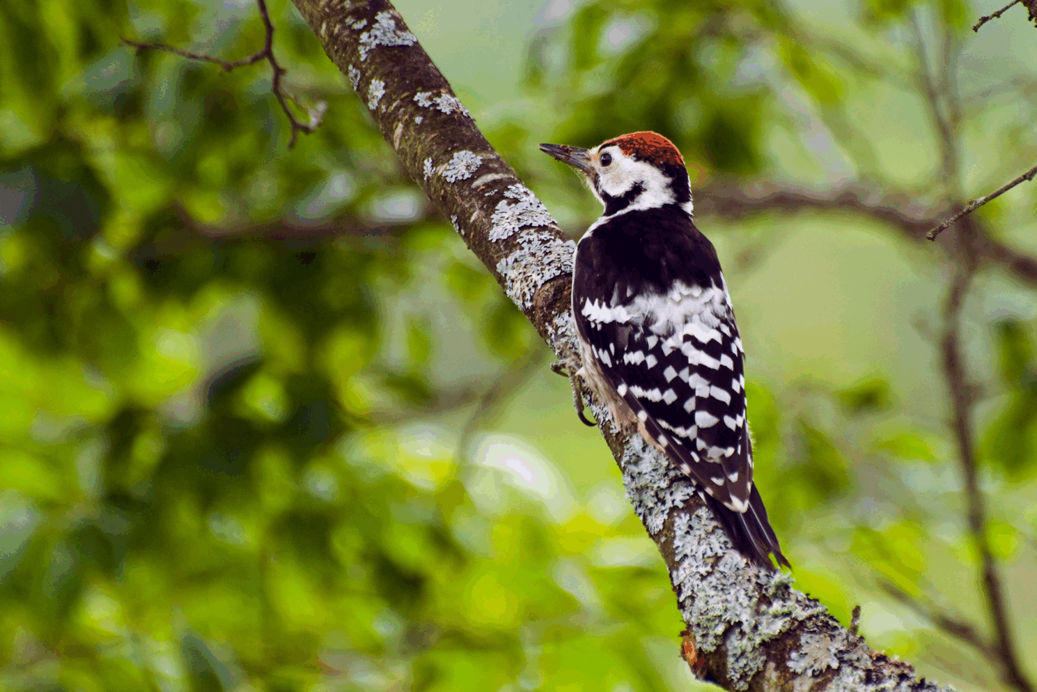
Users can plainly see that this is a woodpecker on a tree, and your alt text can succinctly describe that situation.
Captions are not the same as title attributes
Title attributes, or title text, is that bit of copy that pops up when you hover your mouse over an image. While often confused with alt text, title text’s main purpose is to give users extra context about what they’re looking at.

That’s not to say you should rely on title text instead of alt text. Screen readers are often inconsistent when it comes to reading titles or not. Most of the time, the text is only presented to users who hover their mouse over the picture.
You can still include a brief description of the image itself, but don’t rely only on title attributes.
Use the right file format for the job
WebP, JPEG, PNG. Unless you’re a designer, file formats probably look like a random assortment of letters stuck on the end of an image. But each format actually serves a purpose.
Let’s start with the best and brightest: WebP.
As Google’s brainchild, WebP stands above its formatting peers in most aspects because it:
- Creates smaller and faster loading files than other formats
- Uses compression techniques that offer a good balance between image quality and file size (which helps with load times)
- Is supported by most major search engines
- Supports animation and transparent backgrounds (no solid color fill behind the image)
The biggest drawback to WebP? It’s new. It’s not supported by some older browsers like older versions of Internet Explorer, Edge, or Firefox. It’s also harder to create and manage since many tools don’t support it natively, leaving you juggling converters or plugins to make the change.
If you have the resources, invest in WebP file formats. It’s especially useful for sites with lots of high-resolution images—like ecommerce, media, or travel businesses—where faster load times make a big difference for user experience.
JPEG (or JPG), comparatively, is a great go-to for standard images. It’s the ideal choice for:
- Larger photos and illustrations
- Bright colors and clarity for somewhat small file size
JPEG falls short when it comes to supporting transparency and delivering the same ultra-optimized performance you can expect from WebP formats because of its lack of features and larger file sizes. But for most standard use cases—basic product imagery or lifestyle photography—it gets the job done.
Then there’s PNG. PNG is best used for images that need:
- Animation
- Transparency
- Lossless compression (when an image maintains is quality even after editing)
- Clean edges
- No compression artifacts (blurry or blocky distorts that sometimes appear in over-compressed JPEGs)
Beyond that, PNG isn’t the best if you’re looking for an image that can quickly load on mobile. It especially lags compared to JPEG and WebP formats. Because of that, if you’re working with fixed-sized design elements or small assets like logos or headers graphics, it’s the best choice.
That just leaves SVG. SVG is especially useful because it can be:
- Resized without losing quality
- Manipulated with coding languages like CSS and JavaScript
Because of this, SVG is the favored format for icons and logos. But it’s not ideal for complex images like photos or detailed illustrations. Largely or overly complicated SVG files can drag performance down if they’re not optimized. And since SVGs are code-based, they can pose a security risk if you upload them from untrustworthy sources.
Here’s a table that breaks down the pros and cons of each file format:
| File Format | Pros | Cons | Use Cases |
| WebP | – Creates smaller, faster loading images – Supports animation and transparency – Uses modern compression techniques – Supported by most major search engines | – Not supported by older browsers – Harder to create and manage | – Ecommerce/product images – Blog headers – Media-heavy content |
| JPEG | – Widely supported across all browsers – Smaller file sizes for photos – Easy to create and compress | – Lossy compression reduces quality – No transparency support – Not ideal for text or sharp lines | – Photography – Blog images – Lifestyle content |
| PNG | – Lossless compression – Supports transparency – High-quality detail for graphics | – Large file sizes – Slower to load on mobile – Not ideal for photo-heavy sites | – Logos with transparency – UI elements – Infographics or screenshots – Animation |
| SVG | – Can be resized without losing quality – Can be styled or animated with CSS/JavaScript – Small file size for simple graphics | – Not suitable for photos or complex images – Can introduce security risks if not sanitized – Larger file size for complex SVGs | – Icons and logos – UI components – Simple illustrations |
You may notice that this list doesn’t include AVIF. That’s because though AVIF is one of the most advanced image formats out there—with even better compression than WebP, smaller file sizes, and higher quality—AVIF is not fully supported across all browsers and devices. And it’s seriously resource-intensive to implement at scale.
AVIF, like most next gen formats, is best used by sites that have a lot of images and the resources to update them like ecommerce businesses or media publishers.
Out of all of these formats, WebP will get you the best balance of quality and performance for your time. It’s widely supported, relatively easy to implement, and delivers notable performance improvements. AVIF can be worth exploring if you have the time, but it’s still in “nice to have” territory when it comes to image optimization.
Compress images without killing quality
Compression quite literally means reducing the file size of an image by removing unnecessary data. That means fewer bytes for an engine to chew through when loading, which improves page speed and performance.
In other words: you’re making an image smaller so it’s easier for search engines to load the page.
The trick with compressing images is that it’s way too easy to go too far. Too much compression leaves you with an almost unrecognizable “after” picture.
There’s a lot of tools you can use to compress an image without leaving you with a blurry, pixelated mess, like this:

Can you tell which one is the before and which is the after? Here’s a hint: the one below is the after.
There’s a lot of free tools you can use to do this manually like TinyPNG, Squoosh, ImageOptim, and ShortPixel.
If you use a CMS like WordPress, you can also enjoy some automated compression every time you add a new image. This keeps your file sizes manageable, no extra manual editing needed. Just make sure to review the quality settings before pushing things live. No one wants overly compressed and pixelated pictures.
The trick to image compression is walking the fine line between maintaining image quality and file size. You can do this by:
- Setting up an automated compression tool in your CMS
- Choosing settings that strike the perfect balance of low file size for fast loading but high quality to avoid blurriness
Always test your images after the fact to make sure the compression stuck. Try to stay below 100KB when possible. Use tools like PageSpeed Insights or Lighthouse to see how your load times have changed.
Serve responsive images for all devices
Remember how you want to have responsive images so users on all screen sizes can enjoy your pretty pictures? The best way to do that is by using responsive images.
All images come with something called a srcset attribute. You can use this to tell the browser what the minimum width of the image should be depending on the user’s viewport:
<img
  src="image-800.jpg"
  srcset="
    image-400.jpg 400w,
    image-800.jpg 800w,
    image-1200.jpg 1200w"
  sizes="(max-width: 600px) 400px,
        (max-width: 900px) 800px,
        1200px"
  alt="Example of responsive image" />
And even if your site is a special case and only has users on desktop, you should still be optimizing your page experience for mobile since Google is a fully mobile-first crawler as of 2023. That means that Google is using the mobile version of your site when it’s looking at content—and images. If your layout doesn’t work well on smaller screens, your rankings will suffer.
That’s where the sizes attribute comes into play. This works with srcset to tell browsers how large an image will appear on different screens sizes. Browsers use this to load the most appropriate image version for each device, which is a great boost for mobile load times and a direct impact on Core Web Vitals and SEO.
The good news? If you’re using WordPress, this is done for you. WordPress automatically generates multiple image sizes on upload that include srcset and sizes attributes.
You can also use something called retina optimization to keep your images looking crisp and high-resolution. This is especially important for users on Apple or high-DPI Android devices because those screens have more pixels per inch, so your standard image can look blurry or pixelated. You can use srcset here to help the browser pick which type of picture works best based on screen density.
Here’s what that code snippet looks like:
<img
  src="logo.png"
  srcset="logo.png 1x, logo@2x.png 2x"
  alt="Company logo" />
This basically tells your browser to “use standard image on regular screens, but load the sharper version on high resolution displays.”
Technical SEO enhancements for images
Yes, there’s more optimizations left to be done. Thankfully, these technical enhancements are easier to scale—and also can make a big difference in your user experience in the long run.
Implement lazy loading (carefully)
Lazy loading is exactly what it sounds like: you’re enabling images to not load until they appear on the user’s screen or viewport.
Though simple sounding, lazy loading is deceptively useful.
Basically, search engines only have to load that first piece of above the fold (that part of your page that’s visible before anyone starts scrolling) content.

Since less things need to be loaded at once, you’re getting a site speed boost. You should also see improvements for something called interactive to next paint (INP). This is another Core Web Vitals measurement which looks at how quickly a page responds to user interactions like clicks or taps. The lower your INP, the faster the page responds to user prompts.
Lazy loading is easy enough to add to an image. All you have to do is add the loading=”lazy” attribute to the image tag like this:
<img src="image-example.png" loading="lazy" alt="Add your alt text here">
Lazy loading does have an Achilles heel. You shouldn’t use it with anything above the fold, especially for your hero images. If critical images are lazy-loaded, users might see blank placeholders before images appear, hurting experience and actually making LCP worse.
Something else to note here is that though most modern browsers support simply adding the loading=”lazy” attribute to your <img> tags, JavaScript-based lazy loading libraries are a bit different. These libraries offer more advanced features like:
- Support for background images
- Fade-in effects
- Infinite scroll
But with great features comes more lines of code, harming performance if you aren’t careful. Basically, start with lazy loading, but you can work your way up through other JavaScript library features if you’re looking for more customization.
Include image schema markup where relevant
Schema markup, or structured data, is code you can add to your site to improve your chances of ranking for rich snippets. Rich snippets are those search results like this:

Or even something like these popular recipe listings:

You can use ImageObject schema to provide extra information about the images like creator name and image license. This information can even show up in Google Image results:

Use it in conjunction with Product, Recipe, and even News schema.
Here’s how you can use images with Product schema:
{
  "@context": "https://schema.org/",
  "@type": "Product",
  "name": "Organic Green Tea",
  "image": {
    "@type": "ImageObject",
    "url": "https://example.com/images/green-tea.jpg",
    "width": 800,
    "height": 600,
    "caption": "Organic Green Tea leaves"
  },
  "description": "Premium organic green tea leaves sourced from Japan."
}
Adding this schema to your page will help images better understand your product page images, improving the odds that your image will appear in rich results and Google Shopping listings.
Or how you can use it with Recipe schema:
{
  "@context": "https://schema.org/",
  "@type": "Recipe",
  "name": "Chocolate Chip Cookies",
  "image": {
    "@type": "ImageObject",
    "url": "https://example.com/images/cookies.jpg",
    "width": 1200,
    "height": 800,
    "caption": "Freshly baked chocolate chip cookies"
  },
  "recipeIngredient": ["1 cup sugar", "2 cups flour", "1 cup chocolate chips"],
  "recipeInstructions": "Mix ingredients and bake at 350°F for 12 minutes."
}
This schema, on the other hand, adds images to your recipe page. This helps search engines better understand what your dishes look like and make it more likely that the image appears in the search results. This gets you more clicks because you’re upgrading your recipe from this:

To like this:

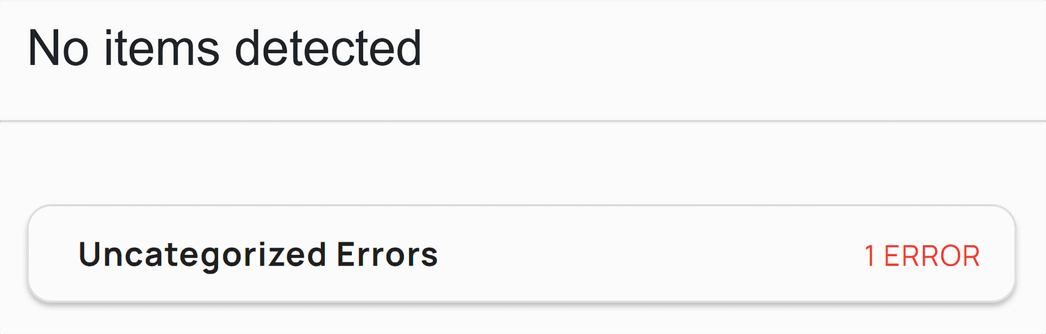
You can use AI like ChatGPT or even old fashioned tools like this to help you write the schema. You can then validate and test it to make sure everything is working as it should with Google’s Schema Tester.
If you wrote the schema correctly, you should see something like this:

And if something went wrong, you’ll get an error message indicating what needs more attention:
Structured data, when used properly with your image’s alt text and filename, is one of the best ways to get search engines to really understand your image. Remember: crawlers like Google can’t actually see your picture, but by filling out these different fields with detailed, keyword-rich copy, you can help them understand exactly what’s going on. And the better a search engine understands something, the more likely you are to rank.
Create and submit an image sitemap
A sitemap is exactly what it sounds like: a list of all the URLs on your site that helps search engines find all the pages you want to crawl and index (i.e., locate and remember for possible search results).
An image sitemap is that, but for your images. It makes sure search engines can find all of the important images on your site. This is especially useful for large enterprise sites or sites with image-heavy verticals like travel sites or enterprise ecommerce sites.
Here’s how Google recommends you structure your image sitemap:
<?xml version="1.0" encoding="UTF-8"?>
<urlset xmlns="http://www.sitemaps.org/schemas/sitemap/0.9"
xmlns:image="http://www.google.com/schemas/sitemap-image/1.1">
<url>
<loc>[URL for a webpage on your website]</loc>
<image:image>
<image:loc>[URL for an image on this webpage]</image:loc>
</image:image>
<image:image>
<image:loc>[URL for another image on this webpage]</image:loc>
</image:image>
</url>
<url>
<loc>[URL for another webpage on your website]</loc>
<image:image>
<image:loc>[URL for an image on this webpage]</image:loc>
</image:image>
</url>
</urlset>
You can also use a sitemap generator tool like XML Sitemaps to pull all of this information for you.
Once you have your sitemap, you can submit it to Google Search Console, or GSC. Google Search Console should be one of your go-to SEO tools. It shows important information like site and page-specific:
- Impressions (how often users see the page in the search results)
- Clicks (how often users go to those pages)
- Rankings (where your page appears in the search results)
- Click-through rate (percentage of impression to clicks)
- Keywords (what terms people are using to find your site)
Use GSC to submit your sitemap and track how Google is viewing and indexing your images by:
- Logging into your GSC account.
- Navigating to Indexing and selecting “Pages.”

- Scrolling down to look at reasons why certain pages weren’t indexed. Look for image URLs with issues like “Indexed, but not currently submitted in sitemap,” or “Discovered – currently not indexed.”

- If you have a specific image you want to check on, you can paste the image URL into the URL inspection bar to see if it’s ranking or not.

You can also use GSC to keep track of your image performance:
- Go back to the sidebar navigation in GSC. Select “Performance.”

- This graph shows the clicks and impressions to your site over the last six months. You can adjust the “Search type: Web” function to select “Image” to look specifically at image performance.

- This new graph shows you organic performance for all of the images on your website. You can adjust this further to different time periods by selecting the “More” drop down and changing that filter:

- And you can scroll down to see what kinds of keywords users are searching to find these images.

Use this information to understand what users are searching for when they find your images. This gives you a benchmark for what is performing well—and poorly—for your site so far.
Improve Core Web Vitals with image delivery
Core Web Vitals are how you measure your site’s load times. Like we’ve already discussed, there are a few different metrics you look at specifically. We’ve already talked about how you can improve INP (interaction to next paint) and LCP, but let’s take a look at one other feature: CLS.
Cumulative layout shift (CLS) is how much things move around on your page while different elements load. Say you’ve been shopping for some carrot seeds and opened the product page ready to buy, but when you click on the “add to cart” button, the page finishes loading and everything shifts, making you click on something completely different. You have CLS to thank for that.
You can improve both CLS and LCP by defining the height and width properties for each image in CSS. Do this by providing inline styles or external stylesheets for the image in CSS like this:
img {
  width: 800px; /* Set the desired width */
  height: 500px; /* Set the desired height */
}
This helps because it gives your browser a blueprint for how much space it needs to reserve before an image loads, minimizing layout shifts (which helps CLS) and speeding up rendering (which helps LCP).
You can take this a step further by using something called aspect-ration placeholders. This sounds complicated, but it basically means that instead of using width and height in CSS, you define the image’s aspect ratio. This reserves space for that specific image, and works well with responsive page designs.
Here’s an example of this that code would look like:
img {
  aspect-ratio: 16 / 9;
}
Priority hints is another technique you can apply here. It uses something called fetchpriority=”high” on your hero image or whatever visual asset on your page should be loaded first, which is a great lift for your LCP.
Here’s what that code should look like:
<img src="hero.jpg" fetchpriority="high" alt="Main banner image" />
And here’s what this look like if you’re looking for it in the wild:
If you want to approach these techniques at scale, you can serve your images through CDNs like Cloudflare, Fastly, or Imgix. These services will do all of this work for you, automatically compressing, resizing, and converting images into modern WebP or AVIF formats.
Image SEO for visual search, Discover, and AI Overviews
We’ve already talked some about the power of optimizing images for visual search, but in this AI-powered world, you can take things a step beyond even that.
Before we get into how to improve your visibility for things like AI Overviews—that answer box that appears at the top of search for informational queries—let’s define how Google Images and visual search rank your content. Spoiler alert: both your image and the surrounding on-page text play a role.
How Google Images and visual search rank content
Google ranks your images based on:
- Relevance: How relevant is information about your image in the alt text, filename, and captions, to the user’s search query?
- On-page content: How relevant is the surrounding on-page content like page’s headings and copy to the user’s search query?
- Page quality and authority: Is this image on an ad-free, high-quality page provided by an authoritative source?
Another quality Google takes into account is entities. These are essentially just people, places, or things that Google recognizes as either relevant to the user’s query, a sign of authority, or both. You can strengthen these entity signals by using optimized file structures and filenames for your photos.
For example, you’d want to name your photograph taken by a botanist in Smokey National Park of an American Chestnut:
/images/2025-american-chestnut-smokey-national-park-dr-owens.jpg
Notice how this name is getting a little long? Consiseness and detail are both key players here. Try to keep things between five to seven words (or sneak by with eight here like we did). So long as you play by that rule and include key details like the subject, location, and photographer (if relevant), you should be fine.
You wouldn’t want to name the image:
/images/2025-07-14.jpg
This filename is too vague and provides no useful information to search engines about what this image is about.
Optimizing for Google Lens, AI Overviews, and zero-click image results
AI Overviews usually serves images alongside explanations pulled from a variety of websites. Images are most common for visual-queries like product comparisons, how-tos, or landmarks, like even just questions like “what flowers should I plant in May?”

On the other hand, Google Lens uses AI to interpret the content around your image when you run an image search, not just the image itself. This doesn’t mean that Google Lens is looking at the pixels or the visual elements of the image itself. Instead, it’s pulling context signals like:
- The copy around the image
- The image’s alt text or filename
- Any schema markup associated with the image
- Nearby headlines or captions
Because Google Lens uses AI to interpret information around your image, the best way to optimize for ranking is to:
- Avoid stock images (usually fail to match entities or intent)
- Use original imagery when possible (provides a distinct visual footprint for Google to associate with your content)
- Make sure the page that houses the image has content that reinforces the image
- Include clear alt text with descriptive value, not just keywords
You might have heard that something called EXIF metadata (like the camera model or GPS data) can be helpful for SEO. This is somewhat correct. Today, context beats EXIF metadata. The copy around your image (captions, headings, page copy) matters more than the technical data inside of the file.
Leverage images to win in Discover and featured snippets
Google Discover is Google’s social media-like model content feed. It delivers a stream of articles, videos, and content based on your interests and prior search history.

Notice anything particular about that example above? There are a lot of images.
The key to taking up space in Google Discover is similar to optimization techniques for featured snippets and for zero-click results, or search results where users only view the answer and don’t need to click.
Try these tactics to improve visibility:
- Provide constant, original, and topically relevant images
- Create eye-catching visuals that stand out on mobile
- Optimize aspect image aspect ratios for mobile
That last tip is especially important. When you’re looking at previews on Discover, for example, you’ll need to crop or scale images to fit 4:3 or 16:9 aspect ratios to keep your visuals from being awkwardly cropped.
Optimizing images for social media shares
When someone shares your page on social media—Facebook, X, or LinkedIn—those platforms pull a preview of your page. This preview includes the page’s title, description, and image. You can actually control which image appears by using something called Open Graph (og: image) and Twitter Card (twitter: image) in your HTML code.
Why are we talking about social media when you’re learning how to optimize images for SEO? Two reasons:
- Using this technique improves how users share your content, which will get you more clicks if your image is eye-catching and relevant.
- Social media previews can show up in long-tail search results when Google ranks Reddit threads or other social shares.
Improve your visibility on social by using Open Graph and Twitter Card, and make sure you have the right image dimensions so nothing gets cropped.
Accessibility and brand implications of image optimization
We’ve talked a lot about SEO and image optimization in this article, but there’s another important part of image optimization that has nothing to do with search: accessibility.
Always keep accessibility and compliance in mind when working on image optimization. Consistently creating brand-relevant content that describes an image is so important when it comes to building user trust—and long-term SEO performance.
How alt text supports both SEO and accessibility compliance
Out of all the techniques we’ve discussed, alt text stands out as one of the strongest areas of image optimization to make your page accessible for all users.
It acts as an image description for those using screen readers. And it makes sure you meet compliance standards like Web Content Accessibility Guidelines (WCAG) and Americans with Disabilities Act (ADA).
Of course, it helps with SEO, too, but when you’re writing alt text, always think about those that will be hearing that copy through a screen reader. Keep things concise, descriptive, and don’t go wild with keyword stuffing.
Why contrast, legibility, and text-in-image considerations matter
Accessibility goes beyond image description—it’s also about image design.
Pay close attention to contrast when you’re creating or picking out images. Text in images should have strong contrast and high legibility. That means avoiding things like:
- Light text on a light background
- Dark text on a dark background
- Text that’s too small to read on mobile
If your graph contains important things like a quote or a chart, consider repeating that information in plain text on the page. That means that everyone (and Google) will be able to consume that data.
Use tools or browser extensions to test for color contrast and compliance with WCAG AA/AAA standards.
Building visual consistency and trust through branded imagery
Images play a big role in how users see your brand. If you’re an ecommerce site selling plant seeds that use endless skull and cross bones imagery, people aren’t going to think very highly of your product’s longevity. You would want to stick to a consistent palette of greens, browns, and nature-inspirated colors. Maintaining regular use of style, visual elements, and even color helps reinforce your brand across your user base.
Consistent brand imagery builds trust and credibility, improves engagement when people recognize your site, and helps you stand out from competitors relying on stock photos. You can take the extra step here by subtly including your logo in your images. This protects your images from being used without credit, and continues to build that powerful brand trust.
Scaling image optimization for your site
Optimizing a few images is one thing. Optimizing thousands? Entirely different. For ecommerce sites and media-heavy enterprises, manually optimizing images isn’t an option.
The best way to build a strategy you can scale? The right tools and systems:
- Automation tools and CDNs like Cloudflare, Fastly, or Imgix that can compress, convert, and resize your images automatically.
- Standardized alt text to easily build descriptions for thousands of images.
- Lazy loading and fetchpriority to improve performance automatically for new pages.
- CMS and DAM platforms that support image metadata, response delivery, bulk alt text updates automatically across thousands of assets.
These tools mean your image optimizations don’t bottleneck. And means any new images hit your site in optimal state.
Scaling images can feel overwhelming. The key to your approach is the right combination of tools and processes. Start small by automating key tasks like compression and lazy loading. Then gradually expand to optimize alt text, filenames, and picture formats. And try not to stress too much. Many platforms offer built-in support for these features.
With a solid strategy in place, you can retroactively optimize existing images and automatically manage new uploads. Your site will be perfectly prepared to provide a fast, user-friendly experience, no matter how much you scale.
But image optimization can only take you so far. You still need a solid on-page and technical SEO base to make a real impact. Before image optimization can really make a difference, you’re site needs:
- Relevant, high-quality content that aligns with your target audience’s searches
- Crawlable, indexable pages with clear URL structure
- Strong internal linking that connects high-priority pages
If your pages aren’t optimized—or crawlable—your images won’t rank, no matter what you do. So if you feel like your image strategy is ready to go, your next step is a full audit of your on-page and technical SEO. That’s where you’ll find the real performance gains.
No comments:
Post a Comment