As of today, the world’s 50 top airlines have all agreed on the same flight search pattern. Yet the path to booking the right flight remains frustrating and confusing. Is there really only one solution? Explore the thought experiment which turned the seemingly untouchable pattern on its head and offered new food for thought.
The topic of flight search has been on our workbench before. Back in 2015, part of us worked on the design strategy of Lufthansa Group. In 2017, airberlin became one of our first clients. Together with the team, we redesigned their digital world from scratch: flight search, booking process, homepage, and much more.
What was considered too progressive in 2016 celebrated its first successes in 2017. Six years later, in 2023, it is now being expanded as a case study by DUMBO.
Note: This is a fictitious case study undertaken on our own initiative and was neither developed nor launched. With this study, we want to question habits, break down barriers and offer new food for thought to improve interactions.
A Flight Search Observation #
If you, like most, have searched for a flight at some point, you are familiar with the usual song and dance involved with playing with the search criteria in order to score an optimal search result. If I change the travel date, will it be cheaper? If I depart from a different airport, will the flights be less-full? As a result, the hunt is a never-ending combination of viewing results, making further refinements, and constantly changing the search criteria. So, do you see yourself here? Twenty-nine students who took part in the study “Online Search Behaviour in the Air Travel Market: Reconsidering the Consideration Set and Customer Journey Concepts” certainly did.
According to the 2017 study, flight search algorithms cover a dynamic solution space with often more than a thousand possibilities that can change rapidly, cutting it down based on user criteria. Users, on the other hand, go through three rounds of refinement on average, filtering and refining search criteria, comparing possibilities, and making trade-off judgments. The analyzed flight searches are insufficient to support the final decision: users must still make judgments and trade-offs depending on their personal preferences and priorities. The study emphasizes the importance of improved interfaces with decision support up to the final decision in order to improve the flight search experience.
Frontstage: What We Can See #
When we observe people booking flights, we notice unpleasant side effects and interesting user hacks.
- Searching for the right flight is extremely stressful.
High prices, limited availability, artificial scarcity, a plenitude of options, as well as an ingrained penchant for cost traps and loopholes. - The flight gets more expensive with every search.
Opaque pricing and the feeling of being on the airline’s hook make travelers suspicious of cookies and tracking. - Flights are like looking for a needle in a haystack.
Alone, the route from Frankfurt to Honolulu offers 8,777 different flight combinations. To get a handle on what’s on offer, travelers turn to third-party providers like Swoodoo to combine different routes or Google to find offers from the surrounding area and many more. - Long waiting times are nerve-wracking.
Prices are recalculated, and availability is checked for every search query. In our test, a query usually takes 10 seconds. This always leads to long waiting times in the observed search behavior. - The quest for the best flight deal.
The most important decision criterion for a flight is still the price. But every search parameter influences it. The lack of price communication reinforces the feeling of intransparency. - The feeling of having paid too much for the flight.
When it comes to flights, most travelers are confronted with “from” prices. However, these are only available on certain flights and in limited numbers. What if such flights are not available? This leads to negative anchoring: what seemed affordable at the beginning now seems all the more expensive.
Backstage: What We Don’t See #
It takes a look behind the curtain to find out that there are numerous technical and business constraints that have an enormous impact on flight search. Rather than years of usability engineering, the search experience is largely determined by third-party booking systems, dynamic pricing, and cost-per-request mechanics.
- 3rd Party Booking System.
Behind most flight searches is a reservation system running called Amadeus. This is where millions of customers purchase their tickets. Amadeus is mostly responsible for which data points are available and how the interface is designed. Airlines use those systems and can only exert limited influence on a better solution. - Dynamic Pricing.
Dynamic pricing is used to set the price of a product based on current market conditions. Prices fluctuate in real-time based on current data. This includes data on customer booking behavior, competitor airline prices, popular events, and a variety of other factors that affect product demand and necessitate price adjustments. - Cost per request.
In most cases, searches are charged per request. To keep costs down, airlines want to reduce search requests. This leads to avoiding both pre-emptive and iterative queries.
Reframing The Problem #
The classic flight search pattern inevitably leads to a frustrating trial-and-error loop.
“
The dilemma: this price-relevant information affects availability, travel time, and service. At the same time, they are factors for the traveler that can be changed depending on the result and personal preferences and flexibility. As a result, travelers develop their own user hacks to compare different search parameters and weigh the trade-off between price and convenience.
How can we give travelers a better flight search experience? Our pitch is The Balancing Act: a guided dialogue between traveler and airline. Strap in — we’re taking a deep dive.
The Flight Search Redesign: Introducing The “Balancing Act” #
What makes a search successful? It’s an increasingly important question in the age of global travel and its limitless possibilities. We focus on finding your personal solution. It puts the traveler, their occasion, and their budget at the center of the interaction and looks at how well the flight offer fits. To do this, we fundamentally change the tailoring of the interaction with travelers. We break down the search form into individual tasks and change the sequence of interactions. This allows a more balanced approach between friction and progress.
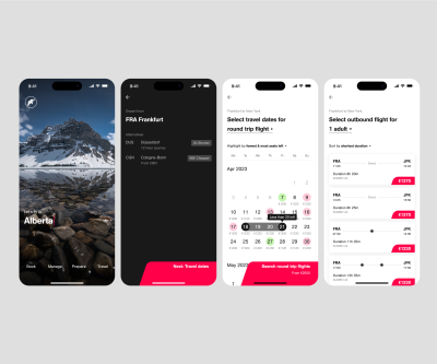
We Will Take You There. But Where To? #
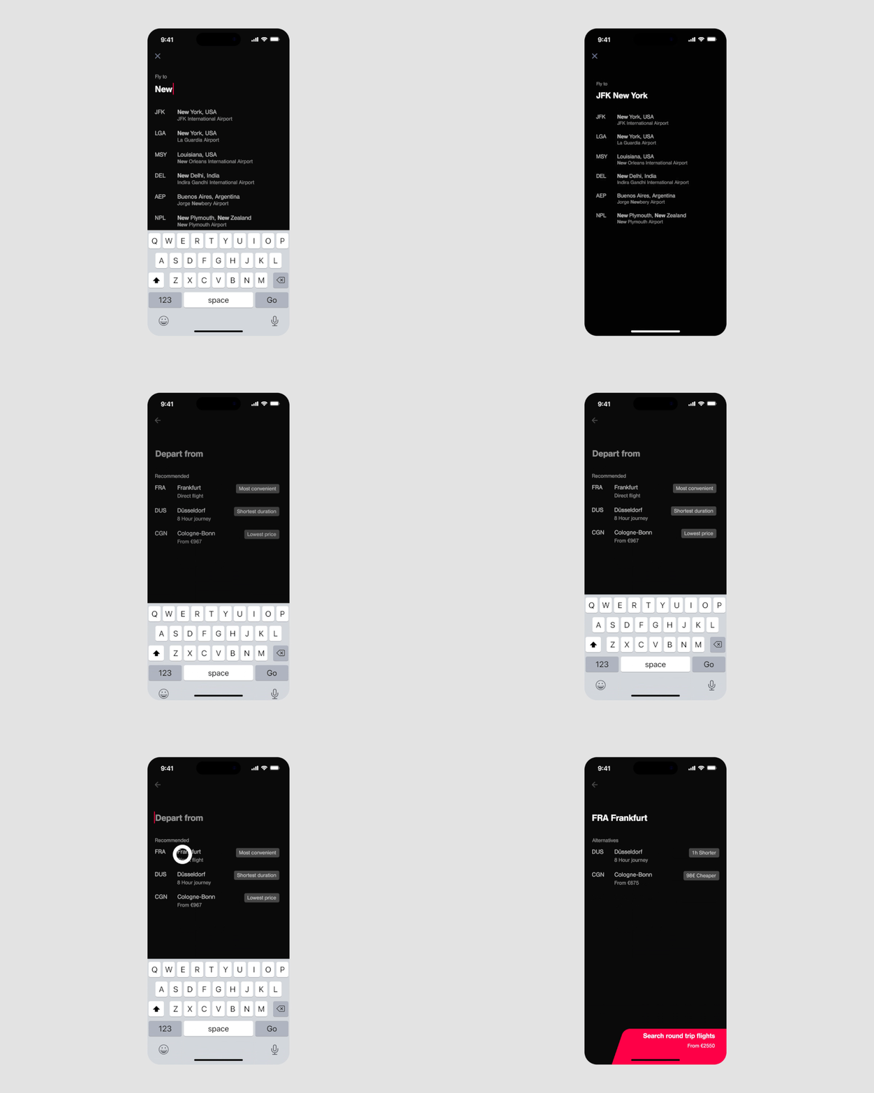
Let’s start the flight search with the only question whose answer is not up for discussion: Where to? Knowing where you want to go, we might be able to help you to weigh up every further detail in terms of cost and convenience. This will allow you to make conscious decisions.

Find The Perfect Connection #
We will find the best departure point for you. Depending on where you want to go, where you plan to stay, and at what prices and conditions, we might be able to offer alternative routes that are easy on your wallet and get you to your destination comfortably and quickly.
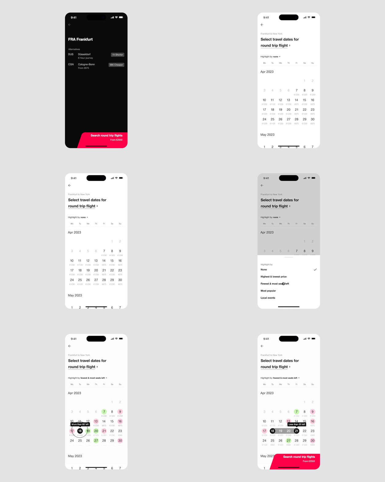
Times That Suit You #
Airplanes are almost always in the air, but they are not always the same. For some journeys, you are time-bound; for others — not. Best-price calendars, travel times, expected load factors (and much more) might help you to find the best flight for your journey.
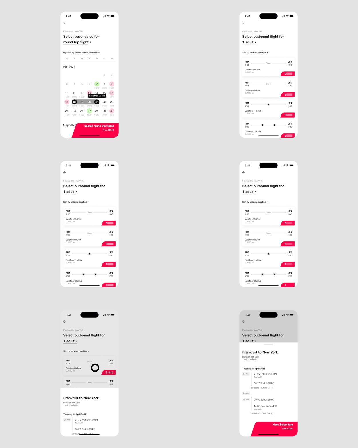
Without Getting In Your Way #
We will react as quickly as possible. Even before we talk about the number of passengers, deposit access codes, or create multi-stop flights, you should have an idea of whether there is a suitable flight for you.
This Is How We Get There: Step By Step #
To redesign the interface, we need to uncover the structure of the interaction moment. For this, we use the Interaction Archetypes framework to help us align our design with the underlying usage intention — the strongest driver for user interaction.

Task #
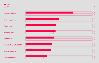
The task is to find a suitable flight. We see that this usually takes several attempts and is achieved with the help of different search platforms and flight brokers. This shows that we are clearly in a weighing phase when searching for a flight. Different flights, routes, and times are weighed against travel planning criteria as well as personal preferences and limiting factors of the traveler.
Intention Of Use #
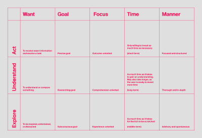
The intention of use is a key determinant of interaction. The better we tailor our interface to the intention of use, the higher the probability that the interaction will be successful. Research findings show that usage intentions for digital applications can be assigned to three categories: “Act,” “Understand,” and “Explore.”
In our case, we can clearly attribute the flight search to the “Act” usage intention: users have a specific task and want to make progress in completing that task as quickly as possible. Flight search is characterized by a clear goal. Travelers want to get an overview of the available flights to find the best option for their specific solution space. They take a structured approach and selectively change search parameters to uncover inconsistencies and explore the limits of what is available.
Success #
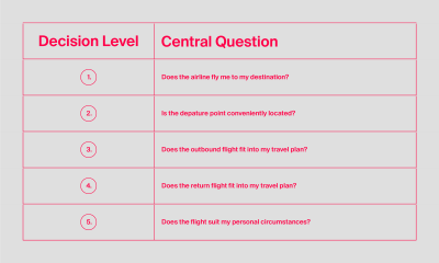
Changing various parameters shows that the solution space for this task is multi-dimensional. And not just that, on closer inspection, it becomes clear that a flight search is a hierarchical step process: a so-called “Analytic Hierarchy Process.” We assume that decision-making tasks are sequential. The traveler works his way from decision level to decision level. All levels of the flight search are causally related.
Goal #
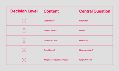
Flight search is inextricably linked to flight booking, which in turn is linked to travel to and from the destination. The primary goal of travelers is “to arrive.” Here, we observe the same causal relationship that we have already seen with the success factors. We are also dealing with a hierarchical step process.
This means that before they start looking for a flight, travelers have already considered the destination, the time of travel, the duration of the trip, and the travel costs. Travelers, therefore, usually have a kind of hidden agenda, which they consciously or subconsciously review in the course of their flight search.
Hypotheses #
If we consider the problem and the context in which the interface is used, three hypotheses emerge. They open up a solution space for the flight search:
- If we design the search along the decision levels, travelers can make faster and more confident decisions at each stage of decision-making.
- If travelers can already weigh their options in terms of price and convenience at the moment of entry, the first search results are likely to be suitable, thereby reducing the re-submission of search queries.
- If we show partial information as soon as it is available, travelers can quickly scan for suitable flight results, thereby reducing friction and the abandonment rate.
The Challenge #
What we currently see in the airline and flight industry space is that search now assumes that its parameters meet fixed criteria. Accordingly, a “successful” search is given if it is able to deliver a result based on the ten declarations. In interaction, however, travelers behave in a way that contradicts this assumption.
The decision-making levels through which travelers approach their destination provide information about it. They are hierarchical and causally related.
“
So if we create space for trade-offs through interaction, we should be able to make the flight search more targeted to the traveler’s needs. This raises three major design opportunities:
- How might we utilize travelers’ decision-making levels to speed up the process?
- How might we help travelers balance price and convenience to reduce search queries?
- How might we deliver results to travelers faster to reduce friction and abandonment rates?
Solutions #

From Static To Sequential #
We say goodbye to the predominant route indication of a flight search and ask in the first step: Where do you want to travel to? We quickly realized that the “where to” question fits the mental model of travelers and can serve as a springboard for goal-oriented interaction. Only if we bring travelers closer to their destination can the airline make a relevant offer.
Four steps #
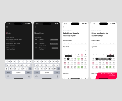
But that’s not all: We completely remove the search form and lead travelers to their flight in a dialogue. Following the decision-making levels, we ask for four pieces of information one after the other, on the basis of which we can generate a suitable flight plan:
- Specify the destination.
- Specify the origin.
- Select the departure time.
- Select the return time.
Four Moments Of Success #
Each entry is given our full attention. This reduces the cognitive load and creates space for content, even on small devices. This, in turn, is only possible if the effort per input is less for the user than the added value generated in each case.
If we orchestrate this information along the decision-making levels of travelers and understand their causality, we can consciously bring about partial decisions. Meanwhile, on the way to the individual solution space, we create four moments of success:
- Can we fly to our destination? Check!
- Can we fly from a suitable departure point? Check!
- Can we fly out at the right time? Check!
- Can we fly back at the right time? Check!
More Later #
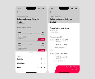
Further queries are refrained from in favor of the offer. All other criteria can be used to adjust the results while maintaining the flight schedule. These criteria are preselected based on the most frequent flight bookings or personal flight behavior.
- Number of adults,
- Number of children,
- Number of infants,
- Access codes to selected flights,
- Selection of class.
From Passive To Proactive #
To make well-informed decisions, travelers need to be aware of the consequences of their choices in the flight booking process. This means they need to understand the impact of their partial decision (date, departure location, airport) on the expected outcome. The better they can do this, the easier it is for them to weigh up. Ultimately, the best flight is the result of a personal trade-off between convenience and cost.
The Best Departure Point For You #
If you live in western Germany, there are five possible departure points within a 90-minute radius. Frankfurt and Düsseldorf are two major hubs among them. So the departure airport is extremely flexible and raises questions:
- Which departure airport comes into question?
- Which airline is preferred?
- What is an acceptable price range?
- How mobile is one on the way to the airport?
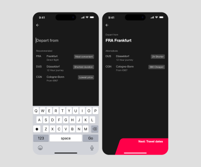
Based on geolocation and the route network, conclusions can be drawn about a suitable departure airport depending on the destination. To do this, we look at nearby airports and rate them according to comfort and price. In addition, the travel time and the airline also play a role.
And that’s not all. We could place targeted offers, which could allow the airline to drive competition or control the load factor across the organization. In this way, attractive incentives can be created with the help of discounts, therefore positively influencing the actions of travelers.

The Best Time To Fly For You #
The travel period is probably the most obscure and yet most important parameter for travelers, yet it is also the most essential factor in determining airfare and availability. A single day earlier or later can quickly add up to several hundred euros. This can have a critical impact on travel planning.
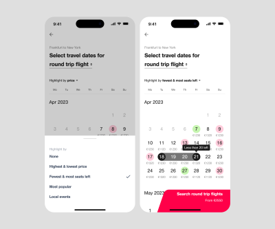
We don’t want travelers to have to correct their search later, so we add additional indicators to the date selection. First and foremost, there is a price display that is broken down daily for outbound and return flights.
Travel planning does not always leave room for maneuver. Therefore, early indicators of availability are all the more important. For this purpose, we mark days on which the destination is not served as well as days with particularly high load factors. In this way, we can set impulses at an early stage of travel planning to avoid negative booking experiences.
The Best Ticket For You? #
A “One-Way Flight” can be more expensive than a “Return Flight.” We consider the option “One-Way Flight” within the date selection. This is because it is an alternative to a return flight. And the associated price is an important piece of information to consider when travelers are weighing options.
Even before the flight plan has been loaded, we put all options on the table. This is how we offer maximum price transparency.
Disclaimer: Multi-stop flights were not considered in this case study.

From Accurate To Instant #
If we communicate flights and their prices prior to checking whether the flight is not yet fully booked or the prices have changed, there is a risk that the offer will have to be corrected. Usually, all of us want to make statements that can be fulfilled. But it needs a tolerance for errors in communication in order to provide volatile flight data as quickly as possible.
The following example: A flight is supposed to have a price of 300 euros, or so it was the day before. In the meantime, the prices have changed, and the flight costs 305 euros. As a result, the assumption based on the information was wrong and had to be corrected to the disadvantage of the customer.
Stupid. But: One was already in a situation to give a price indication. After all, the flight before and after might cost 600 euros and is therefore even more irrelevant than a flight for 305 euros if one had assumed 300 euros.
The communication error is less important than the added value at the moment of interaction. We can only overcome technical and business constraints with the help of estimates and assumptions.
Caching #
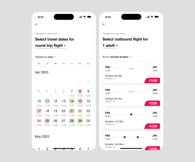
In order to achieve price transparency, we have to refrain from requesting price calculations. Due to the costs per request and the loading times, it is not possible for us to communicate prices as they currently are. Therefore, we have to cache prices from previous searches, at least until a flight selection can be made.
This could also mean that we know that prices may change once the final flights are selected. The requirement for accurate price communication is sacrificed in favor of relevant selection criteria and fast landing times. After all, price is typically the most important factor in weighing any partial decision.
Flight Plan #
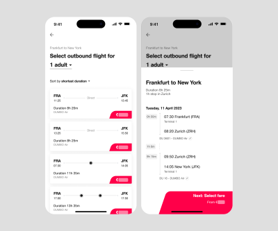
To speed up the interaction, we need to put the availability check at the end. The route network has been determined; the flight plan has been drawn up. With the route information and travel times, we should have the corresponding flight plan immediately available. The availability check can be either downstream or simultaneous. In this way, we enable systems to communicate without being a hindrance to travelers.
Geolocation #
Geolocation data can be used to draw conclusions about the departure airport. We do not necessarily have to use the geolocation API for this. It should also be possible to achieve sufficient localization with the help of IP address search so that we can immediately create added value. Once we have identified the airports in the vicinity, we can evaluate potential connections in terms of cost and convenience.
Overcoming Limits #
Anyone who has ever had to search for and book a flight surely knows: it is nerve-wracking and time-consuming. Before you can even start the search, you have to enter ten details in the search form. This means that in the very first stage of the search, you’ve already had to make ten decisions. Unfortunately, and often, only one thing is certain: the destination of the journey.
Along our thought process, we have shown that the classic flight search pattern is broken, often because external factors such as technical and business constraints influence the flight search experience. However, we have shown that airlines and searches can break the pattern. This can be achieved by entering into a dialogue with the user and leading them from one decision level to another to eventually fit their specific needs and goals.
If you found this approach useful or interesting, I recommend our guide to developing your own Interaction Blueprint. It is based on our “Interaction Archetypes” framework that allows you to strategically illuminate a user’s behavioral patterns, as well as their interactions with digital interfaces. It has greatly transformed and improved our design process. We hope that it could transform your design process, too
No comments:
Post a Comment