This article covers common problems using CSS floats and how to solve them using a block formatting context (BFC). By understanding the disadvantages of using BFCs and how to minimize them, you can ensure that your content is displayed correctly. Whether you are a beginner or an experienced web developer, you will learn valuable insights and practical solutions for dealing with CSS float issues.
Let’s imagine we’re making a small component. It can be anything, really, but let’s use a media object as an example. Nicole Sullivan had a solid definition of media objects from way back in 2010, and you probably already know the pattern well: some form of media (often an image) on the left and text beside it on the right. The media could be an image or a video, for example.
A media object is a mini layout. The most popular and easy-to-implement layout approaches these days involve CSS Flexbox and Grid. Once upon a time, long ago, some developers might have gone for a table display method instead.
Although it was created to achieve a newspaper or magazine media display on websites, floats were the gold standard for creating layouts before Flexbox and Grid were introduced, even if it wasn’t specifically designed for that use. Again, not the easiest — or the best — way to approach a layout, even for something as small as a media object.
Why are we talking about floats in 2023? Flexbox and Grid are well-suited for the task of a media object, after all. It’s really a matter of preference, but one reason to use floats in media objects is that they can be more lightweight and require less markup compared to other layout methods. The goal here is not to convince you that floats are the single best approach for laying out media objects but to help work around the challenges of using floats in a situation like this. When a media element, like an image or video, interacts with text, floats are a valid option.
Often, developers encounter content-wrapping issues while using floats, and that’s especially true for media objects where one element is on one side and text is supposed to sit beside it on the other. For example, what if the text on the right is super long? It will naturally wrap around the element on the left if it exceeds that element’s height. Or it can overflow the container that contains it.
While some developers may see this kind of behavior as a bug, it is not. That’s just the float behaving as it should. In this article, we will discuss the concept of block formatting contexts in CSS and how to use it to eliminate media object float issues.
Block Formatting Contexts #
A block formatting context (BFC) can be defined with or without respect to floats. Following the breakdown of the term into individual words, a BFC is a region (context) in which block-level elements are laid out (format). Referencing floats, a BFC is a section of a web page layout that restricts the positioning and clearing attributes of floated items to the containing block. This means that floated elements are contained within the block formatting context and will not interfere with other elements outside.
Several ways exist to create a block formatting context, some of which include:
- Using the
floatproperty with a value other thannone. - Using the
overflowproperty values other thanvisibleorclip. - Block containers with a
displayproperty value offlex,inline-flex,grid,inline-grid,inline-block,table-cell, ortable-caption. - Multi-column containers with values not set to
auto. - Elements with a
containvalue ofcontent,paint, orlayout. - Elements with the
positionproperty assigned toabsoluteorfixed. - Elements with a
displayvalue offlow-root.
Using any of the above CSS methods creates a block formatting context that contains floats within the container. Floats are merely one of them.
Common Float-Related Issues
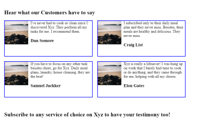
Going back to our example of a media object, we can get a good idea of the sorts of “issues” that come up when working with floats. In this case, let’s use a grid of testimonial cards as an example since all we really need in each card is an image and a block of text.

This is the basic HTML for the layout, minimized for brevity:
This HTML gives us a <section> element that is the container for four <article> elements, where each one is a testimonial container that holds an <img> and a <div> with a block of text — our media objects.
Let’s apply some light styling in CSS:
This code is by no means perfect. In fact, it introduces the wrapping and overflow issues we’re about to discuss. We will look at these issues together before getting into solutions.
Issue 1: Height Collapsing #
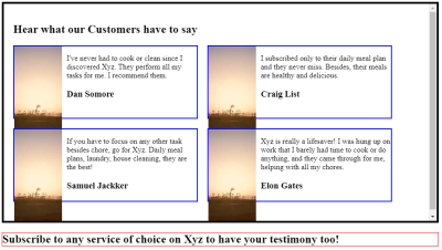
When an element is floated in its container, it exits its normal document flow and into a floated position, making no contributions to the container’s height. In a container of many floated media objects, the container element’s height is collapsed to contain only non-floated elements. The collapsed height might be inconspicuous in containers without a border or non-floated elements and could disrupt the layout of other elements after a media object container. However, this issue can be easily discovered if there is a non-floated element in the container, among other floated elements.
Let’s add a border to the parent container to see the height-collapsing effect.
Yikes! The parent container that holds all of the testimonials isn’t actually tall enough to fit all of the testimonials.
Issue 2: Overlapping Content #
Since floats are removed from the document’s normal flow, they can overlap with other elements on the page. This can cause unexpected spacing and layout issues which, in turn, lead to broken interactions with the element behind the floated element.
I’ve added a red border to the <h2> element that comes after the testimonials to see the issue more clearly.
Imagine if that was a form instead of a heading. Clicking on a media object would actually put focus on the form instead of the media object! That can be an annoying experience.
Issue 3: Text Wrapping #
It’s weird to call this an “issue” because wrapping around media elements is exactly what floats are designed to do. But, hey, having two elements sit side-by-side is a super common layout pattern. This is where I’d advise you to look at Flexbox or Grid instead of using floats, but we’ll press ahead because I know this comes up, regardless of best practices.
Let’s add more text to the text content container and watch it wrap around the image.
Again, the markup is pretty straightforward. It basically goes like this:
The image is floated left in the CSS, and you can see how the text wraps around it. Again, this is how floats are expected to behave. But we’re calling it an “issue” here for the sake of illustration.
Common Solutions For Float Issues
All of the issues we’ve looked at are due to the fact that we introduced a block formatting context by placing floats on the testimonial cards and the images in them. The funny thing about that is we actually need to create another block formatting context in order to fix the issues in other block formatting contexts.
There are classic and popular ways to go about it, as well as a better way that we’ll get into.
The Classic Solution: The “Clearfix” Hack #
It is possible to resolve this issue using the clearfix hack, which is like resetting the float.
By “clearing” an element, it does not participate in the flow of the
float but rather adheres to the document flow. This could be achieved by
creating an empty <div> element at the end of the media objects and setting it to clear: both.
That’s the “classic” clearfix pattern, but another way to do it is with the parent container’s ::after pseudo-element. This way, there’s no need to add that empty <div> to the markup.
The Popular Solution: Removing Overflow
OK, we just looked at one way to solve the floating issues. Let’s look at another, perhaps the most widely used way to go about it. But let’s also tweak the situation a bit just to make things more interesting.
This time, we’ll focus on float issues within the individual testimonial media objects. Our testimonial media object has a floated image that’s sized taller than the text surrounding it. The floated image exits the container flow and, as a result, is no longer contained.
Let’s give the <img> element an explicit height of 300px and a width of 100px.
This restricts the media object’s container height to make the float
issue more apparent. You can clearly see how the floated image overflows
the testimonial media object’s container and runs into other
testimonials.

The height of the content is what influences the height of the testimonial container. If the image were in the container’s flow, it would be taller than the text, and the container would adjust to it. But, alas, that’s not the case since we introduced a block formatting context when floating the image.
The popular solution with a single line of CSS on the testimonial’s parent container:
The
BFC this generates establishes a new document flow within the page’s
root element, containing all the container’s child elements, including
floated media objects. It effectively prevents the testimonial elements
from being displaced beyond the parent container’s borders — no extra divs or pseudo-elements are needed like the clearfix approach.
That certainly gets the job done! But I want to show you one more way to do this because I believe it’s the best of the bunch.
The Best Solution: display: flow-root
display: flow-root was introduced to address inconsistencies associated with using overflow for generating BFCs. In fact, display: flow-root was explicitly designed to produce BFC, while the overflow property is designed to manage content that surpasses its container. Consequently, overflow can induce unintended side effects, from unwanted scrollbars to data loss.
That’s why I recommend using display: flow-root. It is meant to create a BFC when you need it, whereas the other solutions are more like workarounds.
Conclusion
CSS block formatting contexts are great because they allow you to leave the main document flow, allowing elements to interact differently in a layout. But, of course, those different interactions can feel like buggy behavior if you’re unaware that you’re actually working in a different formatting context.
This is exactly why we have modern layout techniques like Flexbox and Grid. Before we had them, floats were a nice trick for faking columns. But the BFC they created wasn’t so nice. Hence clever workarounds like the clearfix to create a BFC to wrangle the other BFC.
Perhaps the bigger takeaway from all this, though, is to evaluate your layout strategy. If you’re reaching for a float, is it really the best option for what you’re trying to do? Because if so, you may as well embrace the natural text-wrapping behavior rather than trying to fight it. And if you don’t want to fight it, that’s a sure sign you ought to reach for a more modern layout technique, like Flexbox or Grid.
Resources #
- CSS in Depth, Keith J. Grant
- Block formatting context (Mozilla Developer Network)
No comments:
Post a Comment